Sony Xperia Z Ultra review
The Z Ultra isn't just a phablet - it's a ginormo-phone. And in a whole bunch of ways it's also ginormously excellent.
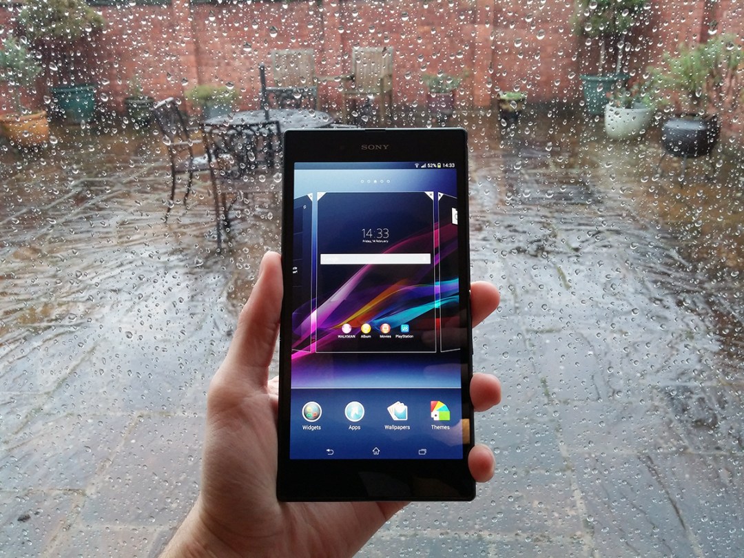
Jack of all trades, but master of none. That’s the danger that awaits the Xperia Z Ultra – a smartphone so huge, it doubles up as a mini tablet.
Can it really fill the roll of two devices? Is it powerful enough to cope? Is its screen worth blotting out the sun when you make a phone call?
The answer to most of those questions is a slightly surprising “yes”.
Screen if you want to go larger
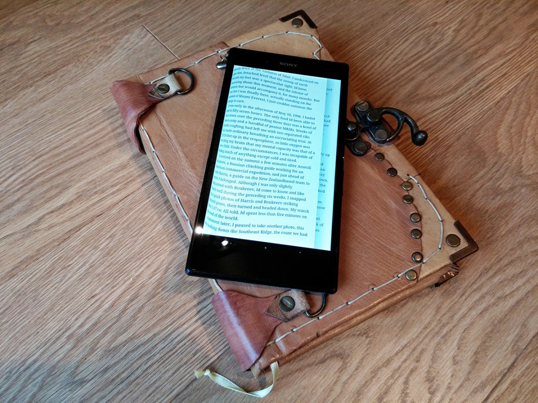
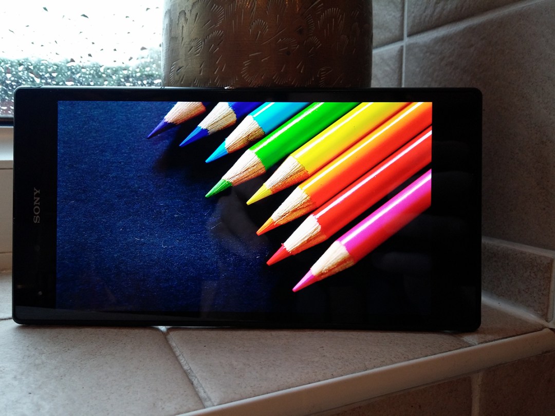
The Z Ultra’s screen will pamper your eyeballs with 6.4 massive inches of full HD loveliness. Like an overzealous Furby, it’ll demand attention the second you turn it on, and you’ll be more than happy to oblige.
Despite having a lower ppi count than smaller 5in 1080p smartphones, it still crams in more pixels per inch than the iPhone 5s. E-books and website articles are sharp and easy to read, and the sheer size of the screen means you can browse the full-fat internet without ever having to faff around with zooming in and out.
HD videos and games look stunning, too, and colours remain punchy and vivid without being too over-saturated and unrealistic.
Viewing angles are also miles better than the Xperia Z and Z1’s displays, which both appear washed out the minute you tilt them even slightly. Blacks are also very decent for a non-AMOLED screen.
There are, however, one or two niggles. The Z Ultra’s display isn’t quite bright enough for our tastes. Even at full brightness, we’re left craving some extra lumens, and you might struggle to use it in very bright sunlight.
The second issue we’ve found with the screen is that the whites are a bit creamy.
You’ll only really notice it when comparing it to the Dazz-like whites of phones such as the iPhone 5s and LG G2, so stay clear of any comparisons and let your brain strategically forget all about white levels. Ignorance is bliss.
Those two problems aside, the sheer size of the Z Ultra’s screen, coupled with its sharpness and excellent colours, will make you very happy indeed.
Is the display good enough to fill the role of a primary small tablet? Absolutely.
A phone so large it’s got its own gravitational pull
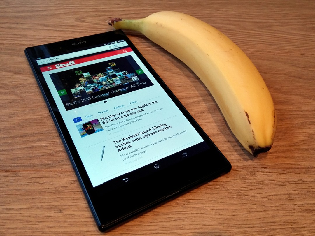
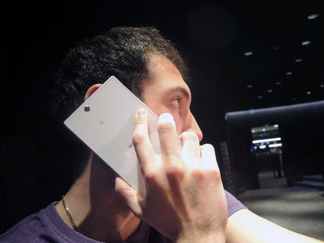
The Z Ultra is Big. Seriously Big. It’ll fill your pockets with total disregard for anything else, and it’ll make you the centre of attention (in a bad way) the minute you hold it to your face for a phone call.
People will laugh. Babies will cry. Your friends will cross the street, denying they’ve ever seen you before. Stick to taking calls through a headphone’s in-line mic. It’s for your own good.
It’s not all bad, though. Big it might be, but our pockets still swallow up the Z Ultra with relative ease, thanks to its wafer-thin 6.5mm thickness. That’s more than a millimetre thinner than the size-zero iPhone 5s, which is impressive in its own right.
As for one-handed use…
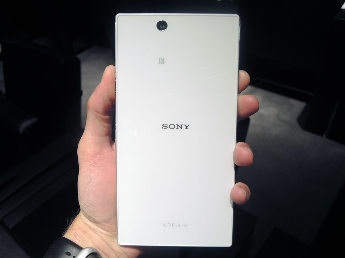
Let’s put it this way: if your name is Shaquille O’Neal then congratulations, there’s a good chance you’re a very rich retired basketball player with a gargantuan 12in hand span. Your fingers will happily tap dance all over the Z Ultra’s 6.4in screen like Michael Flatley on Ireland’s street cred.
If you’re not Mr O’Neal then we’re afraid to say that this is definitely a two-handed device.
Sure, you can try delicately balancing it while texting, but do you really want your gorgeous glass-clad gadget bumping nasties with a rough concrete pavement? The answer, of course, is no. No you don’t.
Power (it lifts)
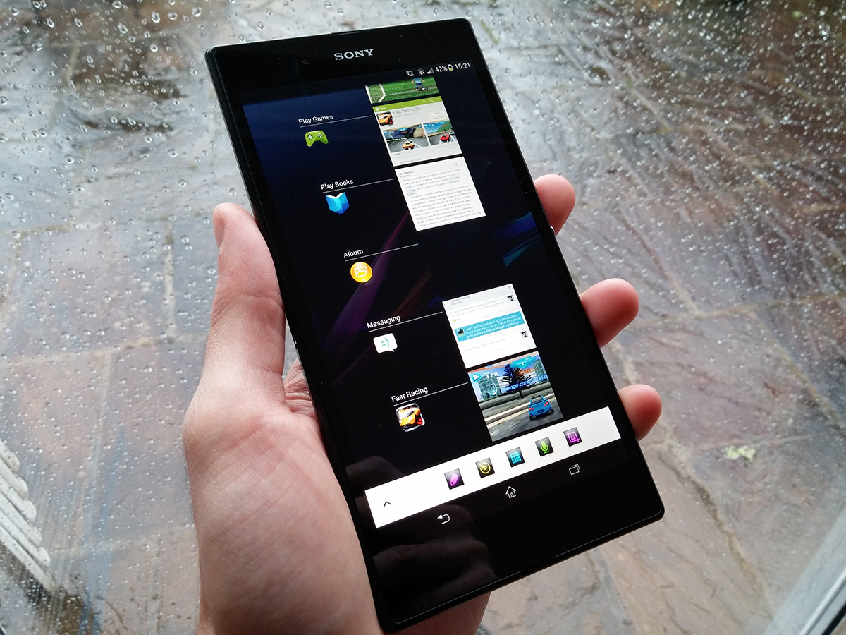
The Z Ultra costs around the same as quad-core tablets such as the Samsung Galaxy Note 10.1, and it’s looking to kill two birds with one stone by being the only portable device you’ll ever need.
Those two factors demand power – and plenty of it – to justify the price tag and do-it-all purpose, and we’re happy to report that the Z Ultra delivers.
Its quad-core Snapdragon 800 processor and 2GB of RAM innards burn through apps and 3D gaming like napalm through paper, while Android 4.3 runs as fluidly as we’ve seen it.
It’s all we could want from a tablet/smartphone hybrid – you will not be disappointed.
It’s got the brains, but what about the looks?
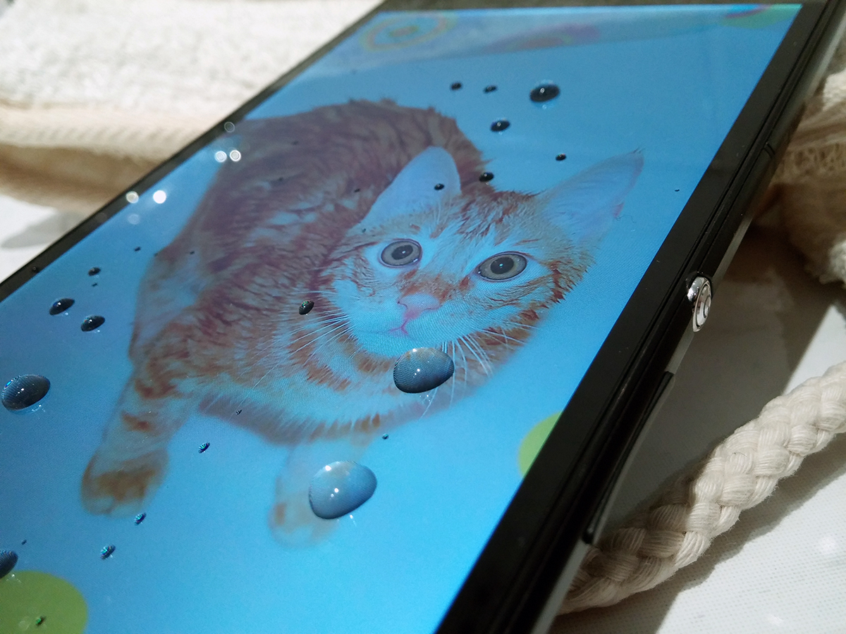
Relax; if you spring for the Z Ultra then you’re getting beauty as well as brawn.
At first glance you’ll think someone took a rolling pin to an Xperia Z. If you know what an Xperia Z looks like, then you’ll realise this is a compliment.
Slathered in glass on both sides with a pleasantly solid power button on the side, the Xperia Z Ultra is a commanding slice of solid tech that oozes premium class.
It’ll happily join you in the bath, too, if that’s your thing, thanks to its covered microSD, microSIM and microUSB slots, which give it the power to take a dip in up to 1m of water for 30 mins – a feature that very few smartphones or tablets can match.
The only complaint we have is that the black finish is a fingerprint magnet, but keep it as polished as grandma’s silverware and you’ll soon bathe in the oohs and aahs of admirers. Once they’ve stopped mocking its size, that is. Damn them.
A camera only a mother could love
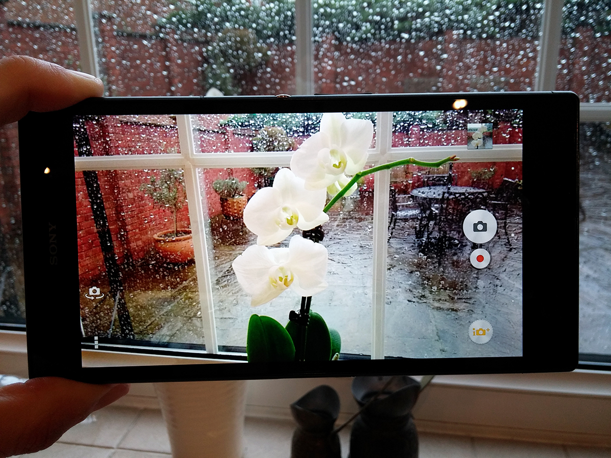
Oh dear, this isn’t good.
If you’re out in bright sunlight the 8MP snapper does a decent job, but anything else (even everyday indoor conditions) and you’ll be laughing. Or crying. Or crying with laughter. Either way, you won’t be happy.
Not only that, but there’s no flash. No LED, no Xenon, no nothing.
It goes without saying, then, that low-light performance is pretty much non-existent.
But for once that might not be a massive deal breaker. The Z Ultra is big enough to be classified as a mini tablet after all, and we all know the rules about people who take photos with tablets, don’t we? That’s right – they should be clipped around the ear and sent to bed with no supper.
And yet…. the Z Ultra is also a smartphone (albeit one with a growth hormone problem) and that means it’s likely to often be the only camera you’ve got on you on a night out, and it’ll be a guaranteed let down on the following morning you go to look at all the fun you thought you’d captured the fuzzy night before.
Android tweaks
The Xperia Z Ultra isn’t running Android 4.4 KitKat, which is a big shame given that it’s been available for a rather long time now.
READ MORE: check out our full Android 4.4 KitKat review
Still, Android 4.3 is no slouch, and we’re fans of the minimalist tweaking that Sony approaches its UI with.
While there’s very little of the stock Android experience left, Sony hasn’t plastered the Z Ultra with the cartoon-like icons of Samsung and LG, and for that we’re very grateful.
That’s not to say that there isn’t any Sony bloatware installed, and while some of it, such as PlayStation Mobile, is useful, it would be nice to strip away any pre-installed apps that you don’t really want.
Verdict
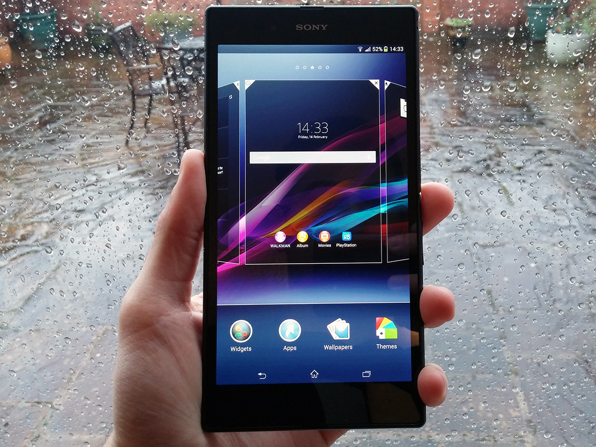
The Xperia Z Ultra is a sleek, well-built super-phablet that blends together power, a premium build and a superb display to create a device that really can act as both a small tablet and smartphone.
Once you get used to its huge size (and learn to not answer calls without a headset), you’ll find that it largely offers the best of both worlds.
Its camera lets it down, though, and while we suspect that many people in the market for a device this size don’t rate the snapper as the highest priority, it’s still a flaw that can’t be ignored.
And that’s the primary reason for the Z Ultra missing out on a 5-star rating. Feel free to restore the fifth star (in your mind, rather than by hacking our website) if you couldn’t give a hoot about the camera, but still make sure you also take a peek at our Samsung Galaxy Note 3 review before taking the plunge. To our minds that’s still the phablet to beat.
Stuff Says…
A super-sized premium phablet that’ll happily replace your smartphone and tablet in one fell swoop
Good Stuff
Great big screen is great for movies
Loves bath time
Oodles of power
Sexy looks
Bad Stuff
Poor camera
ABSOLUTELY MASSIVE

