The 11 most impressive iWatch concepts so far: which would you wear?
Imagination goes where Apple’s secrecy will not allow us

Apple’s iWatch has been a long time coming – if it’s coming at all, of course.
Assuming it is, no mere mortal knows what it’ll look like, but many have imagined what it could be. These are 11 of the more creative renditions we’ve seen circulating on the web. Some are fanciful, some are convincing, but every one has a certain something about it that makes us want to have a go.
Let us know which ticks your boxes at the bottom of the page.
Tomas Moyano
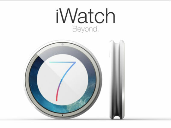
The newest concept of the litter seems to have taken its cues from the Misfit Shine, sporting a coin-sized watch face with a groove along its side allowing it to be attached to all manner of accessories. Designed to be charged both wirelessly and via solar power (a mite impossible, as it turns out), this version will also allow you to listen to music wirelessly with newly-designed Bluetooth AirPod in-ears.
Gábor Balogh
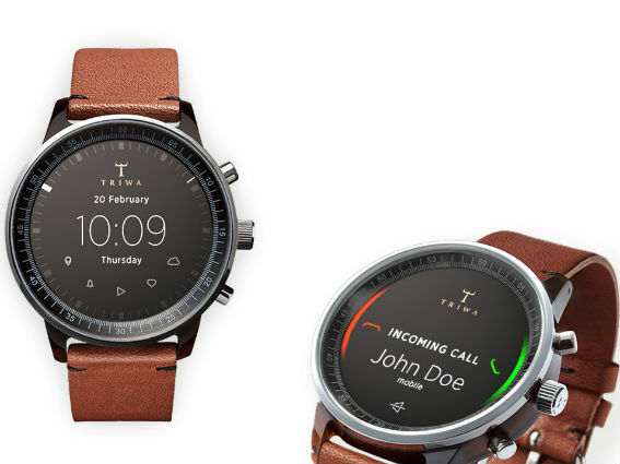
If you’re looking for something more traditional – and let’s face it, most of us are – Gábor Balogh’s concept is the way to go. He replaces the face of the Havana timepiece from Swedish watchmaker Triwa with a display that’s – here’s the twist – not touch-enabled. Instead, users will twist the bezel and toggle the three side-mounted buttons to access apps. Based on our experience of the touchscreen-free Pebble Steel, and given how much we all like our ‘dumb’ watches, that sounds just fine.
READ MORE: This is the best-looking smartwatch concept we’ve seen so far
READ MORE: Pebble Steel review
Todd Hamilton
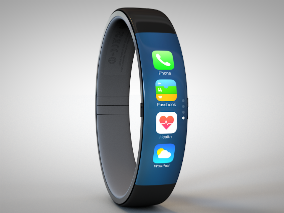
Inspired by Thomas Bogner’s iWatch mockup, Todd Hamilton’s design tweaks the original to include a curved touchscreen display, which has enough space for four icons and a page controller on the right to swipe through pages of apps. While display space is fairly limited, it’s not an issue, as he doesn’t try to cram too much into its slim interface. Reminds us of the Samsung Gear Fit – and, given Tim Cook’s fondness of Nike’s physically similar armwear, that may not be far wide of the mark.
READ MORE: Samsung Gear Fit hands-on review
Esben Oxholm
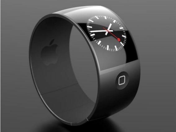
While this rendition might look more bracelet than watch, its design means that it’ll fit any wrist, as spacers can be added to the lower part of the watch. With the iconic home button being the only physical control on the watch, the rest of the interaction is centred on the slightly curved touch screen.
Nikolai Lamm
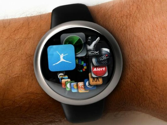
This version celebrates Steve Jobs’ obsession with all things spiral, and also handily utilises a new iTunes UI feature called – you guessed it – Spirals. If it can happen for iTunes and staircases in Apple stores, you can bet it makes complete sense for the conventionally circular watch face.
Yrving Torrealba
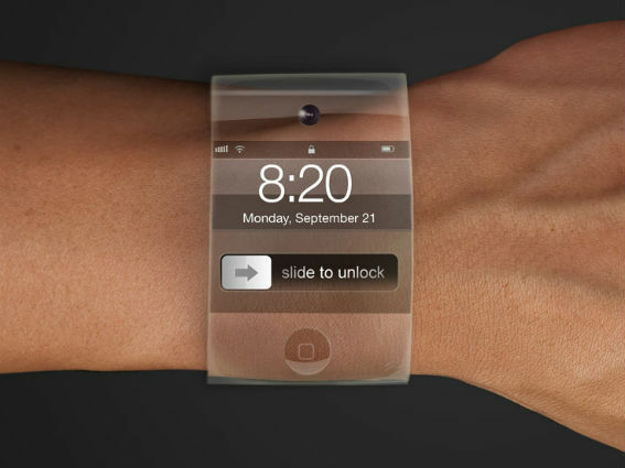
Clearly – pun intended – the least visible of designs yet, the transparent strap of this iWatch begs the question of whether using a see-through material on the strap compromises its flexibility. Little else is revealed about the iWatch’s functionality, but that invisible strap is an interesting idea. Please don’t let it be plastic.
Pavel Simeonov
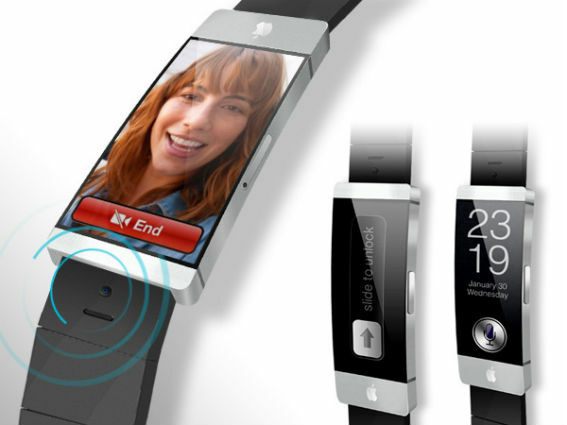
While Pavel Simeonov’s imagining of the iWatch might look like a shrunken-down iPhone on a strap, it packs additional features like Nike+, a body sensor, and a pedometer to keep watch on your health. With a built-in camera and phone functionality, you won’t even need your iPhone anymore.
READ MORE: Nike FuelBand SE review
Ciccarese Design
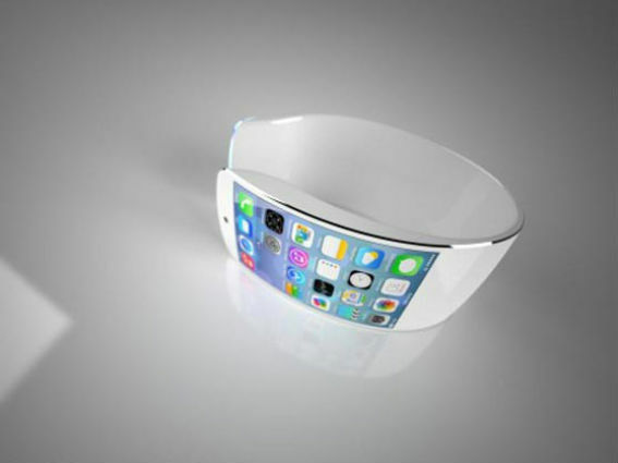
The Italian team behind this design is a mixed bag of IT engineers and designers, who combined fashion and functionality into a beautiful swooping design that’s unlike what we’ve seen so far. Pretty as it might look, it also seems like it would make an awkward fit unless that strap is made out of self-resizing unicorn hide.
Antonio Derosa
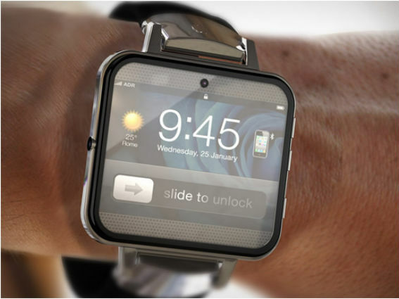
The successor to the original iWatch concept comes rebooted with 32GB internal storage, Wi-Fi and Bluetooth connectivity to your other iThings, and a front-facing camera. What’s not so predictable is the integrated LCD projector to show off your snaps to more people, whether they like it or not. Seems a little fanciful to us.
Sourcebits

This version might make for the best fit thanks to its elasticated fabric strap. It’s also the most technically thought through with its proposed A7 chipset, M7 co-processor, Bluetooth capability, and integration with the usual fitness apps. To encourage the complete Apple ecosystem buy-in, it also integrates with other iThings, even your Mac. Again, not convinced – that’s too much power for one piece of smart wristwear to pack. If an hour’s battery life sounds accptable, though, fill your boots.
Tolga Tuncer
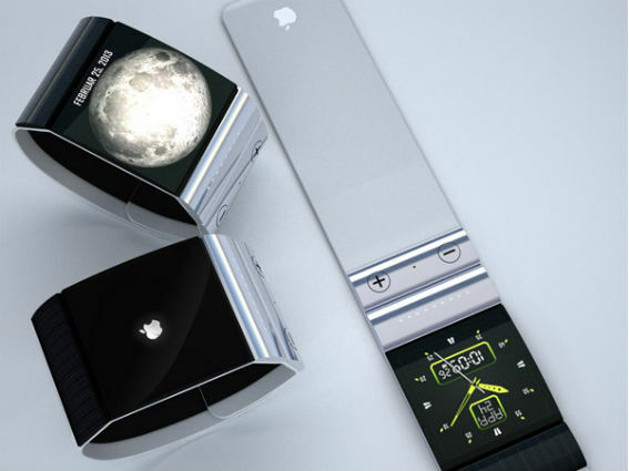
While this might look like one of those snap-on bracelets of yesteryear, you’ll most likely break your wrist if you try that with this. Tolga Tuncer’s version comes without a touchscreen, and interaction is allowed via a slim touchpad with MP3 controls so the display stays smudge-free.
READ MORE: Apple iWatch preview: everything we (think we) know
So, which watch would you happily slap on your wrist? Let us know in the comments below.

