What Apple Watch can tell us about iPhone 7 and iPad Air 3
Apple’s fond of taking iOS back to the Mac, so we imagine how Apple Watch ideas could influence the next iPhone
On September 9, Apple announced Apple Watch, its latest new product line.
Stuff has been hands-on (and wrists-on) with the new device, and came to the conclusion that while it’s probably not revolutionary solely from a hardware standpoint, Apple’s software, ambition and partnerships could make it the device that brings the smartwatch to the masses.
It could also be what brings new thinking to existing iOS devices in a similar manner to how the iPhone and iPad has increasingly informed the Mac. We won’t be surprised if some aspects of Apple Watch arrive in future versions of the iPhone and iPad.
This isn’t an article of predictions or rumours, though; instead it’s an exploration of technology and ideas which could benefit Apple’s phones and tablets.
READ MORE: Why the Apple Watch is more than just another smartwatch
Pressure-sensitivity
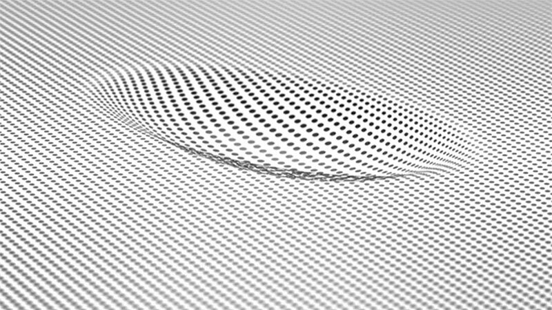
Apple Watch has a display that can detect the force of a touch and respond accordingly. A light touch is interpreted as a typical tap or swipe, but a more forceful one activates context-specific controls, akin to a right-click or two-finger tap. On a much larger display, this technology is more complex to implement, but it would have plenty of applications on iOS, from art apps through to digital instruments.
A sapphire display
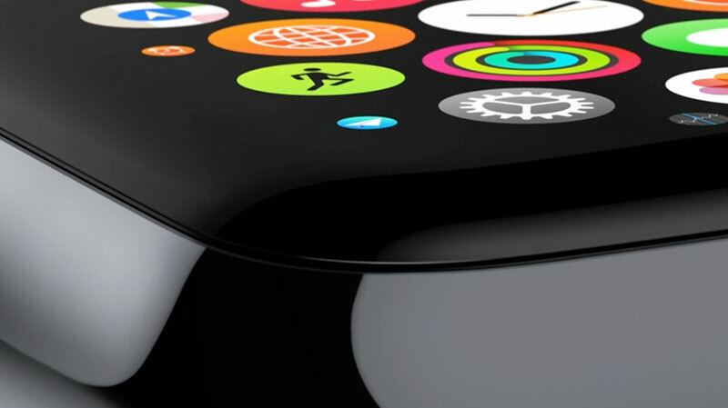
During the introductory video for Apple Watch, Jony Ive noted that the display uses sapphire glass, sapphire being, the “second hardest transparent material after diamond”.
Prior to the unveiling of the iPhone 6, rumours suggested that device would also be getting a sapphire display, but it turns out that material was reserved for Apple Watch, presumably due to issues relating to cost, scale and a lack of flexibility (increasing the likelihood of a screen shattering when an iPhone is dropped). However, advances in technology and falling prices could change this by the time the iPhone 7 arrives.
READ MORE: Hands on with the Apple Watch
Fluid Home screen navigation
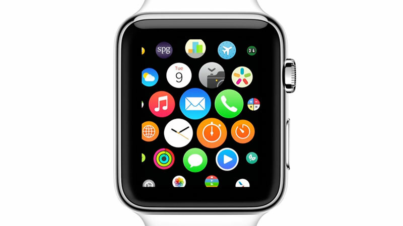
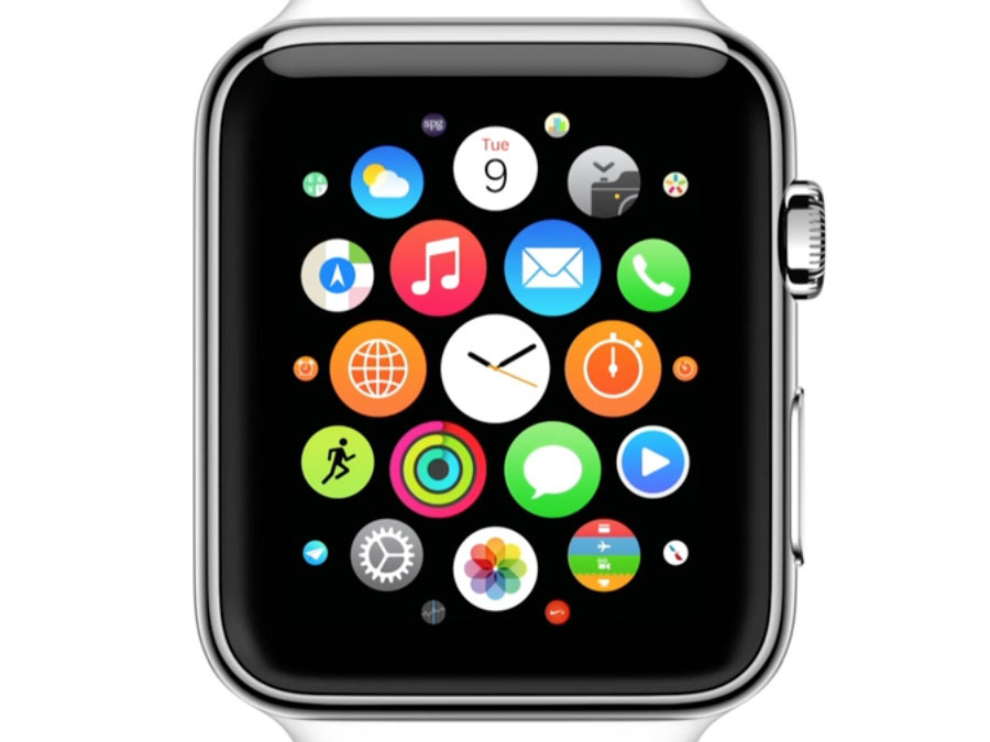
Apple Watch’s screen is small, and so apps are navigable by swiping and zooming a potentially infinite field. It makes the concept of ‘pages’ on the iPhone (and, for that matter, most competing smartphones) seem comparatively quaint and old-fashioned.
Perhaps Apple’s thinking different for a smartwatch will lead to new thinking on its other touchscreen systems, although icons without names could make navigation tricky with large app collections, so we’re not sure we’d want to see that specific aspect of Apple Watch on an iPhone or iPad!
A sense of focus
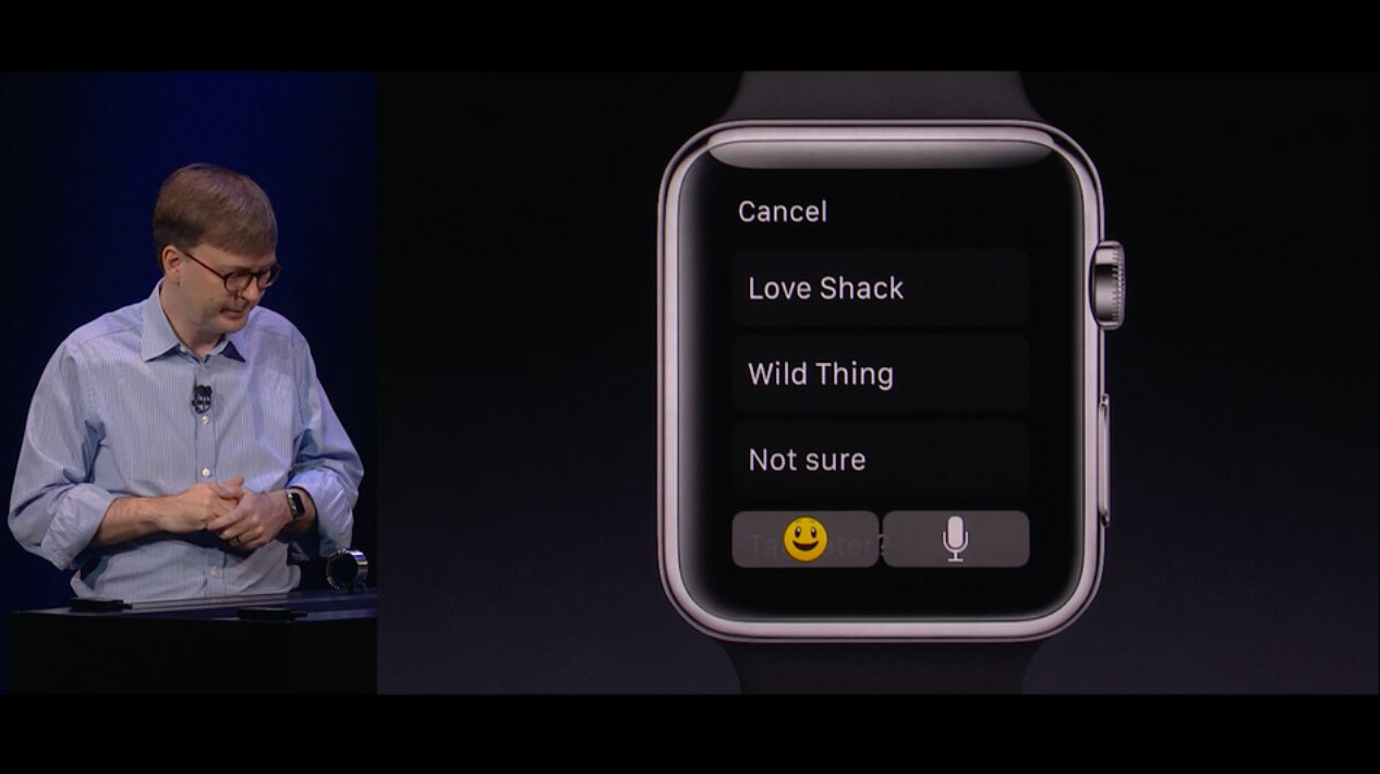
Something evident during Apple’s iPhone 6 demos was a sense it was all about showing people more – a ‘density of information’ as Apple put it. But Apple Watch is all about efficiency: apps that provide basic options for fast actions and replies, and a card-like ‘Glance’ system for rapidly checking through important information.
iPhones and iPads have analogues of these things to some extent, but it would be good for Apple to keep fighting for providing people with more important information rather than just more information. In a sense, it’s what Google already does on both Android and Android Wear, with Google Now providing the info it thinks you most need.
Inductive charging
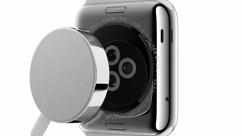
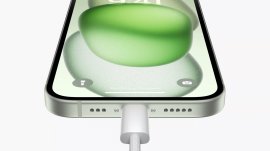
An Apple Watch would look dreadful if it had a Lightning port, and Apple therefore wisely introduced inductive charging to the line and combined it with the company’s MagSafe technology. It’s smart and intuitive, and makes charging an iPhone with a wire feel positively prehistoric.
We could see updated charging technology for the iPhone in particular being a very popular decision on Apple’s part.
READ MORE: Apple doomed as company goes several days without launching new product
Smarter interface design
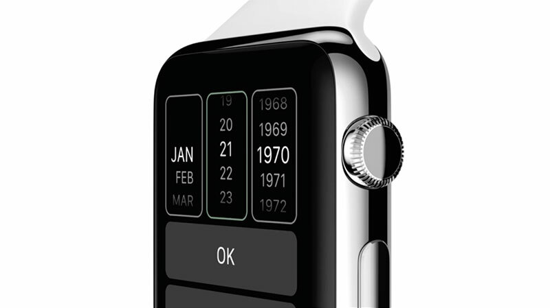
With iOS 7, Apple went for a kind of flat design, but with subtle levels and shading adding some depth. However, the limitations of screen size on Apple Watch have forced a more overt kind of minimalism when it comes to important controls. A great example is a select menu, which is flat and simple, versus the 3D ‘wheel’ monstrosity on iPhones and iPads.
But Apple Watch also has a sense of bold colour and playfulness that’s lacking in the rather sparse and overly serious iOS. The iPhone and iPad interface could learn a lot from the newcomer.
Subtle and human communication
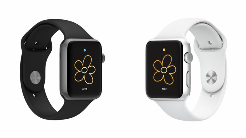
Communication with Apple Watch can be very different, often subtle, and frequently human. Users are encouraged to send each other little doodles and even heartbeats, or get someone’s attention with a tap; and the device can communicate with the wearer by vibrating in different ways to indicate the direction in which they should travel.
Of course, neither of these things is beyond an iPhone, but software as it increases in complexity too often – as Jony Ive puts it – inhibits rather than enables communication. iPhone and iPad equivalents have already become a little entrenched, and could again learn a lot from Apple’s latest device.
With Apple Watch, Apple has been forced once again to reimagining interfaces and user interaction, and we can only hope the lessons learned soon positively impact on the company’s other devices.
READ MORE: Apple iPhone 6 hands-on review


