7 ways to make your Prisma photos look like true works of art
Don’t be an artful bodger. Here’s how to get the most out of the painterly photo app

Apps that add art filters to your smartphone photos are nothing new, but recent release Prisma has made us sit up and take notice.
To find out why, read our overview of the free iOS (and now Android) app here. Simply put, its filters are by far the best we’ve seen – they actually look like real paintings or drawings, rather than just a passable digital approximation. That’s apparently all courtesy of some serious cloud-based machine learning tech.
But there’s more to making a great Prisma picture than simply jumping in and slapping the first filter you come across on a snap. Having used it for a few days, here are our tips for ending up with a gallery-worthy masterpiece, rather than something better suited to your local charity shop’s bargain bucket.
1) Ditch the watermark
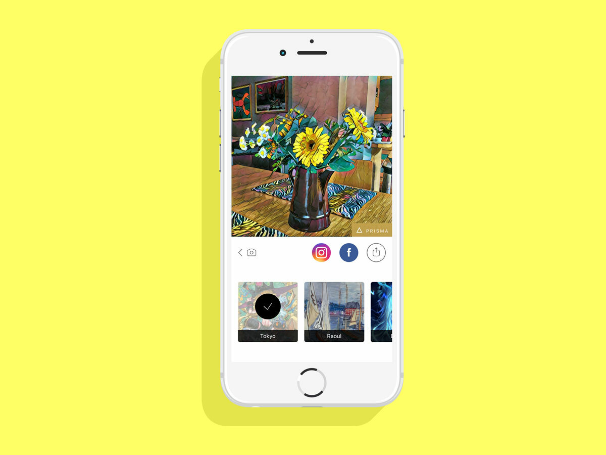
By default, Prisma puts a small logo watermark in the bottom-right corner of all your completed artworks. While it’s fairly tasteful, as logos go, it’s also an unnecessary distraction from your lovely image. Let’s kick it to the kerb.
So before you start taking any photos, open up Prisma’s settings menu by tapping the gear icon, and tap the “Enable Watermarks” slider to the off position. While you’re here, you may want to turn on the slider by “Save Artworks Automatically”, as this will mean you don’t have to store each individual image you create separately.
2) Use your favourite photos
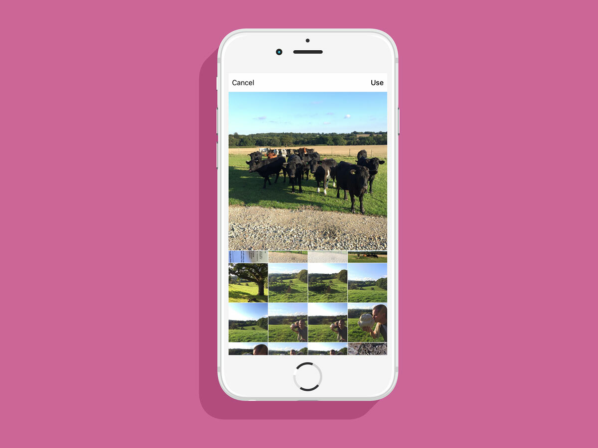
Prisma has a camera function built in, but it’s basic in the extreme – there’s no HDR, no manual controls, and all you can really do is turn the flash on or off. Luckily, as with most filter apps you’re able to import photos from your iPhone or iPad’s photo gallery, so it’s well worth diving in and seeing what Prisma can do with some of your favourite old snaps.
NB: Prisma only works with square format images, so anything in a portrait or landscape format will have to be cropped after import.
3) Don’t use Prisma to take your base shots
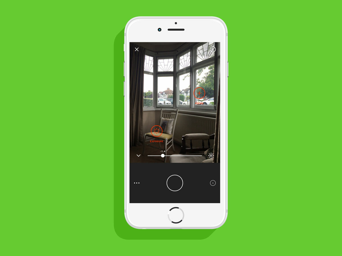
We know it’s a bit of a kerfuffle, but when you’re taking new shots to use as the basis for Prisma artworks, we suggest you use either the default iPhone camera or a third-party camera app. VSCO, for example, give you far more control over how your base image turns out than Prisma’s camera – you can set different points for focus and exposure, and manually tweak lots of other settings. Just make sure to save the photos to your camera roll so you can import them into Prisma afterwards.
Taking things a step further, you don’t even need to take photos on your phone at all. If you don’t mind the added bother, feel free to take them with a “real” camera, then move them onto your iPhone or iPad’s camera roll later.
4) Get the “ingredients” right
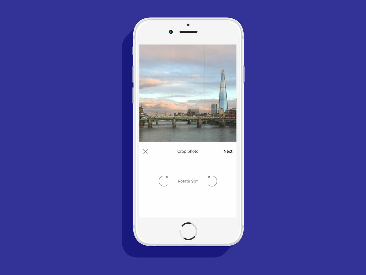
Prisma’s filters use well-designed algorithms to generate the arty effects you see in the final shots. Once you start to recognise how each filter works, you’ll know what to look for in a base photo.
Each filter is different, and the best way to find out what works is to practice with all of them. But in general we’ve found that contrasty photos, with extremes of light and dark, prove effective for the majority of the filters. Try to avoid using “flat” photos lacking in definition, as these will tend to get even flatter when the filter is applied, resulting in the loss of detail as everything becomes a dull, indistinct mess.
And, as with any photo, it pays to carefully compose your image. Remember, for example, the rule of thirds: imagine a lined grid over your picture dividing it into nine equal squares, and try placing important subjects not down the centre of the photo but at the points where the gridlines meet. These images tend to be more pleasing to the eye.
5) Know your filters
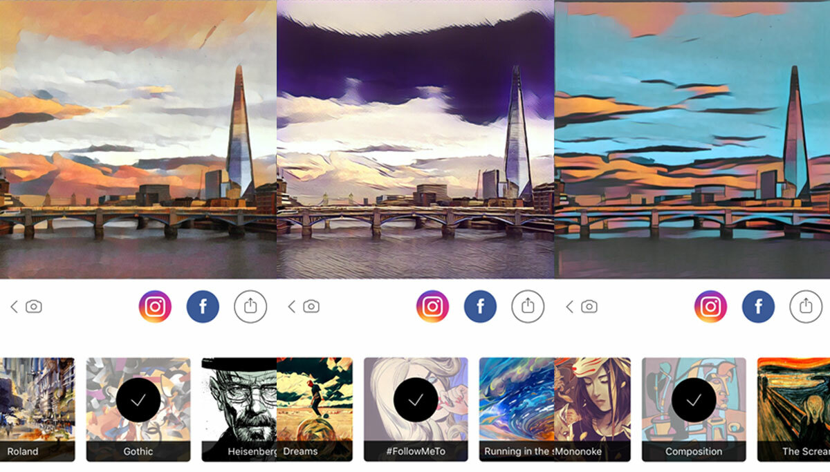
At the time of writing, Prisma comes with an impressive selection of art filters – 34, in fact. Even after just a couple of days of use, we’re starting to identify our favourites, as well as those that almost never seem to yield good photos.
MIOBI, Curtain and Electric, for example, are all Impressionist-style brush stroke filters that seem to work well with almost any sort of shot you use, while Heisenberg is a black-and-white ink sketch filter that can be brilliantly effective when used with the right base shot, but dreadfully dark and indistinct if you choose the wrong one. Filters like Mondrian and Impression (a sponsored filter from soap-maker Palmolive) rarely seem to produce anything worth looking at.
As we say in section 4, the best way is to simply practice with all the filters until you’ve found the ones that best suit your style.
6) Don’t feel forced to use max intensity
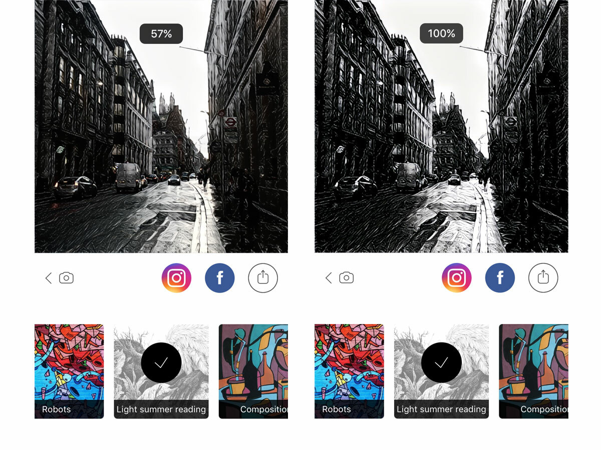
The intensity of each of Prisma’s filters can be adjusted by sliding your finger left and right on the image. Most of the filters work best at high intensities, but some, especially the more extreme examples like Roland and Flame Flower, benefit from a bit of dialling down. Don’t be afraid to be subtle.
7) Share your masterpieces with the world

There are quick links to share finished artworks on Facebook and Instagram, but don’t worry if you want to share them with your friends elsewhere. Just hit the share button and you can save the image to your camera roll, send it in a text or WhatsApp message, put it in a tweet or upload it to Flickr.
Unfortunately, Prisma’s saved images are quite low in resolution, at just 1080 x 1080 pixels, which limits your options if you want to print them poster-sized. Ah well, perhaps hi-res downloads will be added in a future update…

