No place like homepage: how to build your own website
With your physical self close to perfection, it's time to create a pristine digital you...

Choosing the right tools for building your personal website sadly isn’t quite as simple as grabbing a drill and ‘seeing what happens’.
Before you get started there are numerous brain-taxing questions to answer, such as the type of website you really need, and the level of design control you’ll be comfortable with.
This partly explains why there is currently a cloud of half-finished personal sites floating around the internet like space debris. But there are ways to avoid joining them. Web designer Matt isherwood reveals how to choose a website-building tool, then how to fine-tune it into a humdinger of a personal hub…
1) The Basics
Before you start thinking about fonts and hosting, you need to decide on the type of site you want. Do you want a site with fixed content, a regularly updated feed or a simple personal landing page? Decide this first, as it’ll help you choose which service is going to be the most suitable.
If the site is for a side project or small business and is best suited to a fixed-content approach, head straight to the next section. We’ve picked our three favourite services for different ability levels and time commitments.
For regularly updated content – whether it’s words, pictures or videos – blogs are best. You might already have heard of the big boys: Tumblr, Blogger and WordPress. All are good starting points with huge communities to tap up for advice.
If you’re looking to get more personal and build ‘Brand You’ (and are also short on time), a more image-led site structure will work better. Upload your favourite photos to the likes of Jux or use Flavors to aggregate existing web services.
Don’t be scared to dream bigger; powerful, customisable content management systems such as Drupal and ExpressionEngine are great for getting more creative. But you will need to brush up on coding and web servers first.
If you are planning to dip your toes into more customisable sites, make sure you learn the lingo. The web can be a scary world of acronyms and sci-fi speak. But don’t despair – many consumer services cut the jargon and explain things in more everyday language.
2) Choose your weapon: the website builders
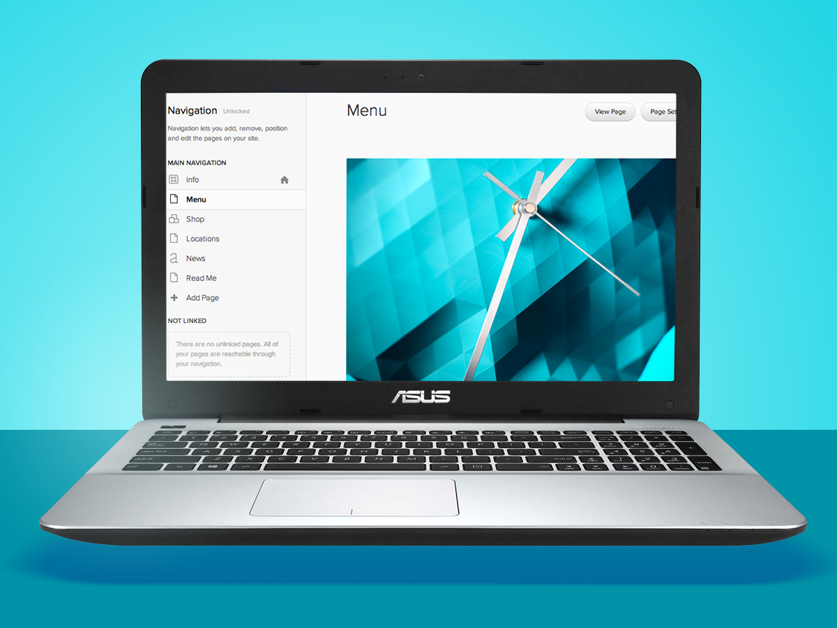
The All-Rounder: Squarespace Personal

Squarespace Personal
If you’re looking for that sweet spot of a site that looks modern and pretty but offers enough customisation to make it feel tailored, take Squarespace Personal for a spin. Its choice of 33 clean, minimalist templates and some intuitive editing tools mean you can quickly knock up a sleek site and also give it some personalised sparkle.
Most of the templates put photos centre stage, so think luxury design blogs, photographer portfolios and annoyingly photogenic bands. The Personal plan gives you a responsive, mobile-friendly site with a maximum of 20 pages, though either side of this are options for single-page sites ($5/month) and a ‘business’ option ($18/month) with unlimited pages.
Though we found it to be slightly buggy at times, its Style Editor makes light work of basic tweaking (font sizes, colours) and you can edit pages further using the ‘custom CSS’ coding option. Those who know their CSS coding onions will find WordPress more flexible, but if you’re willing to sacrifice some customisation for style, you’ll be well served by Squarespace.
from $8/m / Squarespace
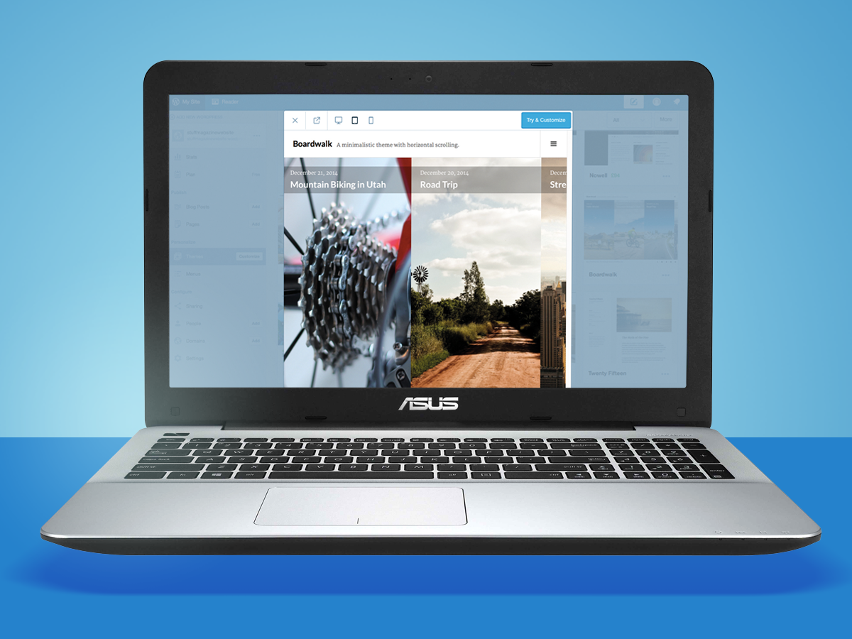
The Tinkerer’s Choice: WordPress Premium
WordPress Premium
First released back in 2003, WordPress is so popular now that it claims to power a quarter of the websites on the internet. For those familiar with CSS lingo, its Premium plan’s level of customisation makes other contenders restrictive by comparison. Put in the tinkering hours and you’ll end up with a site that’s truly personalised, rather than a subtly tweaked version of a template.
The flipside is that its learning curve is far steeper (if you’re a newbie, nothing will make sense for a good hour or so) and you’ll usually end up spending more than you would on (for example) Squarespace, to get a similar level of sheen.
£85/yr / WordPress
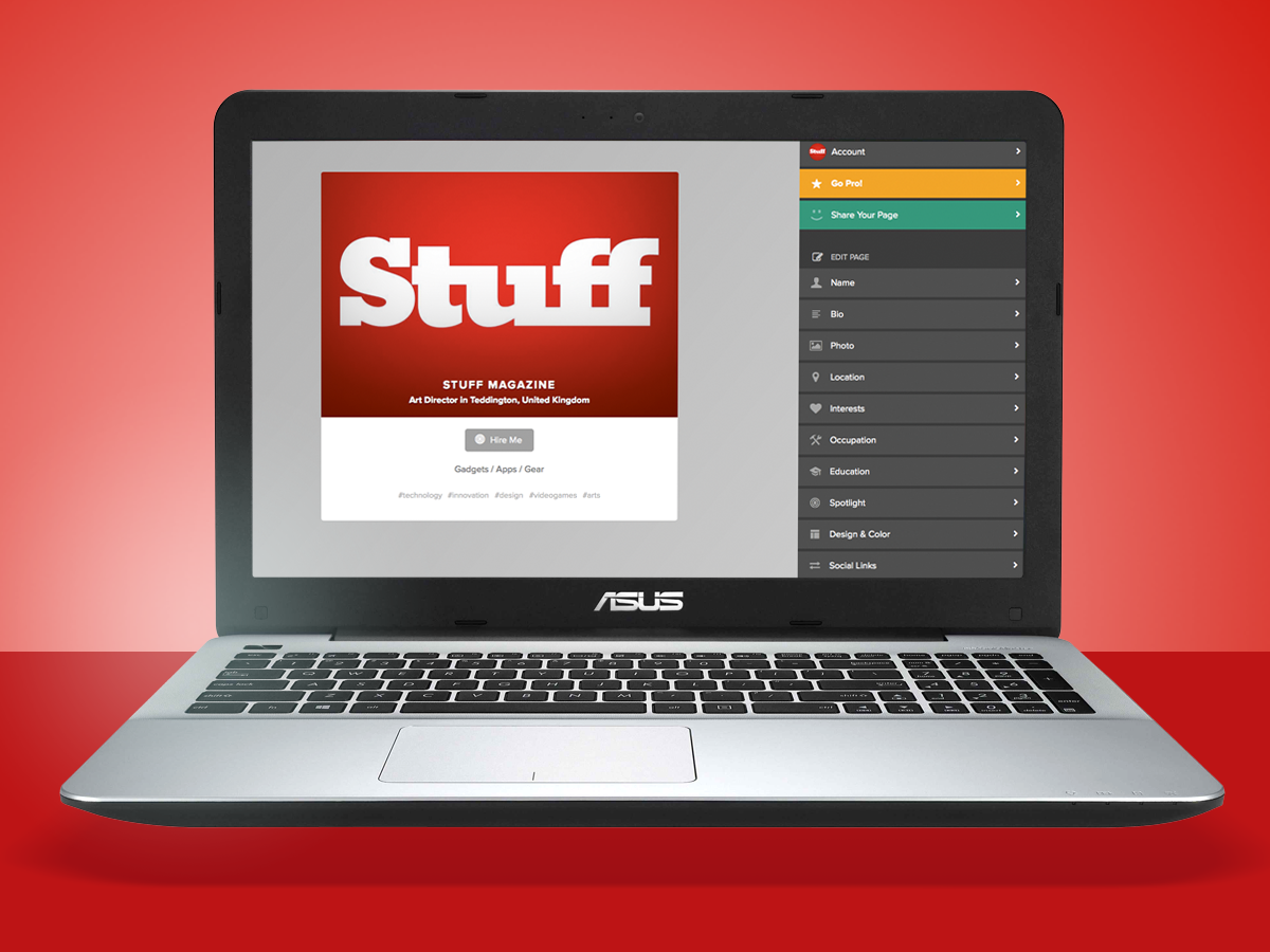
The Two-Minute Site: About.me
About.me
This cheap and cheerful website builder takes minutes to set up, but that’s because it merely acts as a holding page for any social networks or sites that you want to promote.
There’s only one standard template, so the page is really just colourful variations on your face next to some links, but you can get a custom domain by upgrading to the $48/year Pro plan.
from £free / About.me
3) Next Steps

Choose a name. Registering a personal domain name is a built-in option on most services, but you can also do it yourself at sites like 123-reg.
Get Google-friendly. Search Engine Optimisation (SEO) is key to getting yourself noticed. Start by making sure your site title and description clearly explain what it’s about.
Build digital shelves. Looking to sell things through your site? Bolt on an online shop. Platforms such as Shopify, Big Cartel and Magento make this easy and can integrate with social media.
4) Design

Test your palette. Don’t know colour theory? Sticking with blacks, whites and greys, with a bright accent colour used sparingly, will avoid your site looking a bit ’90s MySpace.
Garnish with photos. Use free photos from Wikimedia or Flickr’s Creative Commons hub to enliven your site. This Creative Commons hub also lets you search multiple sites simulataneously – just make sure you credit the photographer and check the copyright terms.
Meet your type. Free typefaces are plentiful these days. Try Google’s free fonts or Adobe’s paid-for Typekit. But don’t use more than two on your site.
5) Exercises
Take a test drive. Go to Usability Hub and try out other people’s web designs – it’s great for seeing what works. You’ll also earn ‘karma’ you can use to get tests on your site.
Crack the code. Code Academy’s web fundamentals course starts with the basics and will have you building a website within a week.
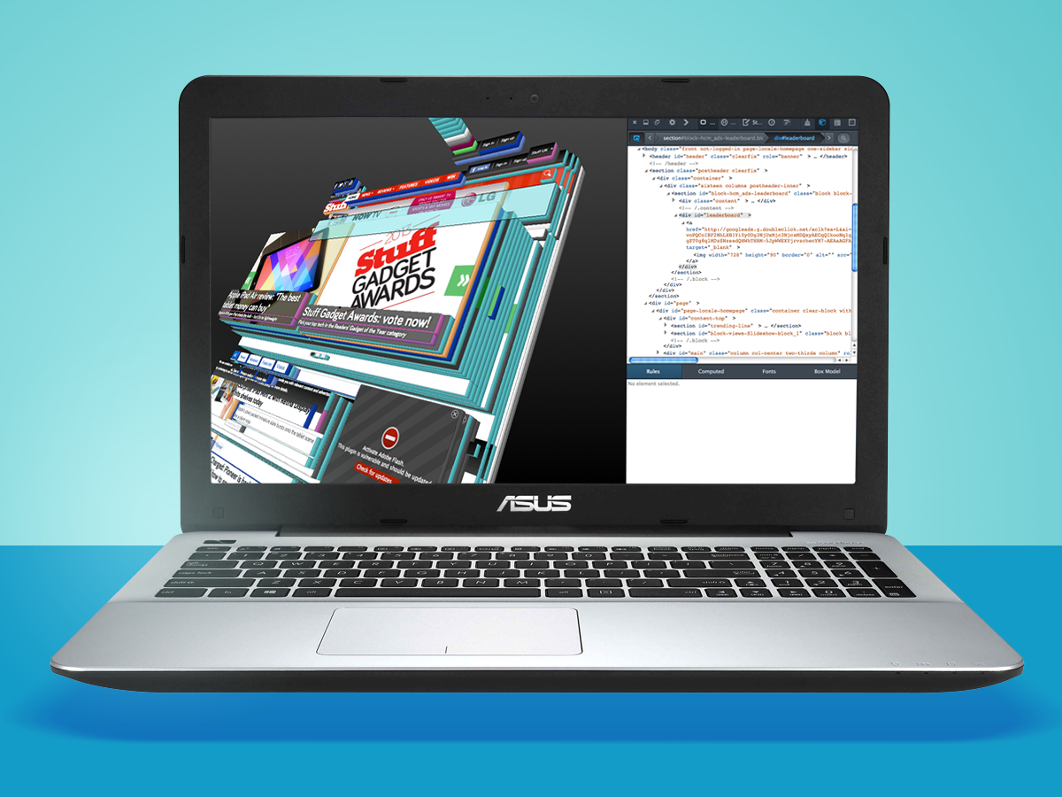
Make an inspection. In Firefox or Chrome, find a web page you like and right-click to ‘inspect element’. You’ll see the HTML (the structure) and CSS (the styling) it’s been created with.
6) Handy Tools

Pixlr. For a free but powerful alternative to Photoshop, head to Pixlr – you can use it to crop, alter and resize images. The Pixlr-O-Matic web app (above) is particularly handy for adding a quick vintage filter too.
IconFinder. This is a great website for getting hold of icon sets and images, which can add a nice finishing touch to your website. It’s especially good if what you’re doing isn’t very photographic.
Google. What’s great about the web-building community is that so much knowledge is available for free. If you’re having a problem, so will someone else – and they’ll probably have written a blog or a forum post on it.
7) Level Up With…
The website: Stack Overflow
This is where the programmers and developers of the web hang out – which makes it the place to post your question if you’re stuck on a problem and want expert help. The depth of knowledge here is massive, so be sure to check through previous answers first or risk being on the wrong end of a geek put-down.
The book: Don’t Make Me Think
If you want people to actually use your website, you can’t afford not to know the contents of this easy-to-read book. The examples may look a bit dated now, but the theory is absolutely solid and forms the base principles of how any modern self-respecting website is built.
£18 / Buy it from Amazon
The course: General Assembly
It’s hard to beat getting into the classroom for some practical tuition. General Assembly offers various options, from single classes to multi-week courses at their London (and worldwide) offices. All taught by practising web professionals, who can upgrade your web-building firmware with relevant and useful skills.
£25-£2800 / Book a course


