Samsung Gear 2 vs Pebble Steel: the weigh-in
We throw the classiest new smartwatches on the planet into a ring and make them grapple for our amusement. But which comes out on top?
Smartwatches are big news right now, with new models springing up like artisan coffee shops on a newly gentrified high street.
The original Pebble Kickstarted the phenomenon last year, swiftly followed by the first Samsung Galaxy Gear and Sony’s Smartwatch and SmartWatch 2. But in 2014, things have gone a bit crazy: we’ve seen a new Pebble debut at CES, three new Samsungs revealed at Mobile World Congress and HTC and Motorola both announce that they’re working on smart wrist-huggers for release later this year. Add to that the rumours that Nokia and, of course, Apple are readying their own devices and you have what we could comfortably term a tech trend.
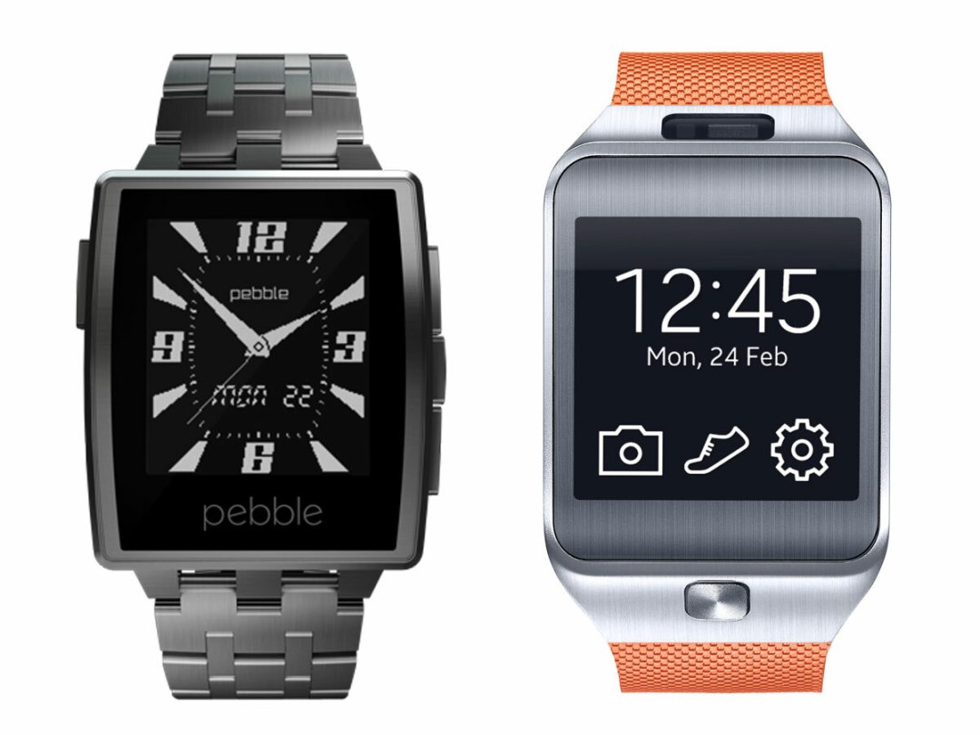
The ones we’re really excited about at the moment are the Pebble Steel and Samsung Gear 2 – two premium clever-clocks which should improve upon last year’s efforts. Let’s see how they compare.
DESIGN
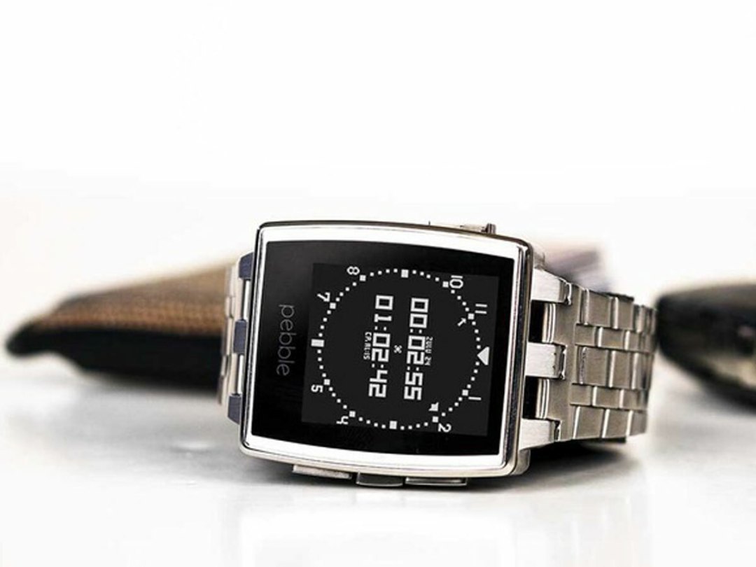
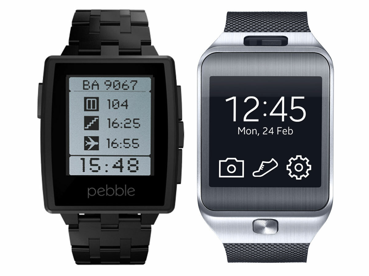
The Pebble Steel ditches the bright plastic of the first model in favour of a metal case in stainless steel or matte black finishes and a choice of metal or leather bands. The slightly curved face is more elegant than that of the original, the buttons are satisfyingly clicky and the whole thing feels comfortable and well built. The overall impression is of a premium device, like something you could wear to the office even if you don’t work in a design agency. In short, like a real watch.
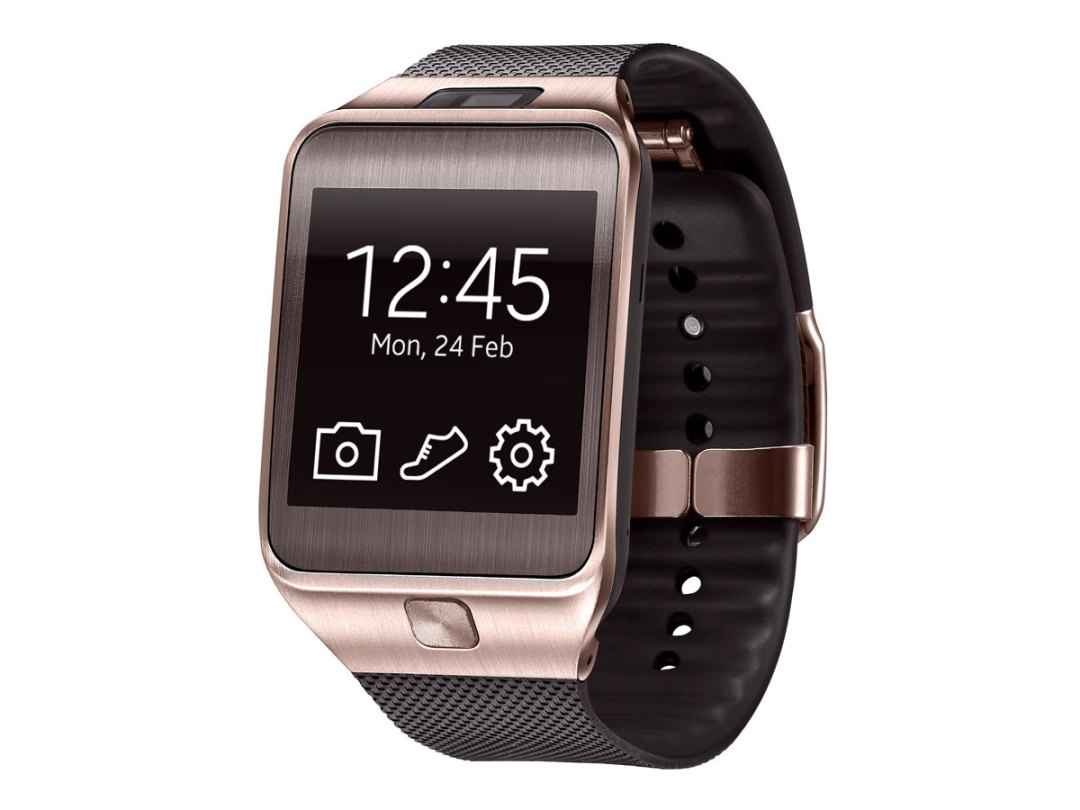
The Gear 2 is similarly revamped from last year’s Galaxy Gear, and like the Pebble Steel it’s gone metal. No, not in a new fondness for studded denim and strong cider, but in an all-metal face available in a range of colours including, um, gold. The design is much sleeker than last year’s model, with no unsightly screws and no protruding bulge on the strap for the camera. Speaking of straps, the rubber one it ships with is perfectly pleasant but the fact it can take any standard 20mm watch strap gives you complete control over its looks. That said, whatever strap you stick on it, it’s still obvious that it’s a smartwatch.
Winner: Pebble Steel
SCREEN
We love the Pebble’s E Ink display – it’s incredibly crisp and clear, especially in bright sunlight. Which, admittedly, is less of a pro here in the gloomy old UK. And while it may only have 24,000 pixels, that’s fine for displaying digits, watchfaces and notifications. The Steel’s screen is unchanged from that on the original Pebble, but it is now encased behind near-unbreakable – and waterproof – Gorilla glass. There’s also a new three-colour LED for notifications.
There’s no E Ink on the Gear 2 – instead, as is usually the case with Samsung, it’s AMOLED all the way. The 1.63in, 320×320 display won’t win any awards for sharpness, but it’s perfectly good at this size and, being a proper screen, can do things E Ink can’t – such as display colour photos. The other big difference is that unlike the Pebble Steel, it’s a touchscreen. Good in theory, but on a screen this size, it can be fiddly.
Winner: Pebble Steel
POWER
The Pebble Steel’s not really about power, acting more as a companion device than the all-singing, all-dancing Gear 2. Even so, we’re a little disappointed that you can only install a maximum of eight apps, especially given that each watchface counts as one. Battery life on the original Pebble disappointed us slightly too, managing around three days’ intensive use – though with a bit of care it did last for the promised 5-7. We’d imagine the Steel would fare about the same.
In smartwatch terms, the Gear 2 is as powerful as they come. It runs on a dual-core 1GHz processor, has 512MB of RAM and even has 4GB of storage space. That means there’s plenty of space for music, photos and apps, and plenty of power to do things with them. The 300mAh battery is slightly smaller than the one in the Galaxy Gear and has more work to do than the Pebble, so the promised three days’ of juice is likely to be optimistic. But then again, most phones struggle to survive for one day.
Winner: Samsung Gear 2
App Abilities
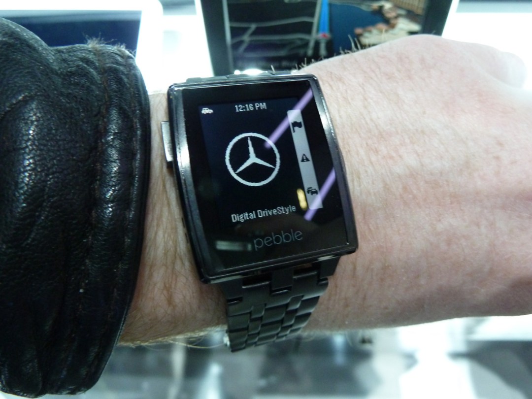
The number of Pebble apps is growing all the time thanks to the opening of the Pebble Appstore on iOS last month. There are more than 1000 now available, ranging from watchfaces to fitness trackers to notification and battery display tools. There are even a few games, though we can’t really see ourselves spending lots of time playing games on the Pebble Steel. There’s a good mix of free and paid-for apps too, and with the store due to open on Android soon, we can only see things getting better. It’s slick in use, with a simple four-button setup that makes operation child’s play.
One of the biggest changes between the Galaxy Gear and Gear 2 is that Samsung’s ditched Android in favour of its own Tizen OS. That’s fine by us, because we found using the original Gear to be a bit of a pain. From what we’ve seen so far, Tizen works much more slickly, but the downside is that its app selection will be limited, at least at first. Samsung says it will launch with around 100 apps and is encouraging developers to make more. What’s on offer? The usual mix of watchfaces, fitness trackers and notification apps. Just fewer of them than on Pebble.
Winner: Pebble Steel
Features
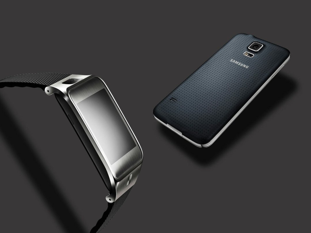
The Gear 2 comes with a built-in camera that, while it won’t produce anything that’s going to win you any awards, feels like a handy feature to have (even if it’s simply to help you live out some kind of James Bond fantasy by surreptitiously snapping subjects from your wrist). But perhaps more handy still is the heart rate sensor. This keeps an eye on your pulse while you’re wearing it and will work with the Samsung S Health activity tracking app. The Gear 2 also acts as a digital music player (you’ll need a pair of Bluetooth headphones, natch), although you won’t be able to cram all that many albums on to its 4GB of storage and, like its predecessor, will draw in notifications from a phone – as long as it’s a Samsung Galaxy phone, that is. You can even make calls on it, meaning you can finally live out those Dick Tracy fantasies.
The Pebble Steel isn’t really big on features. And that’s fine, really – it’s designed to be a companion to your phone and not a standalone device. So what do you get? Well, it can display notifications of all kinds – texts, emails, incoming calls, calendar entries and social networking updates among them. It can also control a variety of devices via Bluetooth, including music players – handy if your phone’s in your pocket – Hue lights, Sonos and more. Plus you can view maps and transport info on it. All the same, the feature-packed Gear 2 has it soundly beaten in this round.
Winner: Samsung Gear 2
Verdict
While we’ll reserve our final judgement until we’ve had the chance to fully test both watches, it’s clear that they’re quite different devices with slightly different purposes. The Gear 2 is (relatively) rich in features and high on spec, while the Pebble Steel sets it sights on being less attention-grabbing: its screen is fantastic and its design is a step above the Gear 2’s. Crucially, the Steel also has better app support (at least at the time of writing) and this nudges it slightly ahead of its rival – at least until we’ve reviewed the two models properly.

