Motorola Moto X Style review
The big daddy of the Moto X family

Ever been told you don’t know how to sell yourself? It’s a nightmare for job hunters and all those semi-pro online daters. It seems like maybe the Moto X Style used to have that problem, and decided the ‘style’ angle was the best way out.
It’s a red herring, though. This isn’t a stylish phone, but a bigger £380 take on the Moto X Play. It’s a bit fancier, sure, but doesn’t belong on the catwalk.
Instead, it’s a Moto X Play with more power, more pixels and a bigger screen. The only major sour note is that the battery life is not good. It’s a good job that the charger zips it up from zero in minutes, then.
Beauty beholders
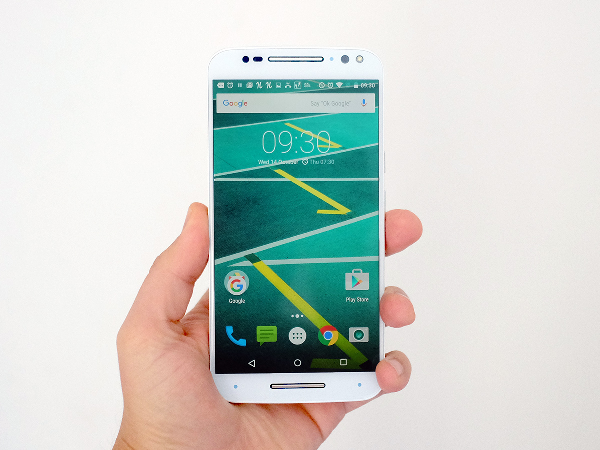
Let’s take a closer look at the whole ‘Style’ thing. Motorola justifies calling its new top-end phone this because whereas the Moto G and Moto X Play have plastic sides, the Moto X Style uses a band of metal.
It’s a bit like company selling plastic and metal forks and insisting on calling the latter ‘catwalk cutlery’. Nah mate, it’s just metal.
Maybe this point has stuck with me because I’m using the white version of the Moto X Style. I’ve nothing against white phones per se, but the white Style doesn’t half show off that the front of the handset is absolutely peppered with tiny little sensors. It looks like the phone equivalent of a swiss army knife.
Pro tip: consider the black version carefully. It looks better.
Get to know › 7 things you need to know about the Moto X Style
Unibody bruiser
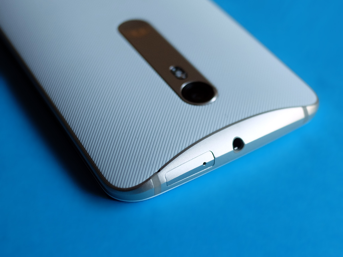
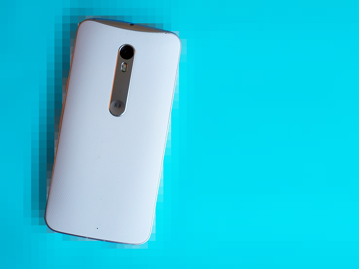
Enough of bashing the Moto X Style with Gok Wan’s naughty stick, though. It’s a decent-looking phone, and feels pretty good too. This is the only one of the 2015 Moto X phones to use a fully enclosed design, meaning the back isn’t just a plastic battery plate you can pull off with a fingernail.
So rather than using under-the-hood slots for the SIM and microSD slots, the cards fit into a tray that pops out from the phone’s top. There’s no flexing to this phone and while the back is plastic, it’s nicely soft to the touch.
The metal surround does add a touch of class too, and as with all current Moto phones, the curvy design helps disguise that at its thickest point the Style is a chunky 11.1mm thick. The body is nano-coated, giving it IP52 protection as well. That means it’s impervious to dust, and can withstand water sprays but not being submerged. In other words, heavy rain is fine, just don’t drop the Moto X Style down the toilet.
Other than being mis-sold as a ‘Style’ phone, the only other thing to hold you back on this Moto’s design front is its size. The Motorola Moto X Style feels quite a lot like a slightly-shrunk Nexus 6, because that’s basically what it is.
It loses just enough width to stop seeming like an almighty stretch like the Nexus, but it is a handful. More so than the similarly-5.7in Note 5, anyway. Just make sure your mitts are up for it. Mine are, but I did automatically switch over to two-handed typing.
QHD hero
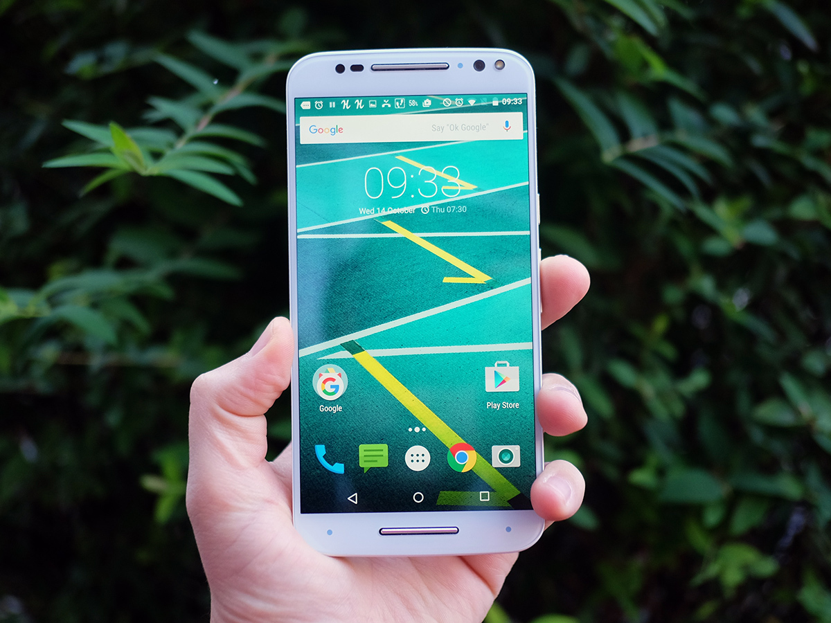
The next question: is the screen worth it? On the specs front, absolutely. The Moto X Style has a 5.7in 2560 x 1440 pixel display, getting you a massive canvas that can convincingly justify the upgrade from 1080p.
I’ve been using the phone to watch some films and TV episodes in the gym, and it’s just perfect for the task. Those looking for a cheaper media monster than the Note 5 could do a lot worse. Like the Moto X Play it has a nice relaxed colour tone, although I actually prefer the tone of the Play.
In our review sample, there was a bit of backlight bleed at the top and bottom of the screen too. This is fairly common in LCD screens like the Moto X Style’s, and shows up as a brighter area of the display.
As a result, the Style’s screen comes across as bigger than the Moto X Play‘s display, but not flat-out better in all respects. Bear it in mind if the quality promise of the ultra-high resolution is reeling you in right now. It’s a good screen, not a perfect one. I also found that while there are ‘natural’ and ‘vivid’ settings available, switching between them barely seems to make any difference. Sort it out, Motorola.
Nexus flavour

One of the real joys of the Moto X Style is that it doesn’t have any appy bloat on it. There’s the Migrate app to help you transfer stuff from your old phone and one bonus Moto app, but for the most part this acts as an extension of the Settings menu, letting you tweak all those extra little bits of functionality Motorola has squeezed into Android. These include gestures that let you, for example, turn the torch on with a karate chop motion. And you can set rules, based on times and your location, that let you fine-tune how the phone rolls in day-to-day use.
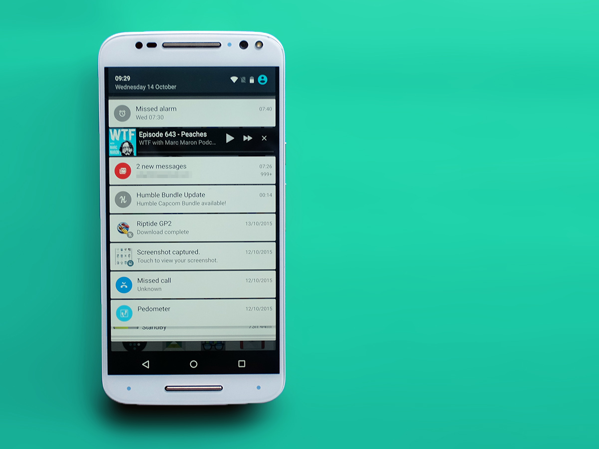
The best Motorola extra, though, is Moto Display. It’s kind of like a custom lock screen, a way to display notifications as they come in. It often rules out needing to even get as far as the normal lock screen. It’s also why there are so many little sensors on the front, letting the Style tell when you’re waving a hand over the screen.
Aside from these little extras and a custom camera app, the Moto X Style’s software feels and looks just like that of a Nexus device. So close that it has many of Android 6.0 Marshmallow‘s traits even though the phone currently runs Android Lollipop, the last version.
The Google Now interface, the default Android ‘look’ used here, has already been bumped up to use the new vertical style of apps menu we first met when trying out Android Marshmallow on the Nexus 6. You might not get Android M, but it sure as hell feels like it already. All we’re missing that really matters is the new Now on Tap digital assistant feature.
Fingers crossed it won’t take Motorola too long to upgrade.
808s, no heartbreak
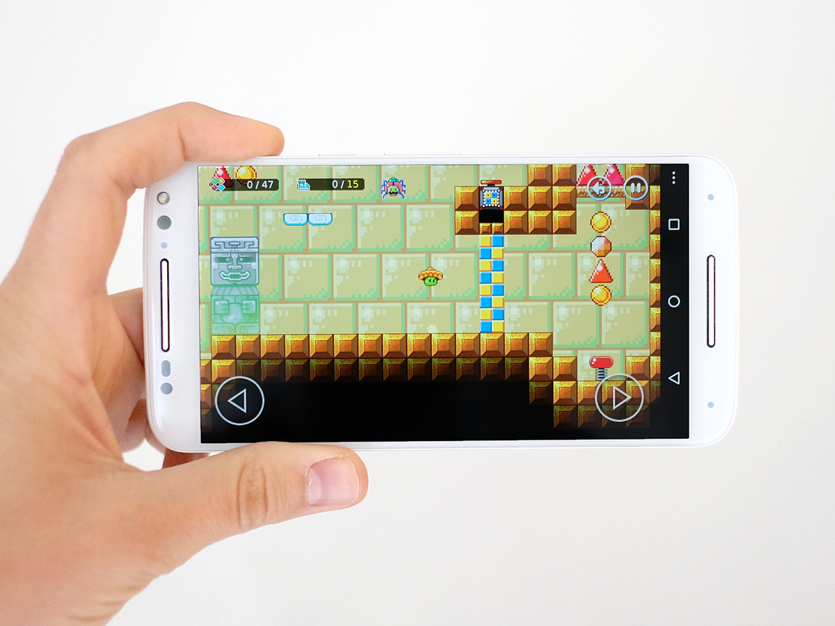
General performance is great too. The Moto X Style has a Snapdragon 808 CPU and a generous 3GB helping of RAM. While the 808 isn’t quite as powerful as a top-tier Snapdragon 810, with six cores instead of eight, it also sidesteps most of the overheating problems that top dog has been plagued by.
I’ve been using the Moto X Style for all sorts of things over the past week: video, browsing, a healthy dose of Bean’s Quest. Not once did it get nearly as toasty as the Sony Xperia Z5 does just from five minutes of mobile internet browsing.
It’s doesn’t really lack much raw power either. The Snapdragon 808 vs 810 is a case of our 808 having two Cortex-A57 power cores instead of four, and a lower-end GPU.
Ultimately, if devs really start challenging our phones’ GPUs again rather than making Clash of Clans clones, the Moto X Style might start feeling the pressure before a Snapdragon 810 rival. But it does do just fine when I max out the graphics in Riptide GP2, which still one of Android’s more challenging games. So I’m inclined to shrug my shoulders and think, ‘Eh, it doesn’t really matter.’
In Geekbench 3 the Moto X Style scores 3470 points. That’s about 700 less than the Snapdragon 810 would achieve, but still a lot more than the lower-end Snapdragon 615 and 410 crowd, including the Moto X Play.
Push the cores › The 30 best Android games
Juice crisis
Now we need to address where the X Style lags way behind the X Play: battery life. It has a 3000mAh unit where the smaller, lower-res Play has a much bigger 3630mAh battery.
While I was happy but not exactly bowled over by the Play’s stamina despite the gigantic battery, the Style’s is pretty mediocre. Reminiscent of the LG G4 but even worse in terms of performance, it’s dead easy to drain it down in a day if you’re going to stream music, browse a bit or play some games. Only pretty light users are going to get comfortably into day two without plugging the phone in.
It does pretty badly when just playing video too, lasting nine hours twenty minutes when, for example, the Samsung Galaxy Note 5 lasts for a whopping 15 hours. The result ranks below the Sony Xperia Z5 and LG G4, two phones that also offer pretty so-so stamina in my experience.
This is the reason not to buy the Moto X Style. Make sure you’re up for such a high-maintenance battery.
There is a silver lining, though. The phone’s battery charges incredibly quickly when you use the bundled charger. Not only does its standard output sit at 2.85A (most phone chargers are 1A or 2A), the voltage cranks all the way up to 12V when using its turbo gear.
We’re talking about going from 0 per cent to 90 per cent in under and hour. It’s seriously powerful. This is something the cheaper X Play doesn’t have, but I’d still much rather have a phone that lasts a solid day and a half even with proper use. Don’t say we didn’t warn you.
Camera: Enter Sony
Things perk up again with the camera. It uses the same 21-megapixel Sony sensor as the Moto X Play, and it’s a pretty good little package.
Its 1/2.3in sensor is the same size as that of a lot of compact cameras, and it’s a lot of fun to use too. I had more fun using the Moto X Style than the higher-end-sounding Xperia Z5. No contest.
It uses the same camera app as the Moto G. The more I use this, the better I think it is. It’s pretty simple and uses a draggable ‘aiming’ reticule rather than tap-touch focusing, which can take some getting used to.
The cherry on top, though, is the exposure compensation dial that sits just by this focus element. Giving you easy control of the brightness of your photos is a new thing everyone seems to be bunging into their custom camera apps, but Motorola’s is the best version of the feature thar I’ve seen so far. The draggable focus just makes it fit in that bit better.
The Moto X Style also has a great Auto HDR mode and, most important, feels quick all-round. There’s no annoying shutter lag and focusing is quick. It even has fancy phase-detection autofocus, built into the sensor. This helps the camera stay quick even when the light level drops.
Image quality is generally very good, with less of the ugly noisiness I found in the Xperia Z5, which has a similarly high-res sensor but actually shoots at 8MP resolution to keep noise at bay. The one area where the Moto X Style camera doesn’t do quite as well is at night.
Without OIS, I had to take multiple frames of any night scene just to make sure I got one that was sharp-ish, and even then the image quality tends to be just OK, not great. It’s more proof that even with a good sensor, a phone really needs stabilisation to be in with a chance of decent low-light photos.
One top tip that I completely forgot to make use of most of the time while testing is that you can actually hold a finger down on-screen in the camera app to ‘burst’ shoot. It’s the best way to make sure you end up with at least some sharp night shots.
Other than that, though, the Moto X Style takes pretty consistently good photos. It has good auto dynamic range adjustment, colour is generally pretty good and strong contrast ensures plenty of punch. It’s only in middling indoors lighting that the ‘dithered’ look of the noise reduction system is a dead giveaway that we’re dealing with something that’s ultimately not going to push over any DSLRs.
Still, it’s good fun to use.
It’s playtime › Motorola Moto X Play review
Side orders
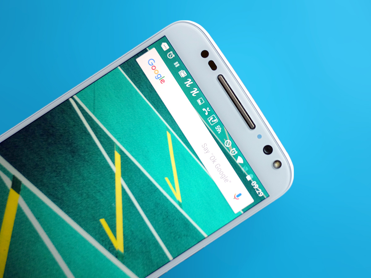
Where the Moto X Style actually goes above and beyond what you get with most phones is around the front. Its selfie camera has a flash. It’s not a two-tone one like the one on the rear, but a bright white single-LED one that has enough power to even out any harsh window light at arm’s length.
It’s a lot more convincing than the ‘screen glow’ flash of the iPhone 6S, that’s for sure. It’s still a 5-megapixel sensor so will still be working with slightly limited detail, but there are few better for dingy dive bar selfies. Just remember: those hard flash shadows are rarely flattering. That said, I did find that it can really warm up faces, so it can often make you look better at times.
Around the front, the Moto X Style’s speakers aren’t too shabby either. It has a stereo pair, marked by those silvery bars above and below the screen. That’s right: unlike the X Play you get actual stereo speakers, not just the appearance of them.
They’re significantly louder than the BoomSound speakers of the HTC One M9 and co, but do sound a bit more strained and less ‘natural’ at top volume. HTC’s famous speakers end up sounding more composed, offering higher actual sound quality. But sometimes volume is what you need, eh?
Motorola Moto X Style verdict
The Motorola Moto X Style is a phone that gets you the sort of specs you might end up paying £100-200 more for from another company. It’s a great deal, especially if you’re out for a big a screen as your hands can handle and don’t mind missing out on extras such as a finger scanner.
That big screen doesn’t reach the heights of something like the Note 5, but there are few other phones I’d rather watch Netflix on.
The only feature that really drags it down is battery life, which is pretty poor. Even by the standards of this year’s stamina-shy flagships. Still, if you think you can live with that, there’s a lot to like here.
Top of the smartphone pops › The 10 best smartphones in the world right now
Tech specs
| Screen | 5.7in 2560 x 1440 IPS LCD |
| Software | Android 5.1 |
| CPU | Snapdragon 808 1.8GHz |
| RAM | 3GB |
| Storage | 32GB with microSD |
| Camera | 21MP with flash, 5MP front with flash |
| Battery | 3000mAh |
Stuff Says…
A big screen, big value phone only really let down by poor battery life
Good Stuff
Big, big screen
Good value
Fun-to-use, good quality camera
Ultra-fast charging
Bad Stuff
Poor battery life
Some backlight bleed


