Olio’s Model One smartwatch saves you time while looking super stylish
It works with both Android and iOS, looks incredibly slick, and is built to last

If you think the impending launch of the Apple Watch means the window for alternative third-party smartwatches is closing, think again.
The Pebble Time has racked up nearly US$20 million, and newly announced options from Vector and Frederique Constant are turning heads. And you can now add Olio to that list.
The upstart smartwatch maker has just revealed its debut product, the Model One – and it’s a stunner. Compatible with Android handsets and iPhones alike, the Model One blends classic watch styling and premium materials with an interface that makes saving time as important as telling it. And its digital assistant has a lot to do with that.
Olio may not have a deep history to draw on, having only started in 2013, but founder and CEO Steve Jacobs has an impressive resume himself. Following an internship with Apple’s iPod team and graduation from university, he worked for various consulting firms. It’s then that he had a chance to help to design some recent notable products, including Beats’ Studio Headphones and Google’s Chromebook Pixel, as well as projects for Apple, Nest, GoPro, and more.
And his team has similarly sharp backgrounds, with engineers pulled from Apple, Google, and HP, but also a watch designer from Movado and a UI designer from Pixar. Despite the diverse lineup, they’ve come together to create a smartwatch that stands out from the pack. “That’s my passion: extremely high-quality, finely engineered, well designed, and thoughtfully crafted products,” says Jacobs.
Finely crafted

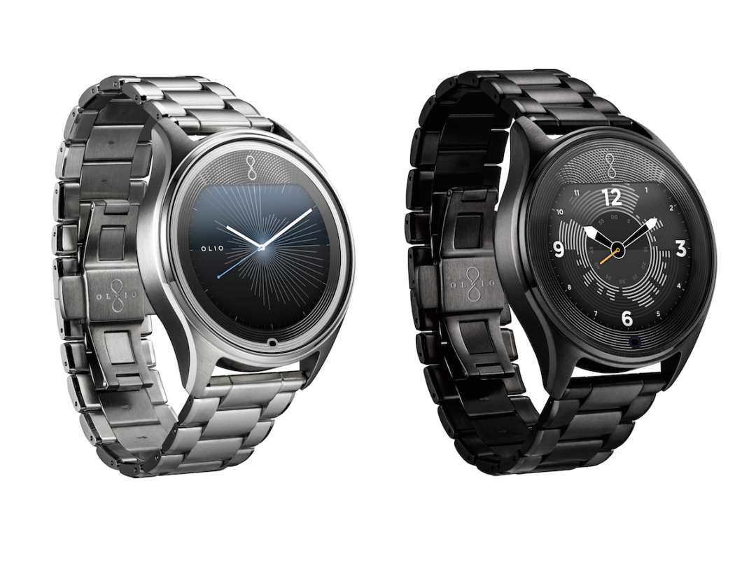
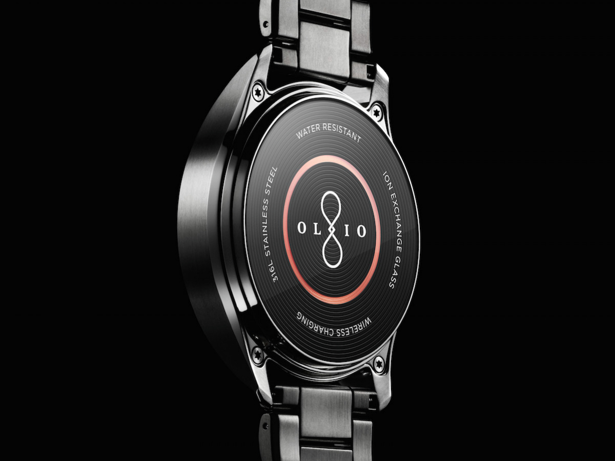
Based on what we’ve seen of the watch itself, we’d say mission accomplished on that front. The Model One is a gorgeous timepiece, available in Steel and Black versions, with both cases sporting 316L stainless steel forged nine times over for serious durability. “They’re really not built like a smartwatch,” Jacobs explains. “They’re really built like a Swiss watch.”
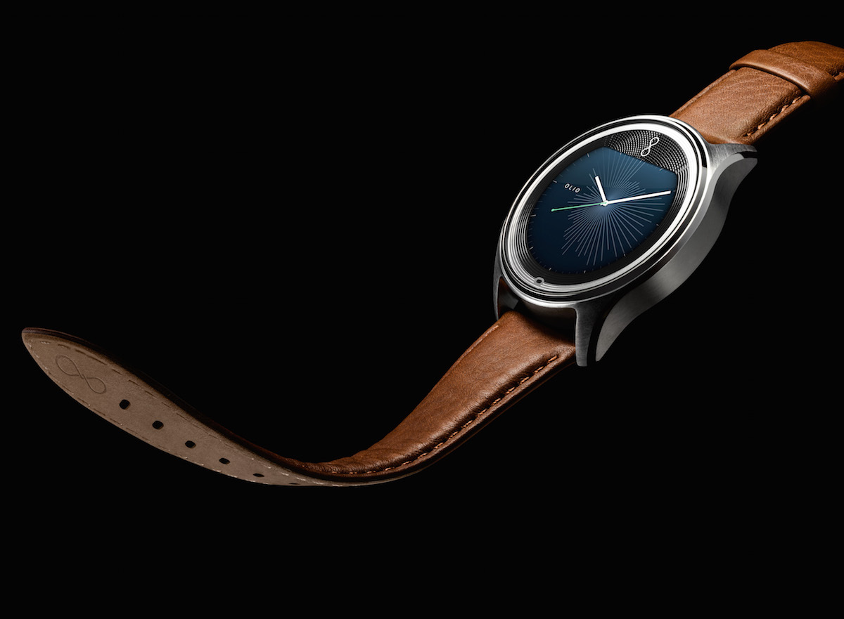
But the Model One doesn’t catch the eye for its strength (although it’s also water and dust resistant and shockproof), but rather its finesse. Each device is hand-finished, with a brushed-metal exterior and hand-polished chamfers. Steel bracelets are included, but Olio also has custom leather straps available, plus the Model One is compatible with traditional watch straps from other makers.
Strengthened ion exchange glass crystals are found on the front and back of the case, with the back one thinner to allow the proprietary (and visible) wireless charge coil to work rapidly when engaged. The glass on the front is thicker, but it’s not just a plain sheet: it has a custom gravure texture to add depth, and each of the two models appears to have a different etching.
“We wanted to [add that effect] because it’s one of the elements we loved about traditional watches. They’re beautiful to look at, they catch the light, they’re dynamic throughout the day, and it gives us something that we can smile at when we look at our timepiece,” he says. “We don’t like that boring black mask around the edges of our watches.”
Function and form

The textured bezel surrounds a 1.3in IPS LCD colour display (running at 216ppi) that gets super bright: Jacobs says it’s rated at 700 nits – more than twice that of the LG G Watch R, and even higher than an iPhone 6. Directly bonded to the glass exterior and behind a polarizer and anti-reflective coating, it should stay legible in any condition. It does have a Moto 360-like “flat tire” shape, as some would call it, but it’s flipped and the visual impact is softened by the etched glass effect.
With a custom battery and energy-efficient LEDs and films used, Jacobs says the Model One currently tests at two full days of battery life, and it charges in less than an hour. Plus, a power reserve mode lets you shut off the smartphone link and make it more or less a digital “dumb” watch, potentially adding another day or two of life if you’re away from a charger for long.
The custom-designed battery tech purportedly also extends its cycle life by two to three times that of a typical smartwatch or smartphone battery, notes Jacob. But if your Model One’s battery eventually loses steam or otherwise is damaged or needs care, Olio is emulating high-end watchmakers by letting buyers mail the device in for battery replacements and other upkeep.
In other words, they’ve got a longer game in mind here than you might expect from a smartwatch. “You don’t buy a watch for a year or two: you buy it for five to 10 years, and sometimes longer,” he adds.
Keep time, and save it too
The watch itself is striking, but it’s the interface that’ll really set the Model One apart from other smartwatches. That’s because it’s designed with the sole purpose to save you time and minimise distractions, and the UI was built as such.
Temporal streams split notifications into two timeframes: earlier and later. In other words, what you missed and what’s ahead. Swipe from the left and you’ll pull in text message notifications, tweets, and other things that occurred since the last time you looked. Swipe from the right and you’ve got your schedule, reminders, traffic info, and other things ready to greet you in the near future. No messy list of random notifications, and no digging around through menus.
Even the watch faces subtly pack in quiet details. For example, the rays emanating from the center in a couple of the images here reflect your digital life over the last 12 hours, based on notifications – the longer the line, the more you had going on during that stretch. Other faces hint at how busy your schedule ahead looks, or show weather icons for segments of the day. It’s at-a-glance info that doesn’t diminish the aesthetic in favor of rote details.
And Olio Assist is the cherry on top: it’s not another copy of Siri or Google Now, although you can use the built-in microphone of the Model One to access those phone-based services as needed. Instead, Olio Assist is “laser-focused on opportunities to save you time,” says Jacobs.
Before a scheduled meeting, for example, it’ll ask if you want it to hold your messages, and then provide a quick digest thereafter. If you get a call while driving, Olio Assist can text that person back to say you’ll call back when you reach your destination. In other words, it acts more like a real-life personal assistant to keep you focused on current tasks and less distracted by your gadgets.
Go Olio, or no?

Jacobs says the appeal of something like the Olio Model One – compared to the Apple Watch or Android Wear devices, with deep OS integration – is as much about fashion choice as functionality. “Our belief is that having one design of a product, that is mass market and that everyone will use, puts us in a weird place as a consumer when we’re looking for a fashion accessory,” he says.
In other words, simply buying the watch that your smartphone maker deems to be part of the ecosystem isn’t much of a choice – and the result of having lots and lots of people wearing the same watch takes away from the appeal of, well, choosing to wear a watch. “That’s kind of uncomfortable for a number of reasons,” he adds, and we can’t help but affirm the thought (even as we covet the Apple Watch).
At the very least, he says, Olio offers a high-end alternative to some of the watches generated by big consumer electronics companies. “No-one buys a Rolex to know what time it is, and on that same tone, no-one’s going to want to buy a luxury timepiece from the company that makes their washing machine,” he says, with a seeming jab at Samsung that’s repeated a few times during our conversation.
The Model One will go on sale this summer in very limited quantities: just 500 of each collection will be available initially, with the Steel model priced at US$595 (about £400) and the Black model at US$745 (about £500).
Pre-orders are available now, although the watches will only ship in the United States at first. In time, as the team can ramp up production without sacrificing quality, a wider international release will follow.
Read More › Apple Watch hands-on review


