Microsoft Zune review
It didn't go down well in the US at launch - does Microsoft’s Zune deserve the insults, and could it yet take on the iPod?

You may have already made up your mind about the Zune. It’s been picked apart in the US following its November launch, and won’t be arriving in the UK till late 2007. But don’t write its obituary just yet. The Wi-Fi player recently arrived at Stuff Towers and, to our surprise, has given us reason to believe that it could yet dent Steve Jobs’ armour.
Microsoft Zune design: the incredible bulk
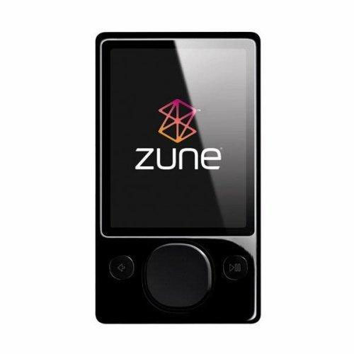
Sure, the Zune weighs in a little on the chunky side compared to a similarly specc’ed iPod, but that extra bulk gets you some next-generation hardware. The screen is large and bright, which not only allows the user interface to look like it was designed this century, but is also surprisingly good for watching movies.
Another big plus is that it also packs in the wireless goodies, with both Wi-Fi networking and an FM radio as standard. Currently, the Wi-Fi is limited to with sharing tracks with your Zune-owning pals (assuming you have some), rather than syncing or buying music directly, but clearly the potential is there. The FM radio is good, and the RDS function displays the station name and music track currently playing.
Microsoft Zune features: music maestro
This time around, Microsoft is following Apple’s lead and runs the entire musical ecosystem from online store, to desktop application, to player. Sadly, the store and desktop software both need improvement: there is currently no support for podcasts, and the playlist support is overcomplicated. Improvements will hopefully be here by UK launch date.
There are some other annoyances, however. Tracks shared wirelessly can only be played three times, and self-destruct after three days (probably at the insistence of the music labels). The online store isn’t as comprehensive as the iTunes store, and uses “Zune points” rather than cash, meaning you need to buy blocks of credit up front.
Microsoft Zune controls: emotional response
But it’s the player hardware that’s going to evoke the emotional responses and, despite it’s slightly larger casing, the Zune is impressive. It’s frustrating that the control wheel is actually a four-way controller, but the UI is gorgeous with album art and user-selected graphics used throughout. The look is a lot more Xbox 360 that Apple’s ultra-simplistic monochrome menus, and only gains in the way of usability.
If you’re thinking of upgrading your current player to the Zune, you might as well eschew standard colours too, and pick up the brown model. In the flesh, it’s a mix of warm, scratch- and smudge-resistant organic shades that’s unlike most consumer electronics on the market. It may not have the iPod’s cool, but Zune could yet be the new black.
Stuff Says…
Microsoft’s Zune doesn’t ooze the iPod’s svelte sexiness, but inside that boxy casing beats a high tech heart with a state-of-the-art user interface, wireless networking, radio and a killer screen for movies


