Android Auto vs Apple CarPlay
Mobile makers are invading your automobile! But which of the two options is best?
Aren’t smartphones brilliant? They do everything. And they do it so quickly and smartly. We take them for granted, of course – that’s what us humans do – but stop and think about it for a second and you have to admit that we’re living in a golden age of technological convenience.
And then you get into your car and swap the all-singing, all-dancing wonder that was at your fingertips for a dumb stereo that doesn’t seem willing to receive anything but Chris Moyles.
Ok, so many modern cars now have touchscreens and the like, but even these are bumbling idiots compared to the sophisticated smartphone operating systems we use every day.
Wisely, rather than continue the futile game of catch-up, a whole bunch of manufacturers now let you get a car-specific version of Android or iOS onto their infotainment systems. You can even add either or both to your existing car with a third-party head unit from the likes of Pioneer or Alpine.
But should you? And which of the two is the best? It’s time for Android Auto to take on Apple CarPlay in the battle to reawesomise your automobile.
Platform
Android Auto
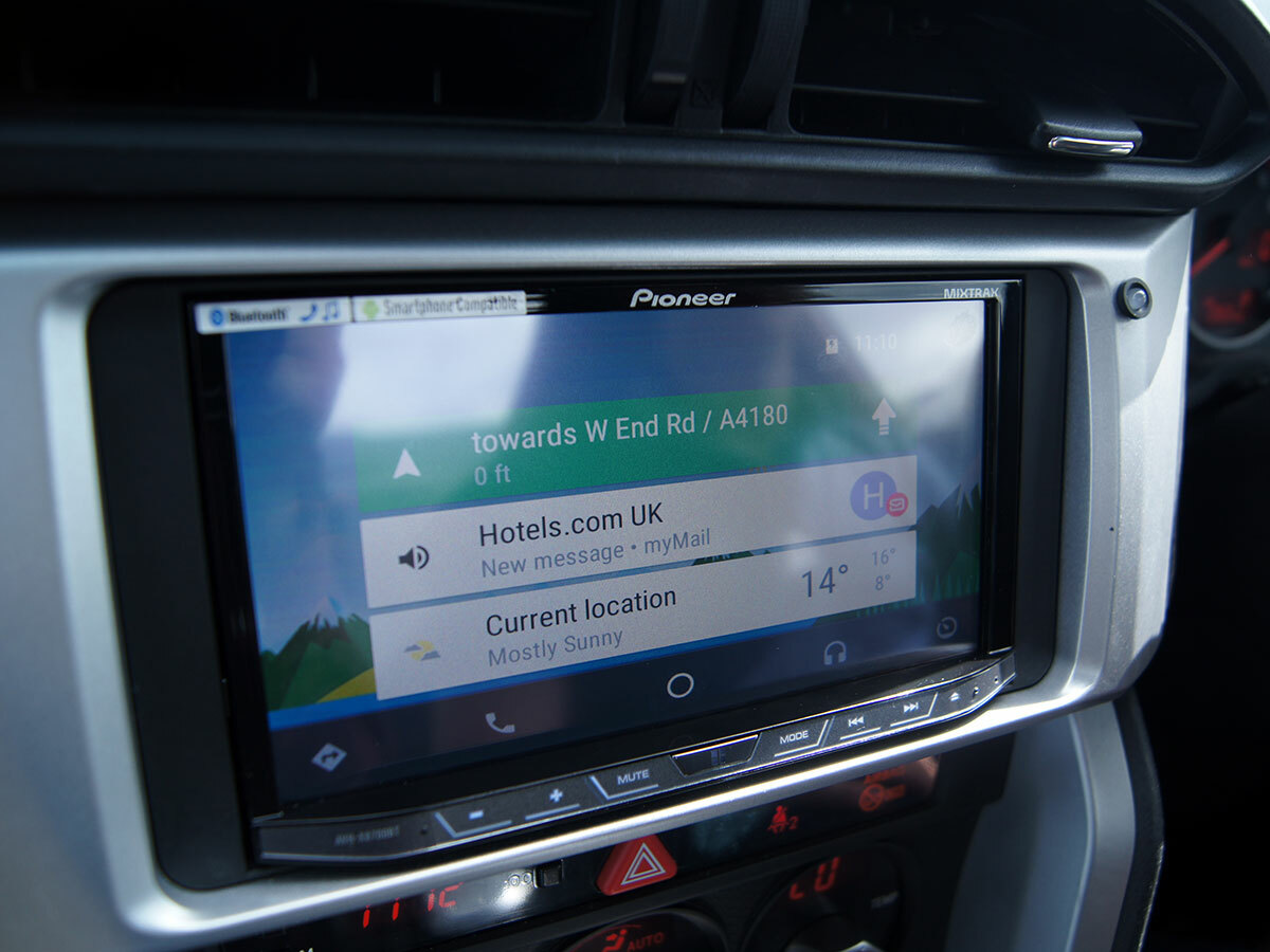
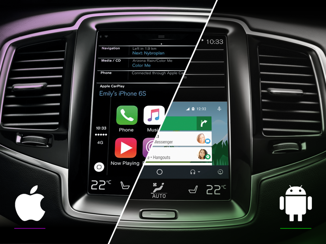
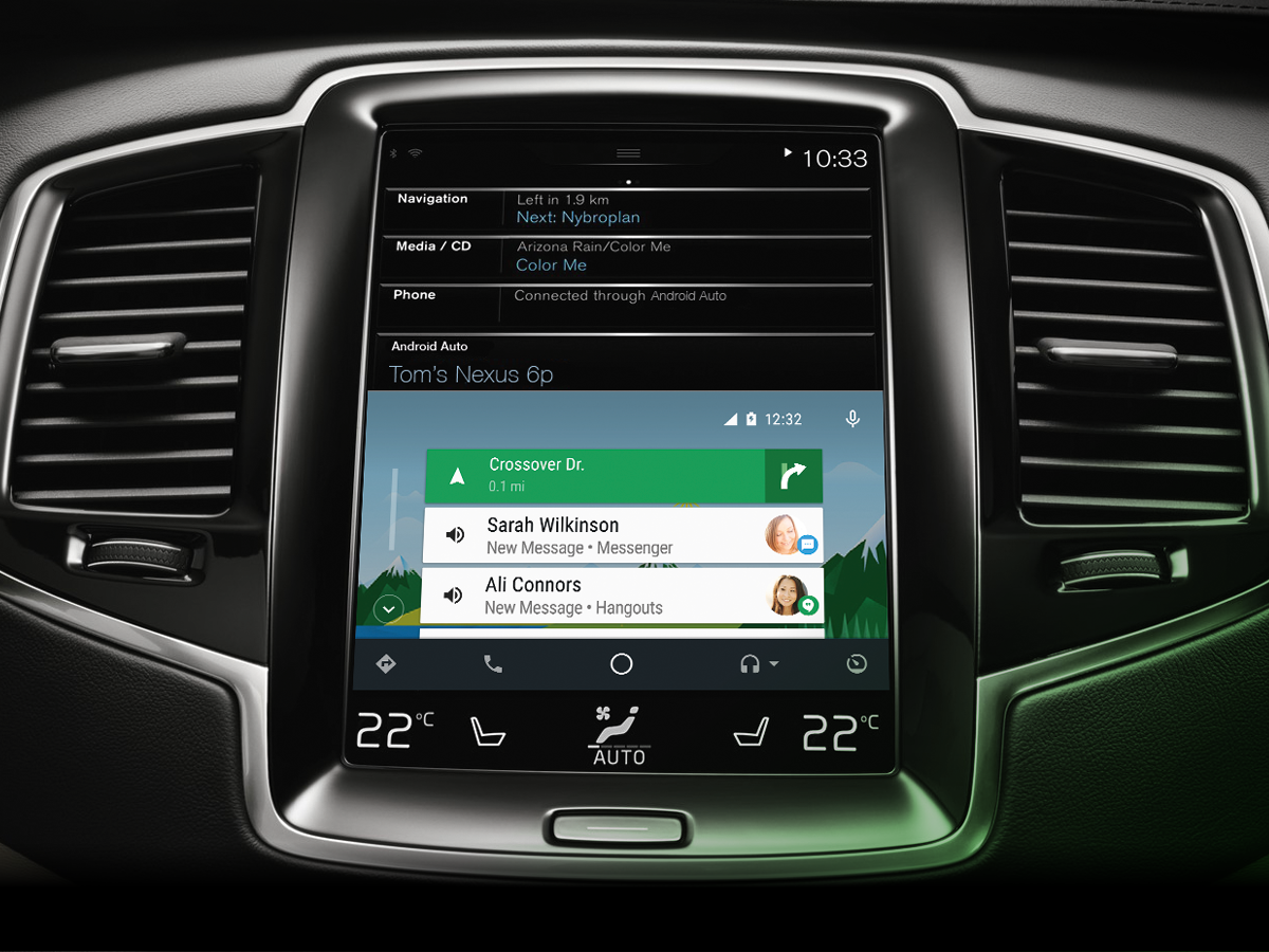
This is a far friendlier interface than the impassive grid of icons that CarPlay gives you, thanks mostly to a customisable wallpaper. Five small icons (for navigation, telephony, home, audio, and manufacturer apps) are arranged in a row at the bottom.
Keeping these icons out of the way means the main display can be used for notifications. At first plug-in you’re told what the weather’s like. Then Google Now will automatically use your driving habits, emails, etc, to try to guess where you’re going and create a banner with distance and traffic details for that drive. Click on that banner and Google Maps pops up, ready to guide you. It’s lovely and slick.
If you return to the home screen during your drive the top notification will always give you your next navigation instruction, and things such as messages (which can be read to you and to which you can dictate a reply) will appear beneath it.
Apple CarPlay
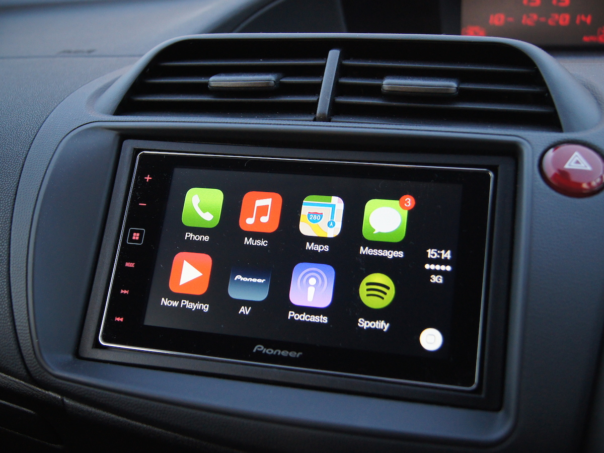
It should come as no surprise that Apple’s gone with a grid of square icons for its in-car homescreen, given that that’s been the stylistic approach of its mobile operating system since the first iPhone launched way back in 2008.
With just eight icons on each ‘page’, prodding the one you’re after is mighty simple even when doing 70mph on the M25 (should the M25 ever clear up enough to make 70mph possible), but you miss out on the clear notifications you get on the Android Auto homescreen. You do, though, get notified when a text message comes in and you can send and receive using audio and dictation.
Irritatingly, you can’t reorder the apps, so Apple’s Podcasts, for example, will always appear on the first page, while your chosen podcasts app is relegated to the second or third.
Winner: Android Auto
The apps that matter
Because each app has to be specifically tailored and approved for use in-car, you only get a small portion of the overall selection on Android Auto and Apple CarPlay. Even so, around half the apps available on each infotainment platform are fairly worthless, so allow me to run you through the ones that are most useful on each platform:
Android Auto
Audible ● Google Maps ● Google Play Music ● Spotify ● TuneIn ● WhatsApp Messenger ● Skype ● Amazon Music ● Pocket Casts ● Stitcher ● Podcast Player ● 7digital
Apple CarPlay
Audible ● Apple Maps ● Apple Music ● Spotify ● TuneIn ● Deezer ● Downcast ● Overcast ● Podcasts ● Radioplayer ● Rdio ● Stitcher
Try this › the 20 best iOS apps money can buy
Navigation
Android Auto
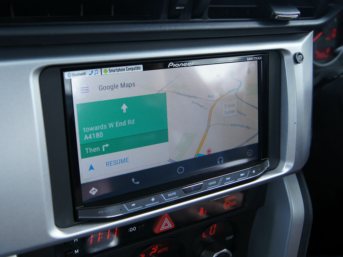
With all of the sat-nav apps available on Android and iOS, it comes as a big ol’ disappointment that Android Auto and CarPlay have just one apiece. The good news for Android Auto is that its single sat-nav app is Google Maps, and in case you haven’t heard – it’s pretty good.
Google Maps has a couple of deficiencies compared to a dedicated car navigator such as TomTom – it lacks a speed readout and camera locations for instance – but it’s a really powerful mapping tool with very clear navigation instructions.
Unlike Apple Maps it also keeps you informed as traffic conditions change, marking them clearly on the map and in your updated ETA, and giving audio updates that include options to navigate around the traffic should a faster route appear.
Apple CarPlay
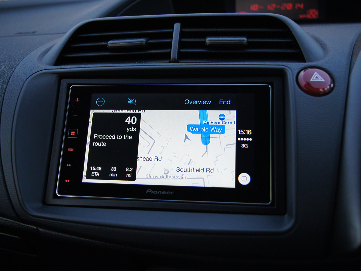
Apple Maps really isn’t that bad. Seriously. Sure, it was something of a catastrophe when it launched back in 2012, but it’s come on leaps and bounds since. These days it even acknowledges the existence of Stratford-Upon-Avon.
It’s still not perfect, though, especially in CarPlay form. The white and grey colour palette is super-stylish and works well on an iPhone screen, but some car screens lack the same level of contrast and that can at times make it a little hard to quickly make sense of a road layout.
As with Google Maps, current speed and speed cameras are absent, but unlike Google it also seems keen to shield you from any traffic-shaped bad news. You can see it on the map at the planning stage, but once you’re driving the red markings disappear. In fact, it seems very much as though the app stops looking for traffic updates and is quite happy guiding you right into a nasty snarl up, and that’s no fun at all.
Winner: Android Auto
Entertainment
Android Auto
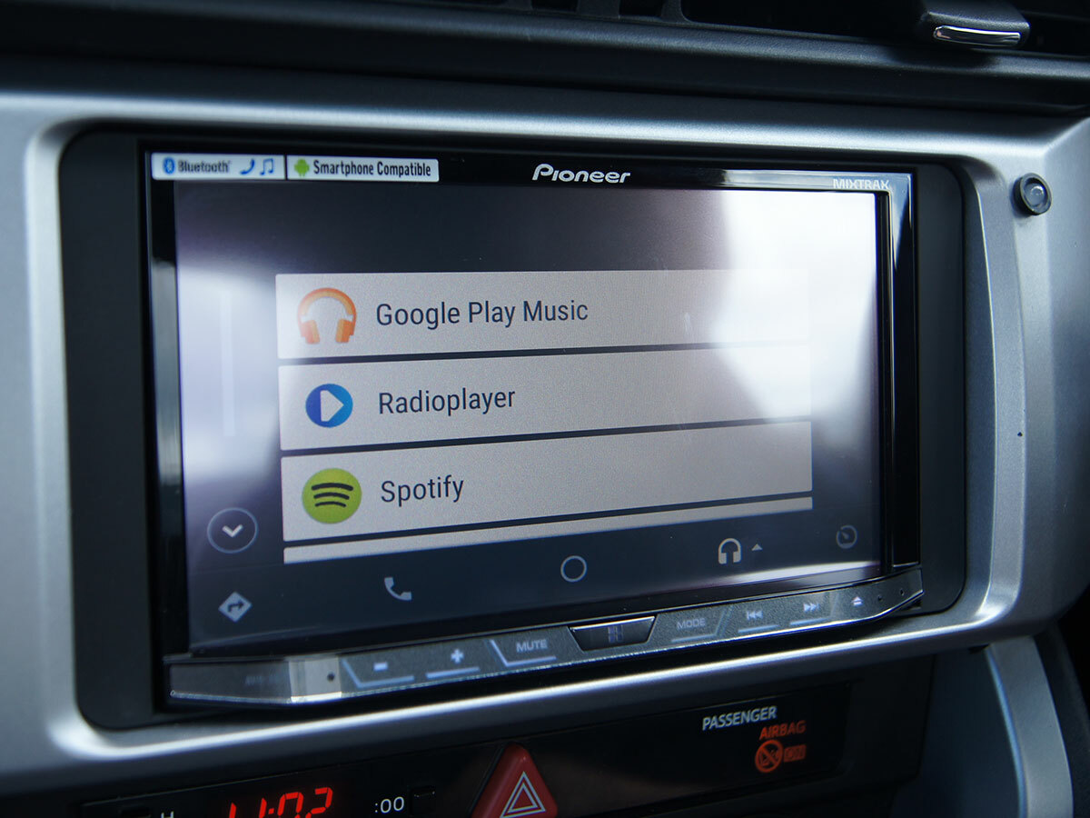
You may not get a choice when it comes to sat-nav, but there are plenty of options when it comes to audio entertainment on Android Auto. Google Play Music obviously comes first, but it’s probably Spotify that most people will be keen to use. The problem is that it’s pretty awful on Android Auto because the number of songs, artists, albums or folders you can see at any one time is limited “for safety reasons”. Click on your Artists folder and you get access to only the first nine, which probably won’t get you even a third of the way into A.
The same problem rears its hugely annoying head in TuneIn, too. Tap to browse By Location, then select Europe, then scream at the screen when it tells you “no more items can be displayed”.
Getting to the music and stations you want is relatively painless using voice commands, but not being able to properly browse is a patronising pain in the backside.
Apple CarPlay
Apple CarPlay’s audio options are very similar to Android Auto’s, but for the obvious swap of Apple Music coming in to replace Google Play Music. Apple Music is actually quite nice on CarPlay, especially since the New and For You features were introduced, the latter of which is pretty good at personal recommendations.
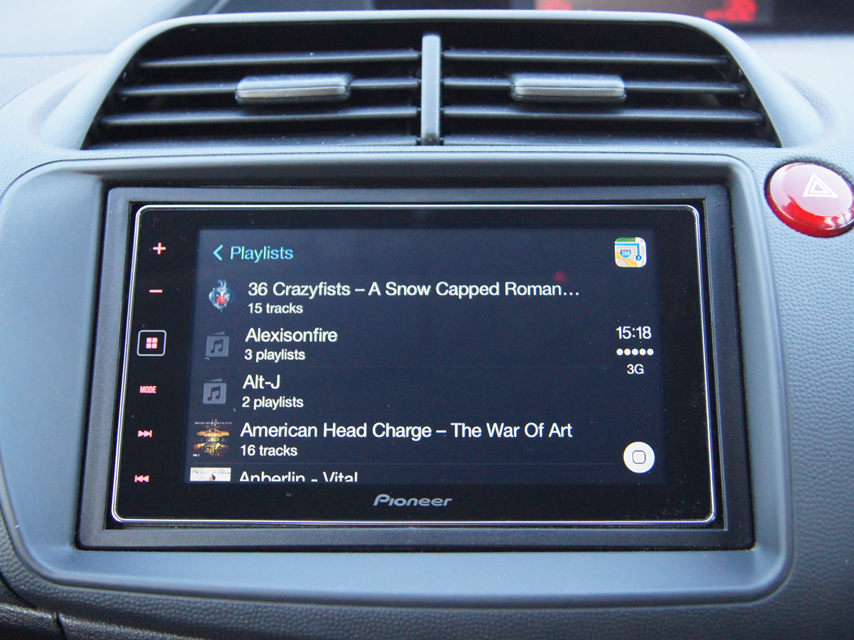
But seeing as everyone’s subscribed to Spotify it’s that that really matters, and it’s not hobbled here as it is on Android Auto. Those who organise their playlists in a folder arrangement that would baffle a cryptographer will find they hit a point at which nothing is displayed, but if you’re someone who saves music to the default Artists, Albums or Songs folders the only problem you should encounter is the need to scroll through long lists. The fact that Siri doesn’t work with Spotify is also a shame, but next to Android Auto’s treatment this is a big improvement overall.
Naturally there’s also a bunch of radio and podcast apps, and while bugs sometimes appear (RadioPlayer is patchy at the moment) there’s always another option available.
Winner: Apple CarPlay
You might also like › Spotify vs Tidal vs Apple Music
Verdict
It’s fair to say that neither of these smartphone-based in-car entertainment systems is close to perfect, and yet I wouldn’t buy a new car now that didn’t have them onboard because both have more potential than anything a car manufacturer is building itself.
Throw your lot in with Apple or Google and you can be pretty darn confident that updates and apps will come at least relatively regularly. Buy a car with neither and there’s every chance you’ll be stuck with the same infotainment for the life of the motor. Urgh.
So which to get? You may not have to choose: most car manufacturers have both or neither.
As for which to use: right now, Android Auto has the lead. It’s got pretty serious issues with Spotify, but its UI is better and more informative, Google Now is genuinely useful in-car, and Google Maps is more likely to get you where you’re going without slamming you straight into a traffic jam on the way.
In six months it could be a different story as more apps come along for the ride and those that are already onboard get updated, but for now the fastest route to automotive bliss is the Android Auto one.
Overall winner: Android Auto
