OnePlus 10T review: super speedy sub-flagship
The 10T is a follow-up to the 10 Pro, but sits underneath it at a much more palatable price point. But is price enough to justify buying it?

This is the sub-flagship OnePlus 10T, a follow-up to the OnePlus 10 Pro from earlier in 2022. It sits underneath that device but to say it is a downgrade in every area does it a disservice. Here’s our full OnePlus 10T review.
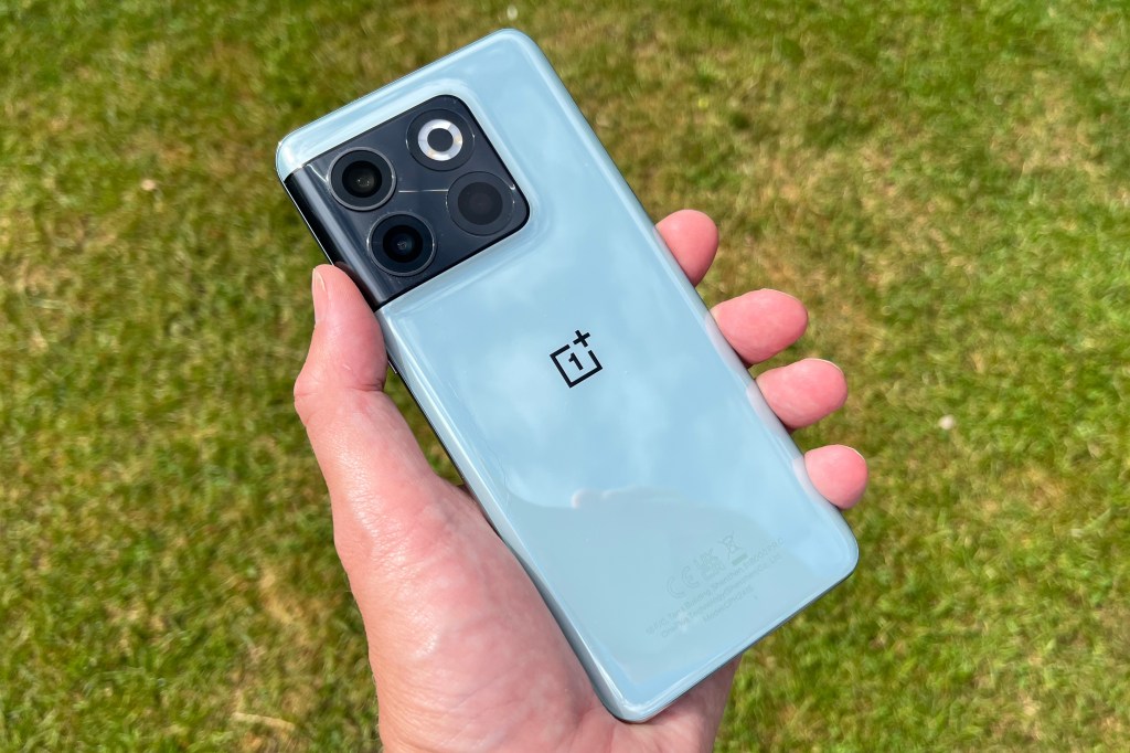
While the 10 Pro is an out-and-out flagship, the 10T takes a similar design but renders it different materials though you’re hard pressed to tell the difference.
The 10T also doesn’t have several flagship-class specs like wireless charging. Instead, it ups the wired charging to a scarcely believable 150W and uses Qualcomm’s very latest Snapdragon 8+ Gen 1 platform (the + is the new bit).
OnePlus’ strategy is an interesting one particularly since while there was a OnePlus 8T, there was no OnePlus 9T last year (there was an India-only 9R though) to bridge the gap between the OnePlus 9 series and the OnePlus 10 Pro (this might have been pandemic-related). And we’ve had new entries into the budget Nord series in the interim, notably the OnePlus Nord 2T – this is clearly an upgrade from the Nord series, but then it is a chunk more change.


Design and display
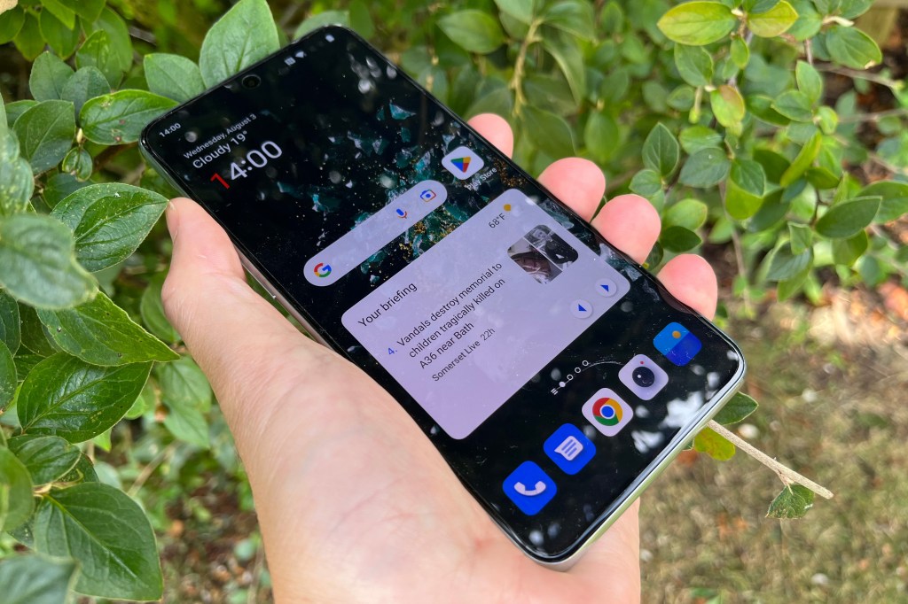
The more you poke around with the 10T, the more subtle changes between this and the 10 Pro become evident. While the 10T boasts a HDR10+ supporting 6.7 inch display as with the 10 Pro, the resolution clocks in at 1080 x 2412 pixels rather than 1440 x 3216, 394ppi rather than 525ppi. The adaptive refresh rate display also doesn’t go from 1-120Hz, instead flipping between 120, 90 and 60Hz as required. While Corning Gorilla Glass Victus is used in the 10 Pro, Gorilla Glass 5 is used for the 10T. Are these changes noticeable? Not generally, though side-by-side the 10 Pro’s display is definitely more appealing.
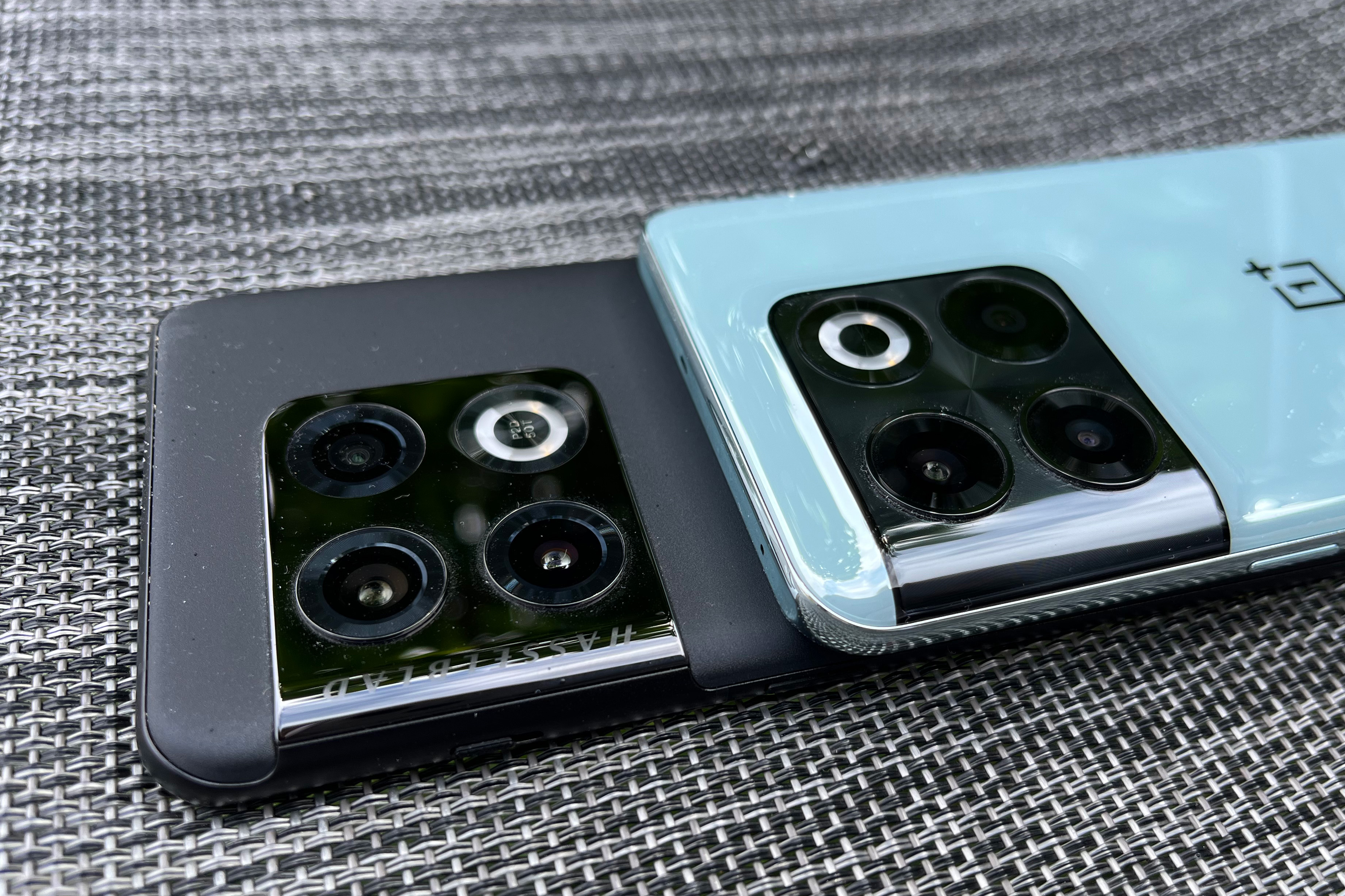
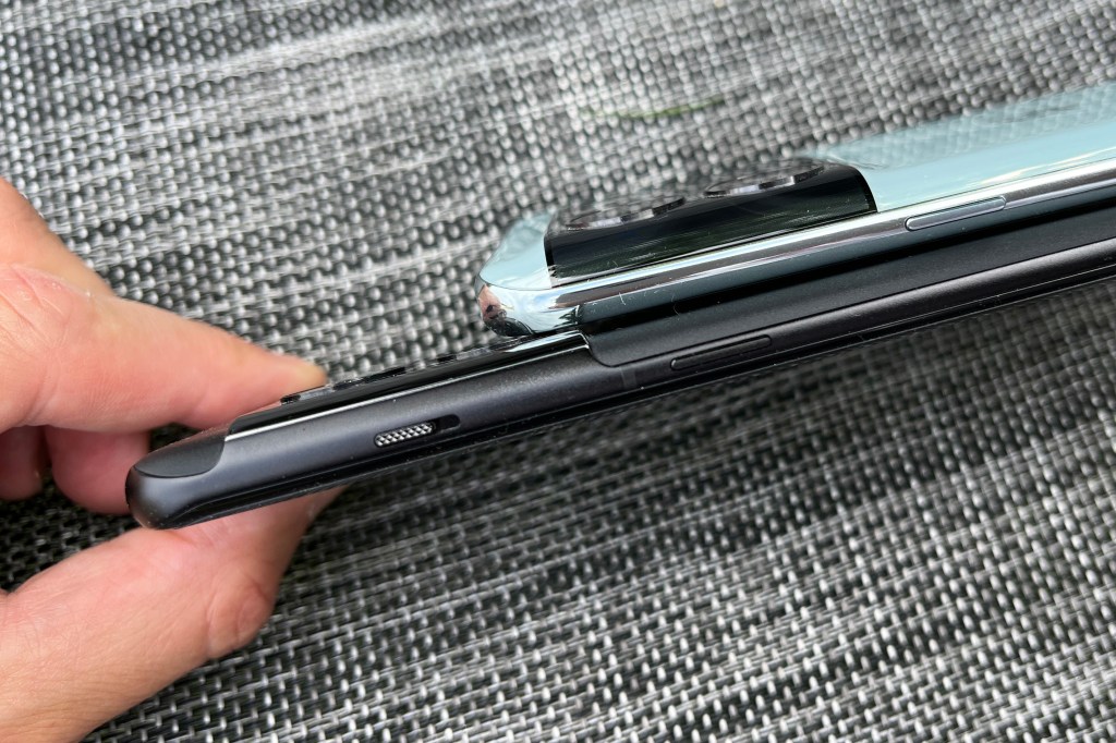
There are some other key design differences. The camera bump is less pronounced and is more of an integral part of the body – it’s a unibody-style design that reminds us of parent company Oppo’s Find X5 Pro – that’s definitely not a bad thing, we love that phone! The bump also has no Hasselblad branding, while the selfie camera is centred rather than being in the corner of the display.
The position of the dual LED flash has also changed. But there is one design decision this time around that will be unpalatable for many OnePlus fans and that’s the removal of the OnePlus alert slider.
This is a OnePlus staple feature and is similar to the distinctive switch on the iPhone in that you can mute the phone without looking at it. This is a real shame, but we guess we may not have seen the last of it. We’ve seen with decisions such as the removal of the glowing Apple logo on a MacBook that change happens and works out fine.
But the premium Android market is so crowded, it feels like removing something so distinctive is a mistake – could it return in the OnePlus 11 Pro – or is this the end of the line for it?

For its part OnePlus acknowledges the controversy this will cause and explained the omission at length in a blog post: “This wasn’t a decision made quickly or easily – we understand its value and heritage on OnePlus devices. This decision provided us with the necessary space inside the device to add new, meaningful technologies… while maintaining a thin and light form factor.
“We know our users expect OnePlus devices to have high wattage charging, a large battery capacity, and better antenna signal. To excel in each of these three areas, the space inside the OnePlus 10T needs to be occupied by new technology.”
The antenna tech has been upgraded on this model, says OnePlus – there are now 15 separate antennae and a feature called AMP connect to reduce interference between Wi-Fi and Bluetooth – but it appears the battery is the key thing that OnePlus blames for the removal, saying that it could only have included a 4500mAh unit in the device rather than the 4800mAh unit actually included.
OnePlus 10T will be available in two colours – the 16GB memory, 256GB jade green version as shown here, and a grippy matte moonstone black finish which is the cheaper 8GB/128GB version. The jade green finish is particularly nice we think. Oh, and by the way, there is a 12GB memory model that exists, but it’s only going to be available in India.

Features and performance
There’s little doubt over the performance credentials of this phone – as you’d expect super speedy across the board, whether you’re playing taxing games, opening boring docs or retouching images.
One of the 10T’s headline features is its 150W fast charging (still branded Supervooc in the style of parent company Oppo) which is simply tremendous if you use the out-of-the box charger. Yes, a power brick is still supplied! The timing on this is around 19-20 minutes from zero to full which is, of course, nuts (in a good way). It’ll be interesting to see how wired charging tech evolves over the next year or two now that phones have got to the stage where we can charge them in a few minutes – will wireless charging be supplanted because it’s too slow?
OnePlus says the 10T fast charge works by using two 75W charging pumps to help with this, while the cooling system has also been upgraded – there are 13 temperature sensors inside the device according to OnePlus and the speedy charging is managed by a custom chip.
As with the 10 Pro, Face Unlock is the easiest way to unlock the phone, but there’s a speedy fingerprint sensor on board, too. And thanks to the latest-gen Snapdragon it boasts the very latest Bluetooth 5.3 connectivity on board, too.

The device comes with OxygenOS 12.1 based on Android 12, but it should get a fairly swift update to the incoming OxygenOS 13 based on Android 13, though OnePlus confirmed that this will happen after it comes to the OnePlus 10 Pro. OxygenOS 13 boasts increased customisation among other features. OnePlus guarantees that the OnePlus 10T will get three major Android updates and four years of security updates.
As usual, there are some cool cases available for it – quite literally as far as the Glacier Mat case is concerned. It helps the phone’s cooling. It also has quite a rough finish. You certainly won’t get your phone sliding around if you use it.
Camera
The 10T appears to have a similar camera setup to the 10 Pro, but it’s definitely not the same – there’s no Hasselblad-enhanced software this time around. There’s the 50 MP, f/1.8, 24mm Sony IMX766 sensor with OIS used for the main lens, an 8MP ultrawide and 2MP macro sensor.
The main camera is a very slight upgrade over the 10 Pro on paper but the rest of the setup is underwhelming, with the macro lens not very useful (as they usually are) and the lack of a telephoto lens unfortunate but expected at this price point. The macro, in particular, left us with a sinking feeling. Indeed, the camera system is similar to the setup from the much cheaper Nord 2T and that is disappointing.


The images from the primary lens are acceptable in normal lighting conditions, but the images aren’t that well balanced and unlike images from the Pixel 6 for example, they’re lacking vibrancy. And then there’s low light – like the 10 Pro we found a lot to be desired from images taken in dim conditions.
Verdict
The OnePlus 10T offers a huge amount – but as with so many phones this year, there’s a stack of really brilliant competitors queueing at the door. In particular, there’s smoking hot competition from the Google Pixel 6. OK, so the 10T has a few features that take it ahead in the specs race. It’s rocking the latest Snapdragon hardware, bleeding edge charge tech, has a bigger battery and has a much better selfie cam. But you should only buy it if you’re OK with a camera setup that isn’t from the top drawer. If you want to take things up a gear and get something better, then check out the Pixel 6. And if you want a telephoto lens then you’re looking at the Samsung Galaxy S22 or the 10 Pro itself.
Stuff Says…
A decent sub-flagship. But the competition is fierce at this price, so it’s only a worthwhile choice providing you don’t want the best camera experience
Good Stuff
Superb performance
Large battery and super fast charging
Variable refresh welcome
Premium design
Bad Stuff
No wireless charging
No waterproofing
No telephoto, macro not useful
Tech specs
| Display | 6.7in Fliud AMOLED 1080 x 2412 pixels (394ppi) |
| Platform | Qualcomm Snapdragon 8+ Gen 1 |
| Storage and memory | 128GB / 8GB or 256GB / 16GB |
| Software | OxygenOS 12.1 based on Android 12 |
| Cameras | 50 MP, f/1.8 wide, 8MP f/2.2 ultrawide, 2MP macro |
| Dimensions | 163 × 75 × 8.75mm |
| Weight | 203g |


