Nothing Phone 2 vs Nothing Phone 1: the two phones compared
Which Nothing has a special something?
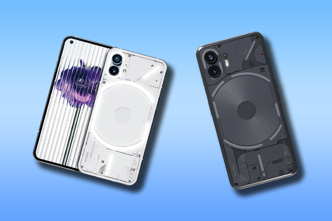
In a relatively short amount of time, Nothing has built for itself a reputation that most tech companies can only dream of. New Nothing products are treated with the type of fanfare usually reserved for new Apple products, celebrity-backed shoe lines or the newest Supreme clothing drops. But hype is only worthwhile if the products match expectations and they’ve so far produced a couple of cracking mid-range phones.
When it comes to price and performance, the Nothing Phone 1 and Nothing Phone 2 can certainly compete with Apple and Samsung. But which is better for you, the Nothing Phone 1 or Nothing Phone 2? Let’s weigh up the pros and cons to find out.
Nothing Phone 2 vs Nothing 1: design
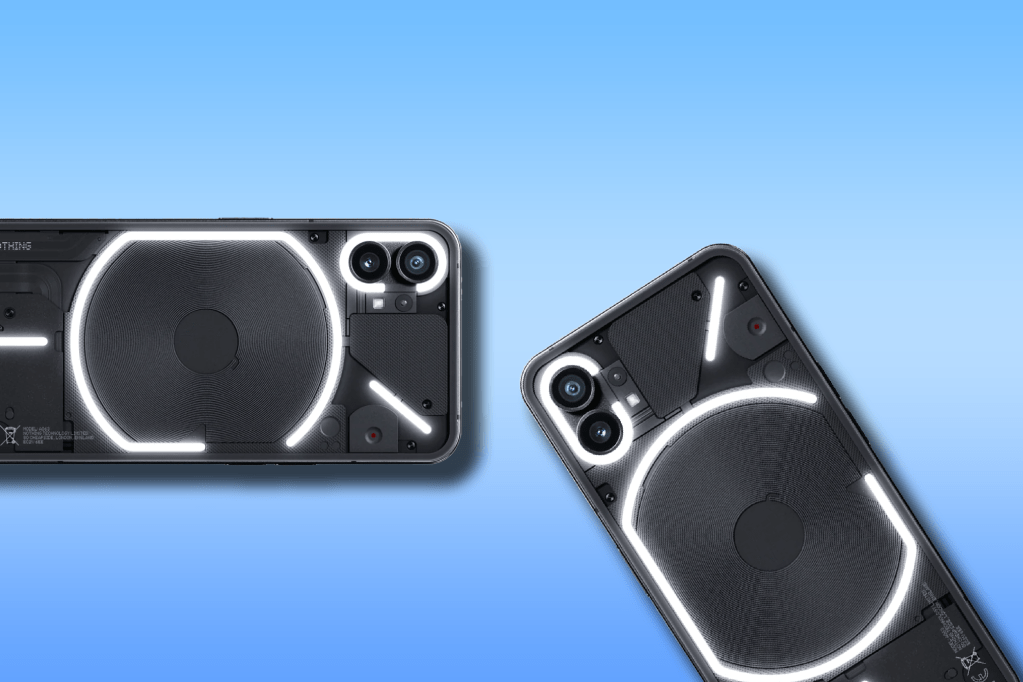
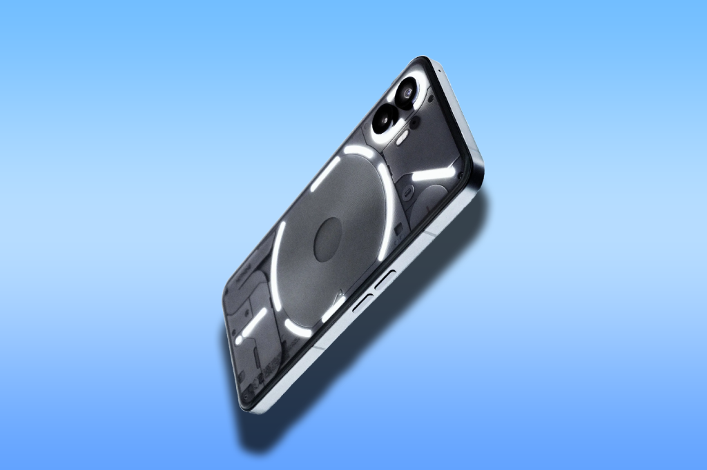
One of, if not the most striking feature of both the Nothing Phone 1 and 2 is the design. Both are stunning and unique in the phone world, sharing see-through styling and Glyph lights on the reverse that glow with a satisfying hue. A transparent rear panel shows off the inner workings of the phone, too.
At face value, both phones are certainly eye-catching, but there are a few differences. The Nothing Phone 1 has a frame made from 100% recycled aluminium, and the whole thing is IP53 splash and dust resistant. The Nothing Phone 2 builds on the Phone 1 and is physically bigger, but swaps the flat rear panel for a 2.5D curved slice of glass. It sits more comfortably in the hand, a surprise given how the screen has grown to 6.7in, up from 6.55in in the Nothing Phone 1.
Nothing Phone 2 vs Nothing 1: camera
Both Nothing phones stick to a two camera setup, but there are some major differences. Phone 2 uses a newer Sony IMX890 for its main sensor, with 50MP output, f/1.88 aperture lens, phase-detect autofocus and optical image stabilisation. Snaps are downsampled to 12MP, but a 50MP toggle in the camera app’s menus can change that. Phone 1 also has a 50MP lead cam with PDAF and OIS, but it uses an older sensor. The ultrawide lens, a 50MP effort with f/2.2 aperture and 114-degree field of view, is unchanged between models.
It was software improvements that helped the Nothing Phone 1 stand out at launch, with a year’s worth of image processing upgrades helping it compete with rivals at the mid-range price point. We’d put image quality towards what a Google Pixel a-series phone is capable of, which is pretty darn good for a brand that’s only been going a few years. Phone 1 isn’t quite as good, even after a few updates, but leaves little room for complaint given the price.
Both phones render images quickly, have a bunch of shooting modes, and can use the Glyph lights as well as an LED flash to give dark images a warm hue instead of a blinding light. Both can also shoot in 4K at 30fps, or 1080p footage at 60fps.
Screen and sound
Does bigger always mean better? When it comes to the Northing Phone 2 vs Nothing Phone 1, not really. The Phone 2 has a 6.7in OLED panel, compared to a 6.55in display found in its predecessor. In the Phone 2, Nothing has trimmed the screen bezels down, which squeezes a lot more screen into a slightly bigger surface area.
When it comes to pixel count, there’s barely anything in it: Phone 1 has a 1080×2400 panel while Phone 2 gets a 2412×1080 screen. Full HD videos are clear and crisp, even if pixel density is ever so slightly down on the pricier phone. Viewing angles, colour accuracy and shadow detail are a very close match across both phones.
The Phone 2 does have a brighter display, managing a peak 1600 nits to Phone 1’s 1200 nits maximum. That makes it easier to see clearly outdoors on sunny days, but there’s not a huge amount in it. Both have HDR10+ playback support, with detailed and vibrant images powered by AMOLED tech.
A down-firing main speaker delivers a wide frequency range for a phone, with the Phone 2’s larger size giving it a slight edge for well-rounded audio. Neither will replace a portable speaker or pair of earphones, though.
Price
Both the Nothing Phone 2 and 1 offer a lot of bang for your buck. In fact, it’s a little bewildering as to how Nothing can pack so much into a $516/£400 and $599/£579 phone. But for US readers, the decision on whether to opt for the Nothing Phone 1 or 2 has already been made for you. Only the Nothing Phone 2 is available to purchase in the US.
The Nothing Phone 1 exists in the sub-$516/£400 category, which pits it against cheaper handsets such as the Poco X5 Pro 5G and Sony Xperia 10 IV. And, in our opinion, the Nothing Phone 1 beats its rivals in some key areas, such as screen quality and the all-important cool factor.
That said, while an extra $232/£180 is certainly a leap in price, what the Nothing Phone 2 offers is worth the extra dough in our opinion. Not only does the Nothing Phone 2 iron out the creases of its predecessor, it has majorly upgraded everything from the screen and camera quality to the overall look of the phone.
Nothing Phone 2 vs Nothing Phone 1 verdict
There’s no getting around the fact that the Nothing Phone 2 is superior to the Phone 1. It’s more powerful, runs smoother, looks better and is still on the lower end of the price spectrum, compared to the likes of the iPhone. The stickler for many then, will be in deciding whether the extra $232/£180 is worth it.
