CMF Watch Pro 2 review: a simpler, smarter, circular watch
Proud to be round
Stuff Verdict
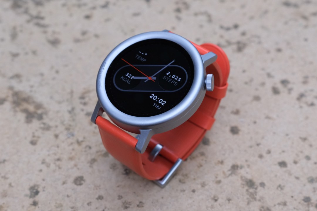
With streamlined looks and a slick UI, the CMF Watch Pro 2 proves budget smartwatches don’t have to be basic. More fully-featured rivals come at a hefty premium.
Pros
- Covers all the smartwatch basics
- Easily lasts an entire week on a charge
- Fresh new look that can be easily customised
Cons
- No app store, contactless payments
- Still not for swimmers
Introduction
Nothing’s disruptive, design-led sub brand CMF neatly sidestepped heavy hitter smartwatches with its debut effort. The original Watch Pro instead went after the bargain basement wearables littering online marketplaces like AliExpress and Temu, only with a feature set you’d normally expect to pay a heck of a lot more for. Now the firm is back for a sequel.
The CMF Watch Pro 2 retains everything that made the original such a value champ, while also fixing that model’s flaws. The styling has also been sharpened up, and modular customisation has been added into the mix. It arrives at the same impressively affordable £69 as before, undercutting entry-grade fitness trackers from Xiaomi, Huawei and Amazfit.
Is that enough to redefine what we can expect from a budget smartwatch? I’ve been wearing one for the last week to find out.
How we test wearables
Every smartwatch and fitness tracker reviewed on Stuff is worn 24/7 throughout the testing process. We use our own years of experience to judge general performance, battery life, display, and health monitoring. Manufacturers have no visibility on reviews before they appear online, and we never accept payment to feature products.
Find out more about how we test and rate products.
Design & build: round we go again


The original CMF Watch Pro felt a little Apple-inspired, with its square screen and curved aluminium casing. It was also a bit of a hulk at 1.93in, which looked a little outlandish on smaller wrists. Nothing has properly mixed things up here, with a circular display set into a significantly smaller case.
My arms aren’t exactly tree trunks, but they’re not twigs either; the CMF Watch Pro 2 fills out my wrist far better than the Google Pixel Watch 2 does.
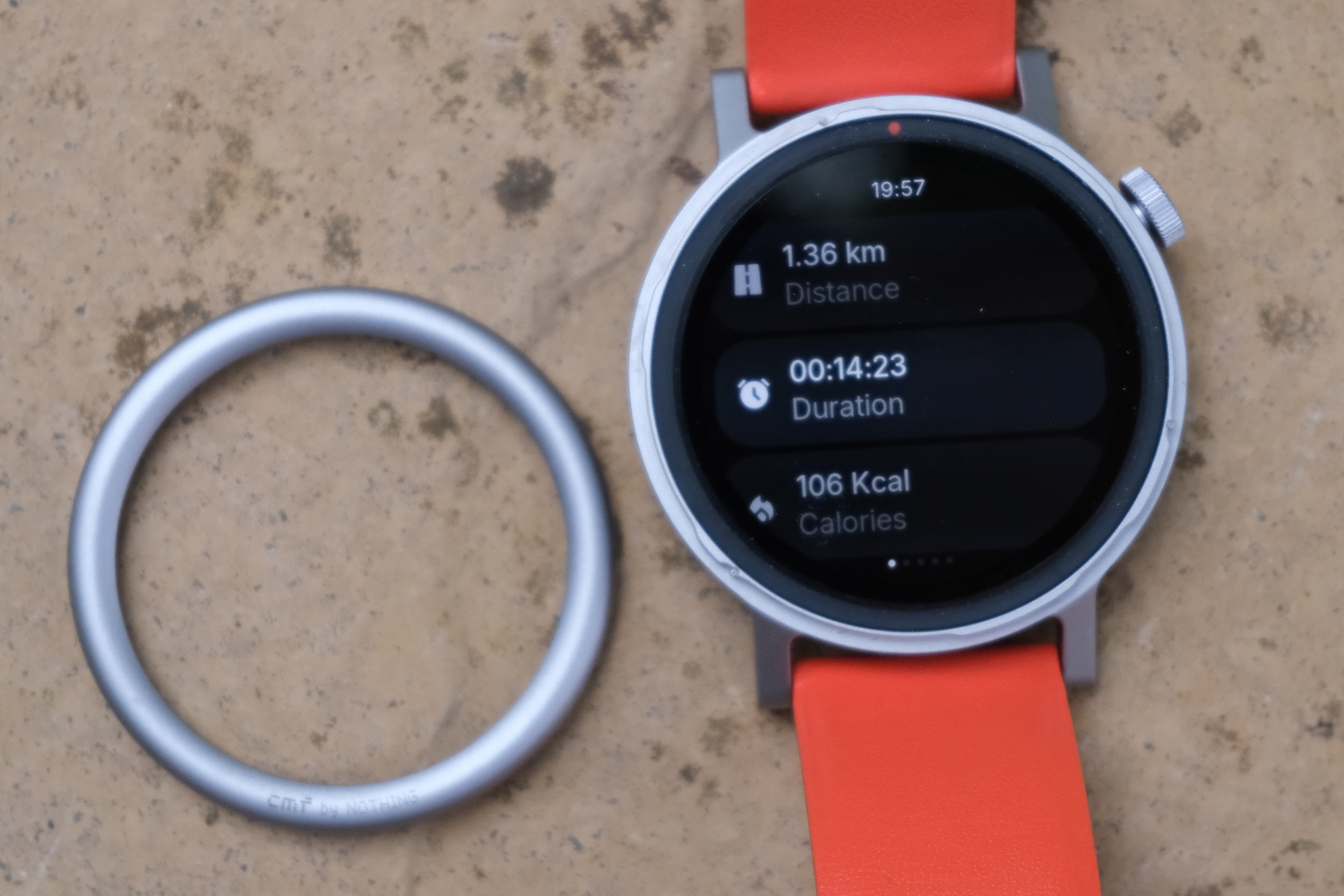
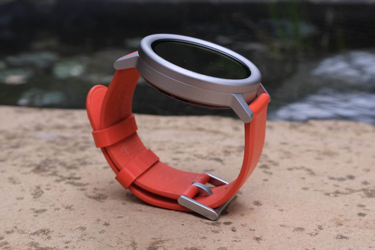
It’s still milled from aluminium alloy, in your choice of Dark Grey or Ash Grey colours. Each has a matte finish that does a great job of hiding smudges and fingerprint muck, and materials quality feels on par with watches that cost twice as much. There’s a choice of flat or rounded bezels to mix up the design; you simply twist one off and screw in the other, no tools required.
The strap is equally customisable, with two kinds of material (silicone and leather) and four colours (two grey shades, plus orange and blue). I’d have liked to see a more sport-friendly quick release strap or loop, but tool-free lugs and a common 22mm fitting make using third-party versions a breeze.
Nothing has upgraded the original Watch Pro’s side button to a rotating crown, which makes scrolling through widgets and apps a lot easier than swiping. Haptic feedback makes it rather satisfying to spin, though it’s not fidget spinner-levels of satisfying like the (much more expensive) Samsung Galaxy Watch 6 Classic.
An IP68 rating means this watch can be submerged and live to tell the tale – but only for up to half an hour, and down to 1.5m. So while sailing and surfing are included on the list of 120 different tracked sports and activities, but swimming isn’t.
Screen: an OLED worth ogling
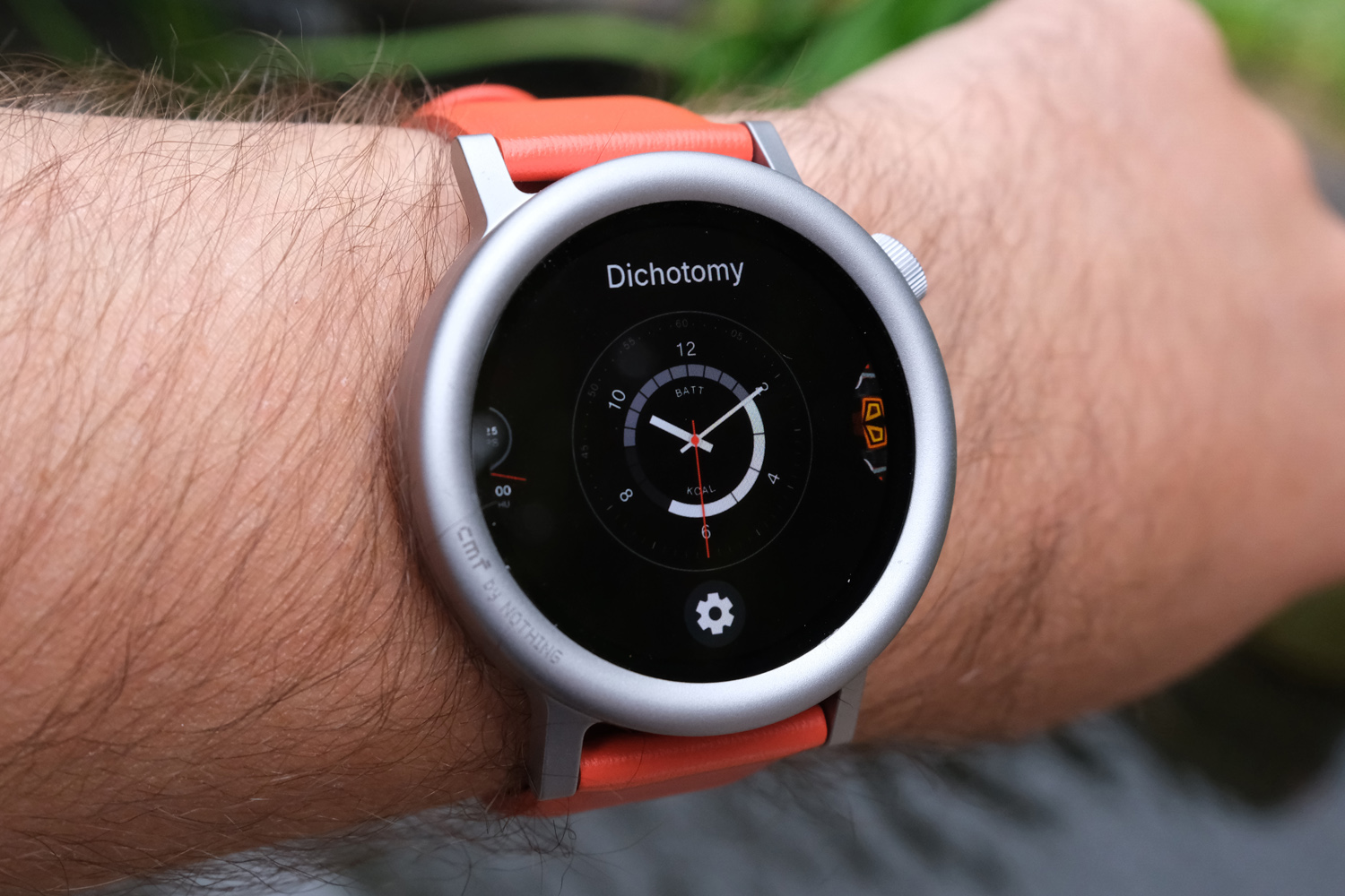
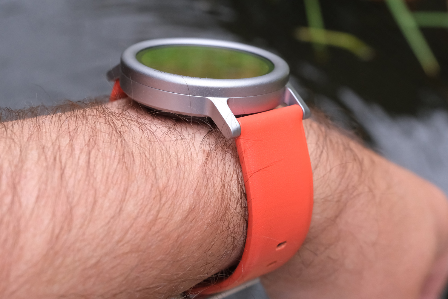
It’s smaller, sure, but a 466×466 resolution means the Watch Pro 2’s circular AMOLED looks even sharper and more defined than the original model’s square one. And that was already punching higher than the budget wearable average for clarity.
The minimal watch interface and heavy use of black UI elements help hide the display bezels, which aren’t all that big anyway. I certainly think they’re subtler than a Google Pixel Watch 2’s. Touch responsiveness is excellent, and it got bright enough that I could clearly read the screen while outdoors on sunny days. What few colours are used look suitably impactful.
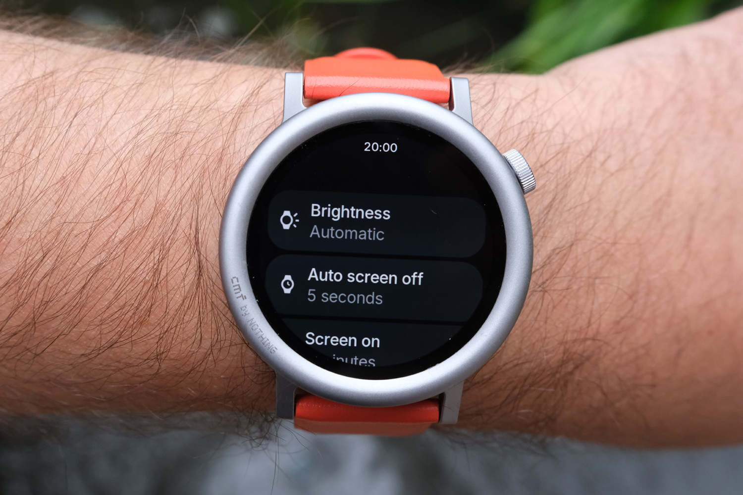
It helps that automatic brightness, which was missing in action on the original CMF Watch Pro, finally makes the cut here. It’s not the quickest to respond to changing lighting conditions, but still an improvement on having to change it manually every time.
There’s an always-on display mode, which is just about legible on sunny days. You do give up quite a bit of battery life to activate it, though. I preferred to use raise-to-wake, which near enough activates the screen by the time you’ve raised your arm up to look at the watch.
Interface: clean and comprehensive
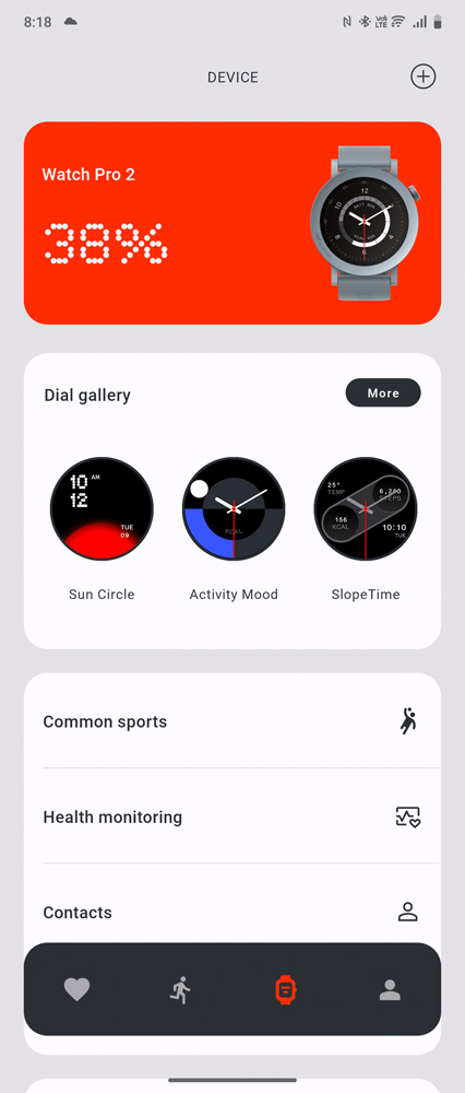
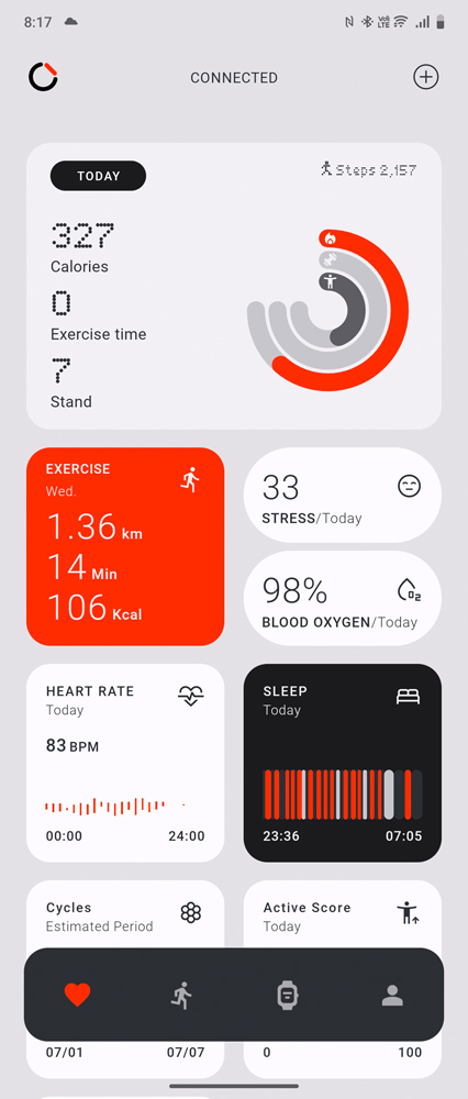
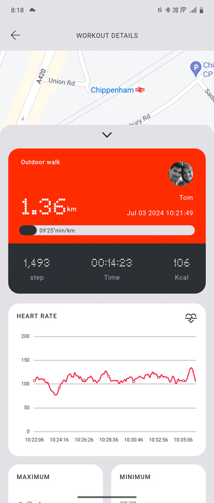

Other than a reshaped app list and slightly tweaked watch faces that better fill the circular screen, Nothing’s bespoke wearable UI hasn’t really changed that much between generations. It’s simple stuff, with a swipe up for notifications, down for quick controls, or left and right to scroll through widgets. Pressing the crown opens the app list; pressing it again returns to the main watch face.
This is about as clean as a wearable interface gets. Each brilliantly simple widget conveys plenty of information with just a few lines, and there are plenty to pick from. The smartphone companion app is similarly pared back.
The first CMF Watch Pro wasn’t the best at staying connected to your phone, which meant notifications would often stop flashing up on your wrist. In my week of testing, I’m happy to see Nothing has fixed those issues for the sequel. Watch and phone stayed in constant contact, with notifications coming through instantly. It still can’t show photos from Whatsapp messages, and it renders certain text characters as black boxes, but that’s true of other third-party wearables that cost considerably more.
Whatever the underlying chipset might be (Nothing won’t reveal the exact hardware) there’s ample oomph for a perfectly smooth user experience. Swipes and taps are detected instantly, animations look smooth and each app or feature opens very quickly. There’s zero giveaway this is a budget wearable.
My only issue was with gesture controls, which wouldn’t play ball during my testing. A shake or quick twist of the wrist is meant to be able to trigger an action of your choosing – but neither would get past the tutorial explaining how to activate them. A firmware update may be in order here.
I was genuinely surprised at how many other features Nothing has included here. It might not be able to make contactless payments, but it can activate your phone’s voice assistant, trigger its camera shutter, and make or receive phone calls using a built-in speaker and microphone. Keep in mind there’s no app store, though, so what you see is what you get.
Health & fitness: nails the essentials
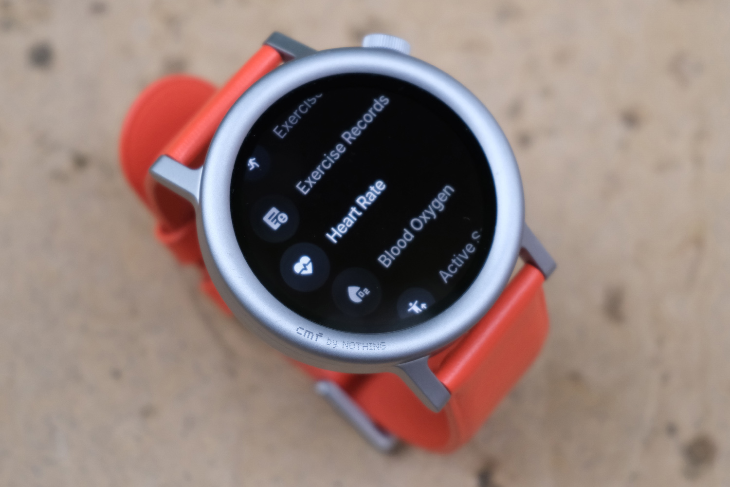

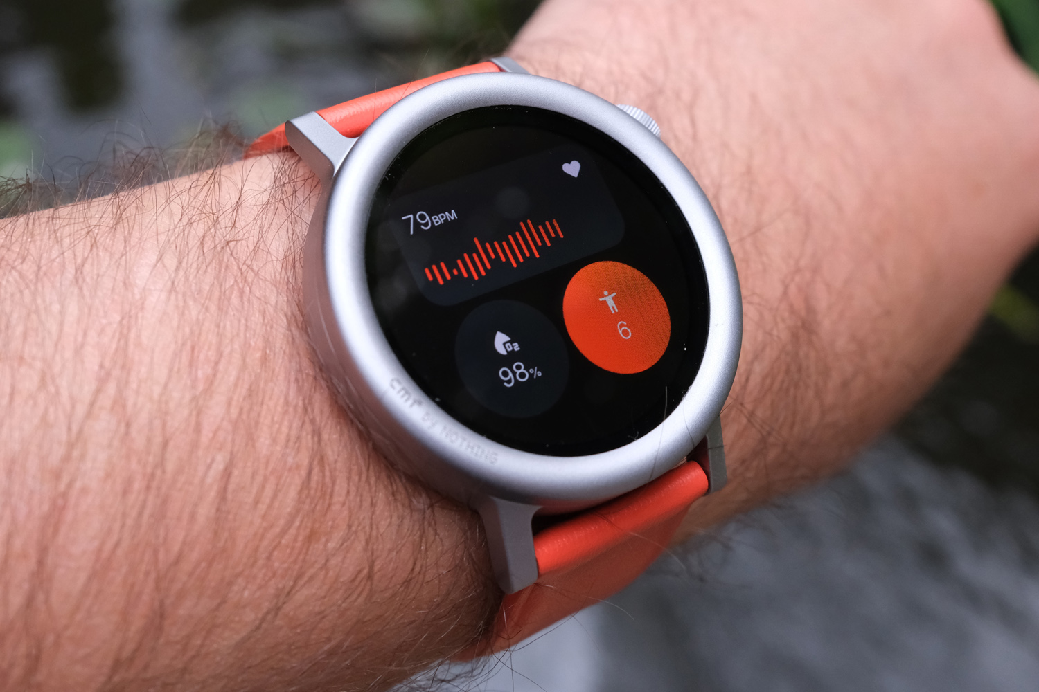
As well as standard stuff like step and sleep tracking, the CMF Watch Pro 2 continuously tracks your pulse, blood oxygen and stress levels through an optical heart rate sensor. It does the top level stuff very well, and largely stayed in step with a pricier sports watches for 24/7 measurements.
You can dig a little deeper into tracked activities on the watch itself, but the phone app is more comprehensive. There’s not the granular info you’ll get from a proper running watch, so serious athletes might still find it a bit basic, but more casual fitness fans have lots to like here.
There’s also GPS on-board; it works with the five main location tracking satellite systems, but is only a single-band receiver. It’s not super quick to get a location lock, and can’t match the best sports watches for accuracy, often placing me on the wrong side of the road – or in the middle of buildings – on my preferred running route. A two or three metre variance is still a great showing given the price, though.
Menstrual tracking is new, and I’m sure it’ll be a welcome addition for half of Nothing’s customer base – but given the initial setup process asks for your gender, I’m surprised there’s no option to hide it from the app list for those who have no use for it.
Battery life: week-long wonder
With a power-sipping OS designed with simplicity in mind, you’d better believe the CMF Watch Pro 2 is in it for the long haul. Nothing claims 11 days per charge, or nine with ‘heavy use’.
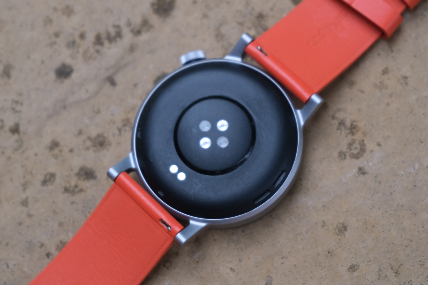
My testing, which used 24/7 heart rate monitoring, about 30 minutes of tracked exercise a day and the always-on display mode, saw closer to seven. That’s still a very solid showing, and four or so days longer than the best Apple Watch or Samsung Galaxy Watch can manage. A full charge takes just under two hours using the proprietary cable, which magnetically grips its charging pins onto the rear of the Watch.
There’s a power saving mode that can apparently stretch a single charge to a huge 45 days, though it essentially strips the watch of all of its smart features. I only really reached for it when running very low on power in the normal mode, to tide me over until I got home.
CMF Watch Pro 2 verdict
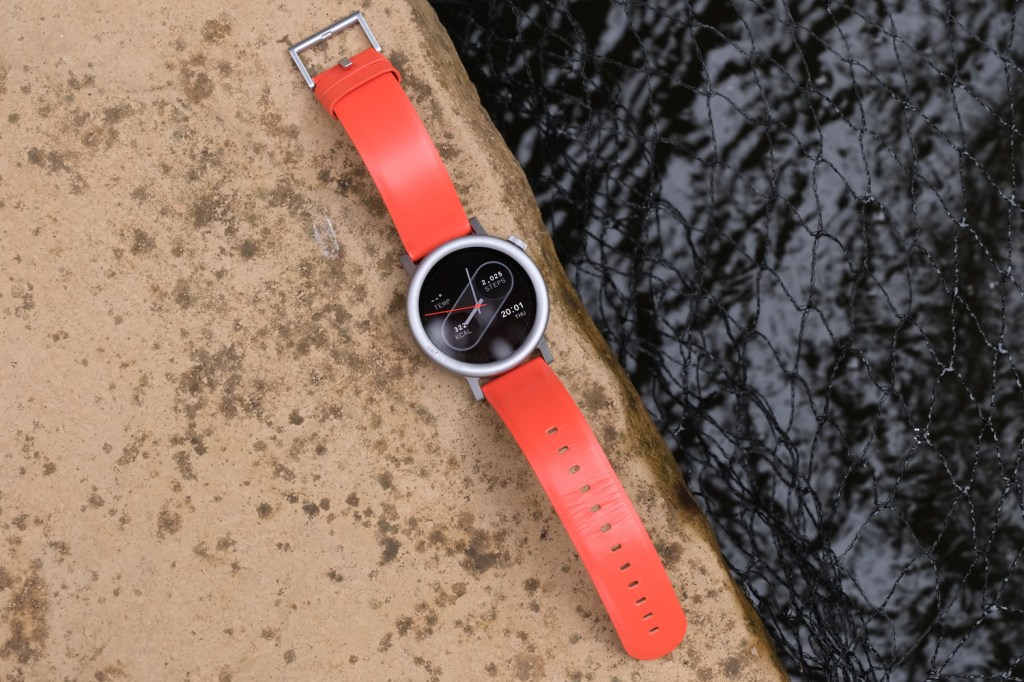
Nothing could’ve just refreshed its first smartwatch with a few nice-to-haves and called it a day, but the CMF Watch Pro 2 is a much more thorough reimagining. It no longer looks like an Apple Watch wannabe, and the swappable bezels are a great way to mix up the looks whenever you fancy.
Swimmers aren’t catered for, and it can’t compete with top smartwatches or fitness watches for features – but then it’s not trying to. This £69 wearable nails the basics, while comfortably delivering week-long battery life and enough fitness smarts to keep most of us happy. And if you need more than that, be prepared to spend considerably more cash.
Stuff Says…
With streamlined looks and a slick UI, the CMF Watch Pro 2 proves budget smartwatches don’t have to be basic. More fully-featured rivals come at a hefty premium.
Pros
Covers all the smartwatch basics
Easily lasts an entire week on a charge
Fresh new look that can be easily customised
Cons
Bad stuff 1
Bad stuff 2
CMF Watch Pro 2 technical specifications
| Screen | 1.32in 466×466 circular AMOLED |
| CPU | Not stated |
| Memory | Not stated |
| Durability | IP68 |
| Storage | Not user-accessible |
| Operating system | Proprietary |
| Battery | 305mAh, 11 days typical use |
| Dimensions | 57x51x19mm, 48g |

