App of the week: Paper review
FiftyThree’s sketching tool tears up its history, evolves into something new and brilliant, and gives Apple’s Notes a bloody nose

For a time, Paper was a beautiful digital sketching tool, seemingly designed for hipsters.
You’d scribble on your iPad, possibly using a stylus while wondering whether to silently apologise to Steve Jobs. Your little doodles would then be housed in quirky little journals that could be flicked through in a pleasingly tactile way. It was all rather elegant and simple.
This major Paper revamp appears designed to annoy just about everyone who loved the original app. It has ditched the journals and introduced a slew of new features. In doing this, it’s is a much better app.
Not just sketchy

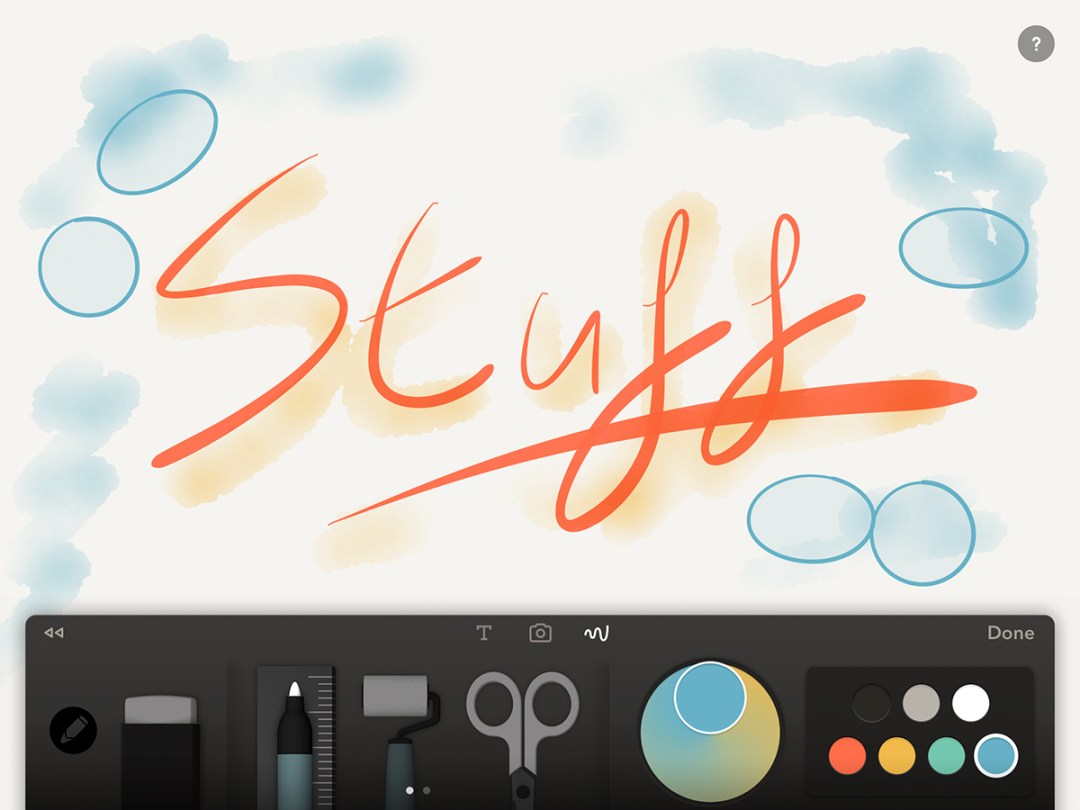
For fans having a massive freak-out, don’t worry: all the sketching goodness remains. You get the original brushes and pen tools, and they still work brilliantly. Paper therefore remains a first-rate app for getting quick ideas down and then dabbing virtual watercolours around your digital pen lines. Pushed, we’d still head to Procreate for more complex illustration, but Paper’s great for everything else.
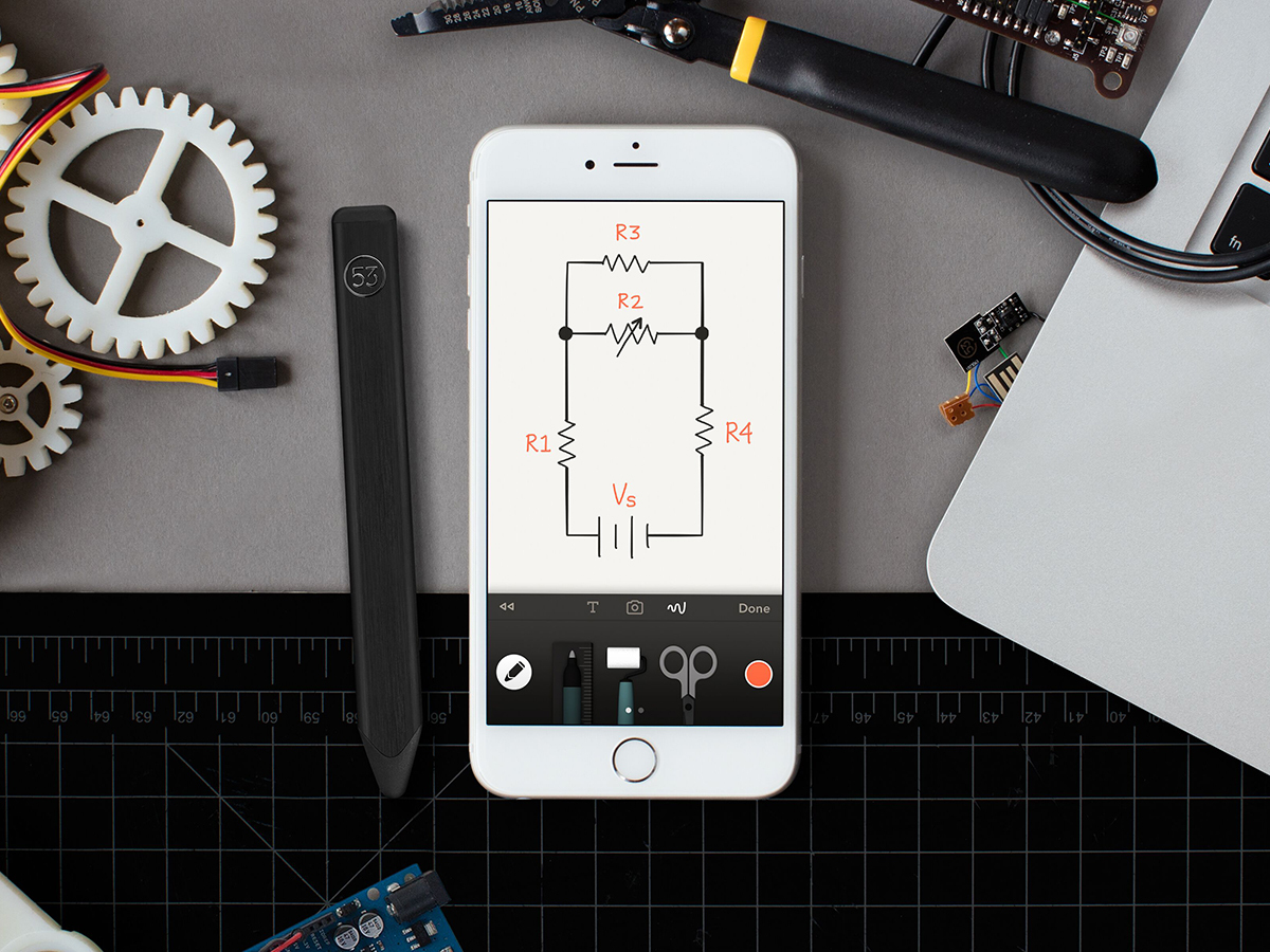
And now so much more has been added to the mix. You get a diagram pen, which tidies up your straight lines and regular shapes, but — cleverly — without eradicating the character from your strokes. This means it looks like you drew that almost perfect circle, when your ham-fisted squiggle initially in fact resembled a path taken by a drunk tethered to a swingball pole. This is superb for diagrams and, briefly, showing off.
iOS Cheapskate › The 35 best free apps for iPhone and iPad
A pretty picture

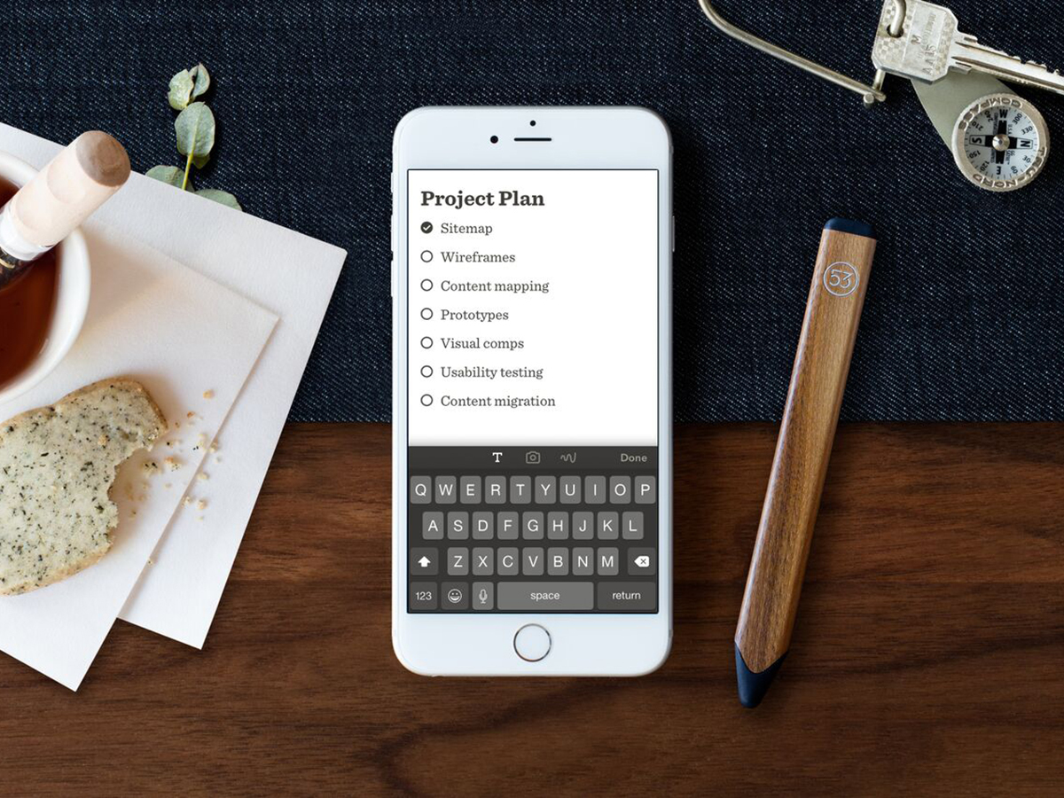
Paper now accepts photo imports, too; you can effortlessly spotlight an area, before adding annotations. You can also create text notes, using a system of swipes to format your words. Swipe left and you get a heading and then a bigger heading; swipe right and you get a checklist and then a bullet point. It’s so graceful, you’ll think the system was designed by a swan seriously into tai chi.
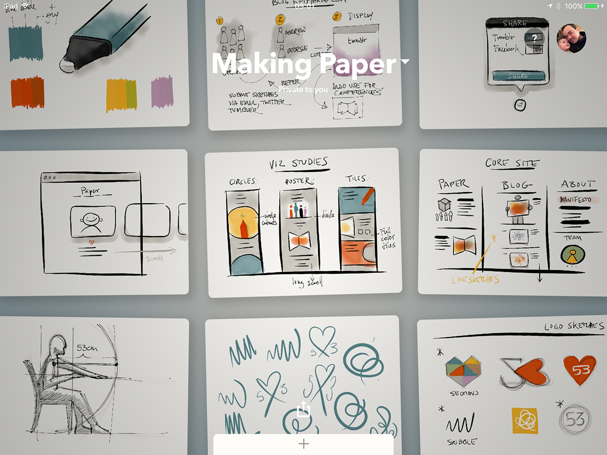
The other big change to Paper is where your notes are housed. Instead of journals, you get ‘spaces’ comprising piles of paper. Tap one and the sheets explode into a grid of sticky notes. These can be rearranged by drag and drop, and exported to a presentation, set of images, or PDF.
We’ve seen people whinging that their beloved journals are gone. But things change. Get over it. And we’d sooner quickly scan a virtual wall of post-its than laboriously thumb through yet another digital journal, trying to find that amazing sketch we did eight months ago.
Small is beautiful

The final triumph of this revamped Paper is its appearance on iPhone. We tried it on an iPhone 5s (as in, that one clinging on in Apple’s line-up) and it proved to be a pretty good experience. Sure, everything was a touch cramped, and we missed the iPad’s larger canvas. But the tools worked perfectly well; the app was responsive; and the new interface ideas translated across without any problems.
The only obvious downside to Paper, besides the app lacking any real smarts regarding palm detection, is the omission of cross-device sync. This is coming, according to the devs, but it’s a pity there’s no way to easily get at your current notes and edits on multiple devices. Of course, Apple’s Notes can do this, and in iOS 9 boasts new sketching tools, some of which look suspiciously like Paper’s.
Use Apple’s app after FiftyThree’s, and the one from Cupertino feels like a half-baked rip-off. We’ll stick with the revamped original, thanks.
Download Paper (£free) for iOS here
Appy Android › The 35 best free apps for Android
Stuff Says…
A superb note-taking app and a courageous and successful update. And it’s free, which is clearly bonkers.
Good Stuff
Superb new toolset
Superior browsing model
Now available for iPhone
Fast and efficient
Bad Stuff
No cross-device sync (yet)
Seemingly no palm detection


