Apple iOS 8 review
Our fingers dance all over iOS 8 to see if it's Apple's best mobile experience yet
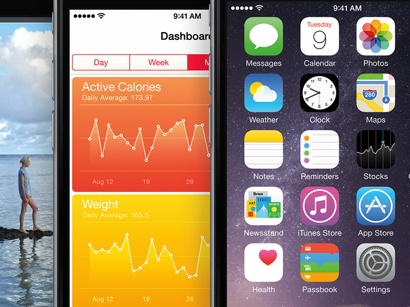
Software has a tendency to move in cycles. One major revision will dazzle in screen grabs, and the next will make a load of changes that aren’t immediately apparent, but could nonetheless be what revolutionise things for users. Last year’s iOS 7 was geared quite heavily towards the former, but iOS 8 is very much in the latter camp.
This revamp provides an inevitable slew of new features, but many of them are about carefully and methodically opening up iOS in a manner no-one thought would ever come from Apple. The result is an operating system that looks largely identical to its predecessor, but that boasts huge scope for powerful apps and workflows through newfound extensibility and flexibility.
READ MORE: How to back up your iPhone and iPad before you install iOS 8
Visual appeal
From a visual standpoint, little has changed. iOS remains very much tied to Apple design head Jony Ive’s vision of minimalism, trying to do in software what Apple tooling does for hardware.
It’s stark, a touch over-serious, overtly content-first, and of variable success in terms of graphic design, layout, typography and usability. Occasionally, this approach stumbles, not least with its over-emphasis on text-only buttons that are frequently indistinct or not obviously points of action; an accessibility control to add button borders is seemingly disgusted at any possible alternative, revealing one of the ugliest pieces of interface design Apple’s ever created.
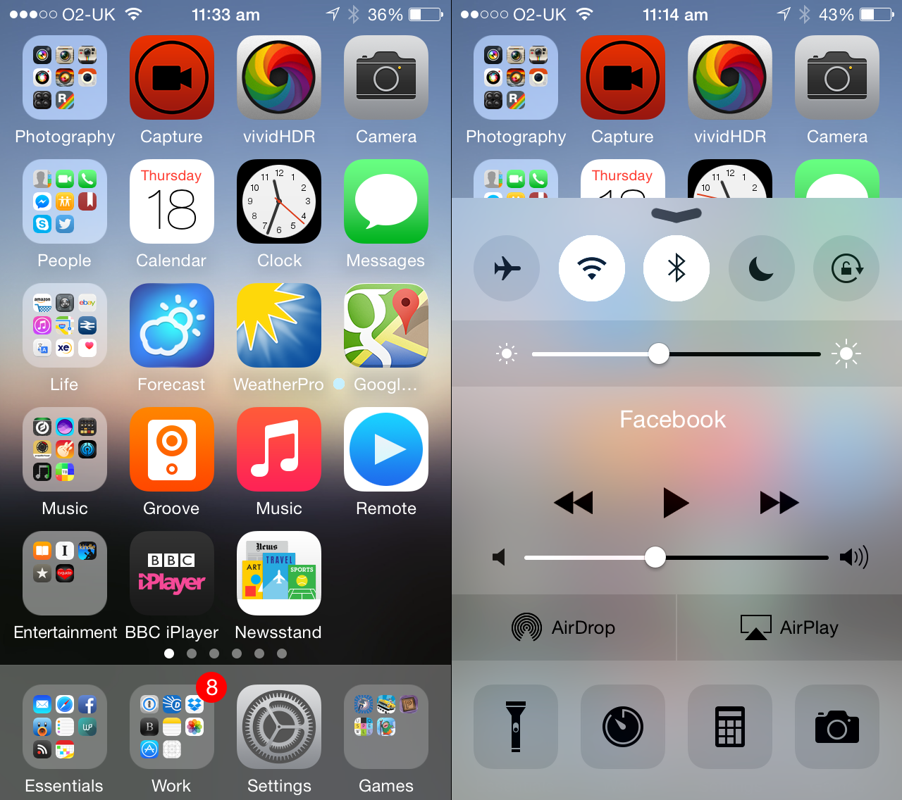
However, just as iOS 7’s updates toned down the worst excesses of this radical departure from iOS’s past, so too does this update make much-needed refinements. The best example is the subtle redesign of Control Center, which ditches spindly indistinct icons on button outlines for bolder glyphs and solid backgrounds. Usability is further enhanced by dialling down the transparency behind the content and providing a preview of how your display will look as the brightness bar is adjusted.
Similar touches are evident throughout this update. If you hated iOS 7, iOS 8 won’t convert you; but if aspects of it merely nagged, the changes here might be enough to stop you pining for the days of linen textures and glossy buttons.
READ MORE: iCheapskate: 38 amazing free games for iPad and iPhone
Extensibility

Really, though, the most exciting aspect of any operating system is what you can do with it. To date, iOS has been locked down, making it relatively intuitive but also inflexible. People had to leap through hoops in an absurd manner to perform relatively simple tasks, such as editing a document in multiple apps, or even sharing content to a preferred service.
With iOS 8, you get the opportunity to swap out keyboards, add widgets (sort of), massively boost sharing and inter-app communications, work with third-party filters inside Apple’s Photos app, and use apps that work with Touch ID for fingerprint authentication.
The last of those is a Godsend for the likes of 1Password, but also has applications elsewhere. Amazon’s iOS app has already integrated Touch ID support, and it’s likely to become something of a staple on supported devices, if not specifically for passwords then for two-factor validation.
As before, Touch ID is divorced from iCloud, with your data living in obfuscated form on your device’s A7 or A8 chip. Developers cannot access your data, because iOS does all the to-and-fro itself. In combination with a robust password system (either Apple’s iCloud Keychain or the aforementioned 1Password), Touch ID stands to revolutionise on-device security for iOS device owners.
READ MORE: Apple iPhone 6 review
Keyboards in iOS 8
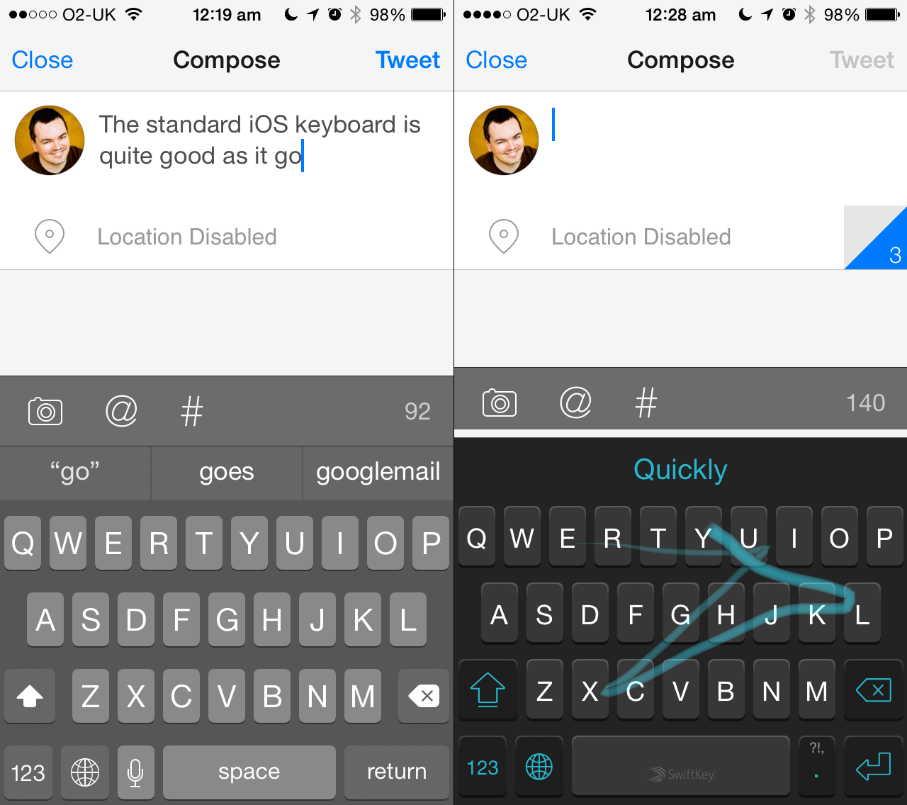
Keyboards in iOS are now hot-swappable, although it’s first worth playing around with the revamped default, which implements a system called QuickType. This heavily resembles many Android keyboards, adding three predictive words above the keyboard that you can stab at to speed things along.
What Apple has done very well is create a keyboard that attempts to adapt not only to what you write but where you write it, offering predictions based on existing content and style. The predictions bar can be removed if you don’t use it or feel it takes up too much screen space, although you won’t want to. Oddly, autocorrect appeared to be less reliable in this initial build of iOS 8, though, slightly hampering any boost in typing speed.
Alternative keyboards are installed from the App Store like any other third-party app, and awkwardly activated in the Settings app. You switch between them using the keyboard’s globe button. The likes of SwiftKey work as you’d expect, finally bringing crazed swipey ‘typing’ to iOS; however, swappable keyboards have enabled more ambitious products to finally make sense on iOS, such as text-expansion utility TextExpander.
Previously reliant on apps specifically supporting it, the app now gets the opportunity to work system-wide by being a keyboard. It’s also worth noting that Apple’s privacy stance impacts on third-party keyboards, banning them by default from internet access and disabling them when typing in secure password fields. Given concerns surrounding online security, this is an acceptable compromise.
READ MORE: SwiftKey for iOS revealed
Widgets
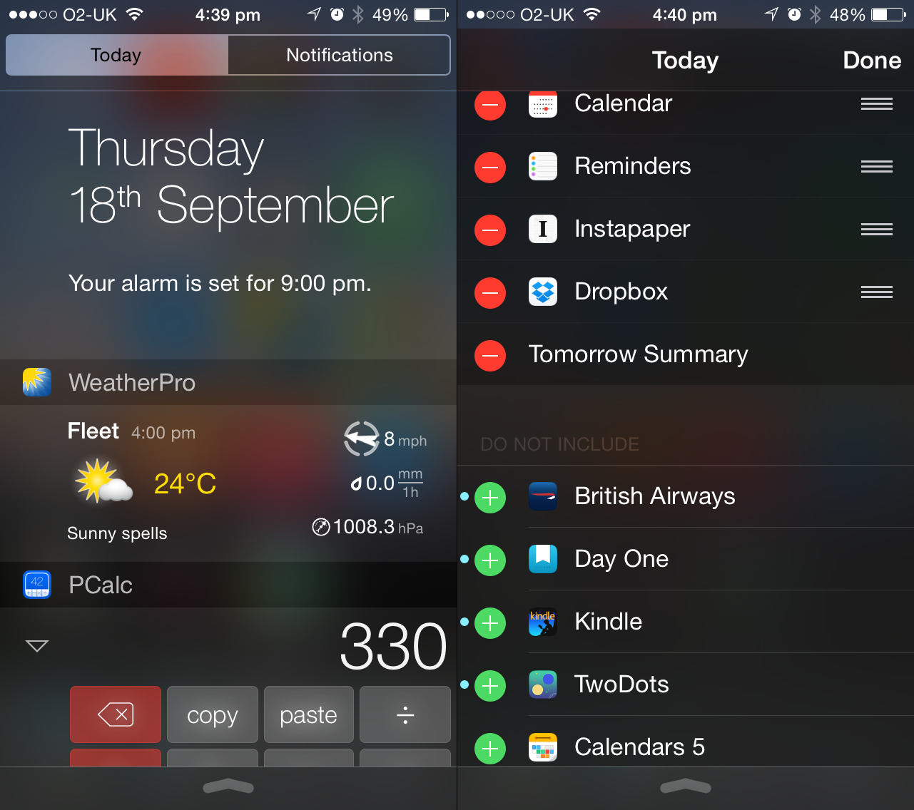
Anyone hoping Apple would upend the Home screen and enable Android-style widgets will be disappointed in iOS 8 siloing equivalents within Notifications Center. However, in use this proves to be an elegant means of providing at-a-glance information, without messing up or replacing uncomplicated existing app launcher Home screens.
Naturally, Apple provides its own widgets for the revamped Today view, but third-party apps are already muscling in on this territory, rolling in widgets as part of ongoing updates: for example, Weather Pro offers the day’s forecast; Dropbox gives you links to recently edited documents; and PCalc offers you an entire calculator.
The system’s single-column, strictly linear design doesn’t feel especially scalable — it’s not going to be much use for maybe more than ten widgets; however, Apple makes it easy to edit your selection, and given that widgets are supposed to be an efficiency aid, keeping their numbers down is no bad thing.
READ MORE: Apple iPhone 6 Plus review
Sharing
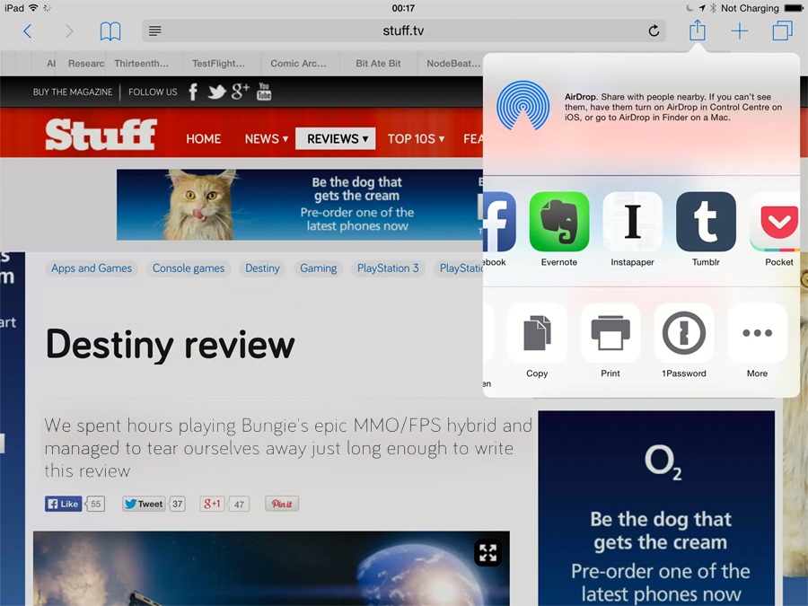
Extensions in iOS come in two flavours: sharing and actions. Both are now available to third-party apps and services, and its implementation finally gives Android users one less string to their Apple-snubbing bow.
Installing a compatible app is enough to make it available to the iOS Share sheet, where it lurks behind a More button until activated. Once active, it will appear by default in the Share sheet system-wide.
The current implementation of extensions upends how certain tasks are dealt with on iOS, even if there’s a whopper of a bug lurking.
The bug in question involves the custom ordering of the sharing and actions lists frequently failing to stick. Presumably, this will be dealt with in an update, and it’s easy to forgive once you start sharing from Safari to Instapaper, unlocking apps using 1Password, uploading images from Photos to social networks, and so on.
Actions are context-sensitive, meaning options only appear when relevant, and the system at the very least means less frustrating hopping between a bunch of apps to get things done.
READ MORE: The 25 best iPhone and iPad games you can play right now
Photos and Camera

The Photos app looks little changed, but is a very different beast from its predecessor. First, the editing tools have been significantly beefed up, in part because iPhoto for iOS has been canned. Rotation can now be arbitrary, and there’s more control over colour and light.
The app retains a small, reasonably impressive selection of filters, but these are now significantly boosted by third-party integrated photo extensions. When editing, compatible apps are listed via a nondescript circular button with an ellipses, and they essentially inject their capabilities directly into Photos. This means you can apply filters from the likes of Halftone 2 or VSCO Cam inside Photos, and the edits remain non-destructive.
The other main change to Photos concerns image storage, and Apple’s at a transitionary point regarding Photo Stream. The company’s long-term plan is to save your entire image library in iCloud Photo Library, currently in beta. Edits will be synchronised across devices, and your library will be searchable, but the system requires you to splash out on the requisite amount of iCloud storage. At present, the old-style Photo Stream remains, although frustratingly there’s no longer a specific album housing its images — instead, you must fish around in ‘Recently Added’.
For taking your photos, Camera gets some minor but welcome updates: manual exposure controls, a delay timer, panoramas on iPad, and a fun time-lapse mode that stitches images together into videos. It’s unlikely these changes will wrench anyone from high-end third-party apps, but they’re enough to ditch the more simple Camera alternatives.
READ MORE: Android L preview
Apps: Mail, Messages and more

There are four new permanent apps as of iOS 8: Podcasts, iBooks, Tips and Health. The first two are no different from their older App Store versions. Tips could have been useful (Apple hates manuals), but merely provides you with, on launch, nine tips (well, we did say Apple hates manuals).
Health is a much bigger deal, serving as the hub for data provided by your iPhone, and any compatible apps and accessories. The idea is to give you a sense of how you’re progressing with exercise and activity, but also to make it frictionless to shift between apps, rather than feeling forced to stick with one because it has your data in its silo. On launch, however, this part of iOS was broken and temporarily off-limits to third-party developers; also, iPad owners aren’t invited to the party, even purely for accessing their data.
Many existing apps have had minor updates. Mail has new gestures and can stash multiple drafts at the foot of the screen, or allow you to peek behind a message you’re writing. The drafts system is a mite fiddly, but nonetheless an improvement on iOS 7; the gestural controls are entirely hidden, but great once ingrained into your muscle memory.
Messages adds controls for muting or leaving conversations, recording audio, and rapidly adding images from your photos or camera. The new features are nice enough, but can’t get around Messages being an Apple-only solution and also one that has a tendency to not sync correctly across devices.
Elsewhere, Safari gets accordion-like tabs on iPad and DuckDuckGo as a search engine option; there’s also an attempt to shift into smart-searching, using abbreviations, but it fared poorly during testing. App Store on iPhone has vertical scrolling search results on iPhone and purchased app hiding on iPad. Notes gets rich-text formatting, finally transforming it into a half-decent text editor. And Siri gets voice-activation when your device is plugged in.
Spotlight
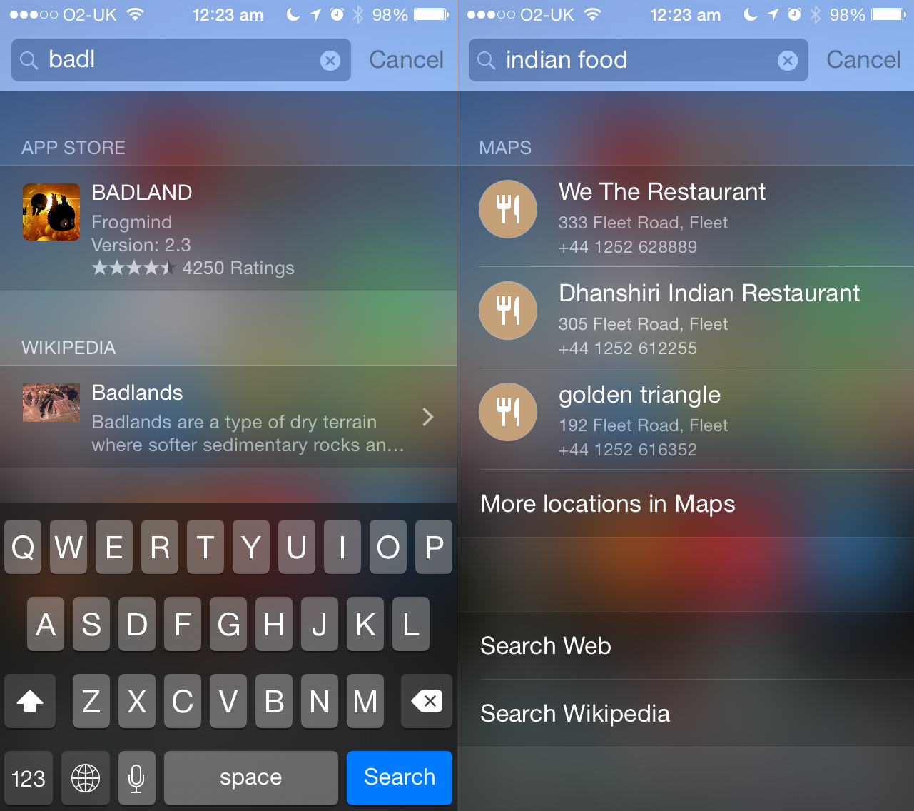
Apple’s system-wide search remains a bit too sluggish to be truly usable, frequently offering new search results just as you go to tap something. However, rather than pare it down in Settings to just showing apps, it’s also worth leaving Spotlight Suggestions and Bing Web Results active as well. The two combine to turn Spotlight into a much more useful tool that provides in-context web searches.
For example, type in the name of a band and you’ll get a link to the artist on iTunes, an album and the Wikipedia entry. Type in an app, service or game name and you’ll likely get the App Store link. You can also do searches for terms that will then list relevant websites or places. Although many of the results of course channel you straight to Apple’s own store, it’s pretty convent to type ‘indian food’ into Spotlight and immediately get the name and phone number of a trio of local restaurants.
Bubbling under
A few of iOS 8’s biggest features aren’t quite ready for prime-time, but warrant mentioning. HomeKit aims to do for automated home gadgets what HealthKit does for health, giving you a hub for configuring and controlling the ‘internet of things’ within your home, shortly before they turn sentient and take over. Homes comprise rooms (that can be grouped into Zones) that contain Accessories that perform Services, which can have Characteristics. The thinking is you could waggle your device and have you entire house sort itself for night, locking doors, dimming lights and adjusting air temperature. The reality is this is a solution awaiting compatible hardware to become ubiquitous. One for the future, perhaps.
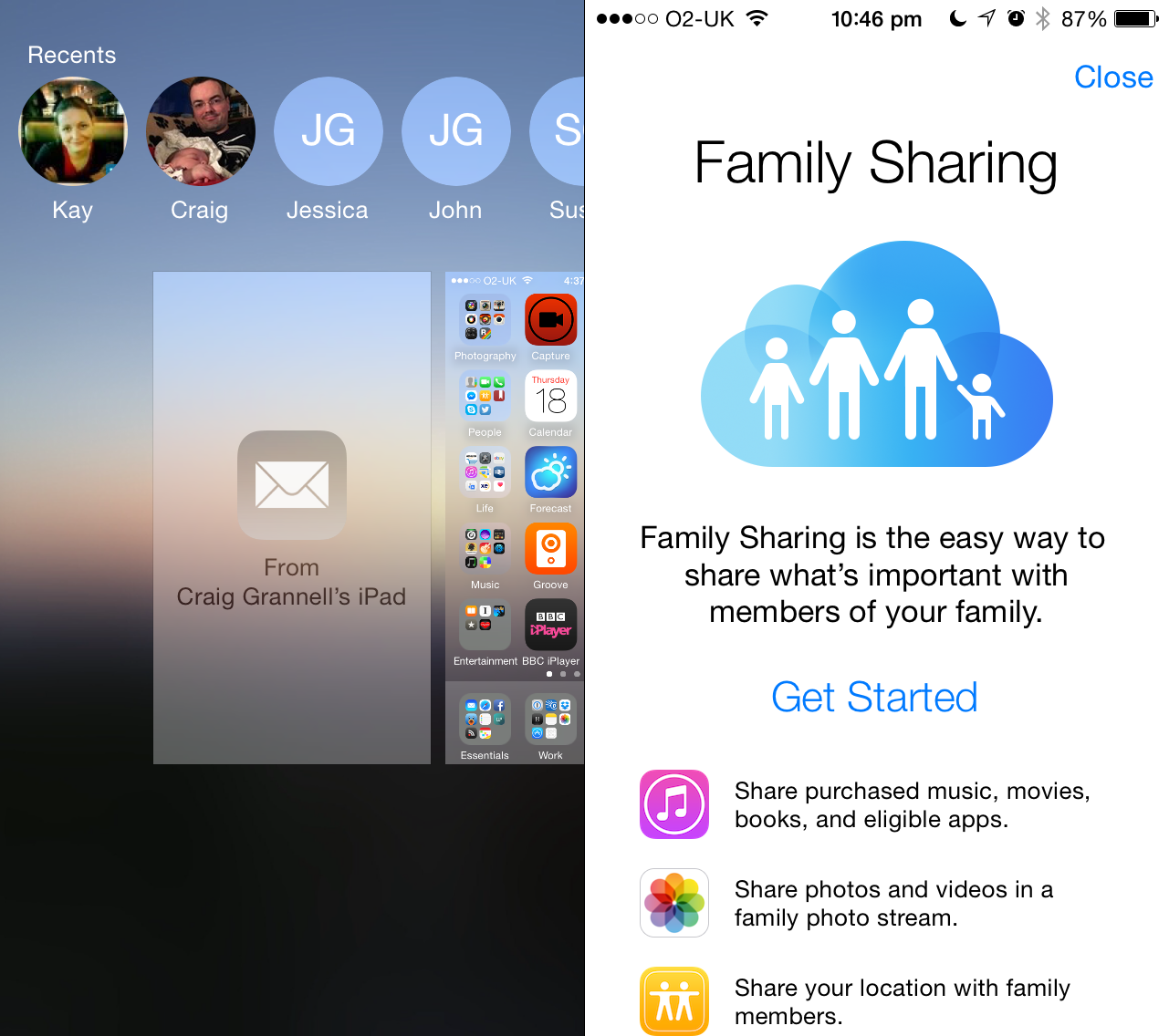
Continuity and iCloud Drive are more imminent. The former is designed to enable workflows to seamlessly transition between Apple devices, enabling you, to for example, start replying to an email on your iPhone and then fling it across to your iPad, or answer an iPhone call on your Mac. The Mac side of things is awaiting OS X support (which will arrive with OS X Yosemite this autumn), but already works on iOS. During testing, we managed to send half-written emails successfully between an iPad and iPhone, doing the transfer via the lock screen. It’s also possible to use the app switcher, although that didn’t fare well during testing, the relevant button frequently vanishing.
Family Sharing is another feature that will need time to bed in before we can properly assess it. It’s designed to allow a family of up to six to share content bought on a single card, with children under 13 having to ask permission when making purchases. Apps are automatically shared and publishers of other media can opt-in. Additional benefits include a shared photo album, a shared calendar, and unified Find my Friends and Find my iPhone. Set-up is reasonably simple (even if adults may find it awkward for all purchases to be on one card), although there’s a curious restriction on only being able to start or join Family Sharing twice in any one year, so watch out for that.
READ MORE: Apple OS X Yosemite hands-on review
Verdict
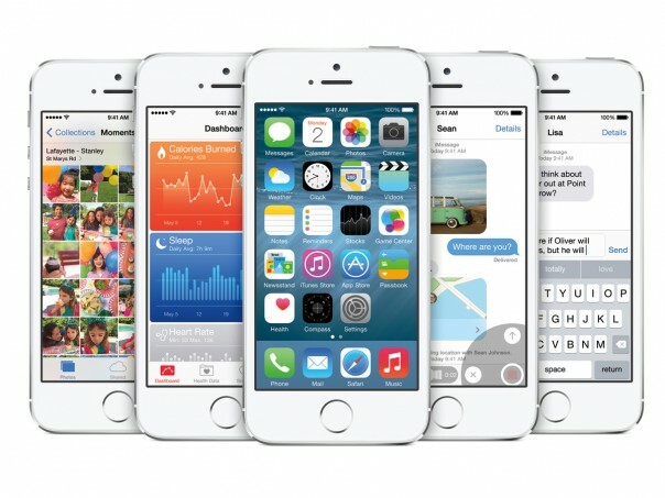
The word that most sums up iOS 8 is ‘potential’. It lays the foundation for iPhones and iPads to become significantly more powerful devices: hubs of health and home automation; powerful pocketable computers for all kinds of advanced tasks and workflows; and a means to access, edit and share a life of captured images. Right now, some of these things are already barrelling along, with apps taking advantage of extensibility features; others, like HealthKit and HomeKit, are just at the start of their lives.
The OS, too, feels like a mixed bag. It’s a lot more stable than iOS 7 was on release, and feels pretty robust during use, but it’s also very buggy. Spotlight simply stopped working during testing on a number of occasions, and layout bugs frequently cropped up on the iPad. Performance-wise, the OS seemed fine on our iPhone 5s and iPad Air, although Ars Technica has suggested iPhone 4s owners should proceed with caution. That device lacks the power and screen size to comfortably deal with the new OS and also doesn’t get Continuity or AirDrop.
Despite the bugs, the advantages iOS 8 brings make it worth upgrading to unless you only use your iPhone or iPad for the most basic of tasks. The new capabilities unlocked through extensions alone could transform the way you use your device for the better, and the many small changes combine to make an impressive update to what was already a solid mobile operating system.
Stay tuned for an updated review once all of iOS 8’s features are live.
READ MORE: Apple Watch hands-on review


