Apple iOS 9 review
Face it: you're going to upgrade anyway, so maybe reading up on Apple's new OS might be a good idea?

This will not be your normal, run-of-the-mill review. In normal reviews, the product’s fully cooked, to the point where you can fairly evaluate every aspect of what the New Thing does.
Since this is a review of iOS 9, we’ll all need to wait a little while: it now transpires that we won’t be able to play with its star feature – 3D Touch – until the new iPhone 6s and 6s Plus reach UK stores on September 26.
For now, let’s call this review a work in progress: be sure that we’ll update it as soon as a 6s lands in the Stuff offices in a few weeks. That said, we have spent a full week testing it now on our iPhone 6 Plus 64GB. That’s enough time to know whether iOS 9 is a serious leap forward for the smartphone experience, or conservative refinement of an already successful OS. There’s certainly enough new stuff in iOS 9 to warrant anticipation among Apple followers – albeit some of it will be hidden under the hood for owners of pre-iPhone 6s devices.
Apple claims to have pulled off a trick that evades most upgrades in real-world usage: improved battery life (up to an hour more, they say, from a single charge) and snappier performance.
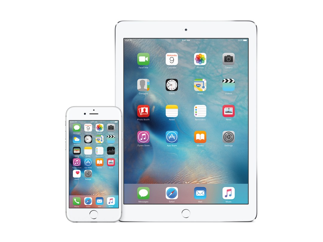
Even if you’re not upgrading to the new hardware, you’ll see above-the-hood changes from the iOS 9 update – the new Siri Suggests search screen (to the left of the main home screen, prompting parallels with Google Now), a new default font, hefty updates to several Apple apps and the arrival of Apple News.
The experience: iOS learns the search game

Truth is, most people upgrading to iOS 9 won’t notice a ton of difference. You will still, mostly, have the iOS interface you’ve known, loved – and occasionally been irritated by – for years.
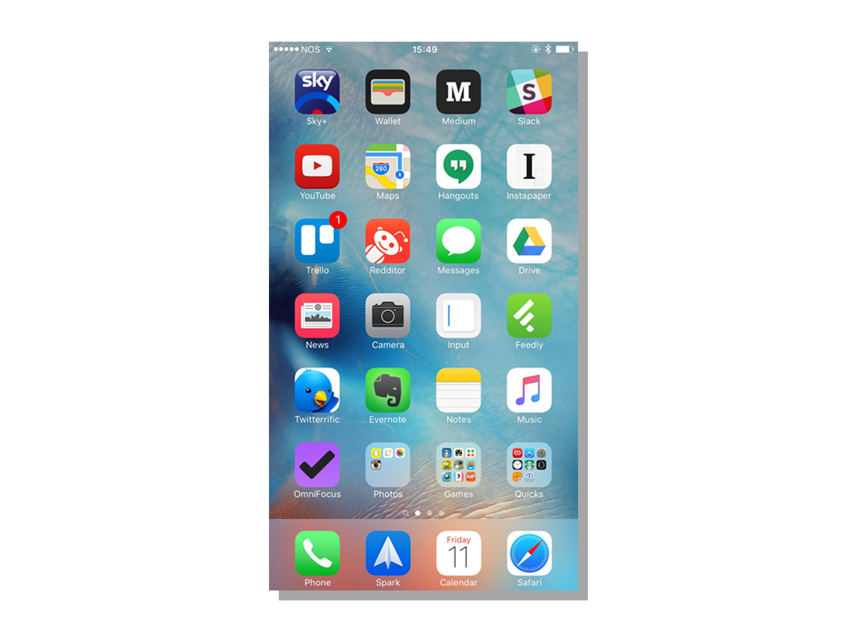
No, you will not be able to move the icons to any point on any home screen (as you can on Android). No, you will not be able to pop widgets on to any point on any screen (as you can Android). It was iOS, and it’s still iOS.
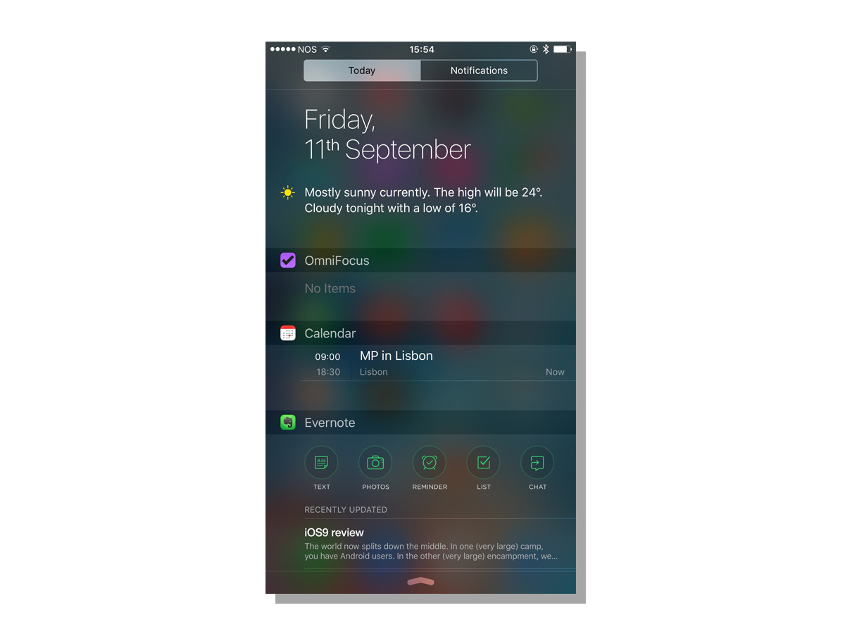
But unlike previous iterations, there’s one enormous difference. Swipe to the left from your normal home screen, and there’s a Siri Suggestions screen. By Apple standards, this is a revolution on the scale of the fall of the Berlin Wall. A whole new screen. And you can’t put icons on to it. Lord save us.
Time will tell just how useful the world’s iPhone lovers find Siri Suggestions. The good news is that it’s nicely designed, and works. If you want to find something fast, type or talk and it finds it (as long as it’s an Apple native app, or a third-party app that has been updated for iOS 9 compatibility). And if you want a shortcut to a commonly used contact or app, it’s right there on the new screen.
Apple claims that the intelligence built into iOS 9 will learn your habits, and change the apps and contacts shown on the Suggestions screen to meet your needs. I can only guess that a week isn’t long enough to have trained the new system, or that my app usage is narrow and entirely predictable – either way, those apps have yet to change enough to suggest some magical predictive brain behind the scenes.

Elsewhere, you’ll notice that your beloved iPhone is subtly prettier – thanks to the new San Francisco font and some updated app icons – and a little easier to use. You can now switch back to a previous app, thanks to a new breadcrumb that appears at the top of the screen – no more closing and opening.

