Apple iPad Pro 11 (2018) review
The best iPad ever – and then some
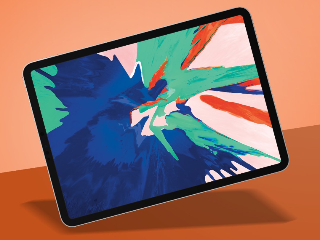
Apple reckons the new iPad Pro is the device’s biggest shake-up since the original – and it has a point. There’s no Home button. It’s got a swanky ‘all screen’ design. And it has the kind of powerful innards that have notebooks glancing nervously at each other.
The question is whether it’s worth punching your wallet in the face to buy one. If you’re already a regular and happy iPad user, you probably already know the answer; but if you’re new to the tablet game, what Apple’s cooked up might surprise you.
Design: it’s got edge
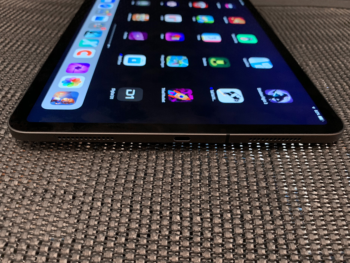
The new iPad Pro remains a slab of glass and metal, but nonetheless feels a bit radical. The new stylings look expensive, and recall the iPhone 5 (aka Stuff’s favourite iPhone). Initially, I questioned how these edges would feel compared to the curved backs of older iPads.
It turns out the new iPads feel great in the hand, even when used over an extended period of time. Weight (or rather a lack thereof) is a factor in that. The new 11in iPad Pro essentially matches the 10.5in iPad Pro at 468g. The 12.9in model has a smaller frame than its predecessor, and at 631g even manages to be 50g lighter than the original iPad.
The new design is also balanced when it comes to the screen. The bezel is even on each side, and the display’s curves mirror those of the device’s frame – an arguably bigger feat than with the iPhone XR‘s LCD. It makes the 10.5in model look comparatively archaic.
Display and sound: screen time
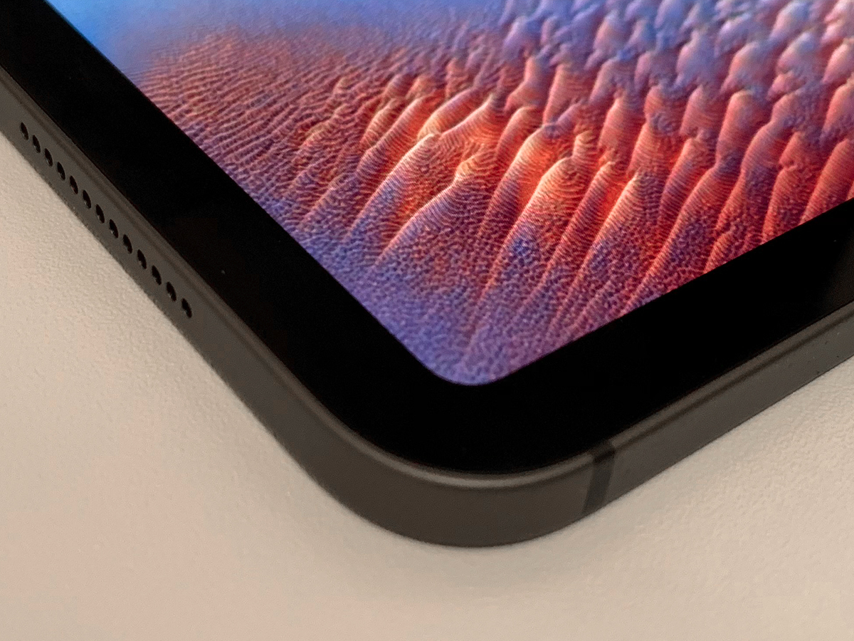
Calling the new iPad ‘all screen’ is a bit of a stretch, given that there’s still that bezel. But the black frame isn’t a problem, and helps you focus on content. Moreover, Apple’s stuffed the new Face ID camera into it, removing the need for a notch, which would look ridiculous on this device.
The 12.9in iPad Pro retains its predecessor’s 2732×2048 resolution at 264ppi – less sharp than a smartphone, but good enough at the distances an iPad is used at. The 11in nets you 2388×1668, also at 264ppi. This is up from last year’s 10.5in model (2048×1536), and is the first iPad to not have a 4:3 aspect ratio – it’s a fraction wider.
Despite being a fingerprint magnet, the iPad Pro display’s coating make it more usable in bright rooms than the plain old iPad. Apple’s ProMotion and True Tone technologies, respectively, ensure it’s responsive and adapts to your viewing environment.
Performance: speed demon
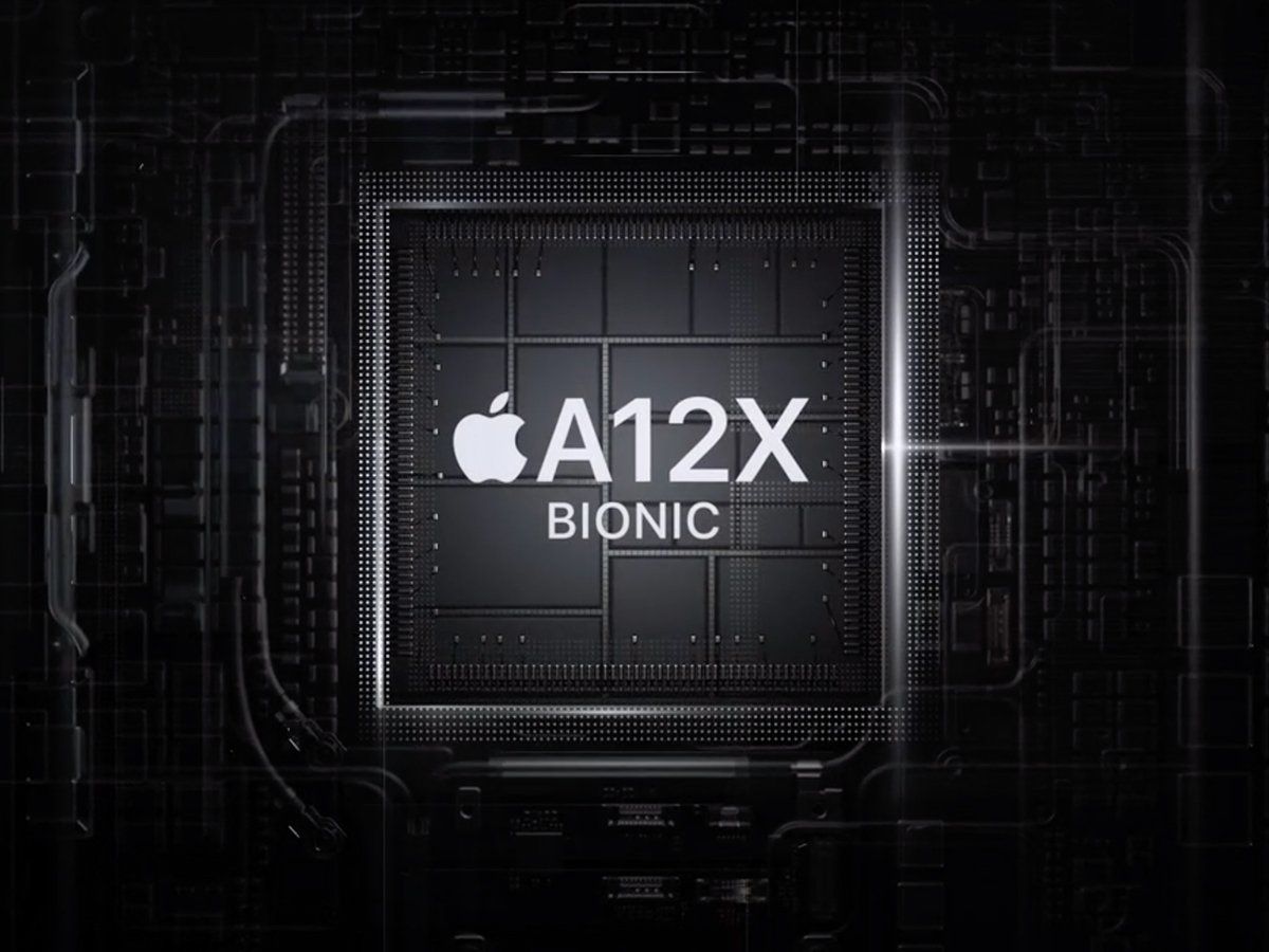
When talking about the A12X Bionic chip at the heart of the iPad Pro, Apple flings figures around with merry abandon. It’s reportedly faster than 92% of portable PCs sold during the past 12 months, and significantly outperforms last year’s iPad Pro – which was no slouch.
In use, it handled anything I threw at it, from complex multi-layered imagery in Affinity Photo to synth-heavy Korg Gadget compositions that choke my years-old iMac. If you want stats, Geekbench scored my 11in at around 5000 for single-core and 18000 for multi-core. That’s not far off what you’d expect from a 15in MacBook Pro.
In a more general sense, the iPad Pro also delivers. Tap the screen and it instantly wakes. Flick the screen and it scrolls smoothly. Even Face ID is improved, working in any orientation, at an angle, and from further away than on an iPhone XS Max. Returning to Touch ID on an older iPad Pro now feels like a punishment.
Software: mostly appy
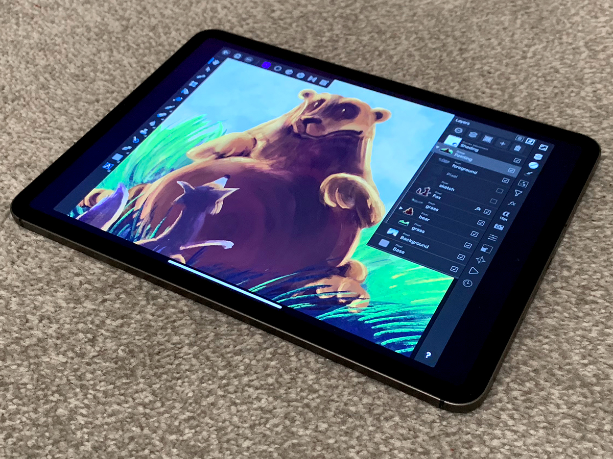
For the most part, iOS 12 is very impressive. And although I’ve seen various people bellyaching about the iPad Pro lacking pro apps, that depends on your reading of what pro means.
Sure, you might not be able to do everything you need to on an iPad Pro, even now; but whether you should buy such a device may instead hinge on what you can do – and whether you can do it better. For example, I’m more productive when writing if I can minimise distractions, and happy to compose music when away from my office – things the iPad Pro excels at. But would I want to manage spreadsheets on the thing? Not really.
Generally speaking, the best high-end apps are polished and optimised for iPad – if not (yet) quite to its new screen size. By contrast, Android fares relatively poorly on tablets. However, Apple could do with iterating on pro-level workflows more rapidly – iOS 12 still feels too rooted in single-task workflows. Only vanishingly rarely do apps provide a two-up document view, for example; and using multi-app Split View remains clunky.
Accessories: a sticky subject
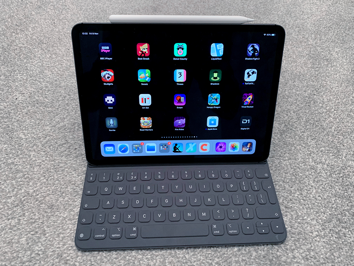
Of Apple’s revamped accessories for the new iPad Pro, Apple Pencil (£119) and the Smart Keyboard Folio (£179) are the most interesting. Both showcase a kind of elegance regarding the ease in which they connect, but the Pencil in particular is an unqualified success.
The new Pencil deftly deals with its predecessor’s shortcomings. It connects via magnets to the iPad Pro, to pair and wirelessly charge. The flat edge improves your grip, and stops the Pencil rolling off of a table. There’s a double-tap gesture that’s configurable per app – in Procreate, it can launch the radial menu; in LiquidText, you can circle a document content, and double-tap to slide a linked excerpt out of your workspace. Brilliant.
The Folio instantly connects and is a snap to set-up, but is more variable in use. Typing on the thing didn’t click with me, and I was much slower than on a standard Apple keyboard. There’s noticeable wobble when the iPad’s screen is tapped. Also, fold the Folio back and you end up gripping the keys, which is just weird.
It also showcases a slight disconnect, in that Apple’s notebook people say ergonomics are a big reason to avoid touchscreen Macs, since you’d have to constantly reach for the sccreen – and yet a docked iPad demands you do exactly that. I’m not sure what the solution is, but iOS needs to help you interact with the screen less when you’re using a Folio – or any other keyboard.
Connectivity: plug and pray
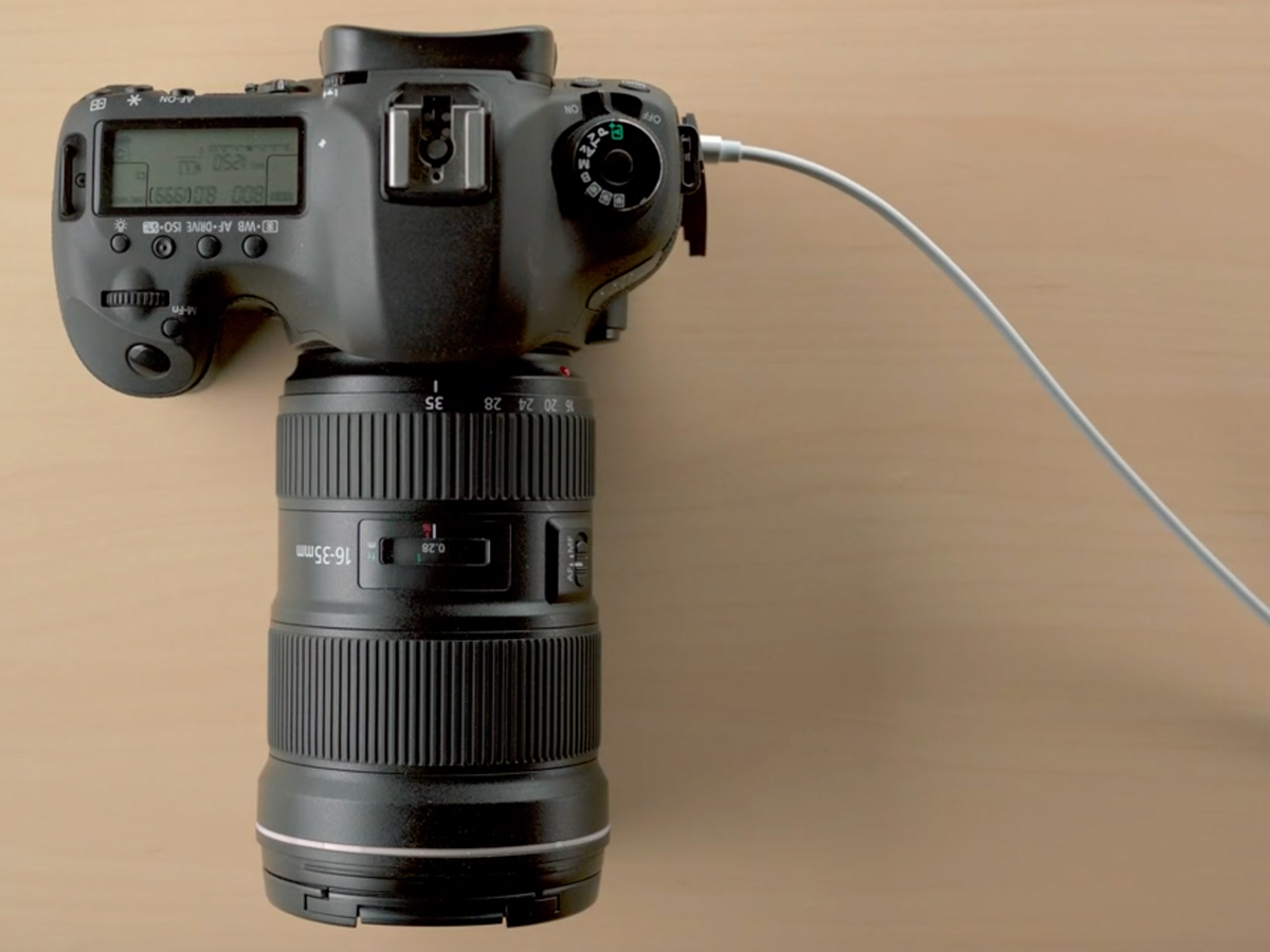
One swift look around the iPad Pro’s edges and you’ll note that both ports from its predecessor are now gone. There’s no standard headphone port, which I’m not thrilled about, given how often I use wired cans for music. (Yes, there’s an easy-to-lose dongle.) But also, Lightning has been consigned to history, in favour of USB-C.
This opens up a world of potential for the iPad Pro, which was most obvious when Apple showed me a unit connected to a 4K display, potentially enabling a dual-display set-up when, say, editing video. But right now, there are some odd limitations. For example, you can’t connect USB-C external storage and rummage through it in Files. Even an Apple-branded USB-C SD card reader demands you fling images into Apple’s Photos app, before potentially sending them elsewhere.
There’s also the issue that Apple’s ecosystem now feels a bit incoherent regarding connectivity. I hope the iPad Pro isn’t a one-off and instead represents the beginning of a transition, where Lightning is ditched in favour of USB-C on every iOS device. If not, you’d best hope you have the requisite pile of dongles to hand.
Random observations
- 64GB at the low end probably won’t be enough for pro-use, and so upgrade accordingly. 256GB is a better bet. If you’ve cash burning a hole in your pocket, Apple also offers 512GB and 1TB options.
- Apple’s lack of a USB-C dongle for Lightning kit is curious. If you’ve a guitar adapter or similar, you’ll need to grab a third-party dongle and hope for the best.
- In Split View, remember only the larger iPad Pro shows two iPad-sized apps side-by-side. Strongly consider it if you do a lot of two-up multitasking.
- Many apps need optimising for the new iPads. During testing, most games played bordered on the 11in iPad Pro.
- A TrueDepth camera means Animoji and Memoji come to iPad. Fans of making cartoon faces and poos gurn in real time, rejoice!
- The Home indicator sticks out even more on iPad than on the iPhone, and is a distraction in games and immersive apps. It desperately needs an off switch in Settings.
- Tap the screen with a Pencil and you go straight to Notes – a nice touch. Sadly, you can’t switch Notes for something else – although you can switch this feature off.
- The older Apple Pencil will not work on the new iPad Pro – and vice-versa.
- Connect an iPhone to your iPad using a Lightning to USB-C cable and the iPad will charge the iPhone. And you can whizz the devices around your head like expensive high-tech nunchuks. Probably.
iPad Pro (2018) verdict
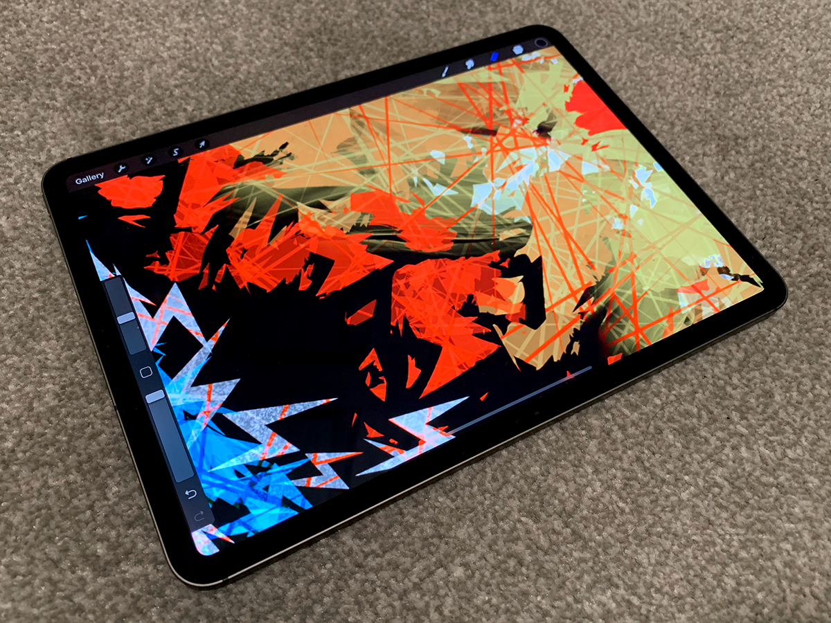
Last year’s iPad Pro 10.5in was the best tablet you could buy. Apple could have shoved in an A12X and that would still be the case. Instead, Apple added a new design, Face ID, and a superb new Pencil. But also we get another round of find the dongle, price hikes, and some general app weirdness while developers rework their wares for another screen resolution while simultaneously smacking their heads into their desks.
So is it worth the outlay? Yes. To me, at least. Sure, the iPad Pro isn’t cheap, but it’s a mobile powerhouse like no other, with a diverse and rich app ecosystem, tons of power, a gorgeous screen, and the kind of focus on creativity and productivity that just doesn’t exist on other tablets.
If you just want to faff on Facebook and Netflix, it’s of course massive overkill, but then there’s the standard iPad or even a slew of Android/Amazon tablets for doing that. Still, even if you don’t need the new iPad Pro, have one in your mitts for five minutes and you’re probably going to want one.
Tech specs
| Screen | 11in 2388×1668 LCD with ProMotion, P3, and True Tone |
| CPU | A12X Bionic 8-core with Neural Engine |
| RAM | 4GB (6GB in 1TB model) |
| Storage | 64GB/256GB/512GB/1TB |
| Camera | 12MP, ƒ/1.8 rear with quad-LED flash/7MP, ƒ/2.2 front TrueDepth |
| Operating system | Apple iOS 12 |
| Battery | 7812 mA (~10 hours web/music/video on Wi-Fi) |
| Dimensions/weight | 247.6×178.5×5.9mm/468g |
Stuff Says…
Once again, Apple blasts ahead of the pack, with a stylish, powerful tablet full of creative and entertainment potential
Good Stuff
Almost unreasonably powerful
New screen and design is superb
Face ID far better than on iPhone
Major improvements to Apple Pencil
Bad Stuff
Camera bump still irks
USB-C issues will throw some people
Home indicator needs an off switch
iOS 12 could do with some pro love


