Casio Pro Trek Smart WSD-F20 review
We took Casio’s nature-beating ticker to the Lake District for some tough testing

Android Wear might have started as a wearable OS for city workers’ wrists, but that’s all set to change in 2017. Take one look at Casio’s Pro Trek Smart WSD-F20 and you’ll understand why.
First seen at CES, this rugged tracker is built for the great outdoors. Casio’s second attempt at a tough smartwatch, the big news is on-board GPS, which means it’s far happier out in the wind and rain than stuck on the 07.50 from Gunnersbury.
It also happens to be the first wearable to launch with Android 2.0 – an update that’s been long in the making, and brings a raft of new features with it.
After strapping it on and heading into the hills of the Lake District and Scotland, then, here’s how the WSD-F20 fared as a go-anywhere smartwatch.
TOUGH AS NAILS
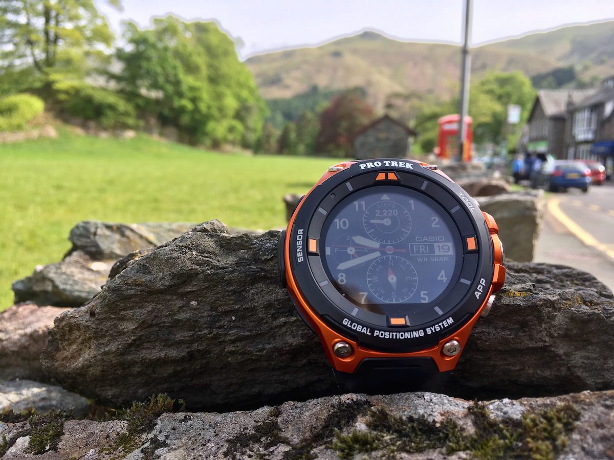
Casio learned a lot from the original Smart Outdoor WSD-F10 – namely that chunky is exactly what’s needed to survive extreme weather conditions. This new watch follows suit: available with an orange or a black shell, you won’t forget you’re wearing it. Not one bit.
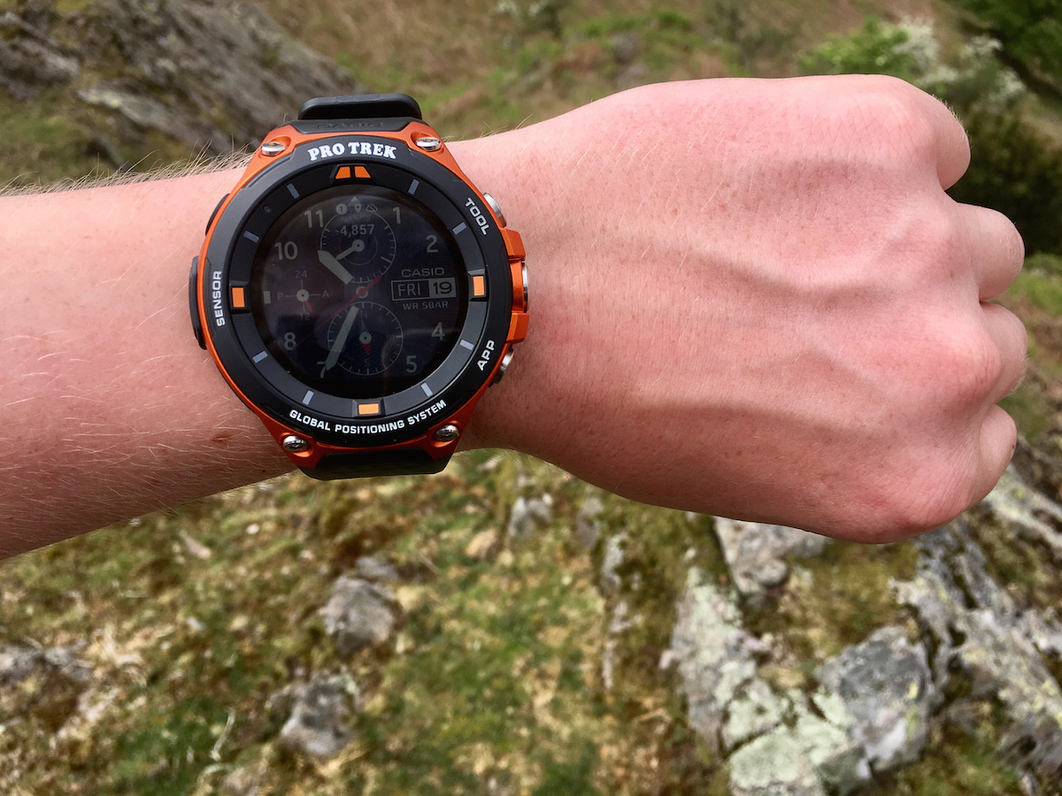
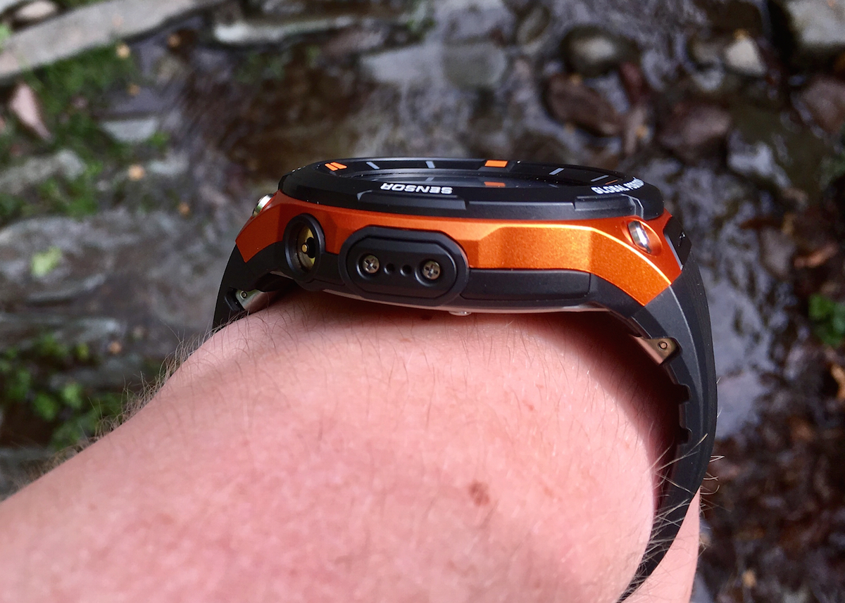
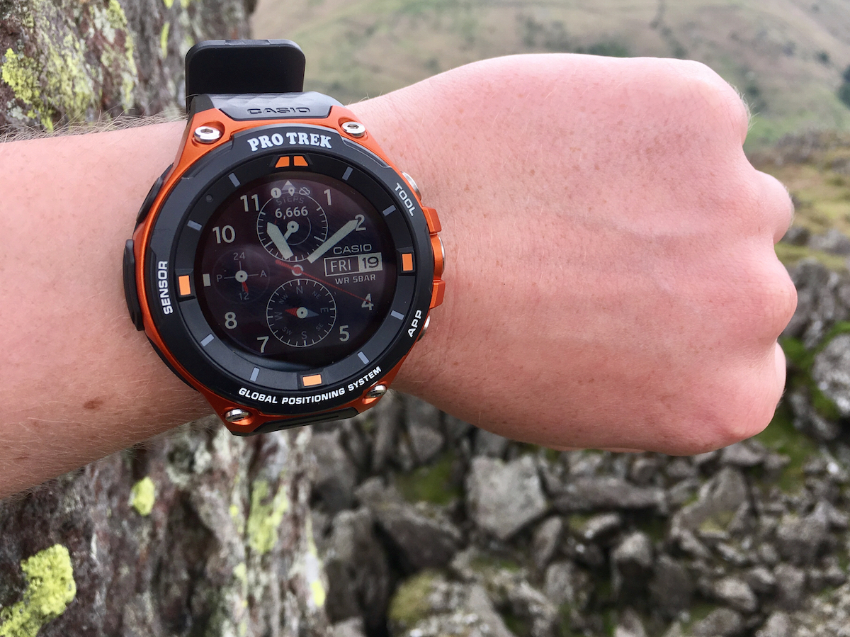
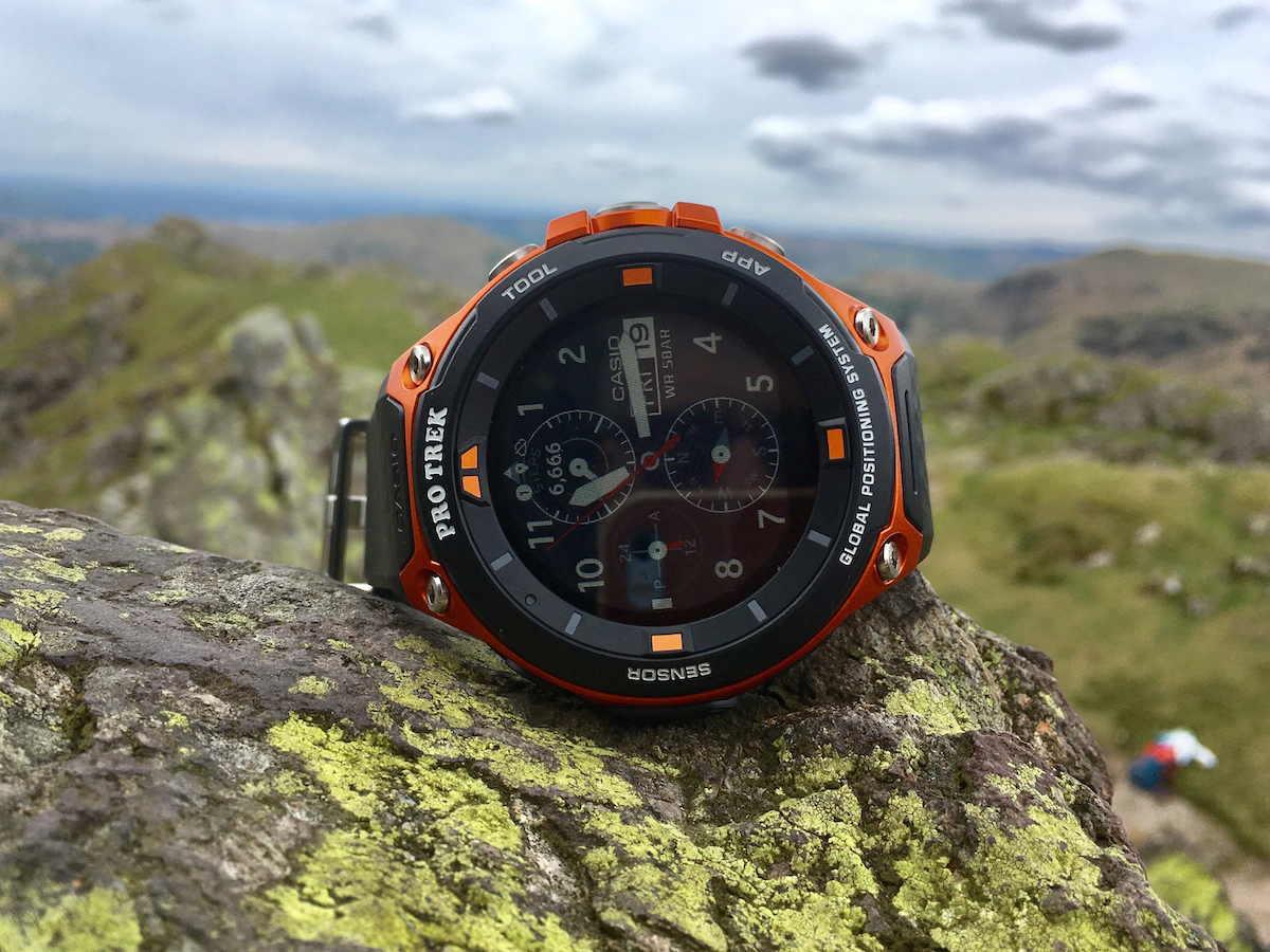
Hiking up to Helm Crag, there wasn’t a single member of the group whose wrist wasn’t dwarfed by the monster Casio. At 15.3mm deep, it sits relatively high, but it’s the 56.7mm width that’s more noticeable.
In an outdoor setting, it doesn’t seem out of place, giving the reassuring sense of heft and durability, especially as you scrabble over rocks. Back at the hotel afterwards, though, let’s just say the F20 stood out at the dinner table. And it leaves a big tan mark.
It can also make the 1.32in flat-tyre display seem a little small, especially when in bright sunlight (where the display lacks punch) and given the high edges (which can make fitting fatter fingers into the edges quite a challenge).
Whether you appreciate its hulking looks will depend on whether you were ever into the G-Shock styling, but there’s no questioning the build quality. Yes, it’s bold, but it all feels bolted together well and it’s pretty striking in the wild.
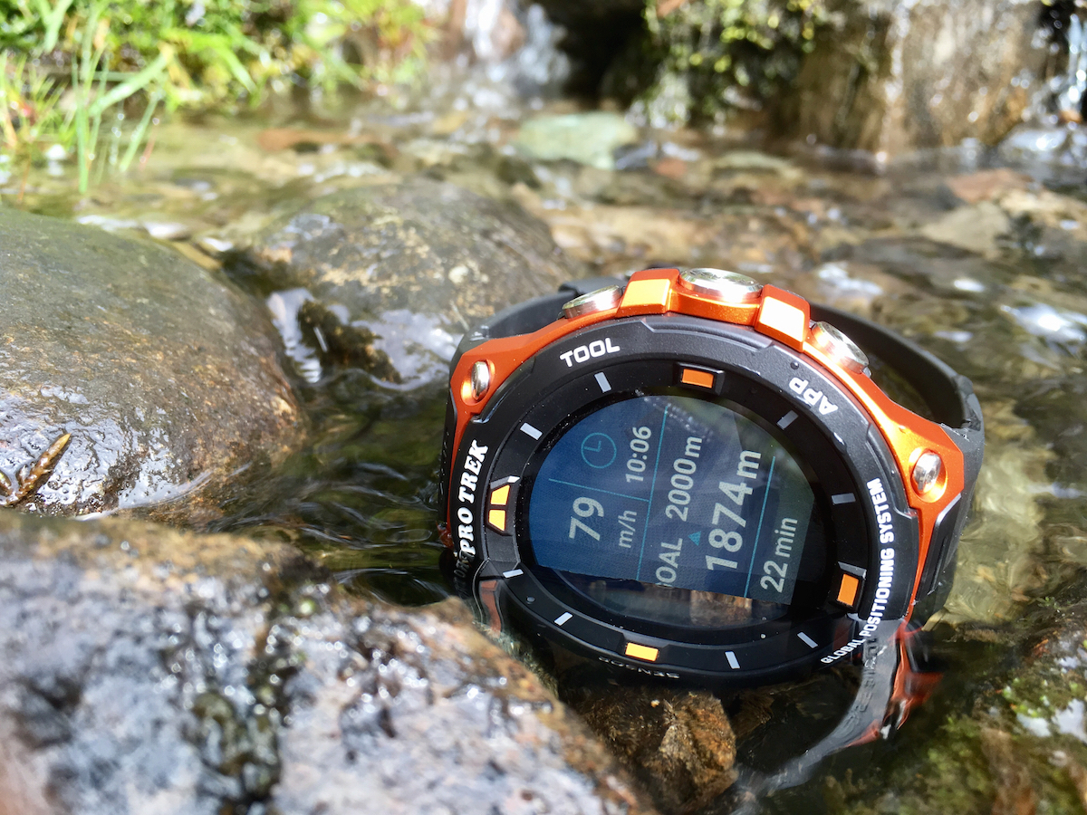
Like the original, it’s also water-resistant (which is handy, given the in-built paddle-tracker) and has apparently been made to military standards, so your SAS-style schlep up Scafell should pose no problems.
PLENTY OF SENSORS
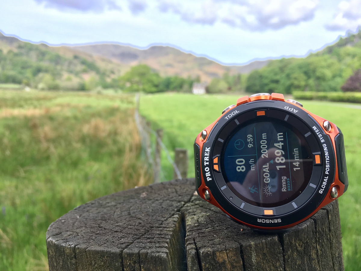
All of that bulk isn’t wasted, either: as before, there’s an air-pressure sensor, accelerometer, pyrometer and magnetic compass inside. Hit the dedicated (but remappable) ‘Tool’ button to fire up the app of the same name and you’ll be able to cycle through readings which, when you’re halfway up a hill and out of breath, is actually quite handy.
The bigger news for this version, though, is the addition of low-power GPS. It means you’ll get phone-free route-tracking with pin-point accuracy. Better yet, the F20 supports full-colour offline map downloads, which, besides making for pretty face backgrounds, means that GPS is actually useful for more than just plotting.
Unfortunately, that offline mapping is quite a fiddle to use. Connected to Wi-Fi, head into Location Memory and the F20 will cache the area currently in view for later offline navigation and route-logging. Problem is, there’s no way to bulk-download maps, so you have to hover over the appropriate area, wait for it to load, then move on. Zoom out too far and it’ll stop downloading.
This makes spontaneous offline tracking tricky, as, if you end up trekking somewhere other than expected (as I did in Scotland, having found a more convenient route around a Loch), there’s a good chance you’ll have no map to rely on.
Which is a shame, because Location Memory is otherwise quite a neat app. You can drop digital breadcrumbs as you explore – if you come across an excellent viewing point, for example, or a rather dangerous stretch of path high on a hillside. Even without offline maps it’ll save your coordinates, and you can even add relevant voice memos, which feels like something that trailblazers and back-country explorers might actually make good use of.
All the same, trekking back to a logged waypoint is quite tricky if the maps haven’t downloaded, and it’s not always clear whether this has happened. Worse still, if nothing’s downloaded, there’s not even a low-res outline map to rely on, so you can’t tell the scale of your view or roughly where you are.
LIMITED JUICE
All of that in-built kit comes at a cost, too. Yes, while in the Lake District I put the Casio through tough conditions (GPS logging a 90-minute kayaking session and a 3-hour hike, as well as variously attempting to connect to Wi-Fi and pair via Bluetooth), but I achieved less than 24 hours from a full charge – with quite significant percentage drops when logging activities.
On the one hand, that might seem fair enough from a smartwatch packed with tech. On the other, for a watch built to live outdoors, it’s frustrating to find that you wouldn’t be able to camp with it for more than a night without some form of power boost.
Admittedly, in day-to-day conditions, walking around Edinburgh, logging a couple runs and a long walk, firing up apps and syncing occasionally, I did slightly exceed the promised two-day battery life. But, having been spoilt by the 10-day cell capacity of the Garmin Fenix 5, I couldn’t help feeling a little underchanged.
Its 1.32in, dual-layer LCD screen does help a little, switching off the main colour display in favour of a second, low-power monochrome screen when resting or running low. It’s attractive and doesn’t interrupt interactivity too much – but it’s a necessity in order to squeeze a little more life out of the Casio, rather than a useful option.
When you are out of juice, power is delivered via a magnetic charging socket. It’s easy to attach – but also comes undone easily, so you can’t really pick up the ticker while it’s charging. A stronger magnet is all that’s needed, but it’s one more power frustration that the Casio didn’t need.
TRICKY TRACKING
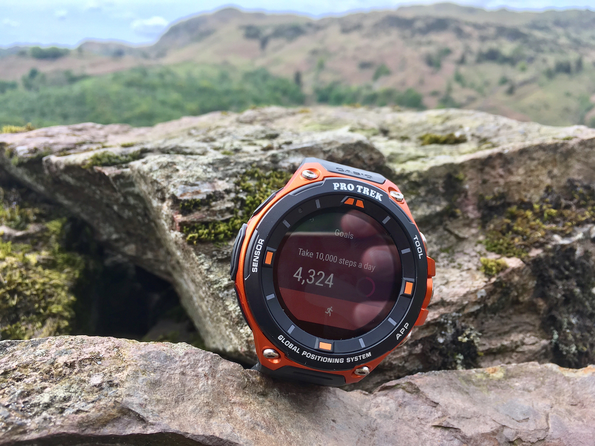
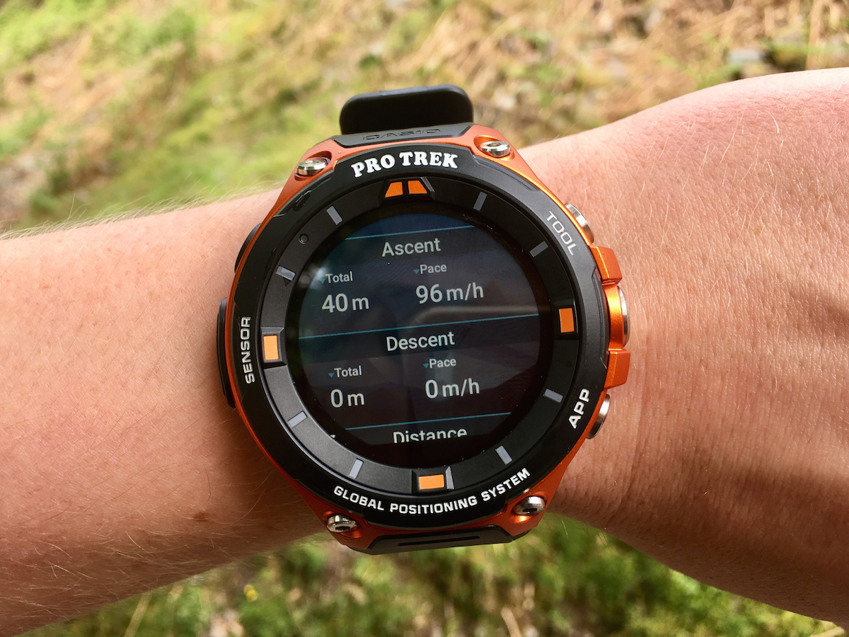
There are difficulties elsewhere, too. The lack of a heart-rate sensor didn’t bother me too much, as I didn’t feel I needed that data while kayaking, for example, and there was plenty of other information that was more relevant (such as distance travelled and pace).
More annoying is the way activities are handled by the default app: pretty enough when using it, once you stop an activity the results are displayed in a notification only accessible from the home screen. Once that’s dismissed, the data simply disappears. There’s no obvious log app or data bank and, even if you didn’t want to use the Casio as a standalone device, there’s no clear way to sync or export that data, either.
Yes, its Android Wear system means you can download alternative tracking apps via the Play Store (which I did with the likes of Runkeeper), but given how much data is recorded from the bank of sensors by default it seems a shame for that feedback to appear only once. In fact, the absence of a native app to show activity summaries, totals and trends, the likes of which are par for the course on Garmin devices and the Apple Watch, only add to the sense that Casio has simply skinned a standard Android Wear watch in a rugged shell, rather than make a substantive tough device.
The overall user experience is quite clunky, too, with multi-tasking a bit of a faff. Touchscreen swipe and button combinations, together with the menu structure and inputs, don’t immediately feel intuitive, leaving a real sense that Casio thought very much hardware-first with the F20. There are aspects which add value, such as the ‘Moments’ app, which allows you to set discipline-specific alerts, such as the high tide time for fishing, or altitude alerts when you’re ascending a slope. This was more than a novelty and actually helped to make best use of the Casio’s barrage of measurement tools.
All the same, there’s an inescapable sense that the core software, beyond some attractive watch faces, needs some work to be more reliable, streamlined and logical.
CASIO PRO TREK SMART WSD-F20 VERDICT
After two weeks of trekking, splashing and striding with the WSD-F20, then, there are more than a few frustrations. While it’s undoubtable that this watch is tougher than old, orange boots and trumps others with its on-board GPS, there are plenty of niggles (both software and hardware) that quickly grate.
Android Wear should be familiar to many, but the interplay between touch and buttons is already a source of irritation. Swiping left doesn’t bring up your app drawer, for example (that’s the big button on the side), but opens your watch faces. It takes time to learn, but doesn’t get more logical.
That battery life is also a problem, if this is to be taken seriously as a proper outdoor watch – which the skiing, paddling and trekking modes (among others) suggest is what Casio wants. Two days of real-world is acceptable (if mediocre), but less than 24 hours of GPS tracking puts paid to any sense that this is a watch for serious off-grid sorts.
The mishandling (and, indeed, disappearance) of logged data, meanwhile, together with the absence of a system-native summary app, is simply confounding. I quickly found myself turning to more reliable and user friendly alternative apps from the Play Store.
If, then, you’re looking for a smart, solid partner for your Android watch – one that won’t complain if it gets bashed around – the WSD-F20 isn’t a terrible choice. It takes the best bits of Android Wear 2.0, squeezes them into a massive, solid shell and sprinkles in a few outdoors-y extras to boot. As a dedicated outdoor tracker to rival the likes of Garmin’s Foreunner 935 or Fenix 5, though, it simply can’t compete.
Stuff Says…
An Android Wear ticker with rugged ambitions, the F20 is closer to a re-shelled smartwatch than a proper off-grid companion
Good Stuff
Reliably rugged
Trusty on-board GPS
Android Wear expandability
Bad Stuff
Middling battery life
Offline maps of limited usefulness
Apps and interface can be unintuitive
