How Apple changed tech: looking back at some of its top achievements
We celebrate Apple's 40th birthday with its greatest ideas and innovations
Under Steve Jobs’ peerless leadership, Apple came to define the way we use technology. His understanding of what worked and his staggering attention to detail made Apple products, in Steve’s words, ‘insanely great’. Tim Cook carried on from where Jobs left off, and Apple has continued to push boundaries and deliver functional, beautiful products used by millions of people around the world. Here’s just some of the ways Apple changed tech.
And no, Apple isn’t always first to the table when it comes to certain products or features, but there’s no denying that everything it produces is incredibly polished.
Pinch-to-zoom
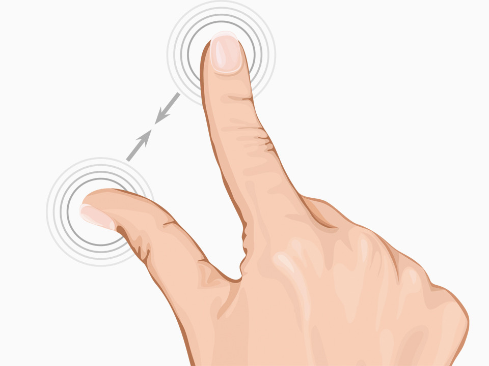
The skill that defines multi-touch. Moving your fingers together across a screen takes you closer in to web pages, documents, maps, images and more. In 2007, this was mind-blowingly clever.
- Read more: How to use Apple Pay with your Apple devices
Inertial scrolling
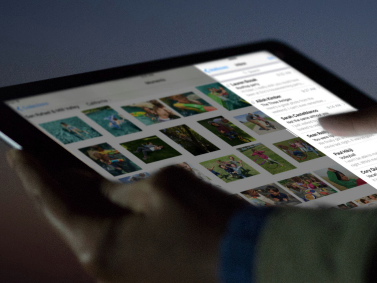
List navigation accelerates and decelerates based on how quickly you move your finger across the interface and, in iOS and OSX Lion, lists and web pages bounce elastically as you reach their limits.
Shake to undo
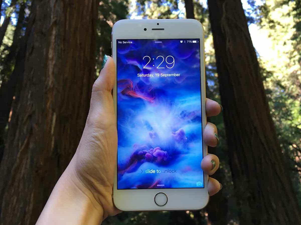
Perhaps the most inspired, but underused, of Apple’s interface touches. On iOS devices, a movement akin to shaking your head undoes the activity you’ve just performed.
Multi-touch trackpad
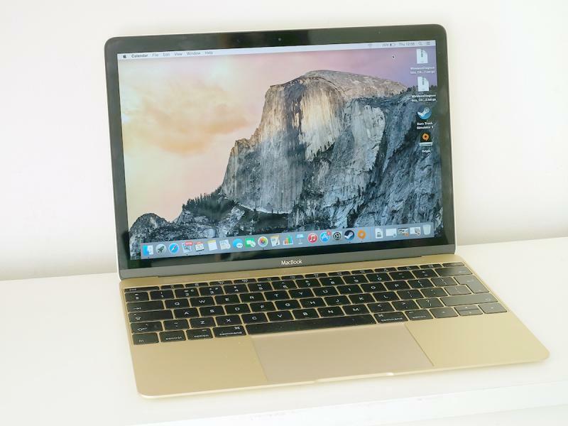
Integrating the button into the mousing surface gave MacBook mousepads extra space for multi-touch gestures, and provided a clearer connection between clicks and actions on-screen.
- Read more: The best apps for kids (of all ages)
Scrollwheel/Clickwheel
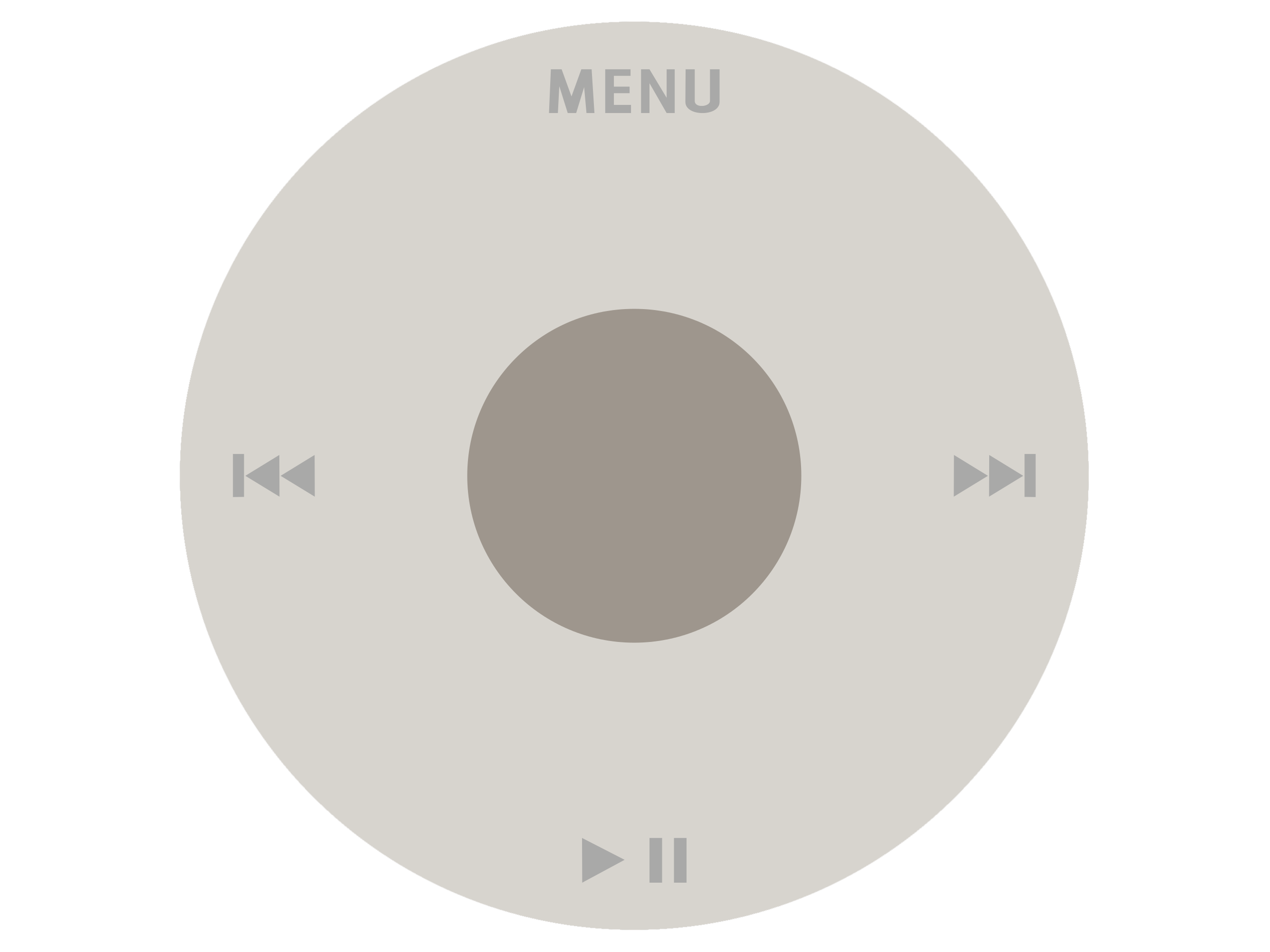
In his tribute to Steve Jobs, Richard Seymour of British design agency Seymour Powell wrote that ‘his true legacy is that he made the digital analogue.’ The scrollwheel and clickwheel, first seen on the 1G iPod and iPod Mini, are perfect examples: for the first time, they allowed you to navigate long lists of tunes in a way that felt human and natural. The wheel may have gone the way of the dodo thanks to touchscreens, but we miss it.
Active screen corners
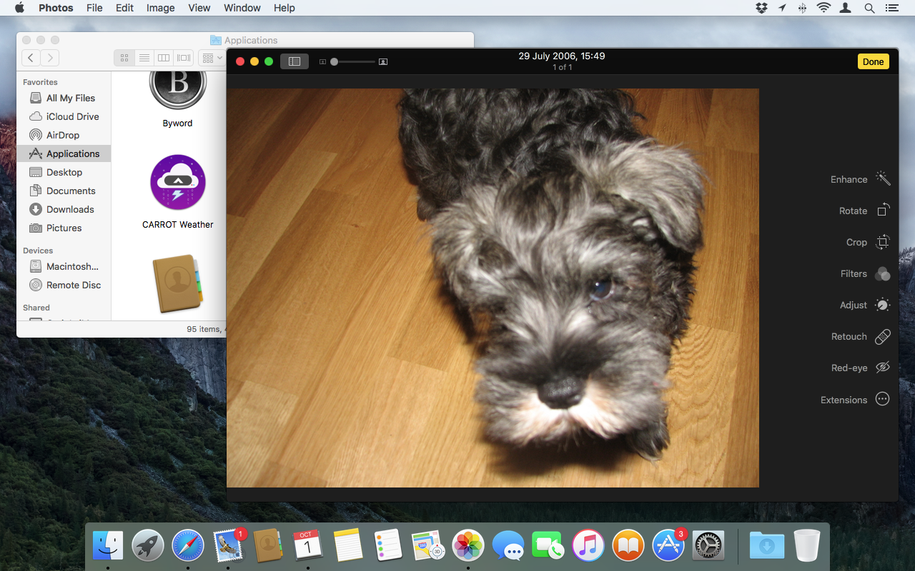
Some find them annoying, some find them indispensible. Mac OS X’s proto-gestures, performed by a swipe to a corner of the screen, gave a taste of the multi-touch magic to come.
How Apple changed tech: Cover Flow
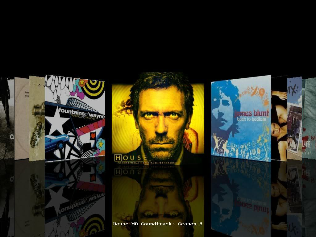
When the iPhone was announced in 2007, those of us too short-sighted to see it as anything more than a music phone were impressed by one thing: Cover Flow. The lack of a clickwheel on the iPhone and iPod Touch was amply recompensed by being able to flick through album artwork. It once again blurred the line between the physical and the digital, and it’s been copied a million times over since.
Read more: How to use Action mode on your iPhone
Easter eggs
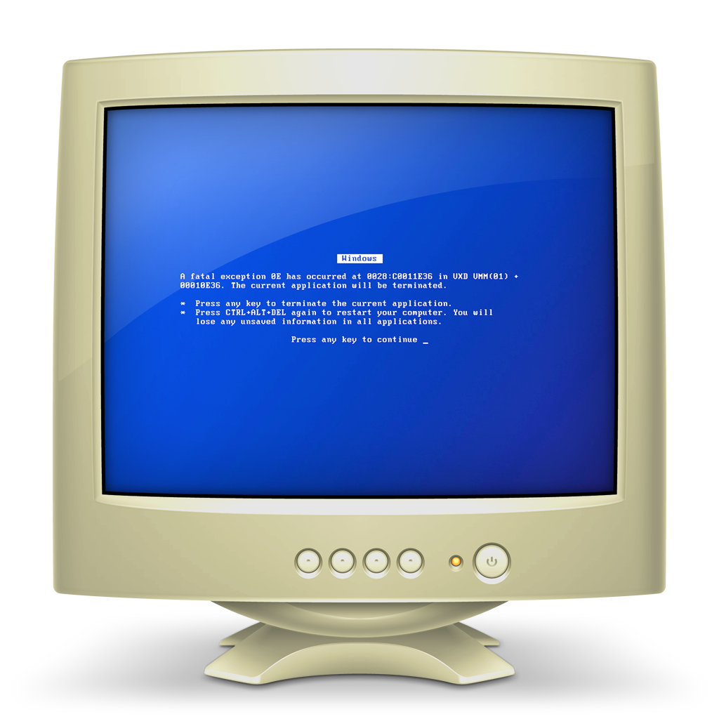
Apple’s cleverly hidden a few hidden messages in some of its app icons:
1. The Maps icon has its pin dropped at 1 Infinite Loop, Cupertino, California – the address of Apple’s headquarters.
2. Windows PCs on your network appear as beige monitors displaying the ‘blue screen of death’ – a cheeky poke at Windows PCs’ perceived unreliability and drab design.
3. TextEdit icon features the quote that’s read byRichard Dreyfuss in Apple’s 1997‘Think Different’ advert, whichmarked Steve Jobs’re-joining (and subsequent revamping) of the then-ailing company.
4. Aperture Photography geeks will enjoy zooming in to find the specs of the Apple photo editing app icon’s lens – it’s a 50mm f1.4, according to the picture. Perfect for portraits, then.
5. The piece of paper on the Keynote logo’s lectern may have the inauspicious title ‘Q4 2008′, but zoom in and you’ll find the lyrics to a song from controversial musical ‘Spring Awakening’.
Simplicity
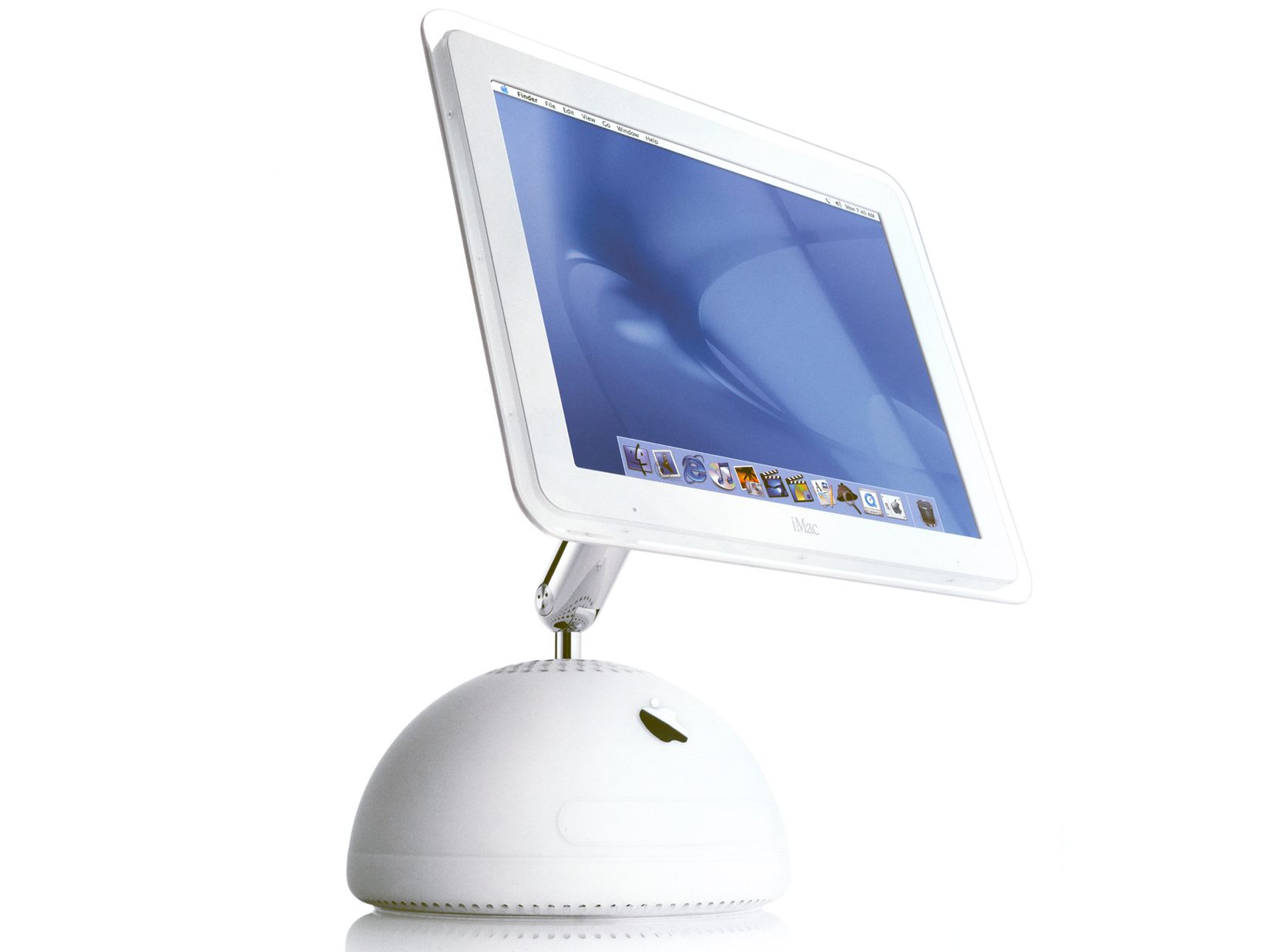
The iconic ‘iLamp’ (as the iMac G4 was affectionately nicknamed on its release in 2002) marked the start of Apple’s journey towards its now unmistakeable brand of sleek, button-free modernism. It also looked uncannily like the Luxo Jr lamp, star of the first film made by Pixar (which Jobs owned at the time).
Unibody
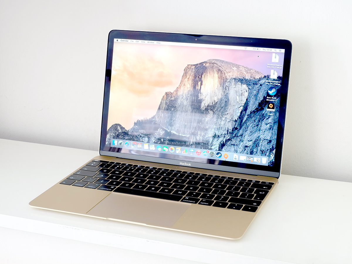
In 2008, Apple forged its new MacBook Air from a single piece of aluminium. It quickly became the basis for all MacBooks and iMacs.
Simple names
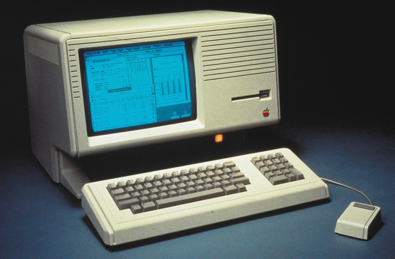
Rather than saddle its products with clumsy names like TX9800PTN-00, Apple used simple monikers such as ‘Lisa’ and ‘Macintosh’, before the ‘i’ generation changed everything.
iMac G3 handle
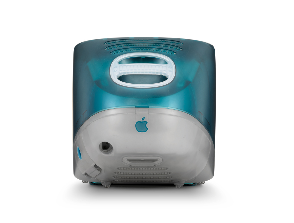
The original translucent iMac, born in 1998, highlighted its friendly simplicity with a handle on the back. The beige monoliths that lived on everyone else’s desks began to look seriously dated.
MagSafe
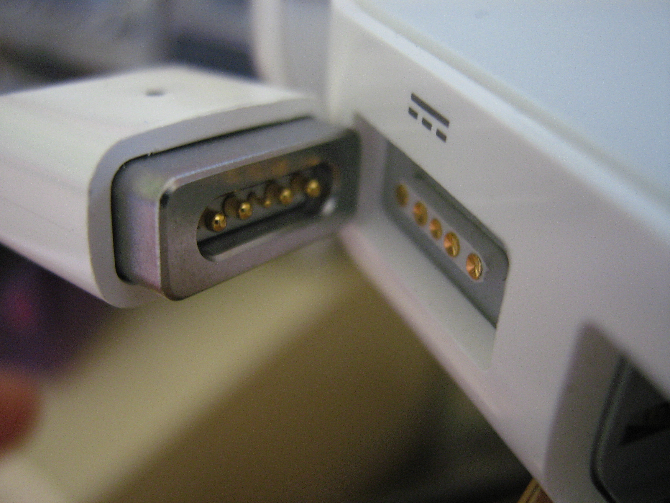
First seen on deep-fat fryers in the early noughties, and cleverly ported to Apple’s MacBooks in 2006. The simple brilliance of the magnetically attached power cord has saved thousands of cat owners, parents and clumsy types from making an expensive visit to the Genius Bar.
Glowing Apple logo
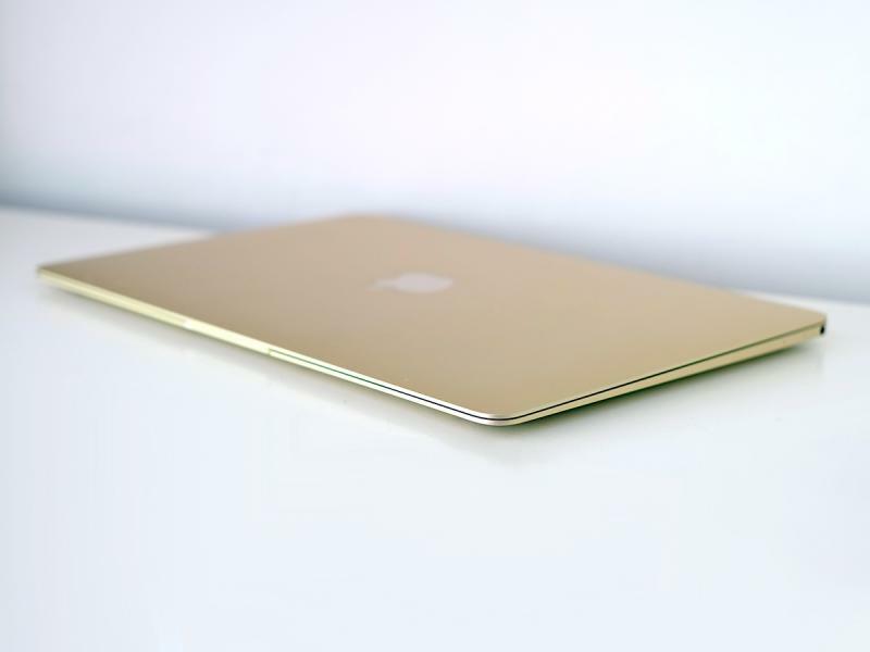
Apple dispensed with its rainbowcoloured logo soon after Jobs returned to the company in 1997. Its plain, silhouette-style replacement soon appeared prominently on every product, with the iconic ‘glowing’ Apple logo first shining out from its Powerbook G3 in 1999.
‘Breathing’ LED
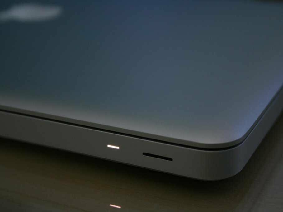
Apple’s painstaking dedication to humanising tech is illustrated by its laptops, which, since 2002, have softly pulsed their LEDs in sleep mode. The speed of its soothing pulse was determined following research into human breathing patterns during sleep, and the light even uses its own controller chip.
Packaging
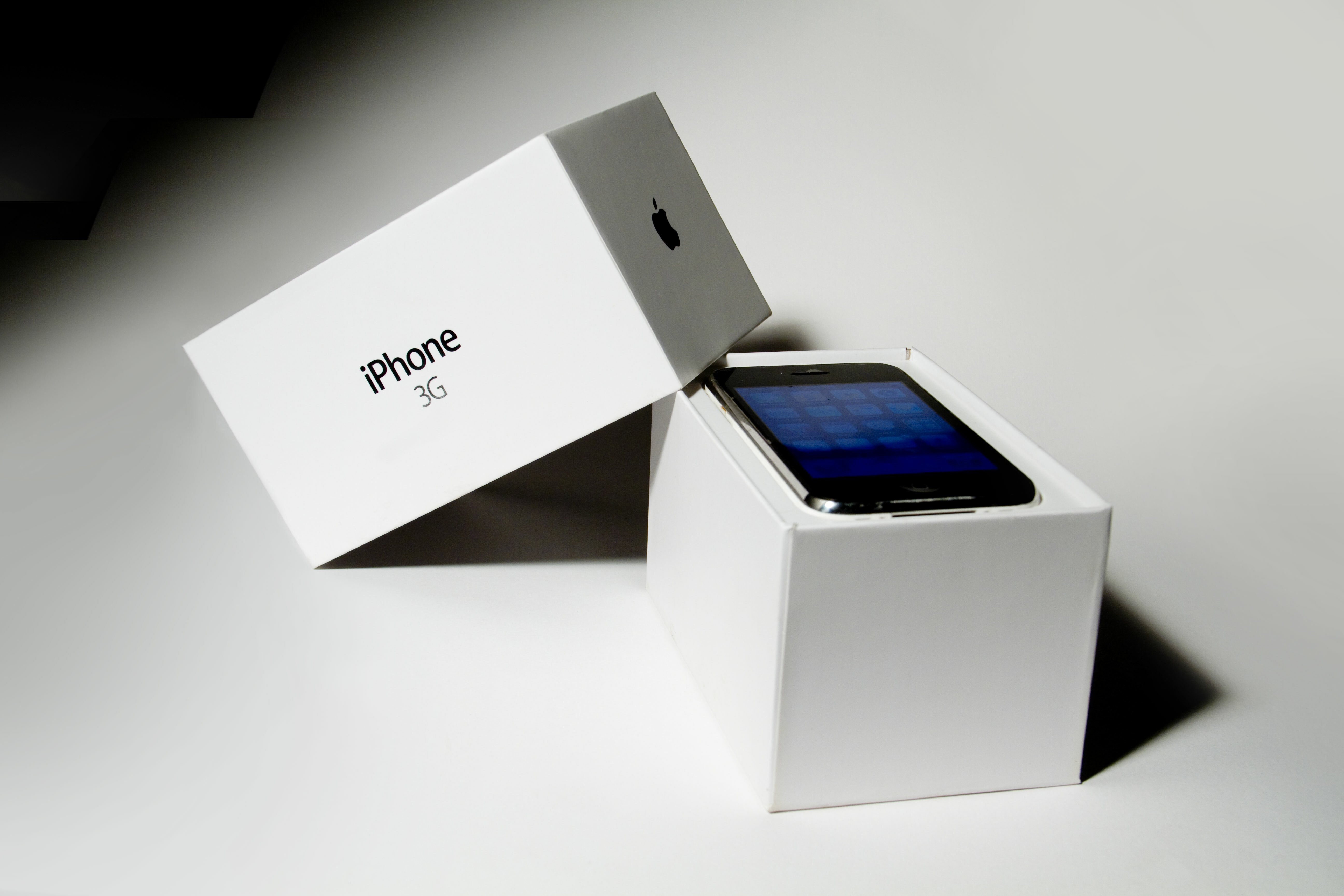
Not for Apple faceless brown boxes and polystyrene chips. Its boxes have all the drama of a Jobs keynote speech, with multiple layers and the ‘designed by Apple in California’ hallmark making them feel like a gift from a master craftsmen.
App store
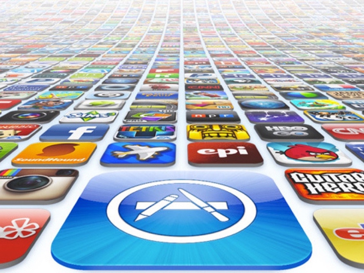
Apple certainly didn’t invent the idea of digital storefronts for apps, but the iOS App Store’s all-in-one (and all-or-nothing) approach was a revolution that rivals soon clamoured to copy. And while detractors still gripe about the App Store’s limitations, the convenience consumers gained cannot be overstated.
Consumer computing
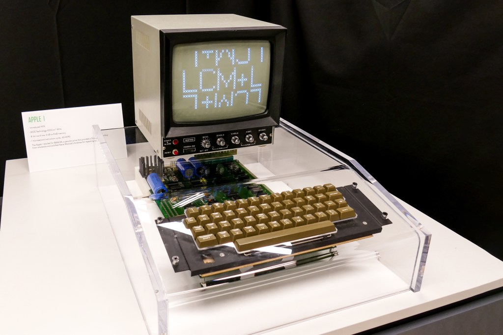
This entry might seem a stretch if you’re unfamiliar with typical mid-1970s computing. Back then, machines were often programmed with switches and output to LEDs. The Apple I (above) bypassed such unfriendliness by requiring only a keyboard and a telly, and the Apple II added a case, ushering in modern home computing.
Overlapping windows that worked
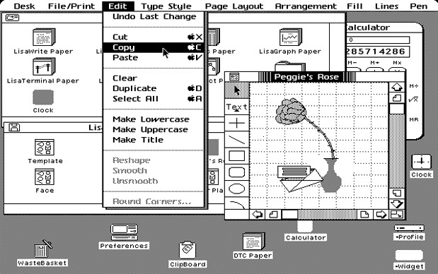
A lot’s made of Apple supposedly pilfering Mac OS from Xerox, but reality is more nuanced. Xerox Smalltalk lacked self-repairing windows, and Apple’s superior implementation became core to the Mac OS experience, rather than being dropped for performance reasons. It was subsequently much aped, even if today’s Apple seems keener on full-screen and Split View.
Read more: How the Apple Watch made me its slave
Keynotes that aren’t boring people in suits
It’s an eye-opener to watch Apple keynotes prior to the return of Steve Jobs — dull is an understatement. But Jobs turned corporate yawnsville into shows no-one wanted to miss. Releases of Apple kit were transformed into must-see events, gawked at by millions, as the rest of the tech industry looked on, avidly taking notes.
2.5D glass
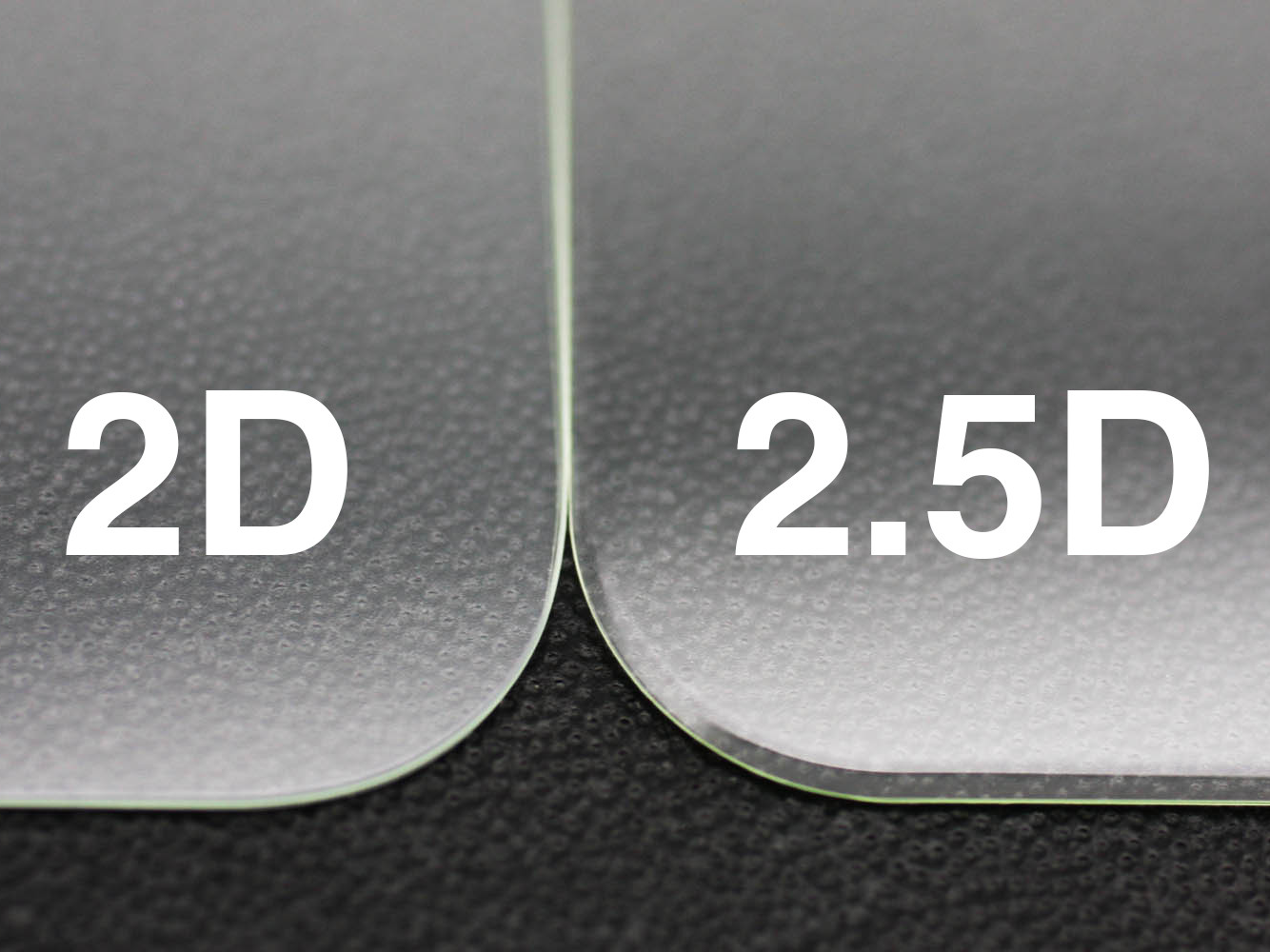
Contender for one of the silliest marketing-hype names ever, 2.5D glass is still a rather hansome touch of design. In essence, it simply means that the edge of a display (like the iPhone’s screen) curves off at all the edges, resulting in a soft, rather than sharp, feel in the hands. Mind-blowing? Certainly not, but we’d be lying if we said we’d want to go back to a regular flat screen.
GUI: computing without command lines
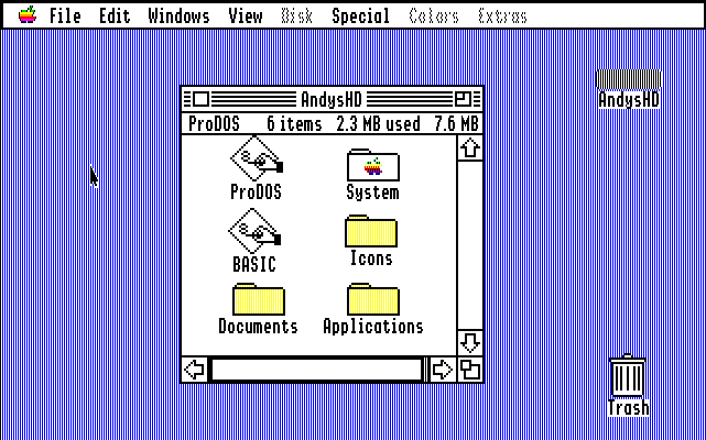
Typing commands on to a glowing screen felt like the future until the Mac rudely noted you could just point and click. And while PC fanatics huffed at the ‘lack of control’, they soon changed their tune when Windows finally became good. No wonder the Mac logo long had a smug grin.
HyperCard
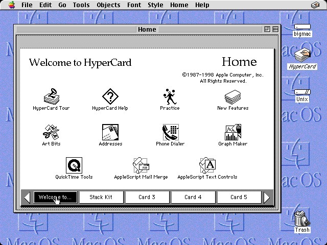
This app enabled you to create stacks of virtual cards, which could house all manner of interactive objects, such as text, images, checkboxes, forms, and links. If you’re thinking that sounds a lot like the web, you’re right — HyperCard strongly influenced the web’s development (and was also used to create the first version of Myst).
Discarding tech before it’s worthless
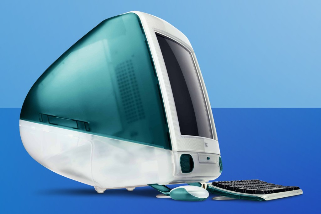
When you’re looking to the future, it can be wise to discard the past, rather than have it linger like a bad smell. Apple’s long been ruthless in this regard, such as dispensing with a floppy drive and proprietary ports in the original iMac, in favour, respectively, of network file management and USB.
Read more: The man who was nearly Steve Jobs
Bringing Wi-Fi to the masses
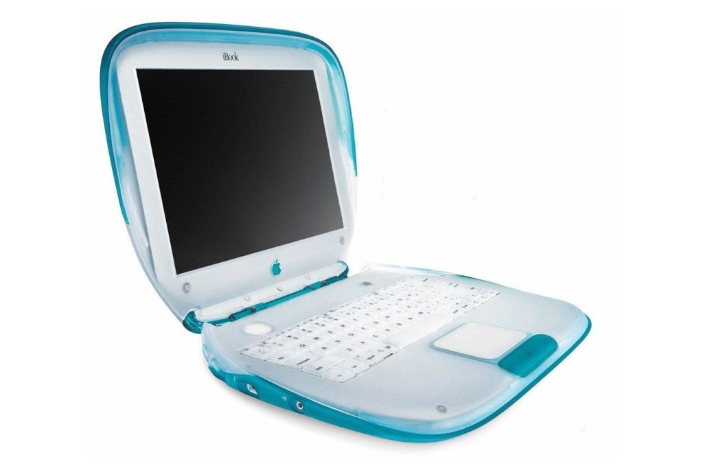
Everything around us now connects to the web, but in the late 1990s, such thinking was radical. And yet at the iBook launch, Steve Jobs revealed the company’s consumer laptop would, by default, have Wi-Fi — a move that was a big kick up the bum for the rest of the industry.
Built-in speech technology
Even the Commodore 64 could speak a bit, if the right software was running, but Macs have been chatty at the system level since 1984. By 1988’s System 6.0.7, SimpleText would happily read back documents. Soon thereafter, Macs wouldn’t shut up, blabbering away in all manner of voices, system-wide.
ResearchKit
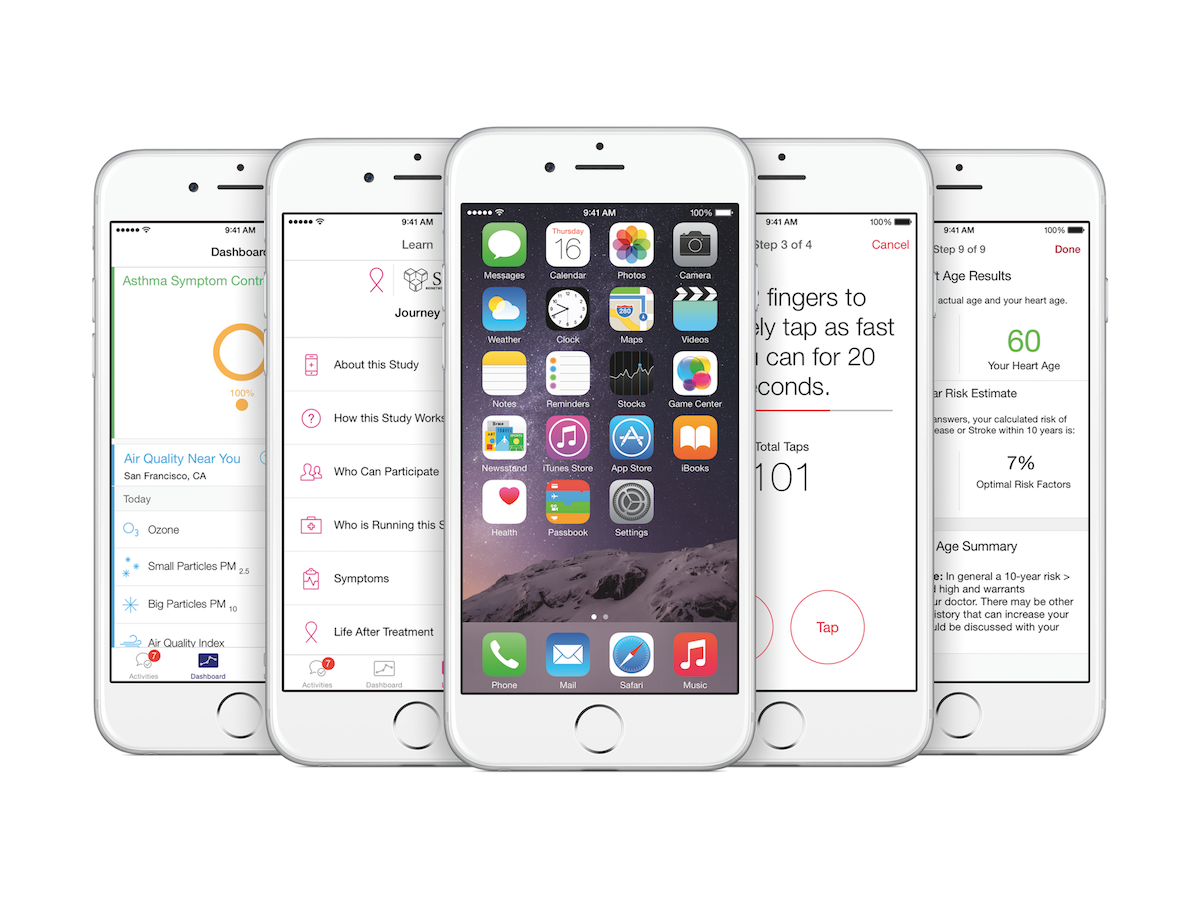
Apple often innovates by iteration, but ResearchKit was a seriously big rethink of people’s very wellbeing. The open source framework enables developers to create powerful apps for medical research, integrating with HealthKit to benefit medical researchers and patients alike. Even if you’re one to scoff at Apple’s other achievements, it’s tough to dismiss this one.
Nike+
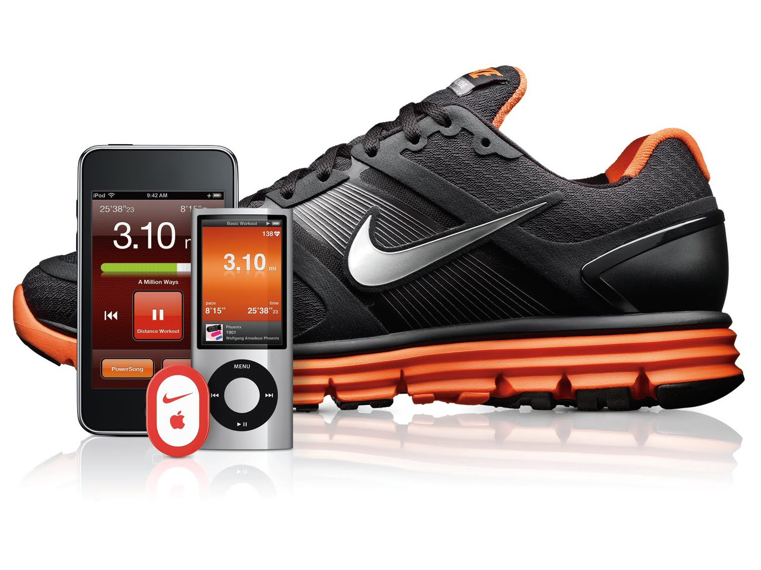
Long before talk of wearables and self-lacing HyperAdapts, Apple teamed up with the Big Swoosh in 2006 to create the Nike+iPod Sport Kit. It wasn’t the most accurate or elegant running tracker – you had to buy compatible Nike trainers or a third-party pouch to tie the sensor to your laces. But it did introduce casuals like us to motivating running software and paved the way for today’s Fitbits and Jawbones.
Apple Retail Stores
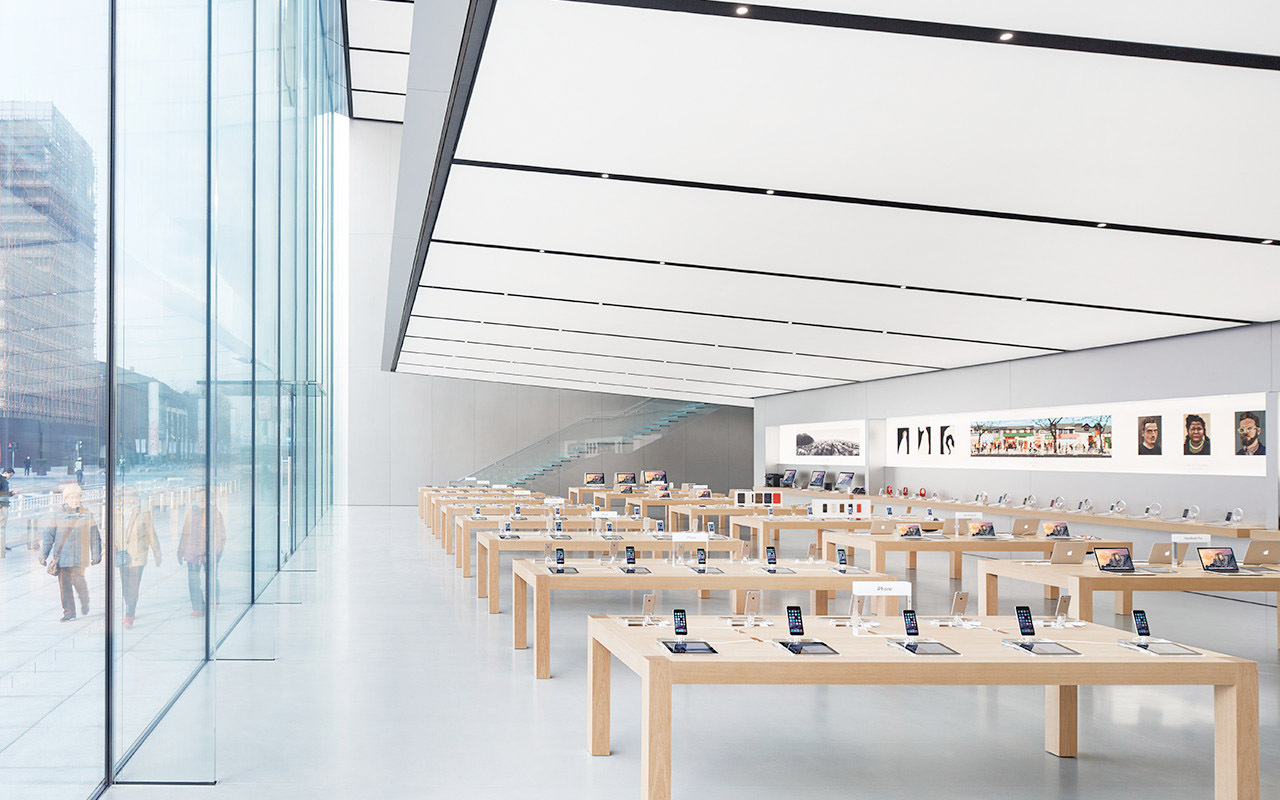
It’s not quite fair to say that Apple invented the premium shopping experience, but it definitely revolutionised the way tech brands sold their wares.
The genius of the physical Apple Stores is in the way they echo the aesthetics of the products sold within: all sleek, white lines, carefully curated displays and a thoroughly uncomplicated buying process. No place here for the traditional tech store approach of ‘cram the shelves with gadgets and employ a load of spotty know-nothings’; instead, an Apple Retail Store is a relatively sparse space, with no more than a few dozens iThings and MacThings actually on display, and plenty of expertise on hand should you need it. Apple took that concept further with the introduction of the Genius Bar, although good luck actually getting an appointment in most of them.
Even the way you buy things is typically Apple in its simplicity, with sales staff walking around with scanner in hand, ready to take your order, take your email address and get the whole thing done in seconds.
Digital Crown
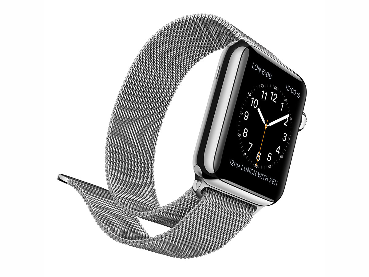
No, Apple didn’t invent an 8-bit tiara. The Digital Crown is Apple’s innovation in the smartwatch game, letting users twist the Apple Watch’s crown to navigate between apps, minimising the amount interaction required with the display. Has it totally revolutionised the smartwatch world? Not quite, but it’s different, sticks out from the crowd, and works rather well.
How Apple changed tech: Touch ID
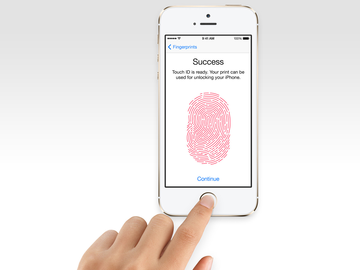
Sure Android phones had fingerprint scanners before the iPhone 6, but in typical Apple fashion, the company waited until it got it completely right. Unlike Android handsets which required you to annoyingly swipe your finger across a scanner, the iPhone 6’s Touch ID home button required nothing more than a gently stationary touch. The iPhone 6s improved on this even further with near-instant scanning, making pesky pincodes all but obsolete. It’s largely gone now in favour of facial recognition, but while it lasted it was the best way to unlock a phone.
How Apple changed tech: Live Photos
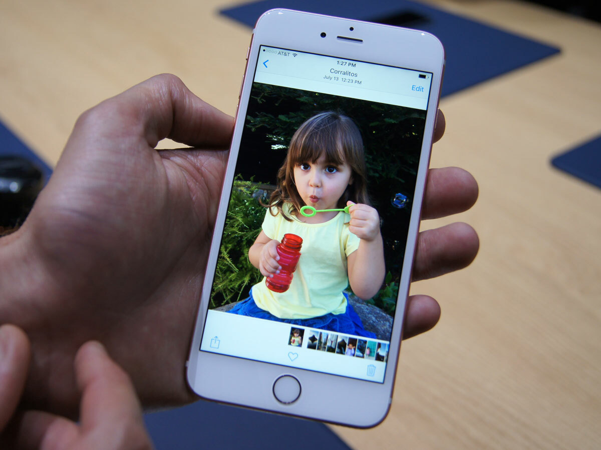
Apple’s Live Photos feature is a Harry Potter-esque way of showing off your photos. When you snap a shot, the iPhone records 1.5 seconds of video footage before and after the shutter button is pressed. Long-pressing (or 3D Touch-pressing) a photo in your gallery then brings your image to life. Again, nothing revolutionary, but another nice little feature to help capture memories in a different way.
- Read more: How to take the best Live Photos
How Apple changed tech: the Lightning port
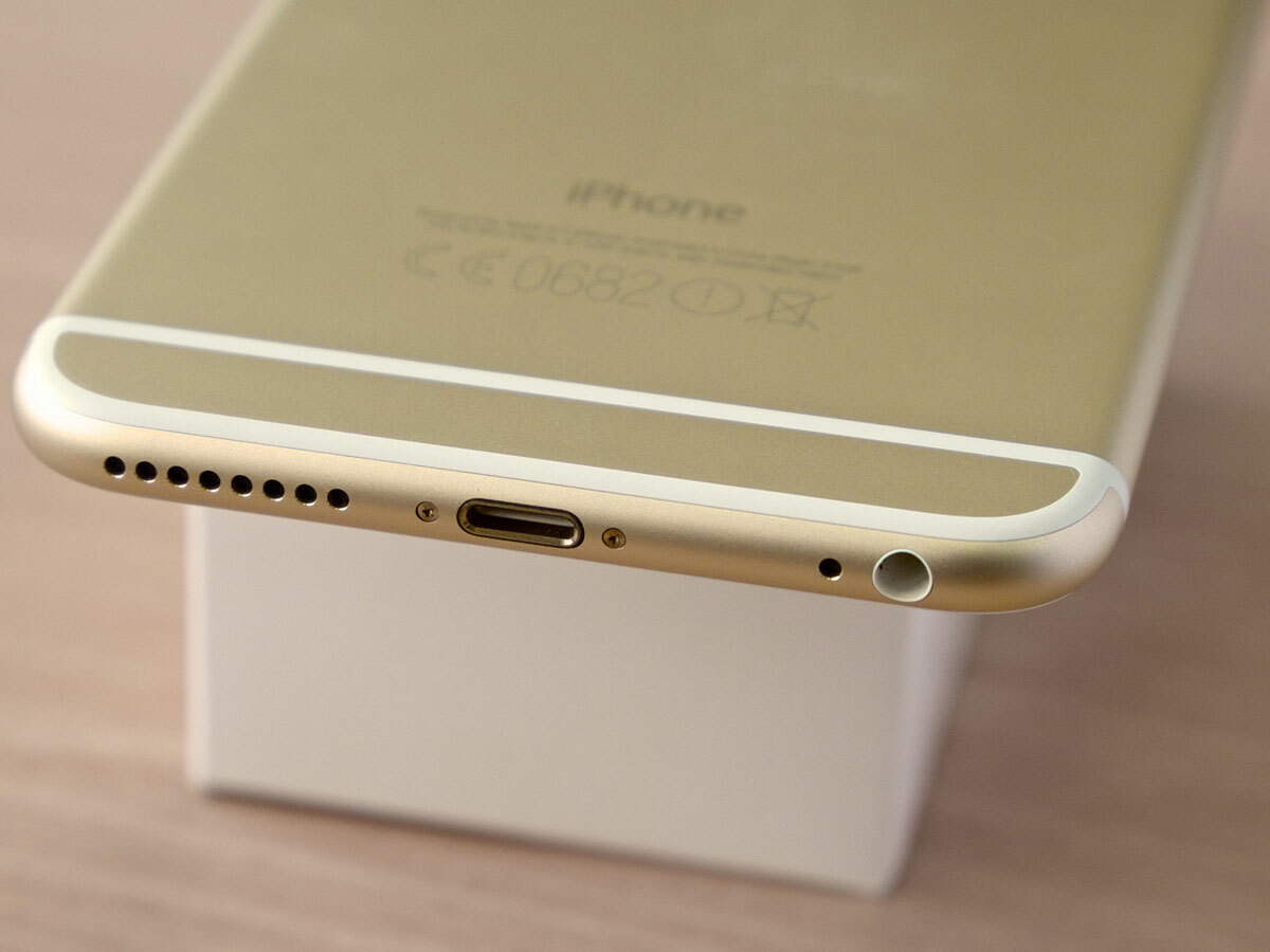
Long before the reversible USB Type-C that would eventually replace it, came Apple’s proprietory Lightning port. Just like the recent USB switchover there was an initial uproar about people having to replace existing chargers and accessories, but the ability to charge your tech without fumbling around for the cable was a godsend.
How Apple changed tech: True Tone flash
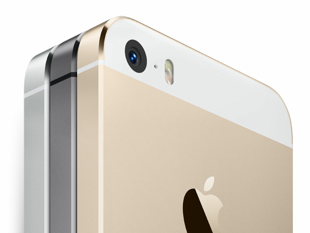
Amongst the various camera improvements Apple has made over the past few years, True Tone flash is one of the most useful. A combination of an amber and white LED produces photos with more realistic tones, and comes in particularly handy for taking shots of your mates in low light conditions. Ghost-face begone.
How Apple changed tech: Apple Pay
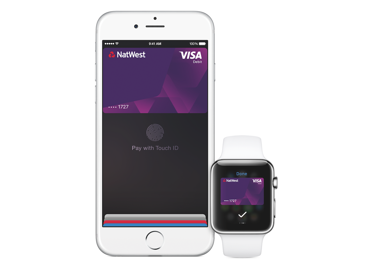
Yes, Android Pay came out first, but it’s still yet to hit the UK, and we’re too busy jumping on buses and paying for Maltesers with nothing but a simple flick of the wrist. In true Apple fashion, it just works. Gone are the days of bulky wallets. Skinny jeans, here we come.
MacBook Pro battery indicator
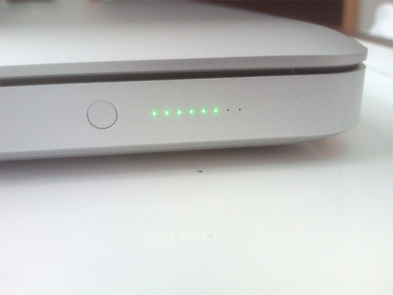
Long-gone but sadly missed. Sure, you could look at your screen to check the battery of your laptop, but it’s not as swish as glancing down at a row of embedded LEDs, is it? Apart from adding a bit of bling to your laptop, the MacBook’s battery status lights were also a useful way of checking how much juice you had left from across the room.
How Apple changed tech: Force Touch
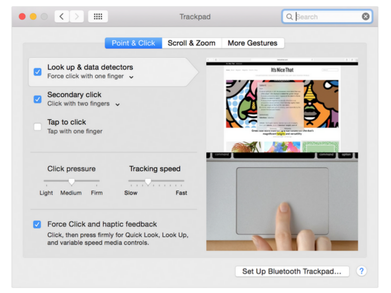
Apple’s Force Touch trackpad works in a similar way to the 3D Touch screen on its latest iPhones. Harder presses bring up different navigation or contextual options, and it really does feel like you’re physically pressing in an actual button. Witchcraft, we tell you.
Read more: The best indie games on Steam
How Apple changed tech: the Butterfly keyboard
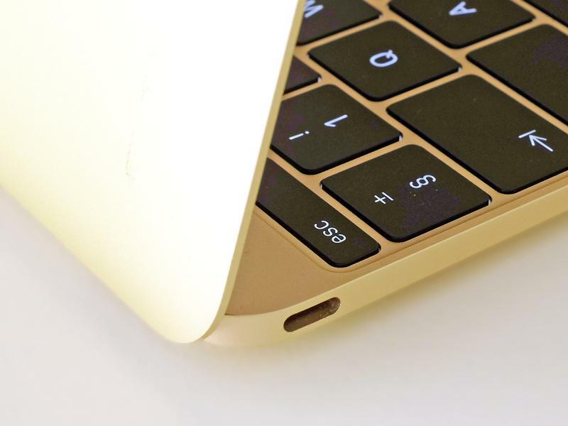
In 2012, the new MacBook shipped with a controversial new keyboard. It used butterfly switches designed for precision, killing off any wobble which could, according to Apple, result in more typos. It saved on space too, resulting in a thinner keyboard with larger keys. The only problem? People hated it, and it filled up with dust more easily, leading to keyboard problems. In 2019 it was ditched, and Apple returned to the older scissor-switch design.
How Apple changed tech: Easy-open laptops
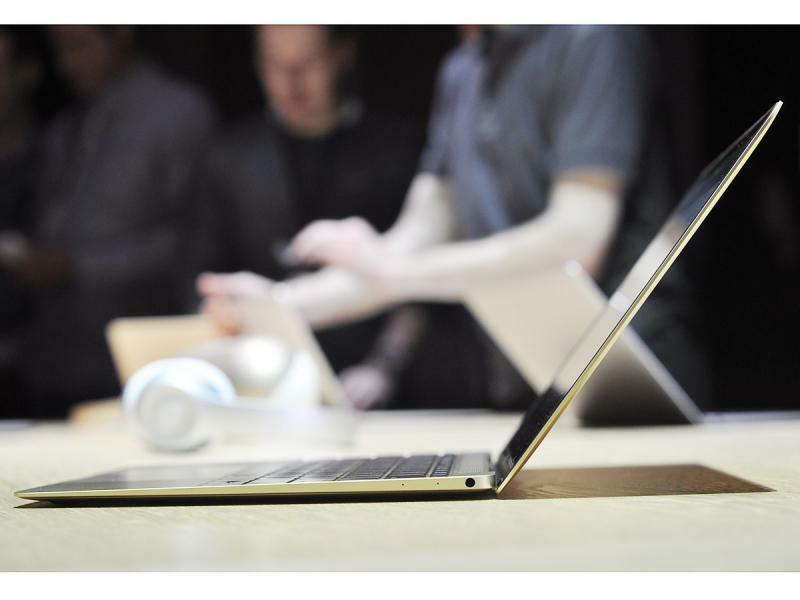
One thing we’ve always loved about MacBooks is the way that you can open them up with one hand, with the base remaining firmly planted on the table. Almost every other laptop lifts off if you try this, and it’s a small detail we’ve grown to love over the years.
How Apple changed tech: the Pinwheel of death
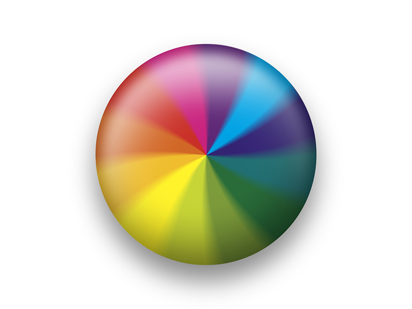
Okay, so chances are you’re not going to actually be happy if you’re met with the famous spinning pinwheel/beachball, but at least it looks nice. Only Apple would take something as annoying as a system freeze-up and try to make it look beautiful.


