6 concepts we wish the new iPhone would take after
Please be real, please be real, please be real...
As great a phone as the iPhone might be, it’s becoming, dare we say it, a tad predictable.
Year on year, we see incremental differences in terms of design. Come 9th September, we’d like to be surprised and see Apple take some cues from these out-of-the-world concepts.
Riho Kroll
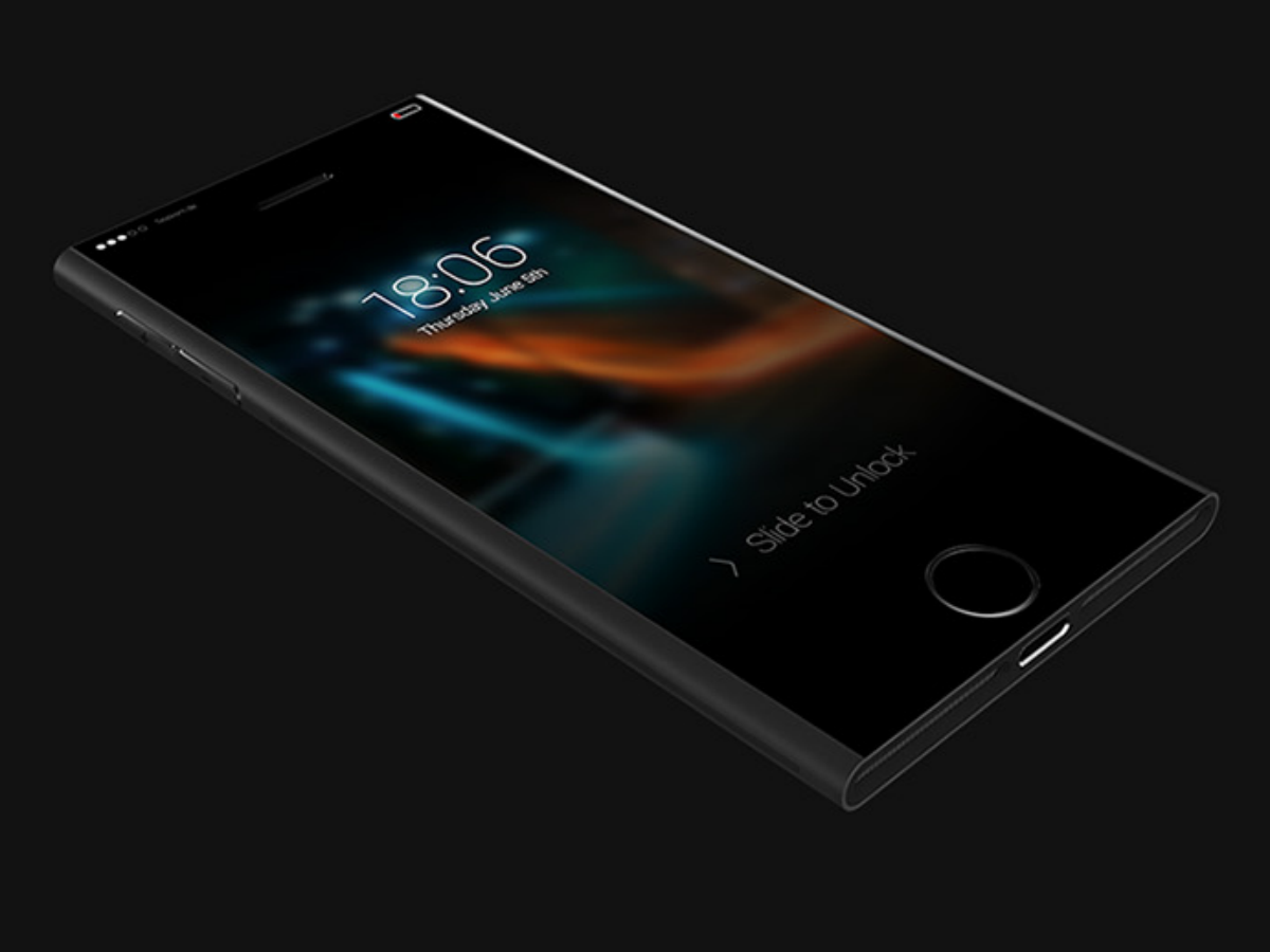
This concept champions a low-power secondary screen for notification and time checking. It’s fired up once you grab the phone or touch its sides. That way your eyes won’t get flash blasted just because you want to check on the time. We’re digging the idea of touch-sensitive sides in this concept because it would lead to fewer smudges on our screen. But it’d also mean we couldn’t slap a protective case on our new iPhone.
Yasser Farahi
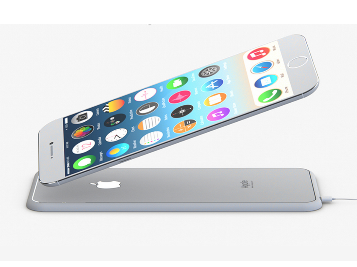
This concept is so detailed, it even has a dedicated site and a spiffy video to boot. Featuring a sapphire glass display, an ambitious 12MP rear camera and 5GB of RAM, this is the iPhone we all want our iPhones to grow up to be. Plus, it comes with barely-there bezels and a wireless charging dock that looks exactly like another iPhone.
Grisha Serov
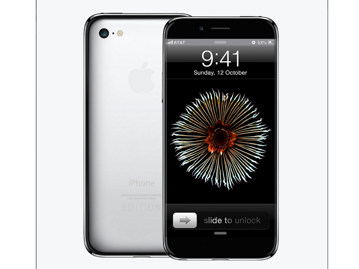
Inspired by the Apple Watch, this concept does away with that camera lens bump that had so many tech pundits up in arms when the iPhone 6 and 6 Plus were revealed. Apart from that cosmetic difference, the Home button with Touch ID has been moved to the top side of the phone for a more organic operation, making room for a big phat screen. The two volume buttons have evolved into a single one that also doubles up as a quick mute switch, for when you get embarassed by a call in the middle of a meeting.
Nikola Cirkovic
Here, the antenna lines have been repurposed to make iPhone interaction that much easier. This concept forsakes old-fashioned buttons in favour of sensors. The lines detect when the phone should be inactive and automatically wakes it up when it’s held in front of your face. If the Apple Watch can instinctively blink to life when you raise your wrist, why not the iPhone, right?
Martin Hajek
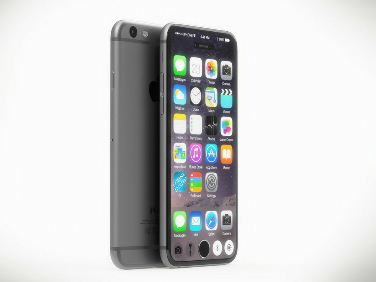
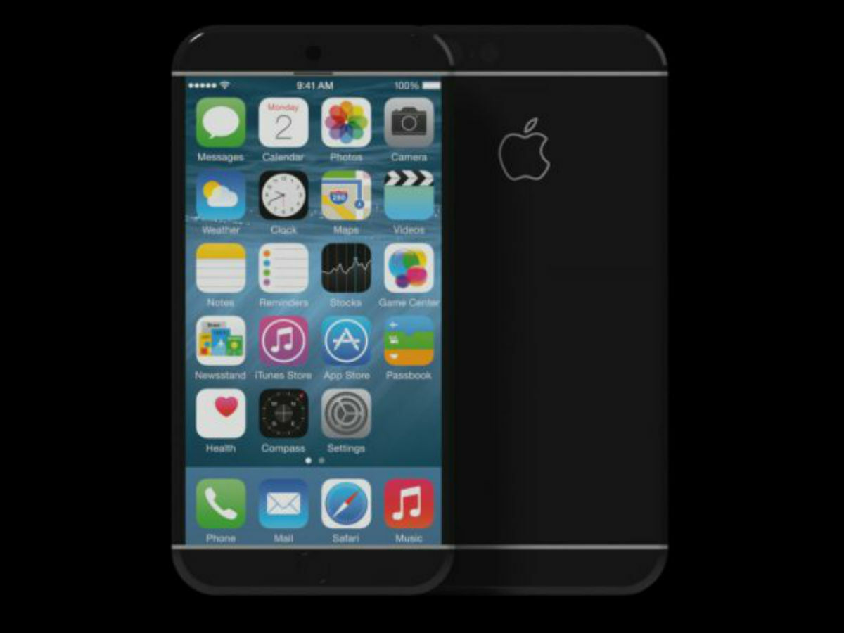
Probably the closest to the current iteration of the iPhone, this professionally-rendered concept imagines an iPhone that’s really quite feasible. It’s all display, except for where the Home button is, so additional icons, like video controls when you’re watching a movie, can be moved to the side. We’ll never again complain about the lack of screen real estate.
And one more…
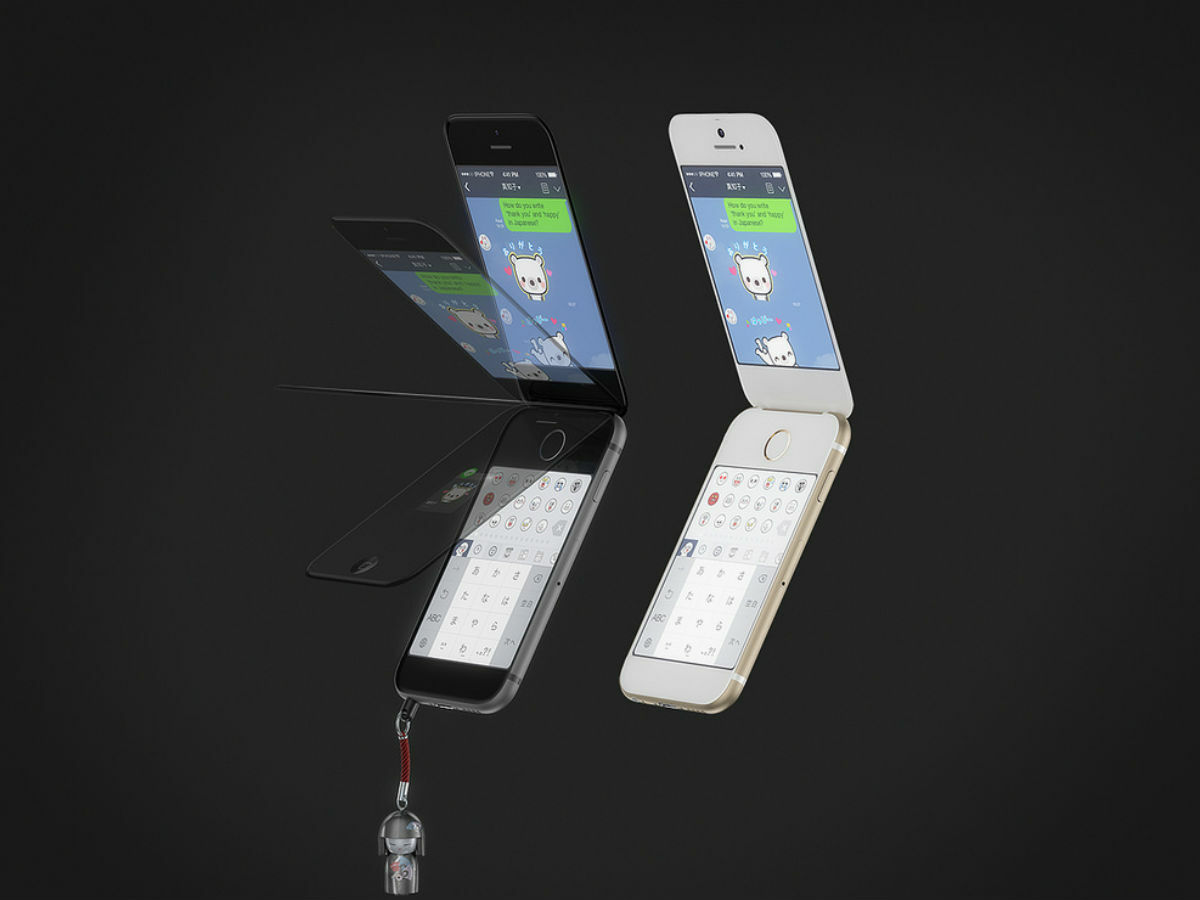
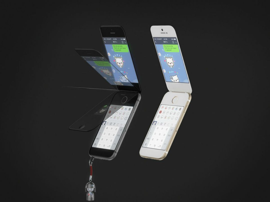
From the same designer comes a Japanese-inspired flip iPhone. Flip phones are apparently still all the rage in the land of the rising sun and they’re called ‘garakei’, thus making this particular version the garakeiPhone. Geddit? Featuring a touchscreen in place of where the number pad would usually go results in a cool current smartphone with nostalgic leanings. We can’t picture Apple ever making this reality, but still, we live in hope.
NOW READ THIS › Apple iPhone 7 (or 6s) preview

