Apple 2020 year in review: the good, the bad and the Big Sur ugly stick
From the highs of M1 Macs to the lows of how little you can plug into them
2020 is nearly over! Thank heavens for that. On the plus side, Apple did some pretty great things this past year. But also some bad things. Tsk. It’s never 100% positive, is it?
All of which brings us neatly to our end-of-year Apple review, giving us the chance to celebrate the fab bits and have another gripe about those moments we’d sooner forget.
The good
M1 chip
The M1 chip arrived in a flurry of Bezos graphs and hype – but it largely lived up to the claims. Pitting the M1 MacBook Pro against its Intel-based predecessor embarrassed the older – yet theoretically higher-specced – Mac. We had to keep reminding ourselves this is the slowest M1 chip Apple’s ever going to release, which bodes well for when Apple starts using the things in higher-end Macs next year.
Rosetta 2
If you’ve suffered through dismal Windows on ARM x86 emulation, you’d have been concerned similar problems would befall M1 Macs. But fire up an Intel app on one and Rosetta 2 quickly installs. Thereafter, Intel apps just work – in fact, on M1 Macs they can be more performant than on Intel Macs. It’s not perfect – there are some compatibility issues, but Rosetta 2 is Apple doing its best to make a tricky chip transition seamless for the majority.
iPhone 12 Pro Max camera
We liked the iPhone 12 Pro Max a lot. It’s Apple’s biggest phone to date – and, on paper, its best. But the camera’s what makes it stand out, going further than any previous iPhone snapper – and the one stuffed inside its smaller sibling. In letting in more light, you get jaw-dropping night shots, and improvements over last year’s phone are especially evident when shooting to RAW. It’s almost enough to make you forgive Apple for the ludicrous size of the camera bump.
iPhone 12 mini
Rumours suggest iPhone 12 mini sales haven’t been stellar so far. We hope such rumblings are hogwash, because the iPhone 12 mini is a spectacular small phone. Rather than stuffing last year’s tech into a years-old frame, this is an iPhone 12 that’s been put through a hot wash – a no-compromise tiny blower packed with power and features, and yet at a lower price-point than its larger sibling. Perfect stuff for the small of hand or pocket.
WWDC 2020
This year’s WWDC could have been a disaster. After all, how do you transform keynotes in a packed hall, countless developer sessions and days of socialising into the virtual realm? WWDC 2020 provided a framework of sorts for COVID-era conferences, going big on inclusivity and fashioning a keynote that didn’t try to replicate a stage-based equivalent. Of course, something was lost for people who love being there in person, but WWDC was nonetheless a surprising and welcome success.
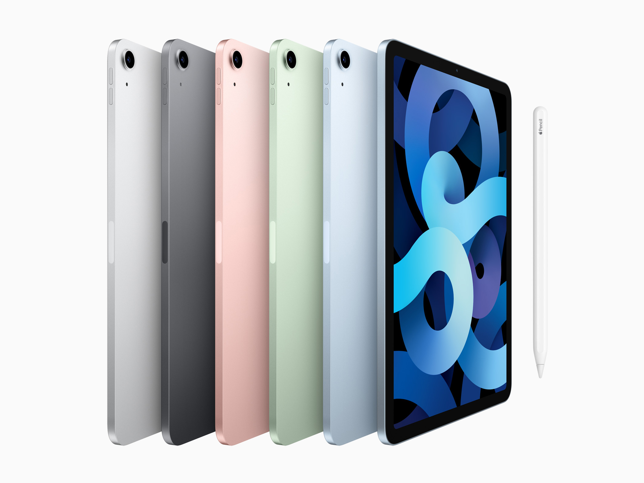
iPad Air
Last year’s iPad Air got you plenty of power packed into a dated design. This year’s Air was the spit of an iPad Pro, and included many of its best features: the snazzy design; an even bezel around the screen; Apple Pencil 2 support. The A14 chip even outperformed the iPad Pro’s A12Z in our tests. Naturally, you pay for these improvements – 100 quid over last year’s model – but you no longer need to ‘go pro’ to get a premium iPad in your mitts.
iOS 14 widgets
There was a lot to like in iOS 14, but Apple finally bringing widgets to Home screens has been our favourite new feature. Yes, Android has had widgets forever, but they’re not as sleek and smartly conceived as what you get on iOS. And because of this, countless developers have got on board, devising little windows into their apps you can catch at a glance, or use to quickly get at cherished content.
Apple Watch hand washing
You probably didn’t think you needed a hand-washing timer, but when your Apple Watch starts counting down, you might realise how lax you’ve been at scrubbing away. Although we’ve since learned COVID is more about aerosol than hand-based transmission, it’s notable that health organisations reckon other communicable diseases are down in part because people are washing their hands more often; and with watchOS 7, Apple Watch owners will wash their hands better too.
Doubling down on privacy
With iOS 14, you got the feeling Apple had finally had enough when it came to shady business practices in third-party apps. We learned a number of major apps were regularly polling the clipboard and tracking your movements. Elsewhere, advertisers demanded carte blanche to track your every move online. Apple slammed the door shut on such things. Hissy fits ensued. We know whose side we’re on with this one.
Commitment to accessibility
Apple’s long been strong on accessibility, but the company showed this year that it never stops thinking of new ways to make its devices accessible to more people. A new accessibility website showed off features such as the iPhone’s magnifier, back tap functionality, descriptive smarts for the visually impaired, and sound recognition for the hard of hearing. Many of these features potentially benefit a much wider range of users too.
We also liked:
- Apple One saving us a few quid on multiple Apple services subscriptions
- AirPods Max showing what Apple can do when it designs a pair of cans
- Family Sharing for IAPs and subscriptions for another round of savings
- HomePod mini squeezing serious audio oomph into a tiny fruit-sized package
- Apple’s 2030 carbon neutral pledge, because we’ve only got the one planet
The bad
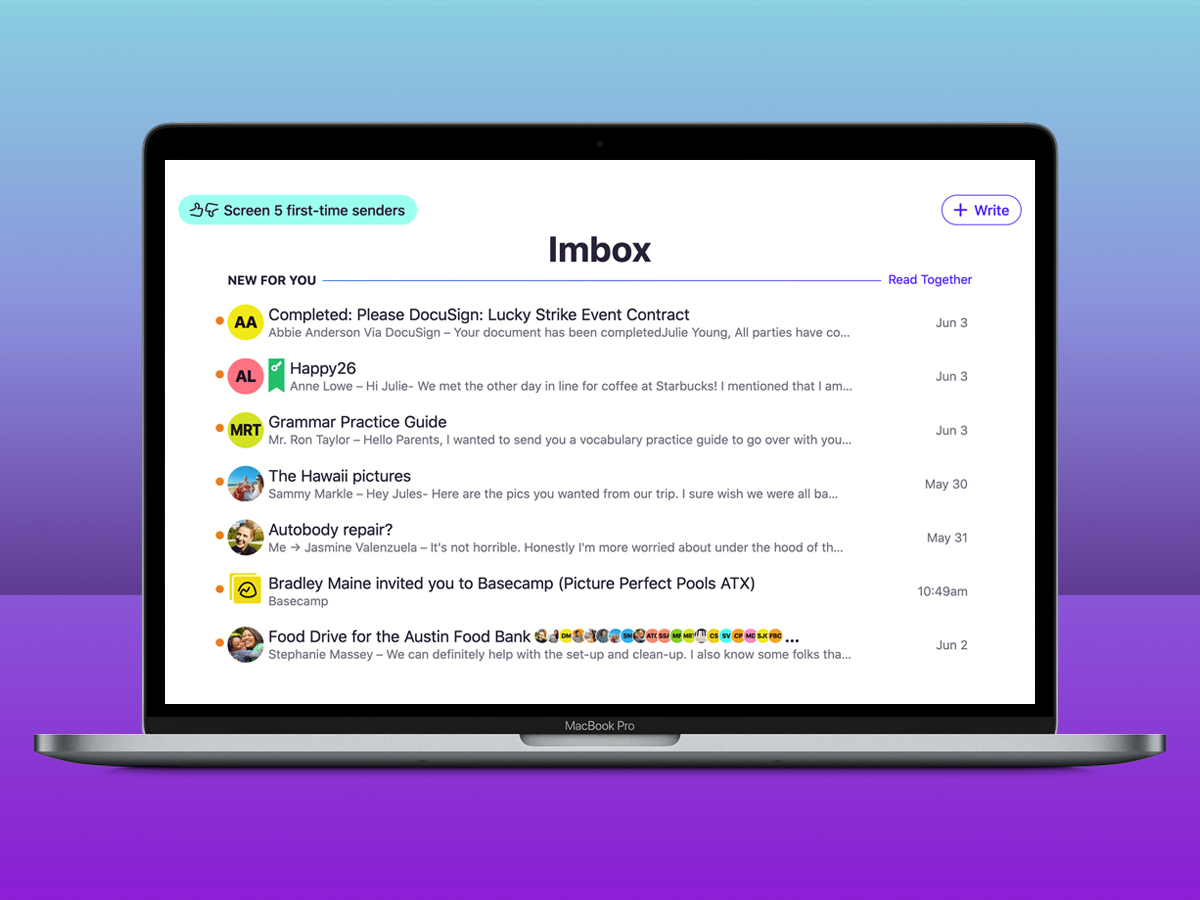
Developer relations
Apple’s relationship with developers bounces between rosy and fraught. During 2020, it often bordered on disastrous. There was a spat with Epic, fights with Microsoft, and a PR disaster with Basecamp’s HEY email. Under the radar, indies griped about apps being rejected due to Apple’s opaque rules when other – more heavily income-generating products – got away with worse. Some of this was companies out for themselves, but Apple was regularly on the defensive – for sometimes indefensible policy.
Streaming gaming stubbornness
Speaking of indefensible policy, Apple’s stance on streaming gaming became news, due to its seemingly intentional incoherence. As far as we can tell, Apple said no to streaming gaming and then yes, but only if every title from a service was submitted as a standalone app – you know, in the way Apple doesn’t demand for albums, books or TV shows. It felt like Apple saw a threat to Apple Arcade and cut it off at the knees. Microsoft took its bloodied limbs home and resolved to get xCloud on to iOS via Safari instead.
iPad apps on macOS
At WWDC 2020, Apple revealed that M1 chips sharing architecture with A-series chips in iPads and iPhones presented an opportunity: iPad apps and games on Macs. An executive’s favourites were very briefly demoed. Now we’ve had the chance to test this feature ourselves, things… aren’t great. Multitouch titles are miserable. Windows often don’t expand – even for media apps. The whole thing’s a mess – and suggests Apple should rethink its reluctance to integrate touchscreens into Macs.
M1 Mac connectivity
The M1 chip inside Apple’s new Macs offers stellar performance – but it also creates curious restrictions. The most evident is the limit of two Thunderbolt/USB 4 ports, which feels particularly restrictive on the Mac mini. These ports do at least each provide full bandwidth, rather than the pair sharing a bus, but that’s not a comfort when you’re lacking ports to plug things into.
Lightning sticking around
We were mildly terrified at the prospect of Apple sealing up the iPhone and claiming no ports was revolutionary. Instead, we got no revolution at all as Lightning hung around like a bad smell, and found its way on to Apple’s new AirPods Max as well. With the industry shifting from USB-A to USB-C, Apple leaving its third way in the mix is deeply unhelpful to anyone trying to cut down on cables and adapters.
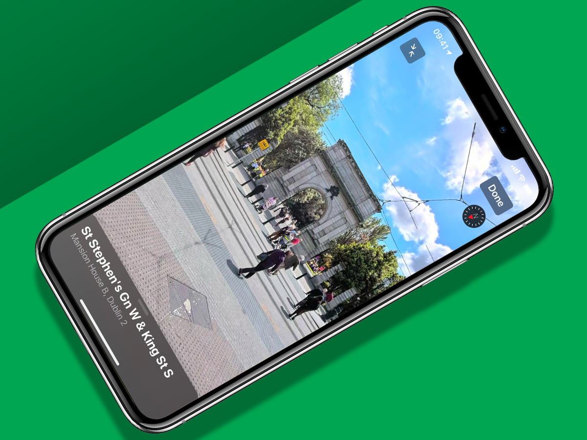
Slothful Apple Maps rollouts
Whenever Apple makes an Apple Maps announcement, we feel a massive asterisk should appear on the screen, because these features never rollout as widely as you’d hope. Look Around rocked up in the UK this year, bringing a Street View equivalent to Apple Maps – in certain, very specific locations. The same goes for bike directions and other new features. Perhaps by 2030, we’ll finally be able to switch from Google Maps.
Ditching chargers
We understand Apple’s eagerness to drop pack-in chargers and headphones. These things are environmentally costly, and many people tend to end up shoving them in a drawer, unused. The end result is waste. But during periods of port transition and when devices need specific hardware to charge at speed, not including these things feels customer-hostile – not least when you spot the cost of relevant first-party kit on the Apple Store.
Blood oxygen tracking
We’re not against Apple’s intent with this one. Being able to track blood oxygen is a noble goal – doubly so in a COVID world. But the execution on Apple Watch isn’t up to scratch. When we can get blood oxygen readings at all – which isn’t often – they mostly suggest we’re already dead, which isn’t helpful. Worse, this lowers confidence in the device’s other health-based abilities, most of which are stellar.
Doing nothing with Dark Sky
On 1 April, Apple ate Dark Sky, in what fans hoped was a terrible April Fool’s Day jape. It wasn’t. The service’s blog noted almost everything would be shuttered as Apple would integrate Dark Sky into its own services. But that didn’t happen. So far, all we’ve seen is US-only rainfall indicators in Apple’s Weather app. Arguably, this isn’t a bad thing, but the plan is still for the API and website to vanish. We hope Apple has a change of heart and just rebrands both.
The Home indicator’s continued existence
No, we’re not going to shut up about this one. Another year’s gone by and Apple’s still persisting with the notion that a massive black or white stripe scything across the foot of the screen is a good idea. It isn’t. Immersive apps/games should be able to disable the thing. Failing that, users should be able to. It’s been three years since the iPhone X rocked up, Apple – give us an off switch for this distracting, ugly piece of UI.
We also weren’t keen on:
- iPadOS lagging and omitting key iOS 14 features App Library and Home screen widgets
- AirPods Max’s case, which is reportedly easily scuffed and looks like a bra
- Reduced battery life for flagship iPhones, compared to last year’s models
- iOS notifications on Big Sur, which you can’t do anything with, bar swipe away
- Rewarding skeevy IAP games in Apple’s Apple Store Best of 2020 awards
The ugly: macOS Big Sur
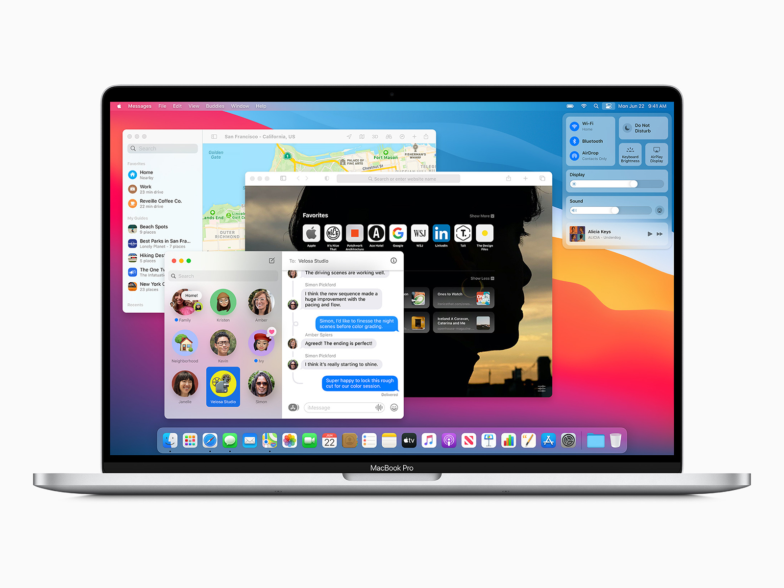
We tried really hard to like macOS Big Sur’s visual redesign. But even with the refinement Apple made since the summer betas, it feels like taste left the building. It manages to be both garish and also lack clarity. Menu shortcuts are bafflingly all greyed out. All the icons are shaped like iOS ones, including, absurdly, Google Chrome’s, which ends up looking like an icon within an icon. We get that change is a thing, but this feels like Apple tried to mash iPadOS into macOS with a fork.

