Dashboard is reborn in macOS Sonoma. Apple: bring back these lost Mac features too
Everything old is new, except the old that Apple hates, which shall remain dead forever

This past week, Apple used tech to change the world. And I’m not talking about its fancy ski-mask that welds screens to your eyes and lets you pretend you’re sat before a 100in display on which you can manipulate Excel spreadsheets with your fingers.
I’m referring to Apple having invented time travel! During the WWDC23 keynote, Apple hurled countless thousands a full 18 years back in time, to the halcyon days of 2005, to gawp at widgets you can directly place on your Mac’s desktop. Or maybe the company reheated Dashboard and pretended it was an Entirely New Thing. Definitely one of those.
I’m not miffed. It’s frustrating when Apple bins a feature you find useful, and then years later has a crack at remaking it in a worse way. (Hello, macOS Ventura widgets lurking in a menu accessed by clicking the clock!) But at least the sort-of-new macOS widgets look snazzy. Even if it was laughable how Craig Federighi and his lovely hair tried to claim the widgets “maintain legibility” as nu-Dashboard fades into your desktop background when you position an app window in front of it. Tsk.
Anyway, this all got me thinking. Apple resurrected and de-zombified Dashboard. It gave it fancy new features, like running widgets from nearby iPhones. So what else could Apple bring back? And by ‘could’, I mean ‘should’. And by ‘should’, I mean because I want that specific thing back.

1. Window stashing and shading
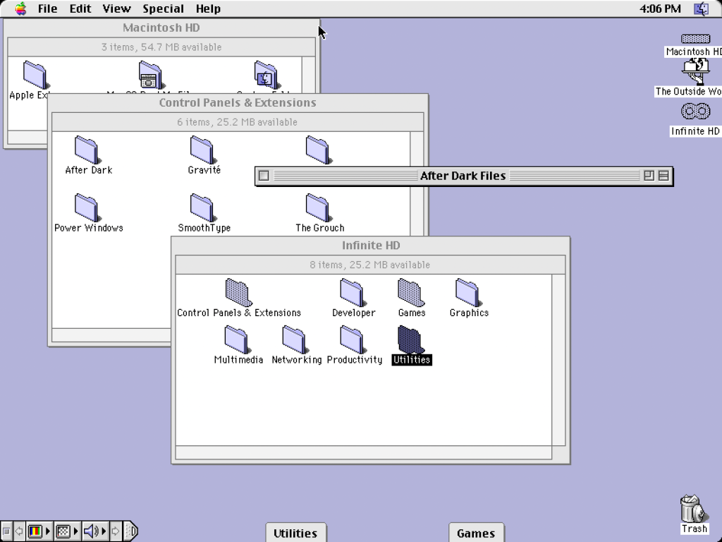
WindowShade dates back to System 6, when it were all fields around these parts. It was a third-party extension Apple subsequently ate, which let you peek behind a window by double-clicking its title bar. Handy. In Mac OS 8, Apple also added a feature that let you stash windows at the bottom of the screen, as readily accessible tabs. Today, double-clicking a title bar resizes the window in barely predictable ways, and the only stashing is to the Dock, where every minimised window looks identical until you hover the cursor over it to see its title. Huff.
2. Features for old people
Following on from that last point, Apple designers increasingly delight in playing a game called ‘hide the feature’. Not sure where a clickable interface element lives? Randomly move your cursor around until it appears from the void. That’s assuming you can see it. Because contrast is also a dirty word over Cupertino way. Grey on grey is the new black. Except greyer. That includes menu keyboard shortcuts, which now uniformly look disabled, since their hue matches inaccessible menu commands. So I’d like Apple to bring back coherent design. Or at least design that doesn’t require 20/20 vision.
3. Controls created by non-sociopaths
And if we’re going full retro, Apple could resurrect buttons and controls that look like buttons and controls. I’m not suggesting the company go full skeuomorphism again. I’m not sure anyone needs fake leather and torn paper on Calendar, or for Contacts to look like an actual address book. But it’d be nice if we didn’t have to click around where we think a text field might be, or hover over a pop-up menu control for its borders to appear. Similarly, if someone fancies making the ‘close’ hit area on notifications marginally bigger than an atom, I’d appreciate it. Thanks.
4. iTunes
Just kidding.
• Now read: The best macOS 14 Sonoma features headed to your Mac


