Galaxy S5? You’ll never tempt me away from my Nexus 5
Samsung's latest superphone is nearly with us - but no matter how good it is, it won't be a patch on Google's most recent effort, says Mark Payton
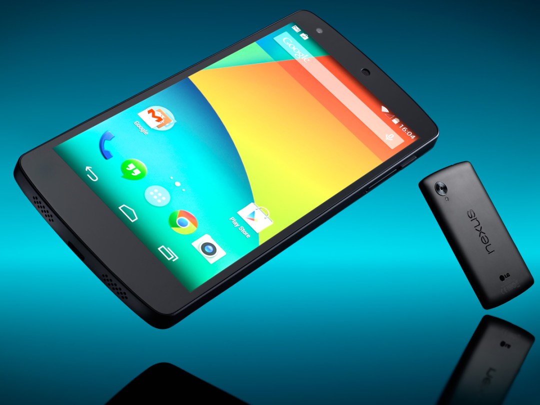
Let’s get the disclosure bit out of the way first: this is not going to be a completely objective view of the Nexus 5.
For starters, I’m a sucker for Android as Google intended it. I’ve owned an arsenal of Nexus phones and tablets, and couldn’t care less that millions of you seem to think that Samsung’s TouchWiz is a thing of beauty. All I see is garish colours, cheesy icons and more misalignments than a dress made in the dark. By comparison, stock Android is lean and polished.
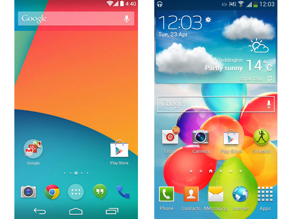
Then there’s the fact that Samsung and HTC insist on cramming their hardware with their own apps and interface tweaks. Some are theoretically useful, assuming you live the life of the ultra-fit, hyperactive fantasy folk who populate television advertising. I’ve never used a single one of them; they’re the mobile equivalent of the bloatware on an HP laptop, destined to be uninstalled the moment it leaves the box.
Lastly, there’s the little matter of price. I wavered for all of 30 minutes before putting the cash down on a 16GB black N5 on the day of its launch. That lost half hour was spent deciding between the Nexus, Apple’s newly released iPhone 5s and the imminent LG G2. But either of the latter two would have meant putting at least £200 more on the counter. At just £299 for the unlocked 16GB N5, the decision’s pretty much made for you.
But that was then. I’ve had the Nexus 5 by my side for five months now, so boredom should be setting in (keep in mind that my smartphone months are in dog years). HTC’s new One M8 is out and beckoning, while Samsung’s Galaxy S5 will hit the stores in a few weeks. So what I have learned from life with an N5 – and is it time to move on?
Design and build: matt, flat, featureless… and perfect
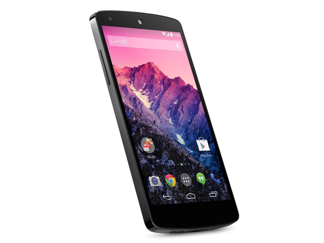

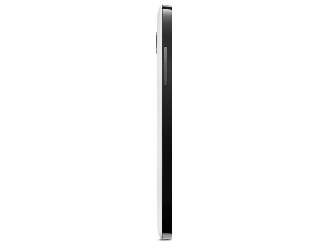
You may think that there’s something slightly wrong with the Nexus 5 straight out of the box. Most handsets have some sort of finish to their shells. Not the N5. It looks as though it was whipped from the production line a little too early: the surfaces are flat matt, in a way that suggests it’s missing a final spray on the casing. But then something strange happens. Give it a week, and other handsets begin to look gaudy and greasy, while the Nexus morphs from under-cooked to a design that’s sharp, minimalist and tasteful.
The transformation may not happen for you, of course. Shortly after the iPhone 5c‘s launch, I was persuaded to review one in luminescent yellow with a powder-blue case. When I close my eyes, I can still see the damn thing now. I was objective about its performance and features, but every moment with the little Apple was an embarrassment – I flat refused to take it out in public. No surprise, then, that the black, almost featureless N5 is my idea of heaven. The only people who ever comment on it are Android fanboys, most of whom want to prove that their LG G2 is better (which, with that LG UI skin, is a fruitless task).
Functionally, the Nexus is as business-like as the design. The power button is on the right-hand edge (HTC: are you watching here? It’s the one flaw with the One that you could so easily put right…). And the volume rocker’s on the left – easy to locate, easy to use (how much fuss can there be designing something that only does two jobs?). If you want to plug in headphones, you use the mini jack found on the top left. And if you want to charge it, head for the microUSB on the bottom of the unit. No waterproofing plastic caps, no slide-out keyboards, no funky buttons – the Nexus is as Route One as a phone design can get, and none the worse for it.
You will find, though, that while the screen does an admirable job of repelling fingerprints, the slightly rubberised back of the unit is addicted to them. My black N5 does its best to hide the issue, but you’re always aware of the smudges.
Performance: Moore’s Law no longer applies
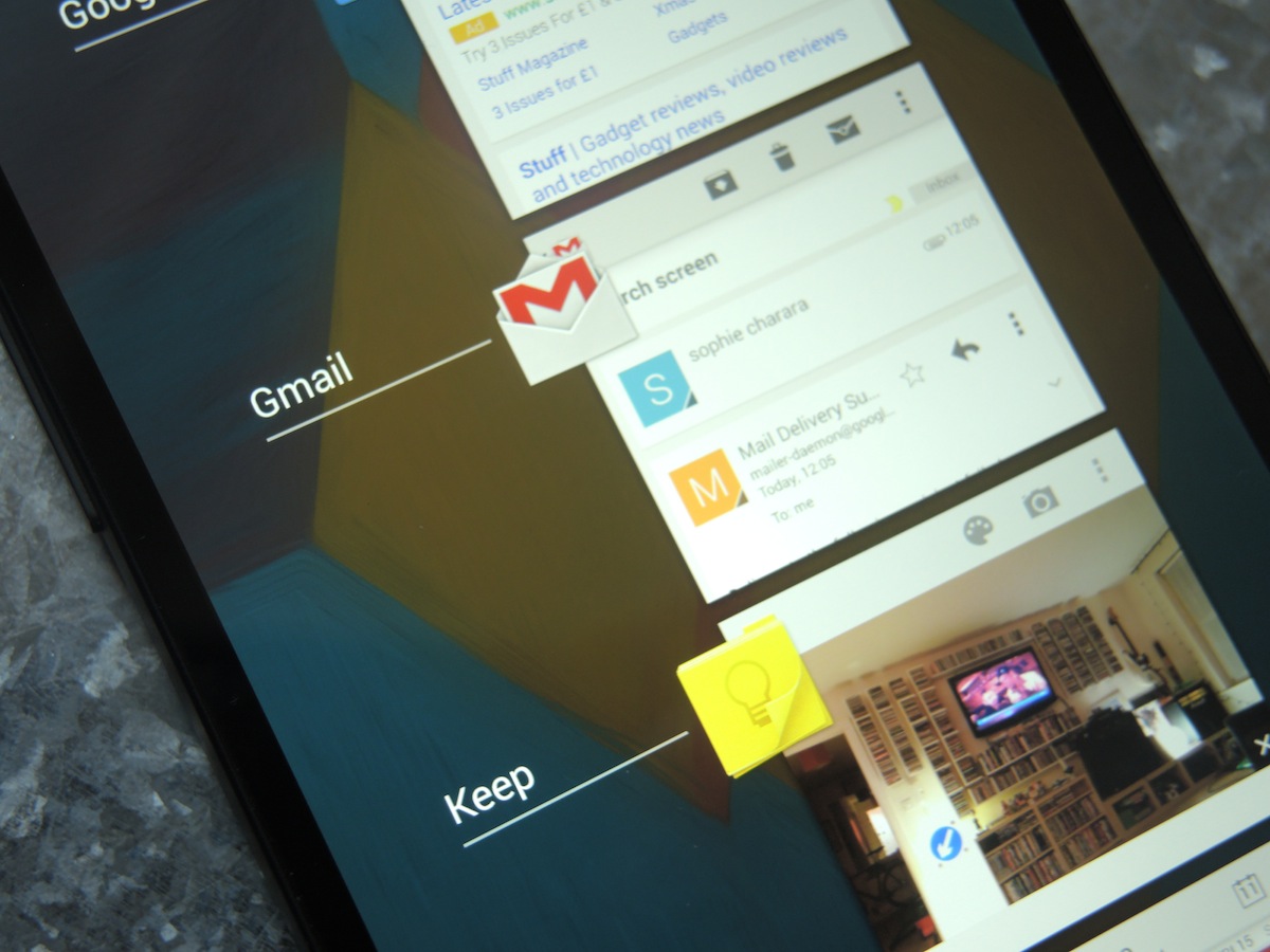
The spec battle between hi-end Android handsets is all good fun, but ultimately misleading. A Galaxy S4 is more or less a match for my N5 in processing power, memory and screen. Yet one responds instantly to every touch, while the other spends milliseconds scratching its chin before agreeing to your demands. In other words, the Nexus 5 is laughable value if what you really value is speed. And who doesn’t?
There’s absolutely no lag in Android 4.4 KitKat, and the 2GB of RAM delivers multi-tasking that is instantaneous, regardless of how many apps I have open. I’m sure the Nexus 6 this year will see an upgrade to the memory and processor, but I honestly cannot see the point. My Snapdragon 800-powered N5 does everything without fuss or delay.
Battery life: read my lips – they ALL last for a day
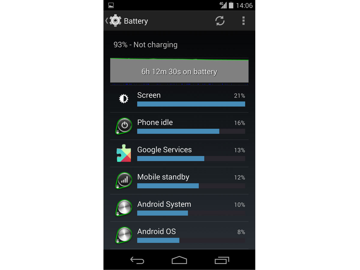
If the world’s forums are to be believed, 80 per cent of all smartphone chat is about battery life. And none are more vocal than Android forums. Owners claim everything from 30 days to 30 seconds for their handset, with countless suggestions for tweaks that’ll squeeze another day’s life from the device. Oh, and incessant chatter about the update or ROM that’ll fix it all.
I’ve always viewed the exchanges with bemusement: most handsets I’ve owned in the last three years have show 25-30 per cent at the end of the day, and since I sleep in a bed with a plug socket nearby (I know – weird, right?), it’s just natural to plug the phone in overnight. I’ve never owned a phone that lasted two days, or habitually drained its juice to zero in minutes. But then, I replicate the same settings on every Android handset I use – turn off all background sync for every app bar mail and calendar, and turn off GPS (who wanders the streets needing that kind of accuracy anyhow?).
And guess what? The Nexus 5, with its sealed 2300 mAh battery, performs precisely like every other handset. Like most of you, I hammer my phone during the day – constant email, browsing and a manual updating of apps (Evernote, Play Newsstand, Twitter etc). By bedtime, it’s showing 25 per cent. Regular as clockwork. If I really thrash the N5 (tethering my Toshiba Chromebook to it on a one-hour train journey, for example), I can kill it by 7pm in the evening. But then, what else would I realistically expect?
The Nexus runs Android 4.4.2, which brings a simpler interface for controlling location settings (‘high accuracy’, ‘battery saving’ and ‘device only’) and monitoring the apps that are using location to draw on your power. It works well, but – as I pointed out earlier – you’re as well served taking 10 minutes to check how many of your favourite apps are set to background sync or push notifications. As I write, the internet’s alive with tales of an update from Google to fix alleged Nexus 5 battery drain issues. I’m sure that the people experiencing the problem are telling perfectly valid tales, and can’t wait for the update to land. Me? I have no idea what they’re talking about. Which either infers variability between Nexus 5s in build (ie mine has different components to yours), or rogue apps.
Display: not designed for showroom show-offs

I’ve used a Galaxy S4 and Note 3 in the time I’ve owned the Nexus 5. Both examples of the top-selling Samsungs suffered from a cold blue tint to their displays, especially evident in applications with white backgrounds (if you’re an S4 or Note 3 owner, go grab Todoist – you should see what I mean). The Nexus, by comparison, is more neutral, and therefore easier on the eye for long periods of time. It’s also beautifully sharp, as you’d expect from a full HD, 1080p display. And at 4.95in, it’s the perfect size – so much so, that I hadn’t noticed how much it had displaced my iPad Air in day-to-day use.
Positioning the Nexus as a full laptop replacement would be dumb, but it’s more than powerful and sizeable enough to bring the need for a Nexus 7, say, into question. You should find yourself setting the N5’s brightness to around 25-30 per cent. This gives the best of all worlds – any brighter, and you’re simply draining battery faster; any lower, and it can be a struggle to make out text and images in sunlight. I can’t imagine why anyone would set their N5 to 100 per cent for daily use… unless they wanted to spend their days bragging about their 1920×1080 IPS+ display to friends from a distance of five yards.
Storage: giga-fetishists look away
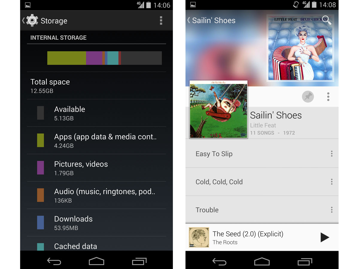
Another common gripe among Nexus haters and owners alike is the absence of a microSD card slot; you’re limited to either 16GB or 32GB of onboard storage. Until recently, I never understood what the problem was – many popular apps didn’t offer the option to move default file locations, so effectively rendering a microSD slot useless anyway. But the criticism has become more valid in recent months, especially with updates to Google Play Music (and the launch of All Access subscriptions), letting you choose where offline files are stored.
Maybe I’m unrepresentative of the average smartphone user: my Nexus 5 is a mere 16GB, but I’ve only ever used roughly half of the onboard capacity. If you’re the type who shoots mini Hollywood epics during the day while chomping your way through the collected works of The Beatles, go for the 32GB N5 – easy as that. Or buy yourself a USB On-The-Go (OTG) cable, and you should be able to connect your unrooted N5 to an external flash drive (check around before doing this – reports vary on compatibility).
Sound: do not turn it up to 11
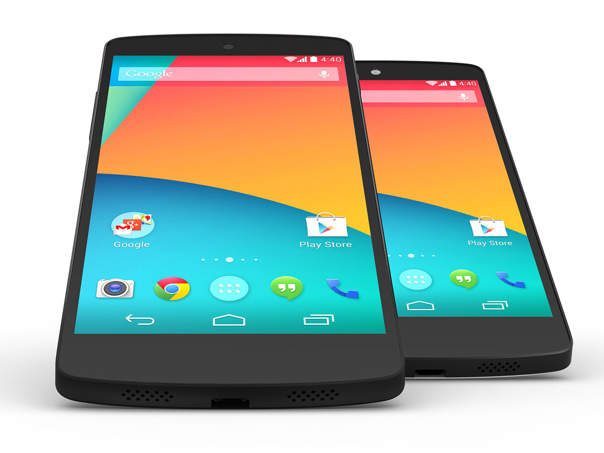
The Nexus 5’s speaker is the one thing that make me regret ditching my HTC One. Notice I said ‘speaker’ – although you’ll see twin grilles on the base of the Nexus, only one of them houses a loudspeaker (the other, in case you’re wondering is a mic). I can’t count the number of times I used the HTC One last year to show off the speakers – either playing a video for someone, or just letting it run through a playlist. But since switching to the N5, the habit has entirely gone.
The Nexus’ speaker isn’t awful – it’s just painfully average. Tap the Google phone up to full volume, and you’ll be treated to a layer of distortion and lack of dynamic range (don’t expect much by way of bass). It’s perfectly usable for calls day-to-day, but this is no micro hi-fi.
Tap & Pay: and the point of this is…?
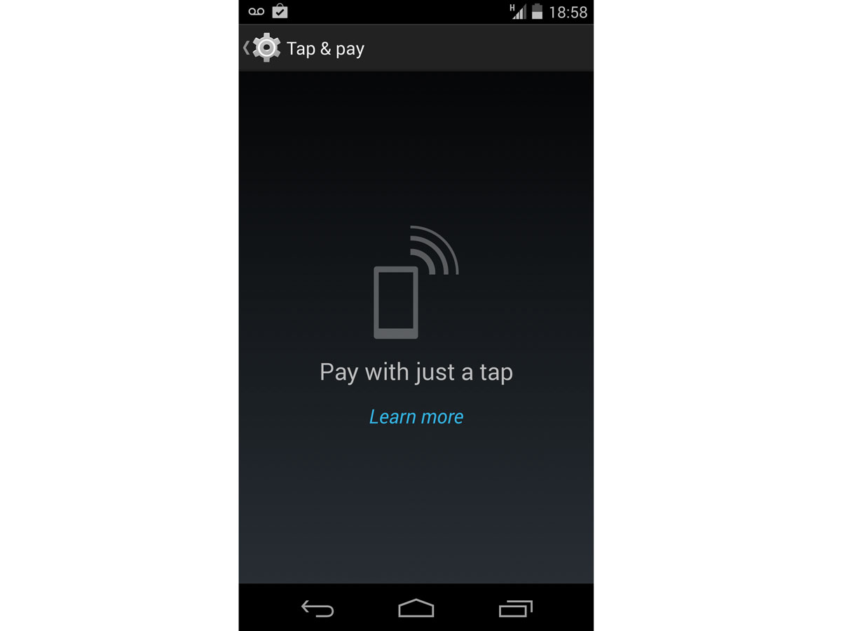
Boot up your Nexus 5 for the first time, and you’ll find NFC enabled by default. Now flick through your Settings screen, and you’ll see Tap & Pay, promising that you can use your shiny new phone to pay at the nation’s NFC-enabled tills. Only problem is, you live in the UK, so the feature’s useless – Google Wallet isn’t available on this side of the pond, and it’s the only app that will bring this specific feature to life (although there are alternatives which use other apps – see below).
Now I understand manufacturers making tech products for global audiences (just one factory line, with customisation of languages and features by territory). But I can’t quite get why Tap & Pay is enabled on a UK Nexus 5 when there’s no damn point – unless Google is planning to launch Wallet here soon. Rumours of an imminent Wallet UK launch have been bouncing around for months now. Until then, NFC on my 5 is disabled – and with it, Tap & Pay vanishes from the Settings screen.
What about the camera?
Google Now: a snack, not the main course (yet)
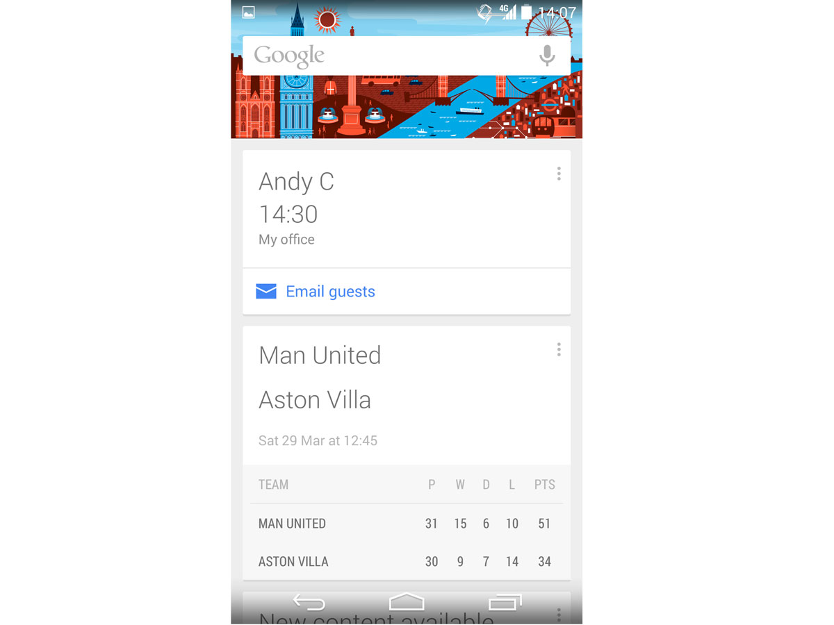
In many ways, the Nexus 5 is Google Now. It’s the flag bearer for the latest Android upgrade (4.4), which puts Now front and centre (well, OK, swipe left or swipe up) and it’s seemingly updated once a month with a host of cool new features every time. And with KitKat, Google is actually reversing the Android experience into Now; in basic terms, regard all of your home screens as extensions of the Now interface.
But try as Google might, the service that attempts to predict your world still feels like an occasional snack rather than the main course. Don’t get me wrong: I use it. But that’s mostly as a distraction when on the train or stuck for something else to do. It’s an in-between-time service, so not one that I couldn’t lose (if it died, a mash-up of your current apps could be used to replace it). I also have a hunch that there are N5 owners wandering the land with no idea that Now is installed on their phone. Fresh from the box, the N5 shows two home screens – you only get the prompt to activate Now if you swipe up or begin a search: it isn’t on by default. I couldn’t figure Google’s logic here on the day I got the Nexus 5, and I still don’t get it now.
On the upside, Google Search and its accompanying voice activation have finally learnt British in their most recent updates. Until a few weeks back, you needed to switch your default language to US English before the Nexus would recognise the ‘OK, Google’ voice command – now, it works with the UK English, and it answers you in a plummy English accent.
READ MORE: Android 4.4 KitKat review
What The Nexus 6 Needs To Fix
If Google remains true to form, you’ll see a Nexus 6 in November of 2014 (so honouring the annual upgrade pattern set by the N4 and N5). Expect months of rumours about octa-core processors, 4K flexible screens and gigabytes of on-board storage. All of it will be rubbish – the Nexus range has built its popularity on good specs at spectacularly low prices… it would be extraordinary if Google decided to outgun rivals spec-for-spec (and given the performance of today’s N5, pointless).
Me? I’d put the money on the counter for an N5 with two simple upgrades: 1. Fix the speaker. Just ‘pay tribute’ to HTC’s One (M8); there’s no shame in it. 2. Upgrade the battery: I’m happy to recharge every night, but being able to hammer the N5 harder in a working day would be welcome. Keep the processor where it is, and the RAM – just nudge the battery to 3200mAh, and everyone’s happy.
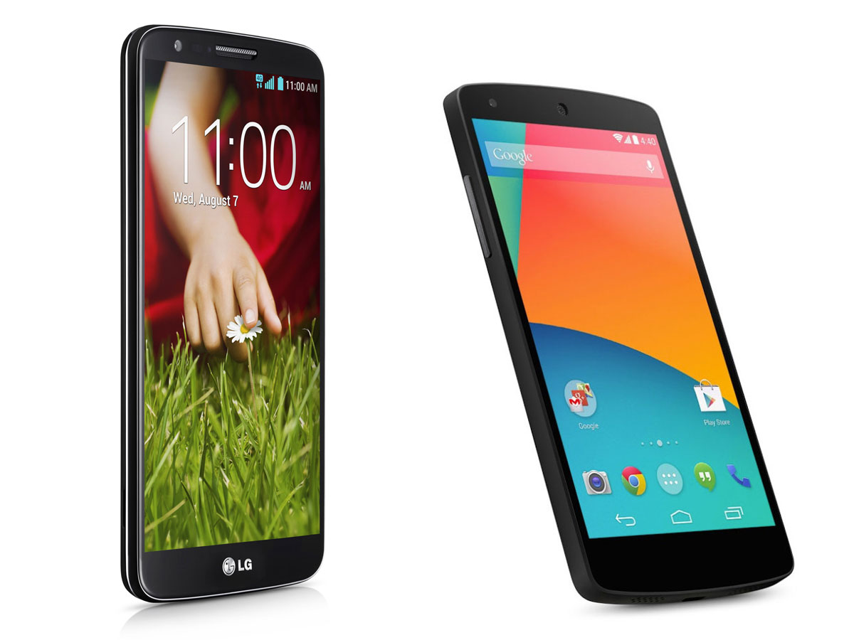
Of course, much of the Nexus 5’s DNA was inherited from the LG G2, and with the Korean giant expected to build the Nexus 6 too, we’ll get a good idea of what it’ll look like when the LG G3 arrives sometime in the late summer/early autumn. Click the link below for more on that.
Anyone want to buy my used Nexus 5?
Well, you can’t. At least not until November. Even then, my N5 may emerge as one of the few handsets I’ve owned that will survive the next generation of hardware. I’m not remotely interested in a Galaxy S5 (blame the plastic, the Band Aid back cover, and that TouchWiz interface, however much they’ve refined it). Even the new HTC One (M8) hasn’t turned my head (well, OK, maybe a slight flinch – everyone else around here has decided that it’s The Second Coming).
In fact, the only thing that could tempt me is a larger-screened iPhone 6 – launch it with iOS7.1 and a 5in+ display, and my credit card would begin to involuntarily twitch. For now, the N5 is ridiculous value for money, and I can’t think of a thing it does that irritates me. Unless Google and LG read my fix list for the Nexus 6 later this year, this one’s a keeper.
READ MORE: Apple iPhone 6 preview


