How I created… the hoverboard
Back to the Future Part II’s Visual Effects Art Director John Bell on imagining the world of 2015… in 1988
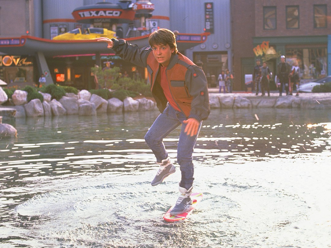
I’d just started getting into the film business a couple of years earlier, so it was a brand new experience for me.
They told me “We’re going 30 years in the future, and there’s something called hoverboards.”
I had to start coming up with images of what Hill Valley could be, what hoverboards could be, whatever might be a logical extension of the first film.
Really, the only thing that I had to keep in mind was that we were in the suburbs. Hill Valley wasn’t going to all of a sudden turn into a big metropolis. It was going to stay a suburb, a sweet little town.
I’d read something that Syd Mead – who designed Blade Runner – had said. When he was trying to visualise 30, 40 years in the future, he looked back 30 or 40 years, to see how things had logically transitioned from one generation to the next.
It’s easy to start coming up with crazy ideas – and you can lose your audience. But if you have something familiar – a shape, a colour, a pattern, a texture – that viewers can latch on to, then it draws them into that world.
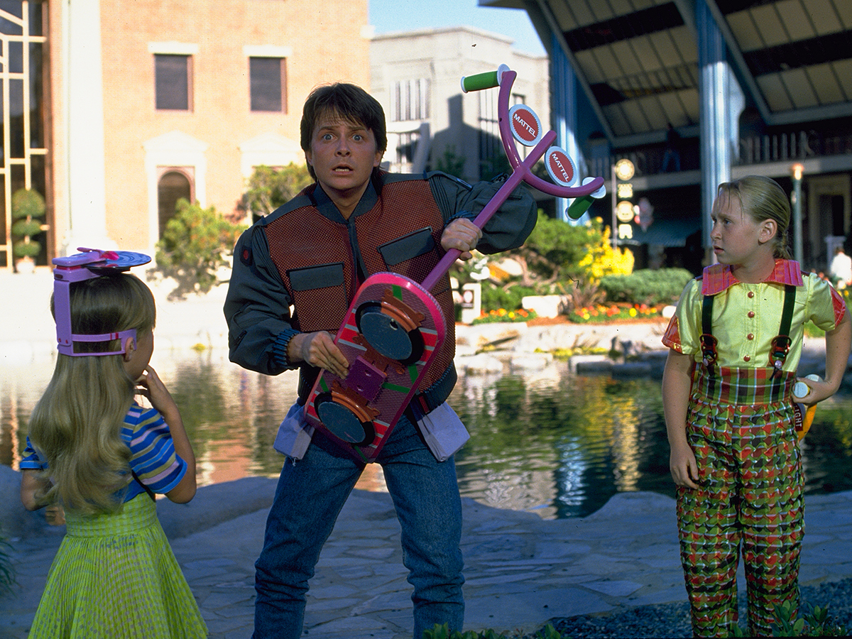
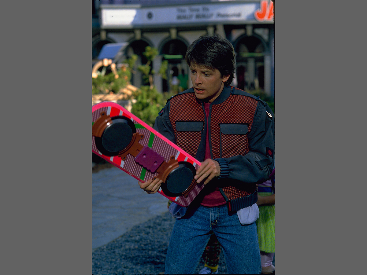
The very first design for the hoverboards was actually circular, like a skim board – with some jets and fans attached to it. They got a lot bigger, becoming a lot more like wakeboards, or snowboards in scale. And I thought, if the 1980s skateboard culture was about modifying and personalising their skateboards with stickers and paint, an extension of that would be that the hoverboard riders would personalise their boards with actual objects along with the stickers and paints. So there are wings added to them, and jets, and random parts – like doll’s heads and vacuum cleaner parts.
The budget and story restraints really had us pare that down. They had to make so many for stunt crews that it was cost-prohibitive for them to make these really intricate pieces for a part of the film that only lasts 90 seconds.
But what came out of that was a more magical type of technology, in a way. Once everything was stripped down off of it, it’s like a smartphone today: it’s just this sleek, simple shape – but inside of it, what makes it powerful, is all the technology that you don’t see.
The Future made real › A $10,000 working hoverboard
We knew Marty’s hoverboard was going to be a little girl’s board, because it was a great contrast to Griff’s gang: they’ve got the big, beefy, burly, sinister-looking boards.
The first designs for that one had Swatch as a sponsor for it – because Swatch was such an iconic brand in the late ’80s, and they had great graphics. Swatch, from what I understand, passed on it. So they said, "Can you do one with Mattel on it?"
In Back To The Future Part II, there was so much product placement – you get that sense of familiarity with those logos and those brands, but it’s twisted into a future reality: "Oh, that’s where Texaco is going to go with gas stations."
I worked with Joanna Johnston on the costumes for Griff’s gang. Back then I was looking at an English magazine called i-D. The graphic sensibility was pushed so far beyond what was being done here in the States and I took a lot of cues from that, not only to help design the costumes with Joanna – a lot of the graphic inspiration for Cafe 80s and other things came from what I was looking at in those magazines.
Everything we came up with was really on a hunch – "What would I want to have in the year 2015? What would be the cool things that I would enjoy?” When you address it like that, if you take it personal, chances are that there are many other people who are going to want that same thing. Your ideas aren’t so unique that they’re going to be held within this small bubble.
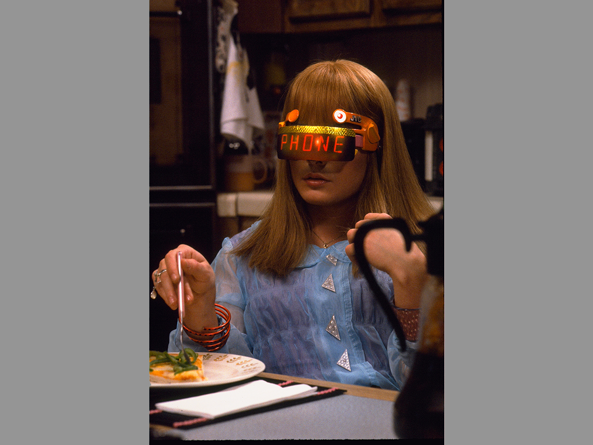
Here we are in 2015 – and see what’s bubbling up, like hoverboard technology, drones and digital technology and Google Glass. They really have a lot of roots in what we were doing back then.
As told to Stephen Graves
