HTC One (M8) vs HTC One – six reasons to upgrade
HTC One looking shabby all of a sudden? Here’s six new things the (M8) does brilliantly (and three reasons it might not be for you)
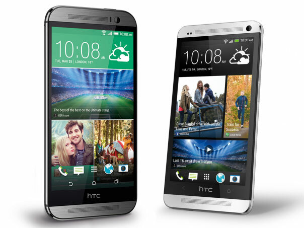
For most of 2013, the HTC One was our darling phone, the one we’d recommend above all others. The G2 nudged it off the top spot but that didn’t make the One any less an (almost) impossible act to follow for HTC.
You’ve heard about the bigger screen, faster processor, camera features and BlinkFeed. But here’s the real reasons HTC One-owning Stuffers would make the leap to the One (M8). Plus a few ways the original HTC One could stay a contender in 2014.
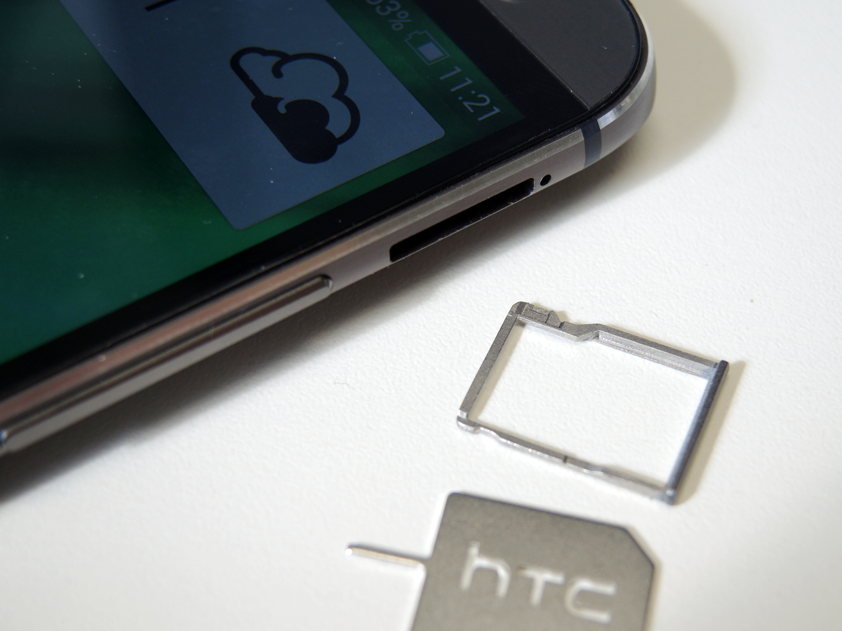
It has a microSD card slot and it’s still beautiful
How many smartphones can you say that about?
Not the original non-expandable One – six months in and you’ll easily fill 32GB, believe us. Or the dual SIM, microSD friendly version of the HTC One announced late 2013 – the flimsy removable back spoils the premium feel.
Not the iPhone or Nexus 5 either – gorgeous but limited or scarily expensive over 32GB. The only rival for media hoarding practicality in a premium form is the incoming Xperia Z2 but the One (M8) is not only dashing in looks but easy to hold too, unlike the blocky Sony.
No more juggling to reach the power button
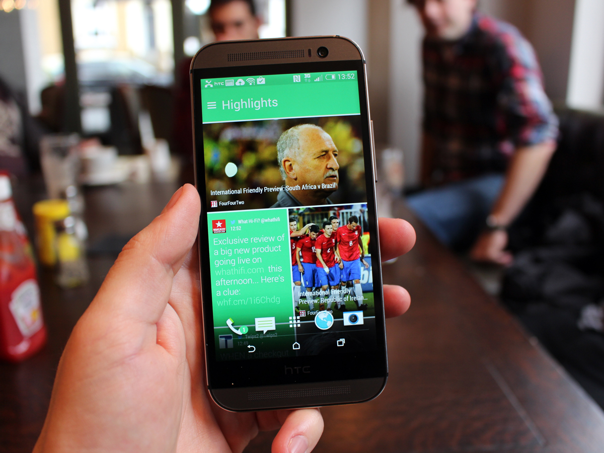
HTC’s moved the One’s power button. It’s now on the right hand side of the top edge to make it easier to press one-handed without hitching the handset up and down in your hand like last year’s.
But you won’t ever use it.
With Motion Launch gestures the One (M8)’s screen can be turned on by double tapping it, like an LG G2, swiping from the bottom of the screen to unlock or from the left or right to go straight to BlinkFeed or widgets. And it’s magic for small handed HTC fans – just keep your thumb hovering above the screen.
5% can last all day
A HTC One with a battery-sapping app installed (more on this later) is a device to curse and curse. It can drop from 14% to 2% to dead right before your eyes.
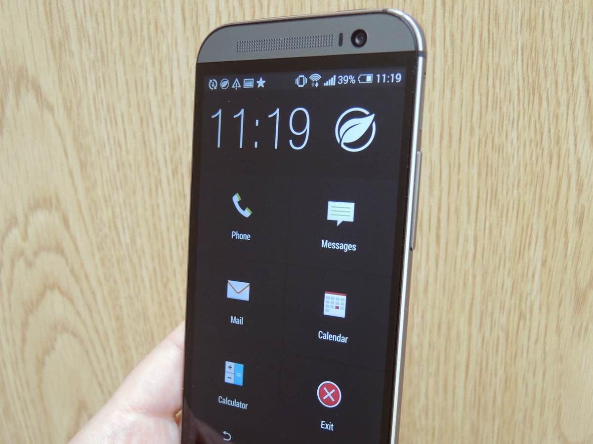
Even though it’s only a slightly bigger battery powering the One (M8), it lasts longer – a day to a day and a half. And if you get stuck without juice, its amazing Extreme Power Saving mode has your back. Ideal for emergencies, it kills everything apart from phone calls, messages, email, calendar and calculator. That 5% could last you 15 hours and so far in our testing, it’s saved us at least once on a long commute home.
It has power-saving step counting
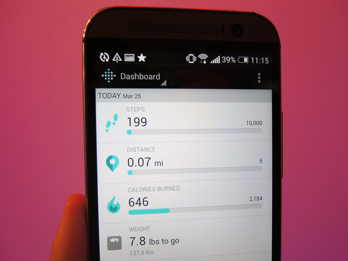
Remember those battery-guzzling apps we mentioned? Fitness apps that automatically track walking and running like the (admittedly excellent) Moves are some of the worst.
So the One (M8)’s Fitbit integration is more exciting than you think. Like with the iPhone 5s version, the Android app doesn’t need an external tracker to monitor steps, distance and calories, it just runs in the background using a low-power motion sensor. More importantly, we haven’t seen any battery problems as a result.
That Dot View case is insanely cool
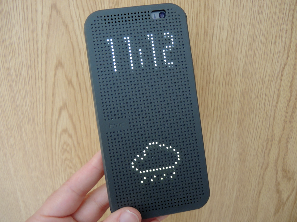
Sure the flappy flip case can get in the way. But hey, it makes us smile.
As well as double tapping to get the time and weather in dot matrix pixels, you get a big old battery icon when you’re running low on juice plus message and phone icons so you know at a glance why your One (M8)’s been vibrating.
And when your alarm goes off in the morning, you can slide down the case’s animated alarm arrows to turn it off. HTC just won the case wars.
It tidies up your Gallery for you
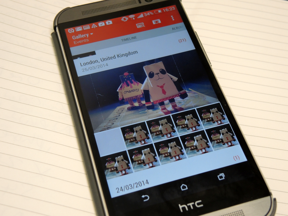
With Sense 6, your Gallery of photos, Zoes and videos gets a clean new “Timeline” layout and it’s much easier to navigate than before. So what? If you take lots of Zoes and, with the new UFocus feature, save multiple images with different focus points then you’ll see a HTC One Gallery can quickly get out of hand.
HTC has even added a search tool called Image Match to help out – it moves photos taken of the same subject into one album. Ah, so thoughtful.
But … It’s Taller
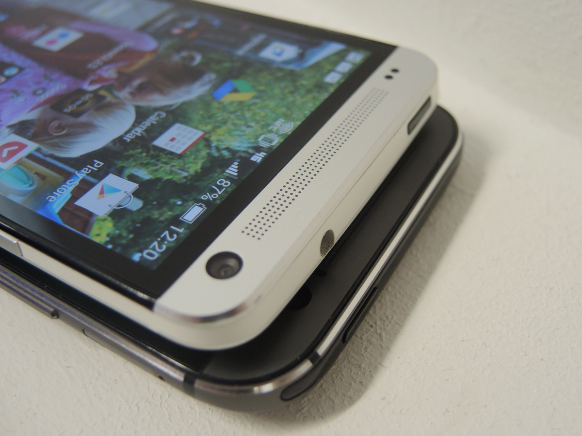
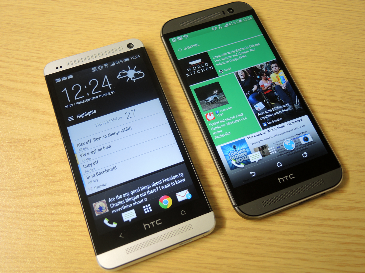
That lovely Full HD screen is now 5in rather than 4.7in but the HTC One (M8) has expanded in size for this very reason.
Though HTC has done a fine job cramming this bigger display into a sleek chassis, there’s no denying the One (M8) is bigger than the One at 8.6mm taller. If the 2013 HTC is only just workable, you’ll struggle to reach all corners of the One (M8)’s screen.
It has the same UltraPixel Camera
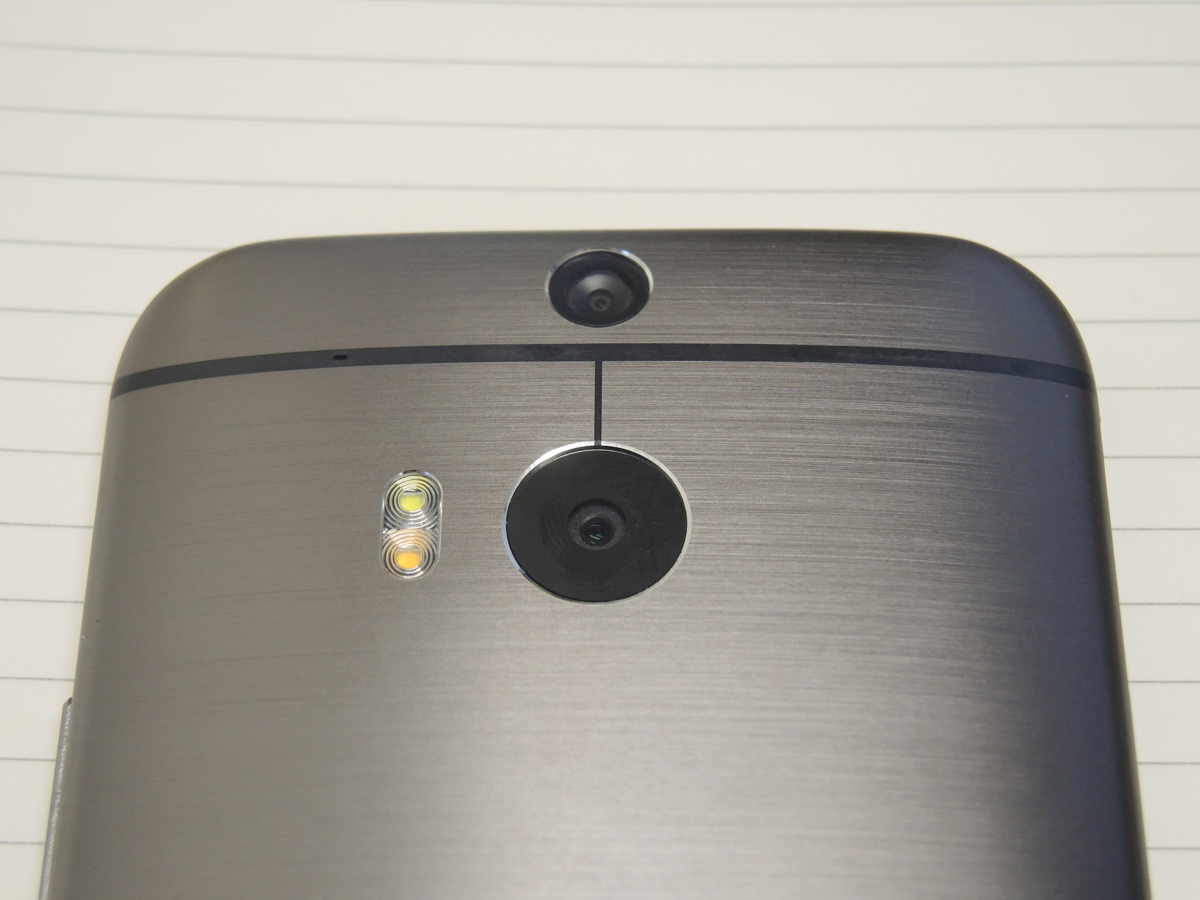
There’s no getting round it, this isn’t the most capable smartphone camera. It just doesn’t capture the detail that a G2, Galaxy S4 or iPhone can.
Colours are punchy and accurate and the HTC is one of the best in low light. But HD video can look a bit smudgy and UFocus would be more awesome with a superb main camera to work with.
The camera was top of our wishlist for the One (M8) but HTC has thrown its energies elsewhere.
The HTC One could be a bit of a bargain
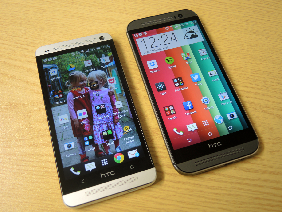
If a 4.7in screen feels big enough and you can live with "last year’s phone", the HTC One looks like a great investment right now. On eBay it’s going for as little as £250 – £320 for a 32GB model with Clove prices starting at £438.
On contract, the prices haven’t exactly been slashed too much yet – with a free handset you’re looking at £29 a month minimum, that’s a saving of only £7 or so a month. But keep an eye on the networks as One (M8)s start to fly off the shelves – fingers crossed for a £20/25 a month steal.
