Google Nexus 6 long-term review: you’re gonna need a bigger pocket
This whale of a handset attracts as much derision as it does curiosity. But what’s the new Nexus 6 like to live with?
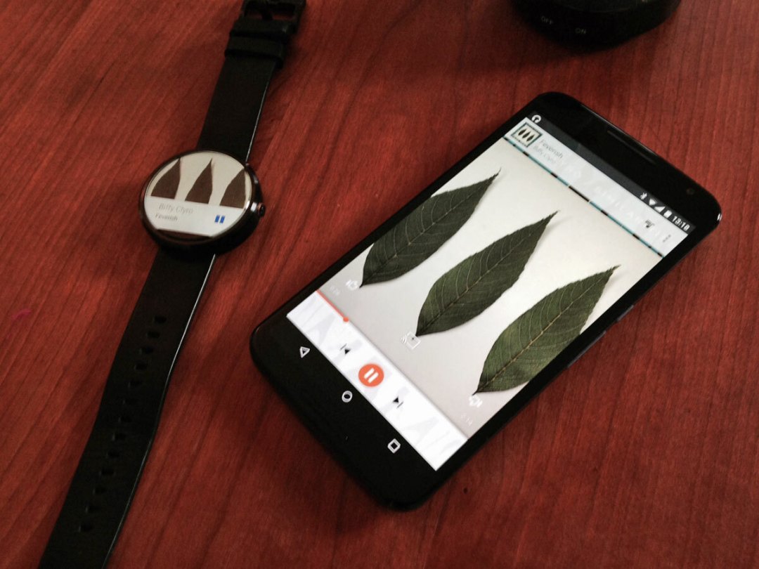
The box says it all, really. The Nexus 6 is huge. Humongous. You think there’ll be a tablet in there, the red-and-white box is that large.
And it’s not as though the packaging’s wasteful, in the way that after-shave or perfume packaging tends to be. No, you prize off the lid, and the new Nexus 6 fills the box all the way to the edges. If you count value in pure square inches, you’ll be bloody delighted.
Neither is it the case that the Nexus off-sets the massive 6in screen by being ultra-sleek. Lift the N6 from its nest, and you realise that this is a thing of proper heft. Don’t get us wrong, it’s not ugly or heavy – but this is no paperweight iPhone 6. It is what it appears to be: a really big damn phone.
The effect’s so visceral that it can colour your view of the Nexus in the first few days, even if you’re the most experienced of reviewers. So we’ve given it time – four weeks, in fact, for the effect to wear off.
So here’s our attempt to answer some of the more common questions posed by people tempted to buy the latest Nexus. If you think we’ve missed anything, just let us know…
Can I really live with a six inch phone?
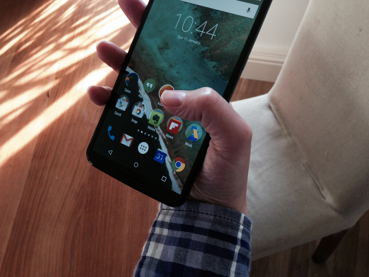
Yes, you can. Well, you can if you’re like me – 6ft 4in tall, with the hands and trousers you’d expect for a guy who tips the scales at over 17st. In fact, with four weeks now elapsed, an iPhone 5 now looks utterly comical – like a prop from Honey, I Shrunk The Kids, not a serious device you can actually do some work on.
And perhaps that’s the most important point about life with a Nexus 6: you can do serious work, to the extent that it has displaced my iPad and even laptop during the day. There’s no magic to this: a 5.96in, 1440×2560 HD screen simply lets you see more.
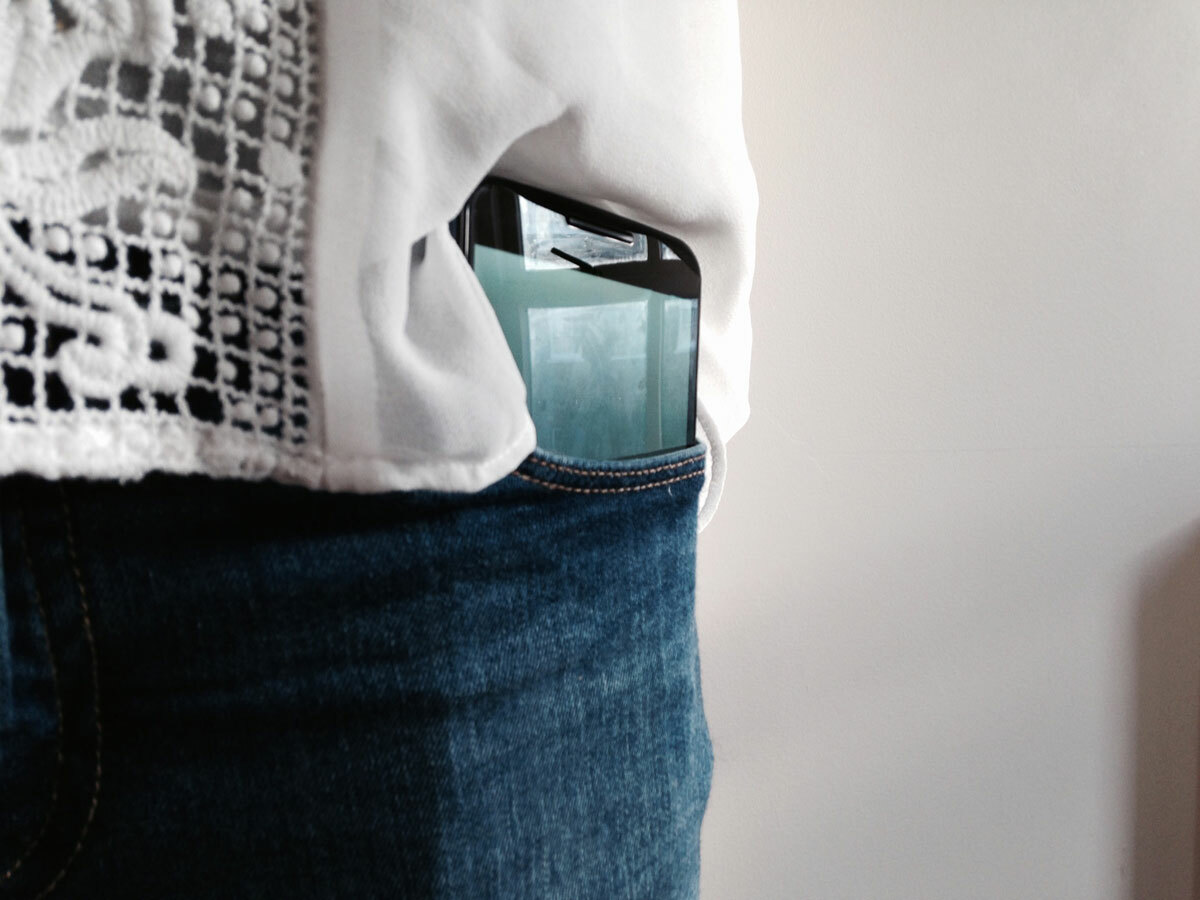
Of course, there’s a price to pay. Yes, the Nexus 6 does fit in my trouser pocket, but not without an outline that looks a little absurd. And the Nexus is one of the few handsets that needs to be forced into my car’s cup holder – at 3.27in from edge to edge, it’s one of the widest handsets on the planet.
And it’s that width that you may find a struggle, more than the height of the device: my hands are big enough to handle the thumb gymnastics needed for one-handed operation – many people will simply find it too much, at which point you need to decide if you’re happy to do everything with two hands.
You can hack it. I have no shame in my OCD when it comes to app arrangement on home screens (a place for everything, and everything in its place…), but even I’ve taken to putting my most-used apps on the left-hand edge of the ginormous screen.
Is Lollipop the unbridled joy that I’ve heard to be?
Yes.
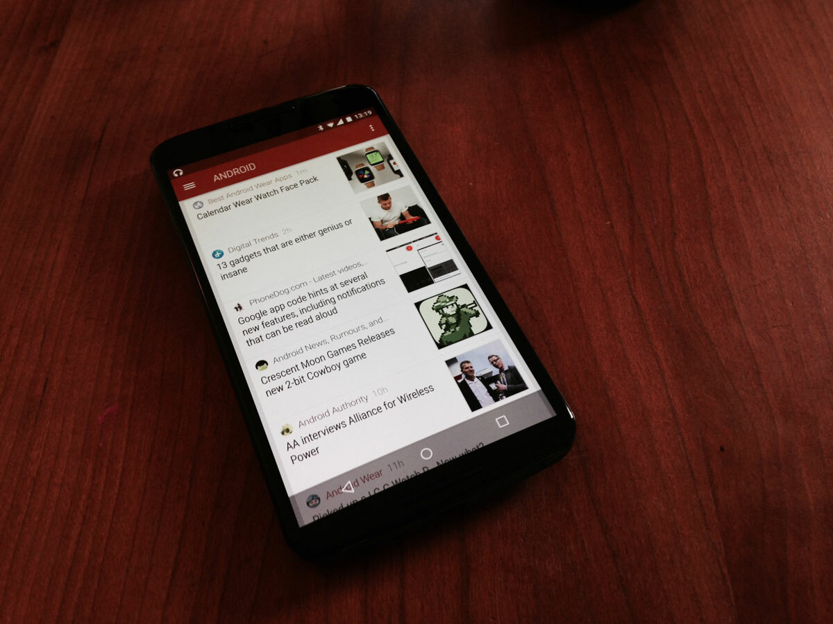
At first, I thought that Google had overcooked the animations. I even felt slightly seasick in the first few days of using the Nexus 6. Everything transitions: the opening and closing of the app drawer, multi-tasking between apps… and the apps that are well-optimised for Material Design bring their own world of sliding and flipping.
But get through that initial shock, and you realise that Google has done something wonderful in Lollipop.
Apps are no longer a layer on top of the OS: they’re part of the experience. You need to use it to fully understand my point, but by comparison iOS looks like distinct components held together in a smartphone case.
Lollipop is fluid, and even though there’s more action and animation that in any previous version of Android, the experience remains wonderfully simple. And if you’ve been using the OS for years, you’ll still feel right at home: basically, there are three buttons, home screens, an app drawer and a notifications screen… it’s as simple as that.
That said, the new notifications and quick settings screen was irritating at first: why do I need to pull down twice to reveal something that under KitKat 4.4 took a single pull?
As the weeks have gone by, I realised that I’m concentrating less on the quick settings (exposed by that second pull), and more on the notifications (the bit that matters, really). Plus, the ability to go straight to the message or text from the lock screen with a simple double-tap is genius.
It’s also frankly astonishing how quickly developers have jumped on the Material Design bandwagon: a good majority of my everyday apps are either now fully Material, or have been tweaked to look good enough in a Lollipop world.
READ MORE: Android Lollipop review
What about battery life?
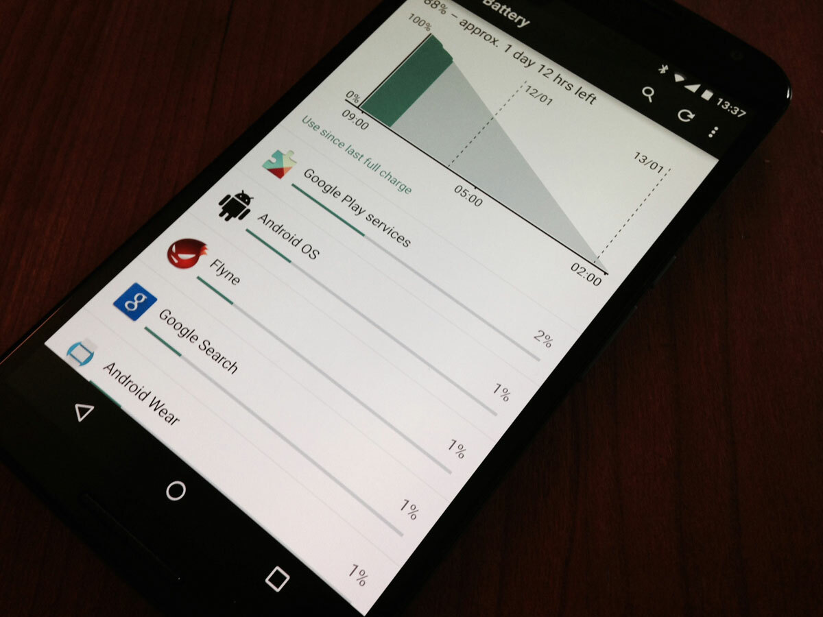
Ah, yes… the bane of the Android aficionado’s life. Forums will tell you to expect 15 minutes from your Nexus 6, even with everything turned off and the screen set to its dimmest level. This, as usual, is rubbish. After four weeks of use, I end a working day with my Nexus 6 showing about 70%. So in theory, I can get two days from my Nexus 6 (although since I habitually charge overnight, I have yet to put that to the test).
Now before the inevitable deluge of disbelieving vitriol arrives, I’ll admit that it took some tweaking to get to that kind of longevity. For one, you need to turn that screen brightness down: mine is set to between 20-25% brightness. Believe me, you don’t need it higher than that. In the first few days, I had it set to 60-70%: lo and behold, Lollipop’s in-built battery monitor quickly explained that the screen was eating most of the juice.
Next, you’ll need to watch for errant apps that do not play nicely with Android 5.0. This is trial and error: install your usual app library, then watch for anything that’s glitching on use (there are plenty of games that do not play nicely with Lollipop at all), and uninstall anything suspicious.
Lastly, be ruthless with notifications and syncing. This has always been infuriating with Android, and Lollipop doesn’t bring any improvements: while iOS provides a single interface for all of your app notifications, Android 5.0 still insists that you work through every app individually to turn off sync and alerts. And believe me, some app developers are damn good at hiding them in their settings.
Oh, and a warning: gaming takes by far the biggest hit on the N6’s longevity: 15 minutes of Monument Valley will do more to to damage battery life than hours of emailing and texting. No surprise there, given the power needed to drive that 493ppi AMOLED screen.
Your N6 will come with the Motorola Turbo Charger, which does precisely what it claims to do: your Nexus will charge at an awesome lick. It will get rather hot while doing so (at least during the initial top-up), but I’ve found no adverse effects from this.
Fortunately, I’ve experienced none of the scary battery drain that others claim when pairing the Nexus with an Android Wear watch (in my case, a Moto 360). And yes, I do have a load of Wear apps installed, even some of the more home-brew affairs. Maybe the clue is in notifications: as I pointed out earlier, I tend to only need alerts for email and texts… everything else is turned off.
Does the Nexus 6 have bugs?
Yes, but not of the world-ending kind.
The phone was recently updated from Android 5.0 to 5.01. This seems to have improved battery life, but hasn’t stopped my N6 from deciding to reboot itself every so often. It happens roughly once a week, and for the life of me I cannot figure out what triggers it – it can be lying idle on a chair, then suddenly show the reboot animation. This isn’t enough to ruin life with the phone, but it is faintly disturbing given Android 5.0’s long gestation period.
A more major Lollipop update is due, rumour has it, by the end of January (supposedly taking it from 5.01 to 5.1). At the very least, this should fix a memory leak issue that Google has admitted to (although the memory leak is quite large, I’ve yet to see it impact on my Nexus 6’s performance in any way).
All that aside, the new Nexus gets on with the business at hand, with almost no fuss.
I’ve seen reports of serious interface lag, with Lollipop’s always-on encryption blamed as the culprit (you don’t need to search for very long to find hacks that will disable the always-on encryption, with N6 owners claiming transformations in speed).
This is all very mysterious, as my Nexus 6 is absolutely stock, and is awesomely fast – not a moment’s lag, anywhere. Go figure. The only thing I can think is that others have been less frugal or cautious with the apps they’ve installed, and that they have been the culprits in slowing the N6 down.
Is it a high end hi-fi in a 6in box?
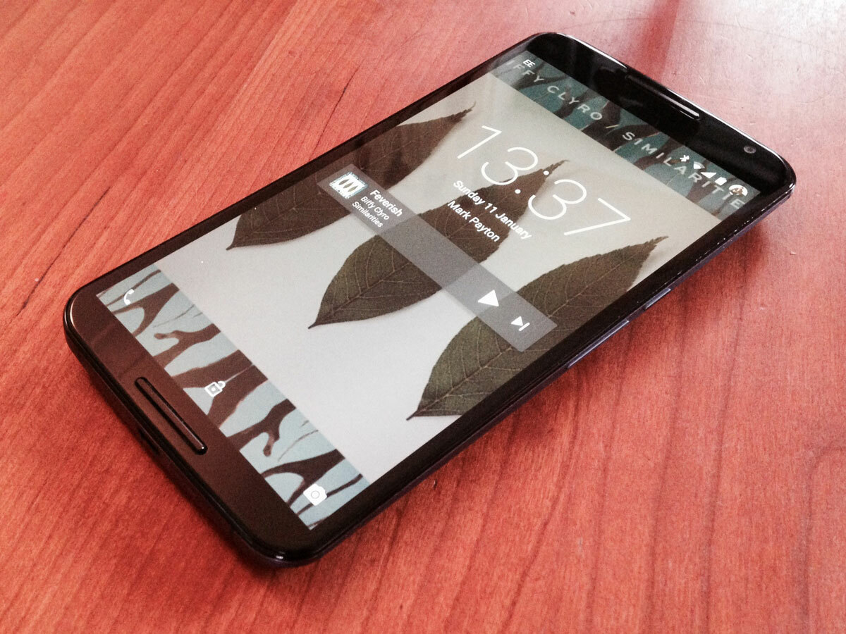
Almost. The Nexus 6 has dual front-facing speakers, so it gets off to a good start. And it’s certainly head, neck and shoulders above the squeak made by my old Nexus 5 (although that’s hardly praise).
The real benchmark in the smartphone market remains the HTC One (M8), which can do a frighteningly good job of sounding like a full-blown system. The N6 lacks the M8’s fullness to the sound, although it’ll give the HTC a very decent run for its money when it comes to volume.
So if you’re not the kind who sits crossed-legged in darkness listening to Pink Floyd albums, you’ll find the Nexus 6 a more-than-capable portable media centre: the sound’s easily good enough for background listening, and the audio is easily good enough to let the N6 work as a go-anywhere cinema.
But I’m secretly Cartier-Bresson: what about the camera?
Yes, the camera. That’s one of the things I should have put under ‘bugs’. It crashes every so often (not fixed by the 5.01 update). And it also can suffer from slight freezes if you have the N6 to auto-rotate (launch the camera, turn it to take a snap… and wait. That could, of course, be just me…).
But let’s be positive. It’s a 13 megapixel camera that is infinitely better than the rather shonky affair fitted to the Nexus 5. Autofocus is fast and works, even in low-ish light. And it has the usual merits you’ll find with the Google Camera app – mainly, it’s quick and simple to use, but with plenty of settings to explore should you wish to do so.
One thing to watch out for is that it’s easy to mislead viewing results on the N6’s AMOLED screen, thanks to its reddish cast. View your snaps on something more neutral (in my case, a Macbook Pro), and you’ll find that the Nexus takes a well-balanced view of the world. And sharp, too, even in low light.
What’s disappointing after four weeks with a Nexus 6?
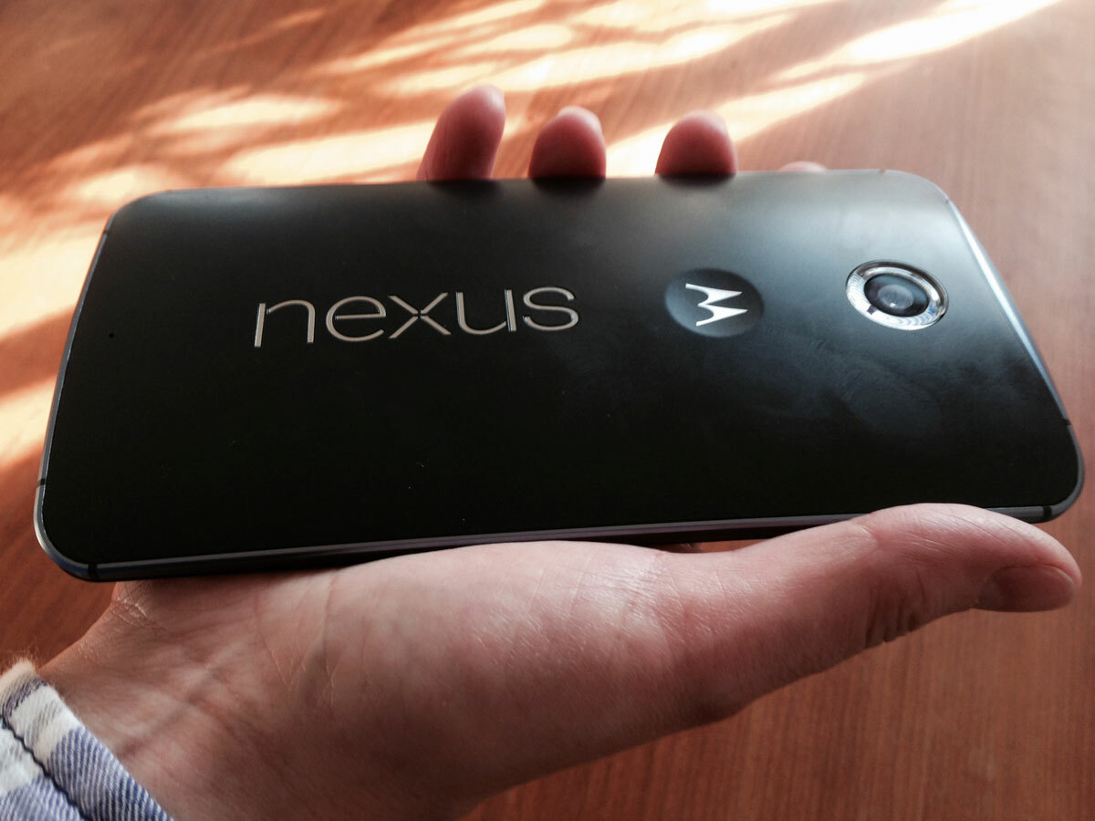
The back of my blue 32GB Nexus 6 may be pretty enough fresh from the box, but it collects smears and smudges at an awesome pace. You can wipe these clean with your fingers, but who wants to spend their lives doing that? And when the rear of the handset is as large and obvious as this, it’s no small issue.
I wish Google had kept double-tap-to-wake in the final release of the 6. It was there, apparently, during the development phase, but had been dropped by the time the Nexus reached stores. It just makes enormous sense with a device of this size – double tap the screen to wake the phone, and maybe swipe down to sleep.
Perhaps Google’s logic was that the in-built Ambient Display tech would render the double-tap useless.
Ambient, enabled by default, gently wakes the Nexus’ screen to show incoming notifications, or when you move the device. It seems to have been made more sensitive with the recent 5.01 update, and in the majority of circumstances, Google may have made the right shout – lift the handset to look at it, and 8 times out of 10 it will show the monochrome Ambient screen (so enabling you to swipe up to unlock it).
I could moan about the need to fiddle with the 6 as much as I have to get good battery life, but since that fits with my habits anyway, groaning would be churlish. I am surprised, though, that a phone with a whopping 3220mAh battery cannot swan through a day with everything turned on.
Finally, I was shocked by the reddish cast to the Nexus 6’s screen in the first day or two with the handset. I’ve come from an HTC One M8, which is about as neutral as a display can be, so the vivid, almost harsh N6 was a cause for concern. However, four weeks later and I barely notice the discolouration: it just looks punchy, colourful and sharp.
Should I buy one?
Yes. With caveats.
If you are 6ft 4in with big trousers and big hands, buy a Nexus 6 now. You’ll love it.
If you’re not, you will need to accept that your smartphone usage henceforth will become a two-handed affair, with the incumbent risk that you drop the damned thing.
And you most certainly need to drop into a Carphone Warehouse and ask if they’ll let you try popping an N6 into your pocket before parting with £499: to not do so would be foolish.
Some have quibbled at the N6’s price. Having lived with it, I think it’s superb value. Sure, previous Nexi have come with stupidly low prices tags. But let’s get real: £499 for an unlocked 32GB device with a beautifully high resolution 6in screen and access to the best Android update ever doesn’t seem extortionate to me.
And unlike the Nexus 5 (which, don’t get me wrong, I loved), the Nexus 6 feels future-proofed – you can’t imagine it looking old in 12 months.
Is this the best phone I’ve ever owned? Perhaps not (I still think the HTC One M8 is one of the best pieces of engineering I’ve ever experienced). But is it an excellent experience and worth every penny? Yes.
