Microsoft Surface Pro 3 vs Apple iPad Air: the weigh-in
The new Surface is a powerful, pixel-packed tablet with laptop pretensions. So how does it fare against the all-conquering iPad Air?
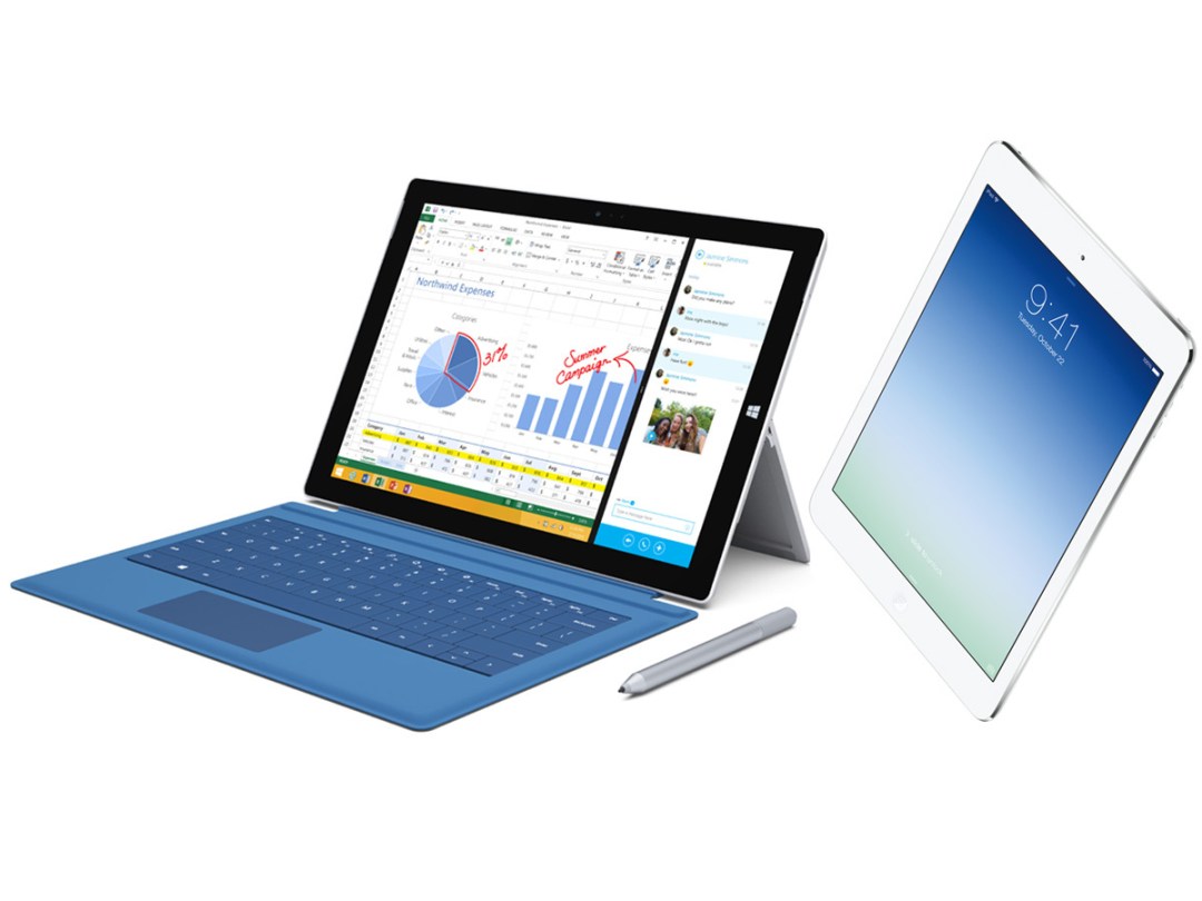
So Microsoft’s updated its Surface Pro device, giving it a bigger screen, more power and an improved kickstand and Type Cover. But while it’s pitching the Pro 3 as a laptop replacement, in truth it fits almost exactly between laptop and tablet.
On the one hand, it has the specs to challenge the MacBook Air range, with a proper Intel processor, the ability to run full Windows 8 desktop software and a display that’s larger than that on the smallest MacBook.
On the other hand, it still has the basic form of an iPad, with the keyboard a mere battery-less accessory and connectivity options still reduced from what you’d get on a proper laptop.
We’re going to compare it to both the iPad Air and MacBook Air, and first up it’s the iPad. Read on to find out which we’d go for.
READ MORE: Apple iPad Air review
Design and build – thin versus thinner
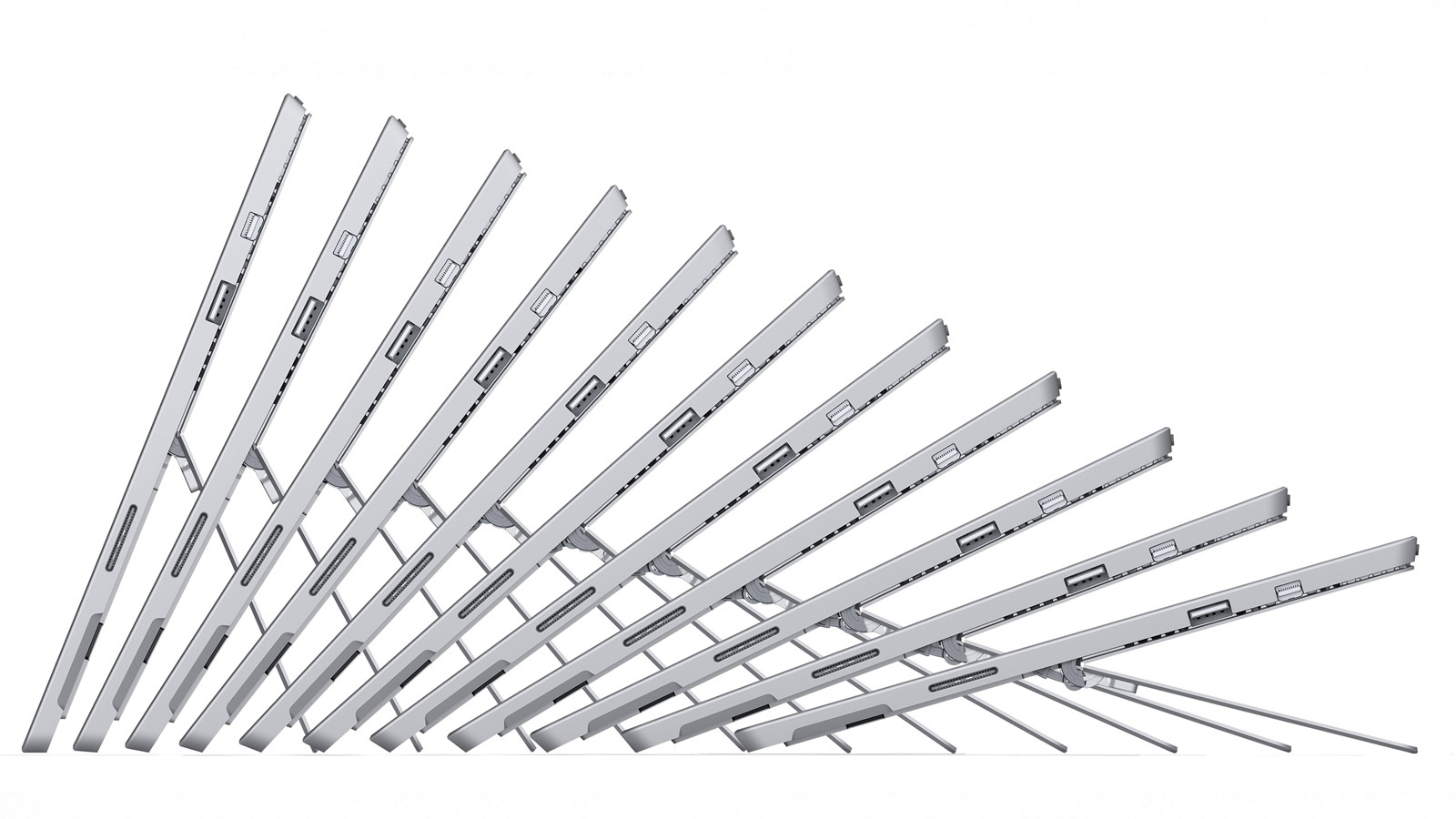
Microsoft’s made much of how thin the new Surface Pro is, and with good reason. At just 9.1mm thick, it’s noticeably slimmer than the Surface Pro 2, which was a veritable beefcake at 13.5mm. Of course overall it’s a much larger device than its predecessor, with its 12in screen resulting in a 292x201mm frame. Despite that increased display size, it’s actually lighter than the Pro 2 – 800g to 900g – and that can only be good news when it comes to single-handed use.
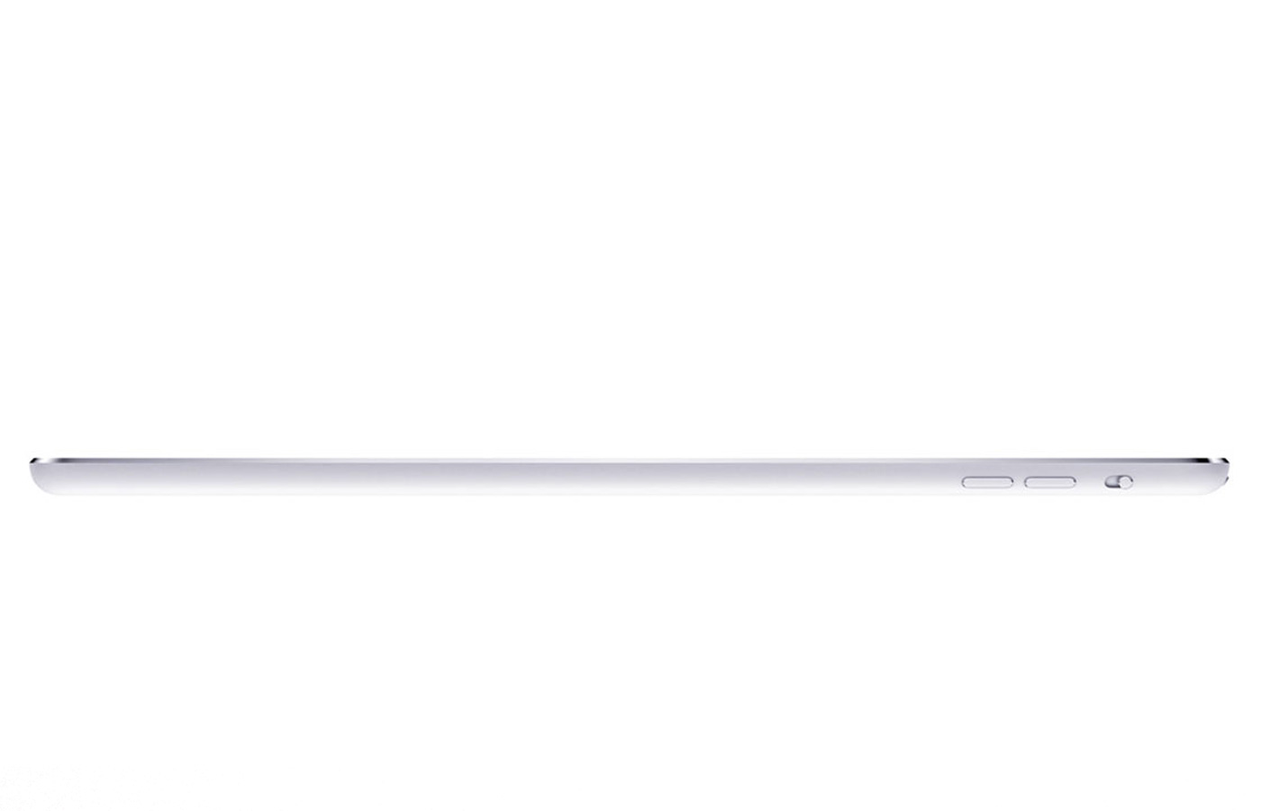
Compare it to the iPad Air, though, and it starts to look almost chunky. Apple’s flagship tablet is a mere 7.5mm deep and measures 240x165mm around. Even more impressively, it weighs in at only 469g. Pick them both up and you won’t have to ask which one has ‘Air’ in its name. Offset against that is the fact that you do lose a fair bit of screen space with the 9.7in iPad.
It’s hard to make a call on aesthetics without having used the Surface Pro 3, but from what we have seen it’s a nice looking device, with thin bezels and a custom-machined magnesium body. It’s also tough: at the launch, Microsoft’s Panos Panay intentionally dropped it onstage from shoulder height, and it didn’t show so much as a scratch. You wouldn’t want to try that with an iPad Air.
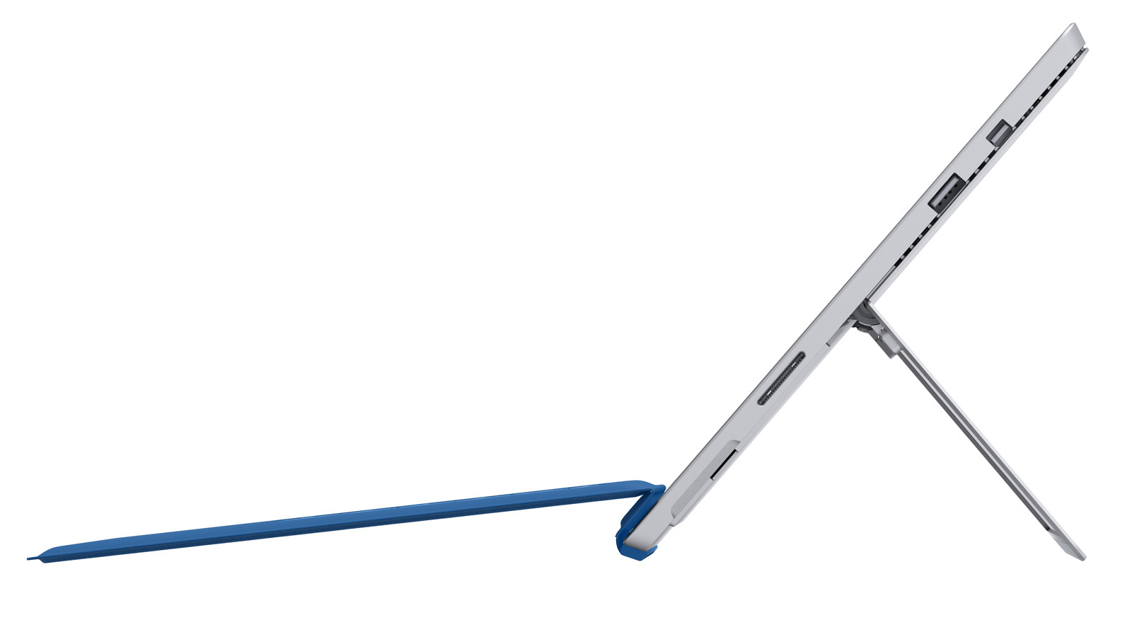
The Surface Pro 3’s integrated kickstand has been massively improved, with the result that you can set it at any angle from 22 to 150 degrees and it will happily stay put. And maybe most impressively of all, though the Surface requires a fan to cool down its powerful processor, Microsoft has managed to make it so small that you won’t hear it (or feel it) in use.
The iPad Air has no such trickery: it’s a tablet through and through. That said, it is the nicest looking tablet we’ve used, with a gorgeous aluminium unibody and subtle curves in all the right places.
It’s hard to say which we prefer without having seen the Surface Pro 3 up close, so at this stage we’re going to call it a draw.
Winner: Draw
READ MORE: iCheapskate – the 30 best apps for iPhone and iPad
SCREEN – IS BIGGER BETTER?
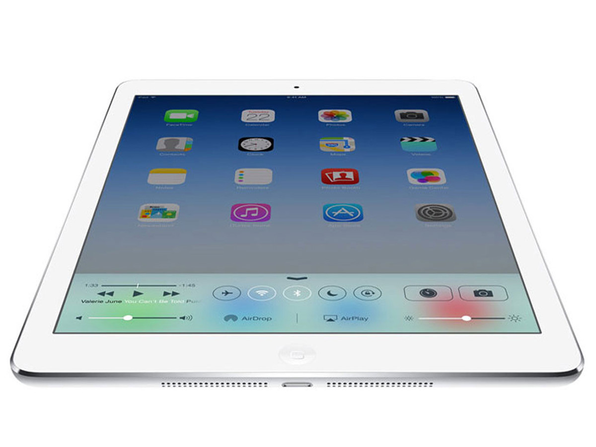
The general tablet trend right now may be towards smaller screens, but Microsoft’s having no truck with fashion. The Surface Pro 3 proudly sports a 12in display, up from the Surface Pro 2’s 10.6 inches and considerably bigger than the iPad’s 9.7in screen.
It also has a relatively unusual aspect ratio – 3:2, whereas most tablets are a widescreen 16:9 or 16:10 and the iPad is a squarer 4:3. By sitting between the two extremes, Microsoft presumably hopes that the Surface Pro 3 will be as well suited to films as it is to productivity and browsing.
Both the iPad and Surface Pro 3 have full HD displays, and there’s not much between them in terms of resolution: the iPad’s screen is 2048 x 1536, while the Surface Pro 3’s is 2160 x 1440. However the fact that the Surface Pro 3’s display is so much bigger means that it loses out to the iPad in the pixel density stakes, managing 216ppi to the iPad Air’s 264.
Will that matter in practice? Probably. Without having viewed the Surface Pro 3’s screen up close it’s hard to be certain, but the difference is big enough that it ought to be noticeable.
Of course there’s more to a screen than mere pixels, and here the Surface also faces a tough fight to best its rival. In our review of the iPad Air we stated that it is "still the best screen we’ve ever encountered on a tablet", praising its superb viewing angles, vivid colours and excellent contrast. Again, it’s hard to judge the Pro 3 against it without having used it, but at this stage we’ll have to award this round to the iPad.
Winner: Apple iPad Air
READ MORE: Windows Phone 8.1 review
PERFORMANCE ANXIETY
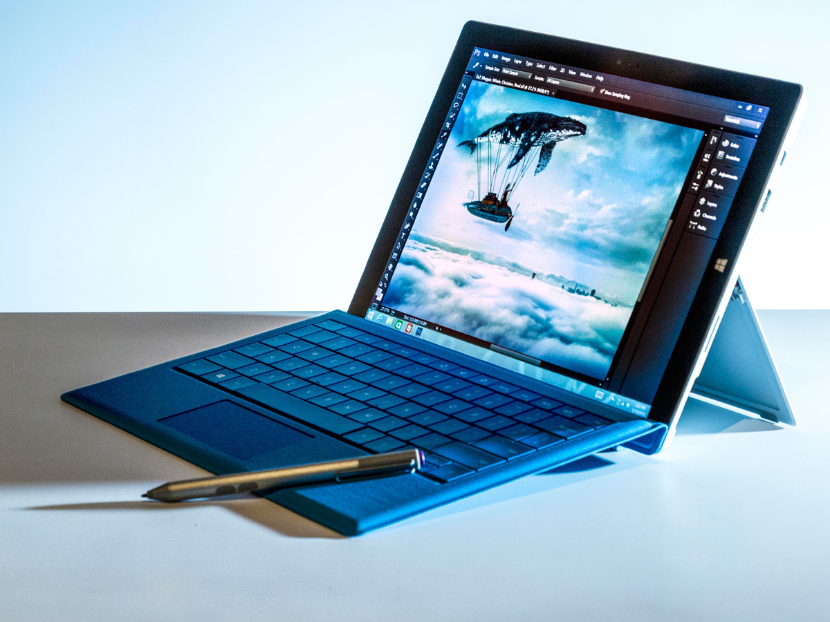
Nobody could ever accuse the Surface Pro 3 of being a lightweight. At least not within earshot of it. It runs on a proper Intel Core processor of either i3, i5 or i7 variety, has 4GB or 8GB of RAM and storage options run from 64GB up to a whopping 512GB. All of which should mean that it flies through even demanding tasks such as running full Windows 8 software including Photoshop.
If the Pro 3 is a heavyweight, then beside it the iPad Air looks like something of a flyweight: dual-core ARM A7 chip, just under 1GB of RAM and storage that maxes out at 128GB. For all that, it packs a mighty punch, never stuttering in our experience with it and scoring highly on the AnTuTu benchmarking tool.
The other type of power that we’re concerned in here is the kind that comes out of a battery. The iPad Air is best described as a typical all-day device – use it sensibly, for instance reducing brightness where necessary, and you’ll get a decent 8 or 9 hours out of it. And that’s assuming you cane it as much as we tend to; use it for the odd bit of browsing here, the occasional game there and you’ll get a few days from it.
We can’t pass judgement on the Pro 3 without having tested it, but the Pro 2 fared considerably better than the original model, so we have high hopes that Microsoft’s claim of 9hrs’ use will be relatively accurate, at least on the lower-specced models.
The differences between the devices are particularly apparent in this category: the Pro 3 is a designed to be a laptop replacement as much as a tablet, and its specs show that. So while the iPad is near flawless at doing what it does, the Pro 3 is always going to be capable of more demanding tasks, and for that reason we’re going to award it this round.
Winner: Microsoft Surface Pro 3
READ MORE: MacBook Air With Retina Display preview
THE OS WARS RESUME
Both Windows 8.1 and iOS 7.1.1 (to be exact) have their strengths, and both bits of hardware are geared to play to those strengths.
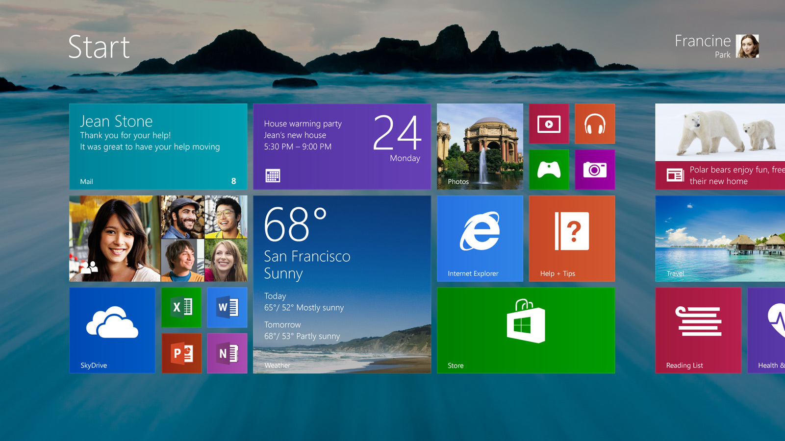
In the case of Windows 8, it’s that it’s a full desktop operating system, capable of running the most demanding of software. Accordingly, the Surface Pro 3 has plenty of power, a built-in kickstand for desktop working, a magnetic type cover for productivity (more on that below) and plenty of connections. In short, you can use the Pro 3 as a laptop replacement, and Windows 8 will give you everything you need to do that.
Admittedly, not everyone is smitten with Windows’ brave new break from the traditional desktop OS, but its update to 8.1 has fixed many of the flaws that bedevilled it at launch, and if you need a device that really can do almost anything, this may well be it. Windows 8’s Achilles heel remains the lack of apps on the Windows Store. Yes, that’s less of a problem on full Win 8 than it is on the stripped-back RT version, but it may well still frustrate you if you’re looking for the kind of mobile-optimised games and apps that fill the Apple App Store. Still, the Pro 3 will come with the full Office suite installed as standard.
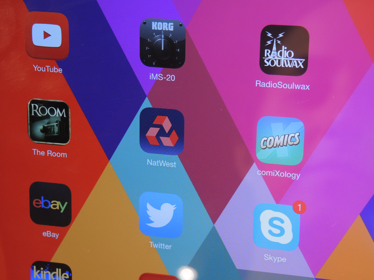
Apple also broke with the past on its latest OS, ditching the skeuomorphic design that had characterised previous iterations and giving iOS 7 a flat, colourful makeover straight from the pen of Jony Ive. It also got various other much-needed updates, including a proper notifications bar and Control Centre. While we applaud the changes, the important thing about iOS is that it’s still the best place to find the best apps. And though Android may be catching up, Apple still leads the way for tablet-optimised fare. Plus, you now get the whole of Apple’s iWork and iLife package for free – that’s iMovie, iPhoto, Garageband, Pages, Numbers, Keynote and the rest.
So, it’s another case of horses for courses here. If you want to run proper desktop software, give the Pro 3 a look. If you want to play the latest mobile games and pick from the biggest selection of innovative apps, it’s the iPad.
Winner: Draw
READ MORE: iOS 8 preview
ACCESSORIES
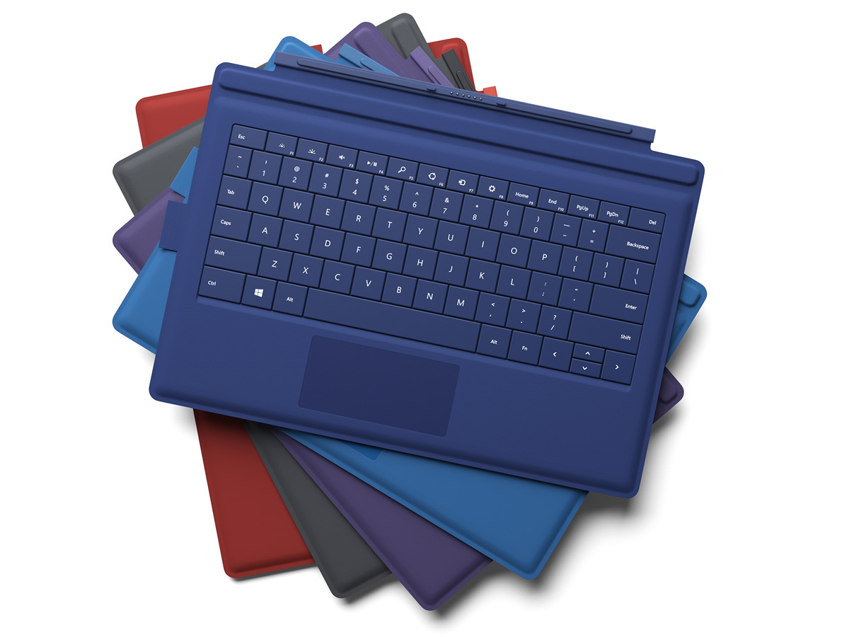
The Surface Pro 3 can be bought with three interesting extras that should make it a much more useful device (while bumping up the cost). The Type Cover is the biggie; you’ll have seen it before on the previous Surfaces, but it now seals itself to the screen magnetically in order to give you a firmer working space. Coupled with the kickstand, it could finally nail the problem of using a tablet as a productivity tool. It also now has a bigger trackpad, which is never a bad thing.
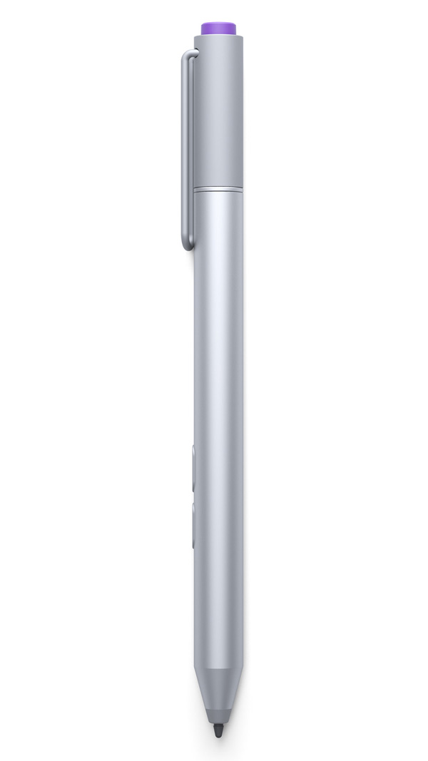
The second extra is the Pro 3’s Stylus, which has also had a makeover since the last model. It’s now powered by tech from N-trig rather than Wacom and slots into the Type Cover when not in use. It has a rather neat new trick, too: press the button on its top and the tablet will instantly fire up the OneNote app, even if the Pro 3 was switched off. Scribble your missive, tap the button again and your note will be synced to the cloud.
Thirdly, there’s a Docking Station which adds three USB3.0 and two USB2.0 ports, Ethernet and 4K output through its Mini DisplayPort.
The iPad’s hardly short of accessories itself, with third-party manufacturers maintaining a constant stream of cases, Bluetooth keyboards, styluses, speaker docks and the rest. So this round’s another tie.
Winner: Draw
READ MORE: Asus Transformer Book T100 review – the other Windows tablet that’s also a laptop
VERDICT
Before we come to any conclusions, we should mention price – because the Microsoft Surface Pro 3 won’t come cheap.
The basic Core i3 model with 4GB of RAM and 64GB of storage will set you back £640, the two i5 models will cost £850 (128GB) and £1110 (256GB) and the i7 versions £1340 (256GB) and £1650 (512GB). The Surface Pen is another £45 and the Type Cover £110.
You’re going to want both of them, so the cheapest model will be about £800, and the most expensive £1800.
The iPad, in contrast, starts at £400 (16GB) and rises to £640 (128GB) in its Wi-Fi only guise. You could comfortably buy an iPad Air and 11in MacBook Air for the price of the cheapest i7 Surface Pro 3.
And in many ways, that’s the point. Microsoft is gambling that people would rather have one do-it-all device than two do-some-of-it products, and will pay accordingly. Maybe they will. But we can’t help feeling that if they’d settled for a smaller profit margin on this occasion, many, many more might do so.
Either way, the Surface Pro 3 looks like a lovely device that we can’t wait to test out. So, would we recommend it over the iPad Air? Really, it depends on what you’re looking for. The iPad, with its smaller form, cheaper price and supremely stocked App Store, still looks like the best bet for casual use. The Pro 3, with its full Windows 8 software, Intel power and larger screen, should be the better bet for working on the go. So, inevitably, we’re going to call it a draw, at least until we’ve given the Surface Pro 3 our full review treatment.
Winner: Draw
READ MORE: These are the 10 best tablets in the world right now
