The new iOS 18 Home Screen feature I’m most excited about is not the one you’d expect
Tinted icons? Nah. Putting app icons wherever you like? Nope. My favourite iOS Home Screen feature is a mite more specific than those
Unless Apple goes bonkers this weekend and reinvents itself as a tamer of goats, a new iPhone will be revealed on Monday. And with it, the official release of iOS 18. This brings a slew of new features – including plenty of customisation. Given Apple’s historically opinionated stance, it allowing even an iota of deviation from What Apple Says Goes™ is news. But perhaps the company is relaxing in its old age, because you’ll soon be able to make the iOS 18 Home Screen your own in ways never before possible on an iPhone. However, the new feature I’m looking forward to is not the one you might expect.
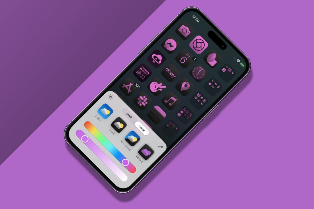
In fact, the iOS 18 Home Screen feature that most excites people is the one I like least. You can tap-hold a Home Screen, go to Edit > Customise, and use the Tinted option to give all your icons the same tint. And then wonder why you can’t find anything. (Colour is a fantastic differentiator. Dear Apple design team: please take note.) Elsewhere, you can switch apps between icon and widget views (better), lock apps behind Face ID right from the iOS 18 Home Screen (sensible), and drag apps to any space rather than them always flowing in from the top-left (how very years-ago Android).
Yeah, I don’t care about any of that.
App it up

My Home Screen wish-list has long been driven by my need to organise a mountain of apps and games. I’ve often had over a dozen Home Screens, peppered with apps and games I need to review. But my main Home Screen for the longest time was arguably a crime against Home Screens. And humanity. I’d structured it into rows based on themes, with three icons and then a folder housing related apps. In the Dock: more folders. A single glance was enough to make faint-hearted iPhone users keel over in shock.
I reasoned I needed to know where every app was and get at each one as quickly as possible. Sensible people pointed at Spotlight. Apple politely coughed at App Library. I grumbled that Apple had stupidly placed App Library after the last Home Screen, and swiping all the way there gave me thumb cramp. Worse: for the iOS 18 Home Screen, Apple prioritised aesthetics over pragmatism. I’d hoped you’d be able to rearrange apps by name or install date via a menu, like the Mac’s been able to do since 1984. Instead, Apple grinned and told us we could now make every icon bright purple.
Six of the best
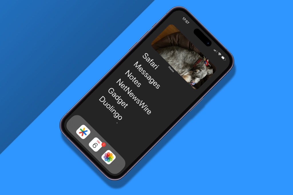
Then I discovered Dumb Phone. More a system for meaningful app use than a mere app, it urges you to replace your Home Screen with a widget. Said widget contains up to six massive text links to your most-used apps. I thought I’d review it and move on. But it stayed. For days. And then weeks. I disabled other Home Screens and started using App Library to get at those apps not in my Dumb Phone widget. I even cleared out the Dock, leaving just Google Authenticator, Calendar (for the date) and Photos, because who doesn’t love having fast access to photos?
One annoyance remains: an unnecessary app label beneath my widget. If only there was a way to be rid of that. Enter Apple, in smug mode. Because on your iOS 18 Home Screen, you can set icons to big-o-mode, which makes them larger and removes the text. And such labels are then gone from widgets too.
Honestly, I’d usually gripe about this too. Alongside the tinting thing, it turns conventional iOS 18 Home Screens into a game of ‘hunt the icon’, where you peck at apps until you chance upon the right one or give up. But for my very specific set-up, it’s perfect. So even this curmudgeon has to say it: Apple, you were right. Although not necessarily intentionally.
 Craig Grannell
Contributor
Craig Grannell
Contributor