15 of the ugliest phones known to man
Beauty is in the eye of the beholder, except when it comes to this lot
15 of the ugliest phones known to man
Today’s smartphones are often shiny trinkets of impossible beauty. They’d have to be to convince anyone to spend circa £1000 on them.
But it hasn’t always been that way. Over the past 30 years, mobile phone design has seen massive changes and there have been a few mis-steps along the way, some misguided, others downright hideous.
Here are 15 of the ugliest phones ever made.
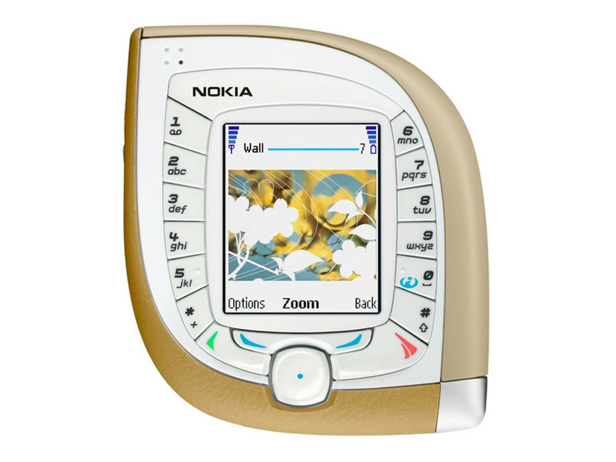
Nokia 7600
Nokia spent some time in the early noughties coming up with increasingly weird and wonderful new designs. While it’s wrong to discourage innovation, some were very much better than others, and the 7600 definitely belongs in the ‘others’ category. Not only was it a nightmare to use, it looked like something from a very bad sci-fi film.
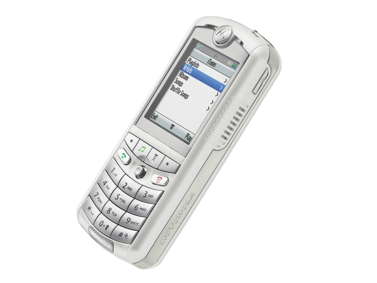
Motorola ROKR E1
The first phone to be compatible with iTunes was a suitably ugly companion for Apple’s notoriously bloated music software. The E1 had the capacity to hold 100 songs but lacked any of the design finesse that Apple had become known for, proving that in 2005 you were definitely better off sticking with your iPod.
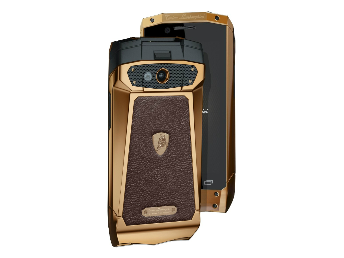
Tonino Lamborghini Antares
Has there ever been a genuinely tasteful tie-up between a phone manufacturer and a car company? If so, they’re few and far between. Anything involving Lamborghini seems to be ill-advised, all lumps, bumps and gaudy leather, which might work on a rip-snorting hypercar but seems out of place on a phone.
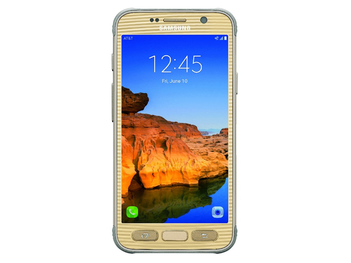
Samsung Galaxy S7 Active
The Galaxy S7 is a wonderful phone, which is probably what makes the Active edition so… unappealing. With its extra ruggedised features, included increased protection from water and dust, plus a stronger screen, it’s a bit like drawing a moustache (or worse) on a work of art. And that weird sandy gold colour? Eurgh.
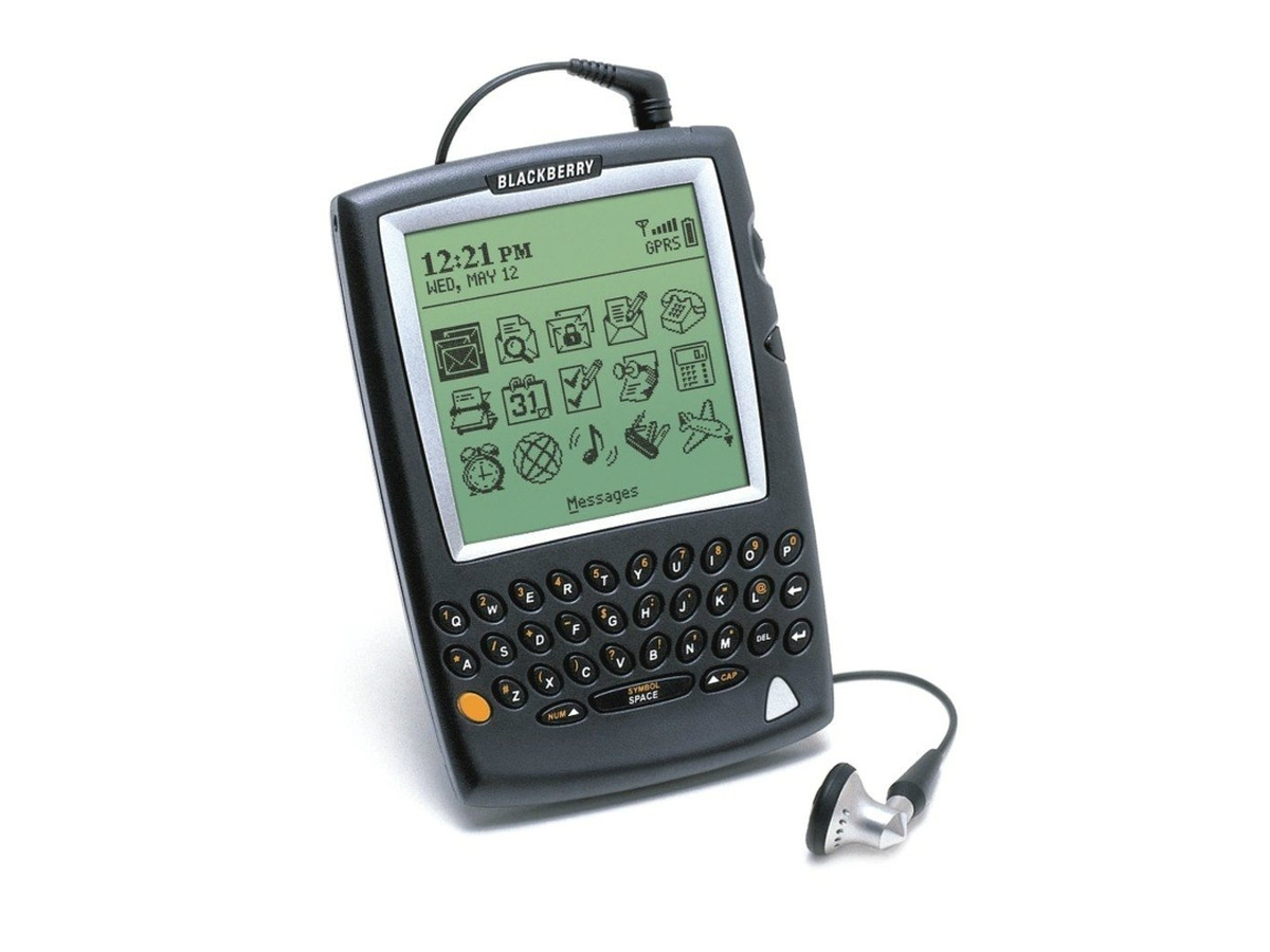
BlackBerry 5810
BlackBerrys have never been known for their design flair, preferring instead to go for the kind of solid usability that allows all-day emailing. But the 5810 has a face only a mother could love. Sure, tech was more primitive back in 2002, but the worst thing is they didn’t even manage to build in a microphone or speaker, so you had to use a headset to make calls. At least that meant you could hide it in your pocket.
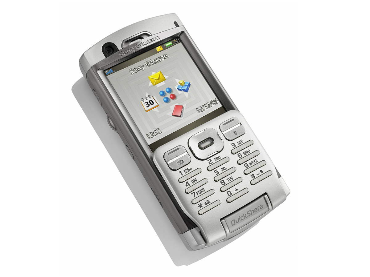
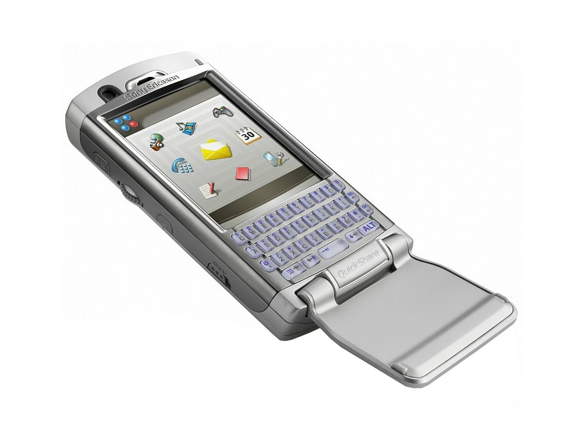
Sony Ericsson P990
Most modern smartphones are basically all screen and nothing else, which is possibly what makes the P990 such an assault on the eyes. It’s got directional buttons, a jogwheel, a numeric keypad and even a full QWERTY underneath the fold-down flap, all in a rather squat frame. Ever heard the phrase ‘less is more’, Sony? Evidently not.
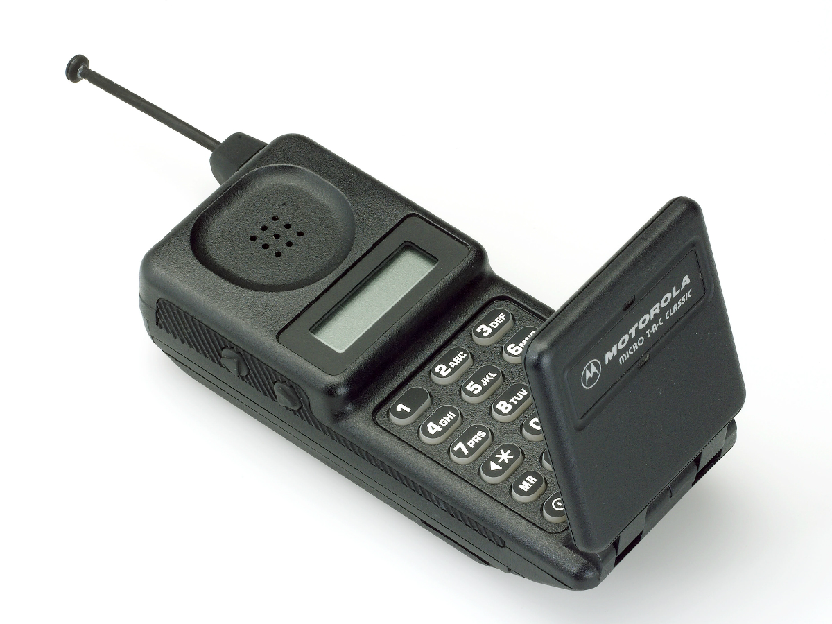
Motorola MicroTAC Classic
It feels a bit unfair to pick on anything too old – all phones looked rubbish in the days of the brick – but Moto’s MicroTAC Classic manages to make miniaturisation look like a mistake. That said, it’s credited with inventing the clamshell design, and without it we’d never have had the legendary StarTAC, so perhaps we should let its ugly mug off.

Toshiba G450
There’s a reason nobody has ever made a phone that’s shaped like a USB stick, Toshiba. It’s because they looks ridiculous and would be a total pain to use. Still, that didn’t stop you making the G450 did it. Resembling an MP3 player you’d pick up for £20 in Maplin, Tosh’s foray into phones never did amount to much. Funny that.
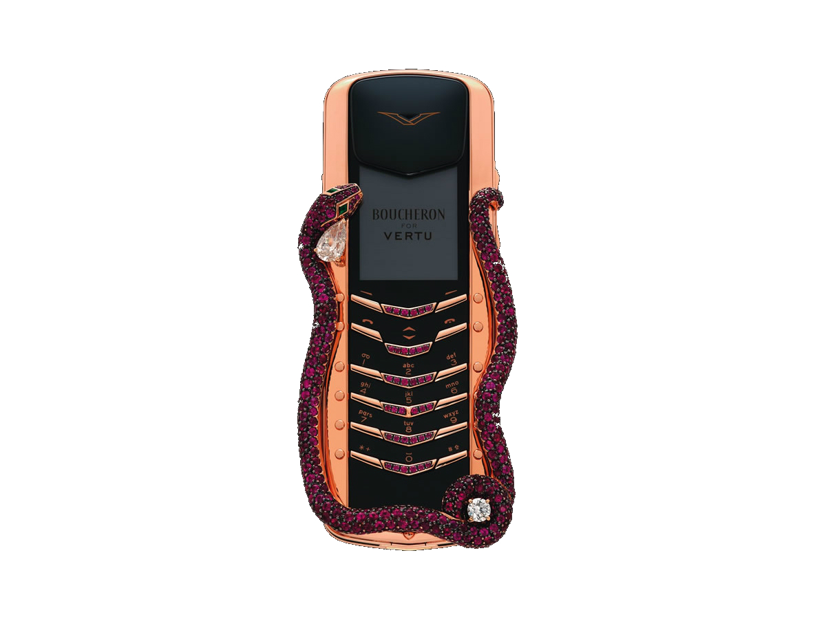
Vertu Boucheron Cobra
It’d be easy to fill this list with Vertu’s various abominations from over the years but there’s one in particular that definitely out-uglies the others: the Boucheron Cobra. Covered in diamonds, rubies and emeralds it certainly justified its astronomical $300,000 price tag and to reduce the chances of people having to look at it even further, Vertu only made eight of them.
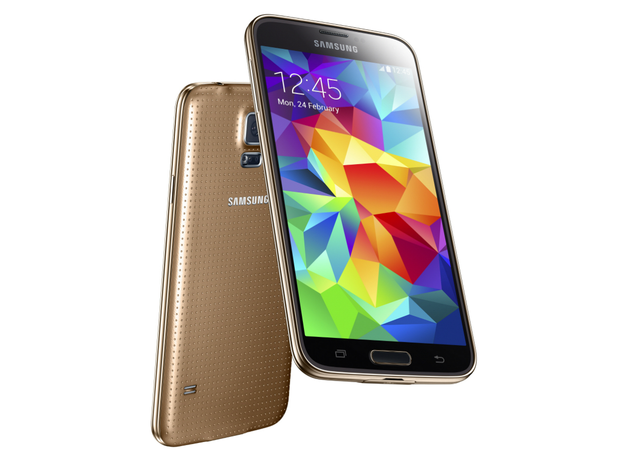
Samsung Galaxy S5
You only have to look at the Samsung Galaxy S5 to truly appreciate the beauty of the S8. Sure, there are far uglier phones on this list but the uninspiring, overly functional design of the S5 was a major reason so many people still chose iPhones in 2014. The S6 was a noticeable improvement in the looks department and the rest, as they say, is history.
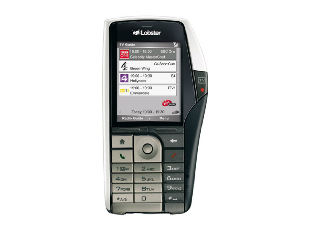
Virgin Mobile Lobster 700TV
With Netflix, YouTube, iPlayer et al more successful than ever, Virgin must be wondering what it did wrong with this TV-toting failure from 2006. Here’s a clue: they made it look like it had something growing on the side. Calling it a ‘tellyphone’ probably didn’t help either. Some puns are best left in the boardroom.
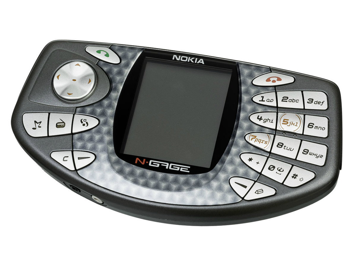
Nokia N-Gage
Some people have fond memories of the N-Gage. Some people are wrong. With all the style of a cheap Sega Game Gear clone, Nokia’s gaming phone allowed you to play rubbish mobile games with slightly better controls, and to make a call you had to hold it like a taco. We’ll take the revived 3310, but this one can stay in the past.
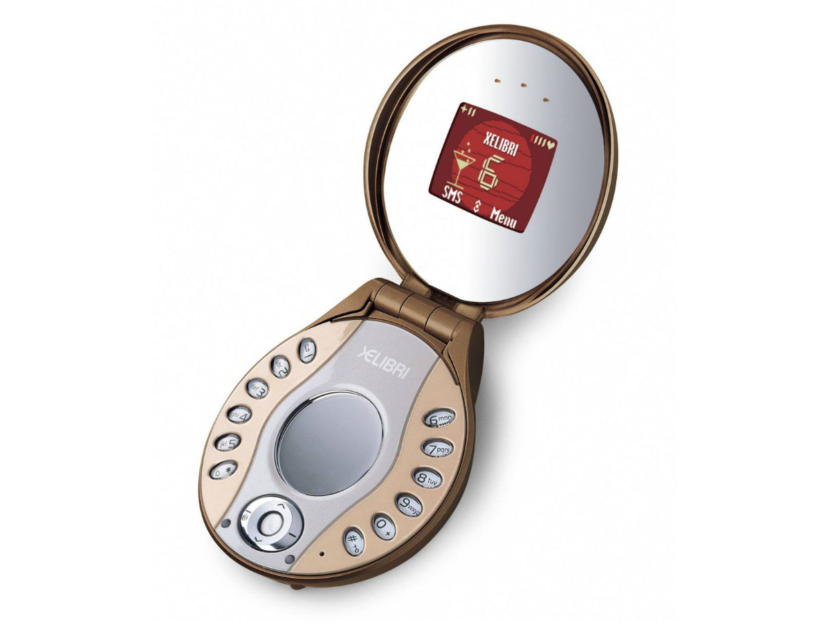
Siemens Xelibri 6
There are few things as misguided in the world of tech as trying to design a product specifically for women, especially when the ball is dropped as spectacularly as Siemens did with the Xelibri range. You see, it turns out women can use the same phones as men (who knew?), so this monstrous mish mash of phone and compact mirror is as pointless as it is ugly.
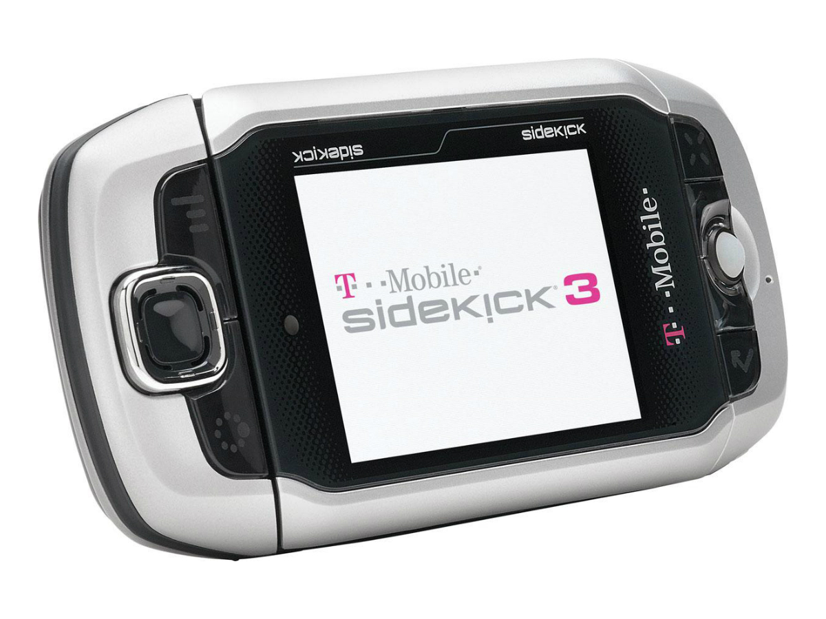
T-Mobile Sidekick
Apparently very popular in America but not so much here in the UK, T-Mobile’s Sidekick was like a PDA for millennials (before such a term existed), with a strange screen that rotated outwards from the body, revealing a full QWERTY keyboard underneath. Few phones of this form factor were what you’d call beautiful. And by ‘few’ we mean none.
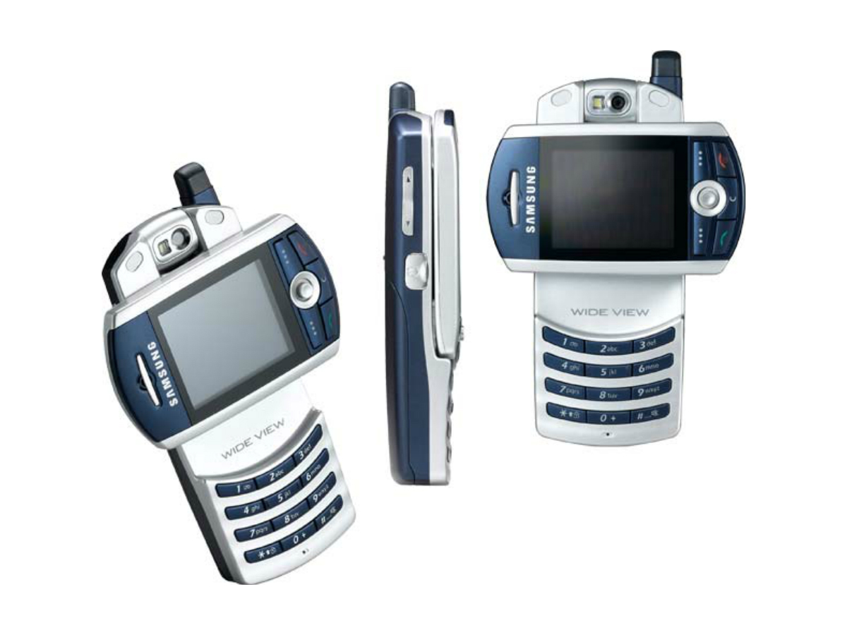
Samsung Z130
Samsung, what were you thinking with this monstrosity? Some ideas sound good in theory but should never go any further than the R&D lab and the rotating screen on the Z130 is a classic example of that. The quality of the display itself was pretty good for the time but it would’ve been even better if it stayed in one place.

