TicWatch Pro review – in pictures
The dual-screen Wear OS smartwatch that wants to take your battery further
WATCH OUT
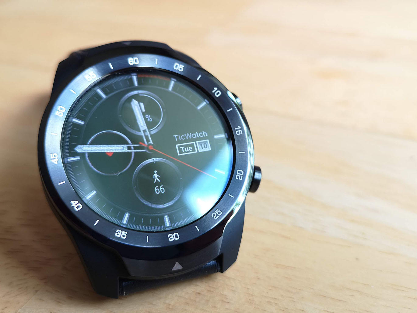
Mobvoi’s TicWatch has gone through a few generations before making it to the new TicWatch Pro. While the cheap-but-capable Ticwatch E and TicWatch S scratched the itch for a smartwatch on a budget, this iteration is here to tick off flashy, with innovative dual-screen tech, a fancy leather strap and solid metallic build. Naturally it’s got a higher price tag to match, but it’s also unfortunately managed to pick up a few bad habits along the way. Does the TicWatch Pro do enough to stand out from the competition and, most importantly, does it justify that £220/$249 price tag?
WHAT A LOOKER
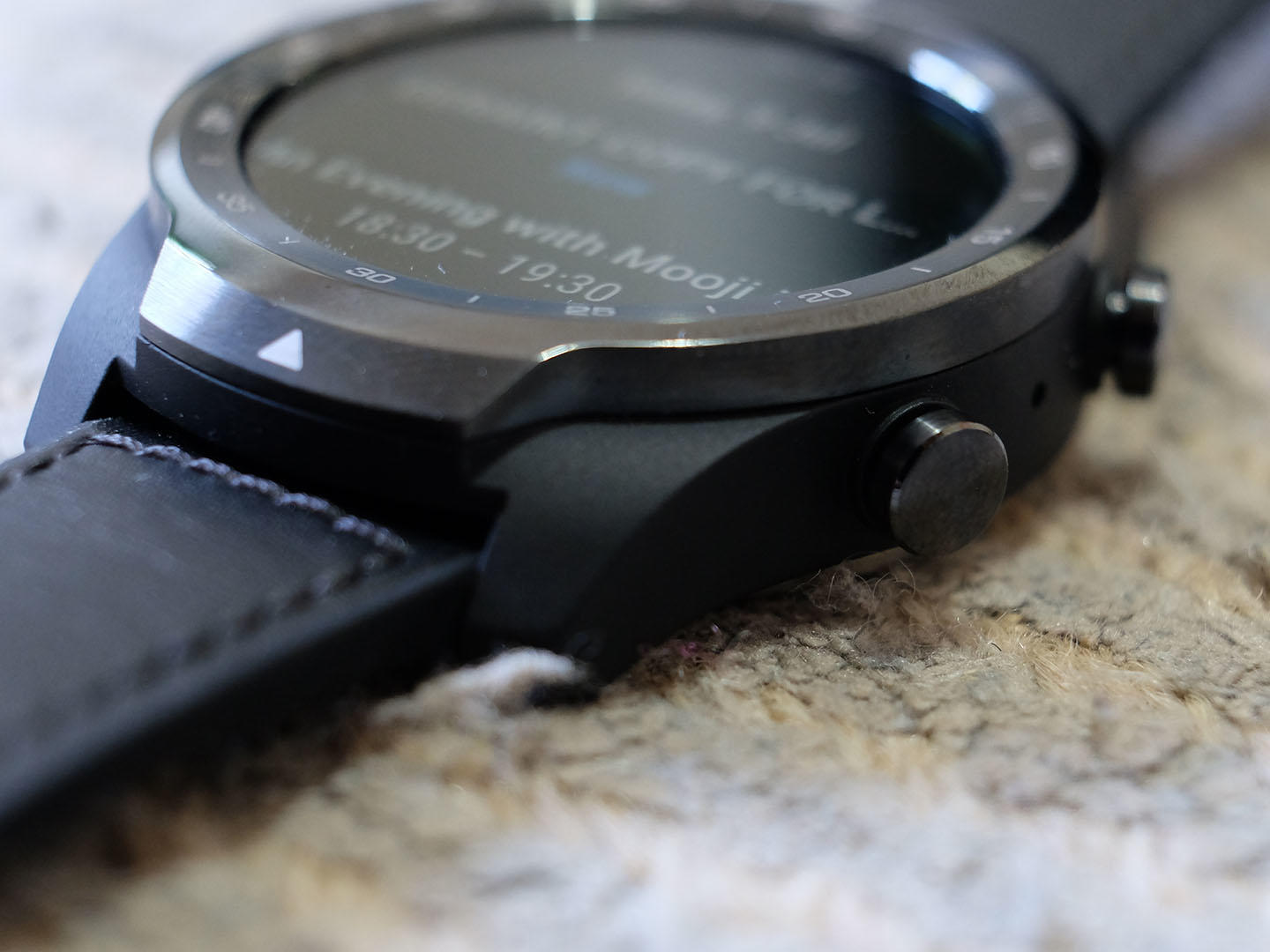
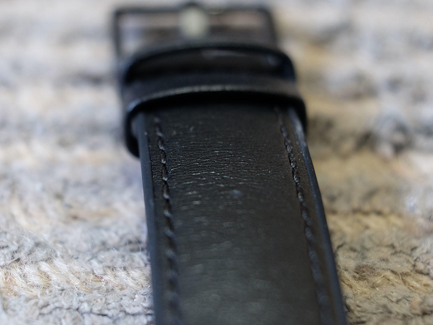
While that TicWatch name may well refer to the tick tock of a clock, we prefer to think there was someone involved in the name that speaks London slang, and meant ‘tic’ in the good looking sense. Because it really is. From the brushed metallic bezel and chunky buttons to the fine leather strap and chronograph outer, this is a very attractive watch. It’s also large, which is a positive for people that like the ‘big watch look’. It doubles as a big battery space, making that a functional positive too. Of course, the weight that comes with it might be a bit much for some and with little flex in that leather strap, unless it fits you just right, it might take a bit of getting used to.
BESPOKE TRIMMINGS
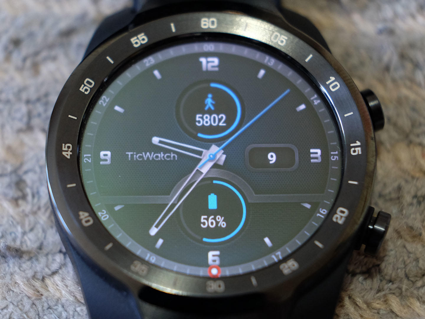
The charger is bespoke and is made up of an included cable with attached dock, which is light and small enough to easily be carried in a bag. Not that you should need to – this watch’s smart dual display does a great job at eking out more battery life when it’s needed, but more on that below. As for the screen, it’s large, round and clear, with touchscreen capabilities that join button and gesture control for quick and easy access to most features. The dual-screen tech is a great idea (again, more on that below) but the issue of fingerprints is worse than ever on that low power display so you do find yourself wiping it clean – a lot.
DOUBLE TROUBLE
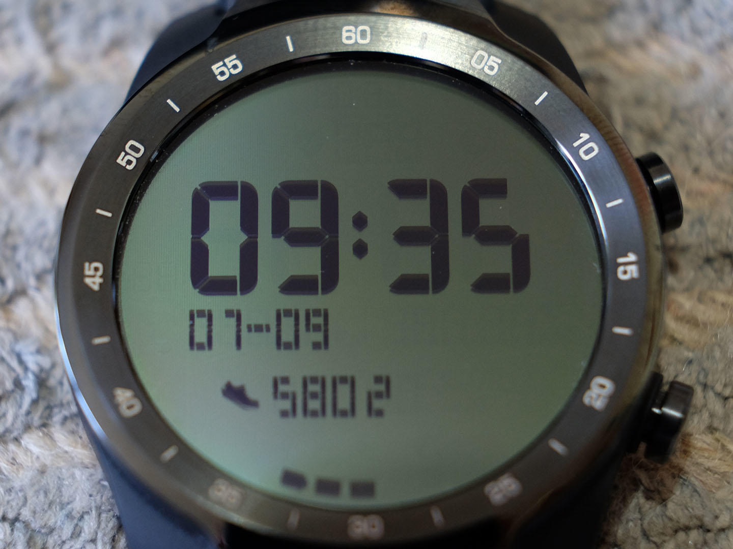
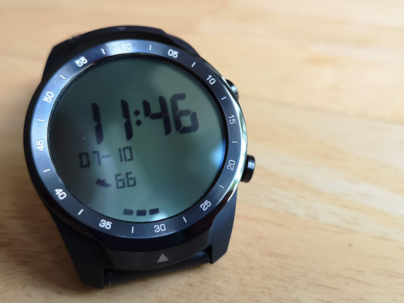
Usually the screen would be covered as a design choice but in this case it doubles as a feature. And double is the operative word here. The TicWatch Pro comes with not one but two screens layered up on top of each other. First up, you get your fairly standard OLED display for full colour and touch-control friendly interactions. But sitting on top of it, you also get a low-power, black-and-white FSTN LCD. The latter looks a bit like the screen on a Kindle – meaning it has a really pleasing analogue feel. But more importantly it means super low battery consumption too. Check out how it did in our testing further down.
OS DAYDREAMS
Android’s Wear OS is another major feature of the TicWatch Pro. This operating system has grown and developed so rapidly that it now rivals the full Android phone OS for functionality. The nice thing about this is that a lot of apps you probably already use are optimised for Wear OS, meaning its super easy to start getting the most out of the watch. Buttons are also a nice way to get quick access to certain areas of the watch without smudging that touchscreen with fingermarks. The top button can be used to bring up all the apps on the phone, and the bottom button can be set to quick launch any app you set it to.
STAY ‘APPY
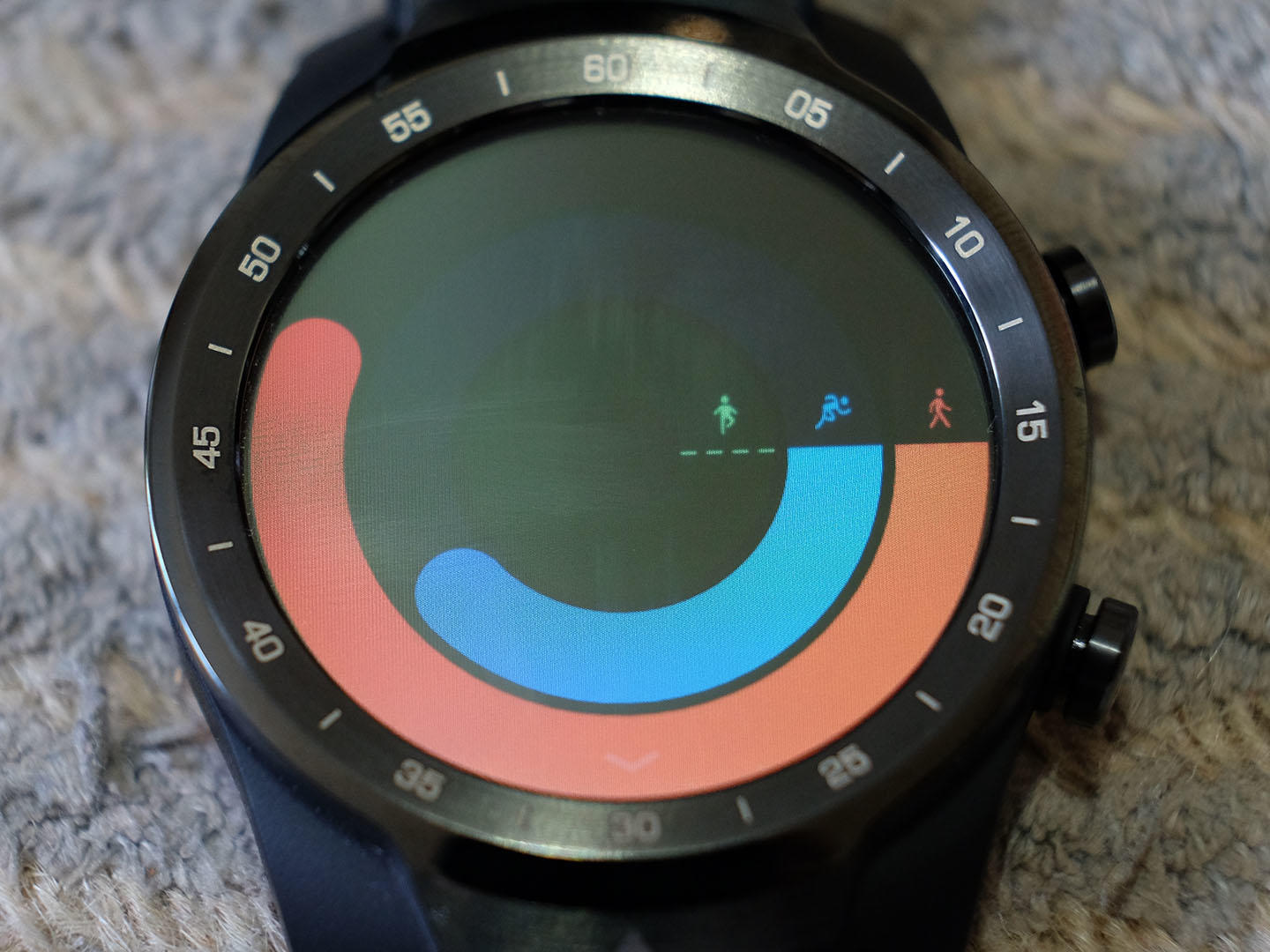
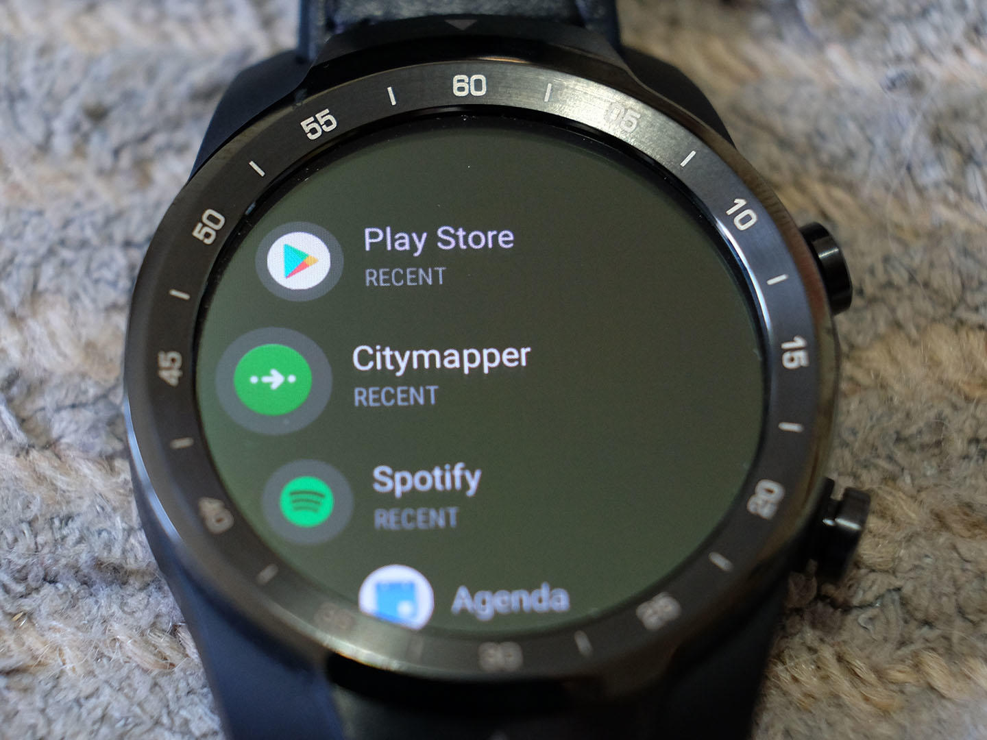
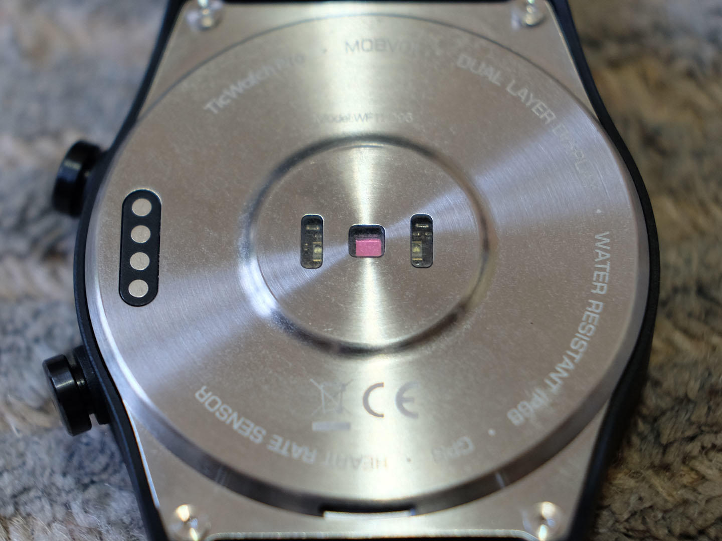
Wear OS apps are plentiful and you can now even access the Google Play Store right there on the watch. From fitness tracking to music playback and games, this has pretty much everything you could want or need. Android Pay is onboard so once you’ve setup your card and logged in via the connected phone, it’s active. This will remain active for tap-to-pay until the watch is removed and it detects this via its heart rate sensor. Yup, much like the Apple Watch. Tracking for out and about activities like running or cycling is great. This is thanks to GPS built into the watch as well as motion sensors and the ability to use the connected phone’s GPS for location too.
LITTLE NIGGLES
Meanwhile, other apps were largely helpful but we did have a few issues. CityMapper, for example, can be started on your phone then once you hit Go on your route the rest is displayed on the watch. While this works well for transit lines we found the map when walking didn’t work – annoying as that’s when you really need the guidance. Spotify is also a major app found on Wear OS. This is great for scrolling through your last listened to tracks meaning you can start playing right from the watch without touching your phone. In our case, though, controls for skipping, pausing or volume didn’t display. An early version glitch, we’d hope.
LONG LIVE THE BATTERY
Battery life is the big sell here. That second low-power screen is meant to extend battery life considerably over the competition, which in reality means you get about an extra half a day. So this Wear OS watch will give you a day and a half, maybe two, while most will top out at a day. You can switch this watch into Essential Mode for more. This is where the low power display is used at all times and then you get a hefty 30 days. While this is impressive you’re essentially reducing the smartwatch to just a watch. You do still get a step count and heart rate readout on the display but little more. That said, Mobvoi has promised that more functionality will be coming to that mode with updates soon.
WHAT’S THE VERDICT?
The Mobvoi TicWatch Pro does bring something new to the Wear OS smartwatch world. It offers a way to extend battery life on a device that needs exactly that enhancement. While that intention and effort is valiant, it doesn’t add that much more life than, say, a Samsung Gear S3 is capable of, unless you switch over to the Essential Mode. That said, this is a good looking and solid watch with lots of features for the price, and it could represent a new way of delivering the Wear OS experience to the wrist. All in all a promising, but too often frustrating, experience.
