Garmin Vivomove HR review
This minimalist watch has secret Garmin powers...
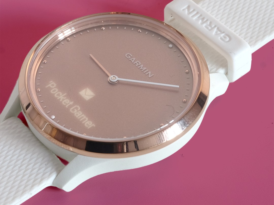
You won’t find many watches as desperate to hide their smarts as the Garmin Vivomove HR. Most of the time it looks like a plain analogue watch.
But with a couple of taps or an incoming notification, a hidden screen turns on, one that lives behind the watch face. Then after a few seconds it’s gone again and you gave a normal watch once more. Magic.
This is also probably the best fitness tracker among what are now known as ‘hybrids’ – in other words, those that externally look like normal watches. There’s enough Garmin DNA to gather an array of stats, including steps and heart-rate.
You do miss out on GPS, so it’s not an obvious choice for serious outdoor runners and cyclists. But anyone looking for a Garmin-lite introduction to sports-tracking should walk this way…
Design: Welcome to the secret Garmin
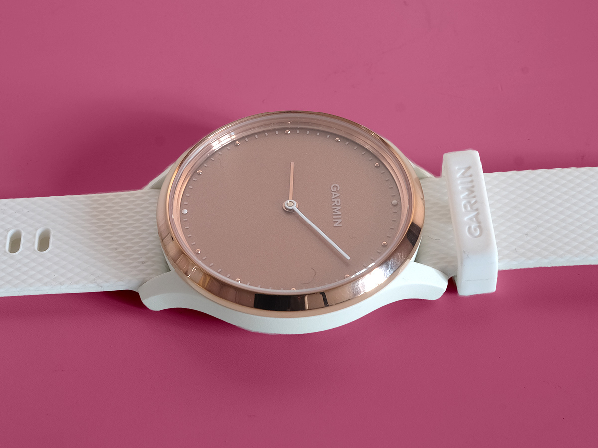
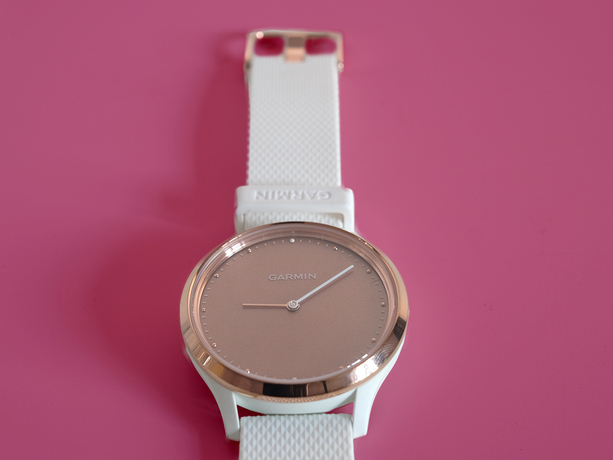
Check out these photos. That’s right: Garmin sent us the rose gold version of the Vivomove HR, perhaps the most polarising of the four colours the watch comes in.
The white rubber and plastic frame/strap looks a little cheap next to the metal and glass of the facia, but if you feel the same there are black, silver/back and gold/brown alternatives. And all nail the “just a watch” look.
Most ultra-simple hybrid fitness watches use a secondary dial that shows you how close you are to your steps goal, but the Vivomove HR sees no need for one. The result is an ultra-minimal look.
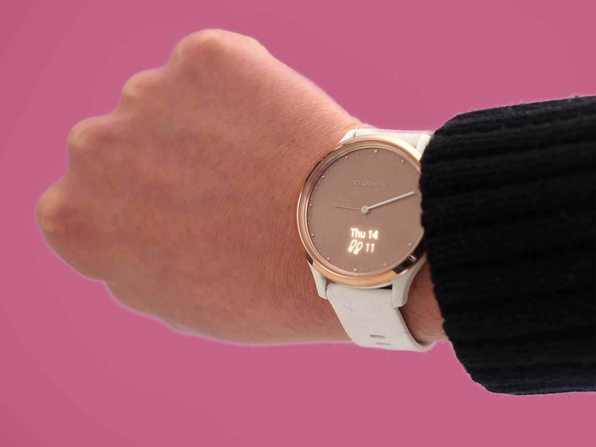
This isn’t a small, wallflower watch, though. Its face has a 43mm diameter, making it a real presence of your wrist. It certainly isn’t the version of the Vivomove HR I’d pick, but I do love the look of the black and black/silver editions.
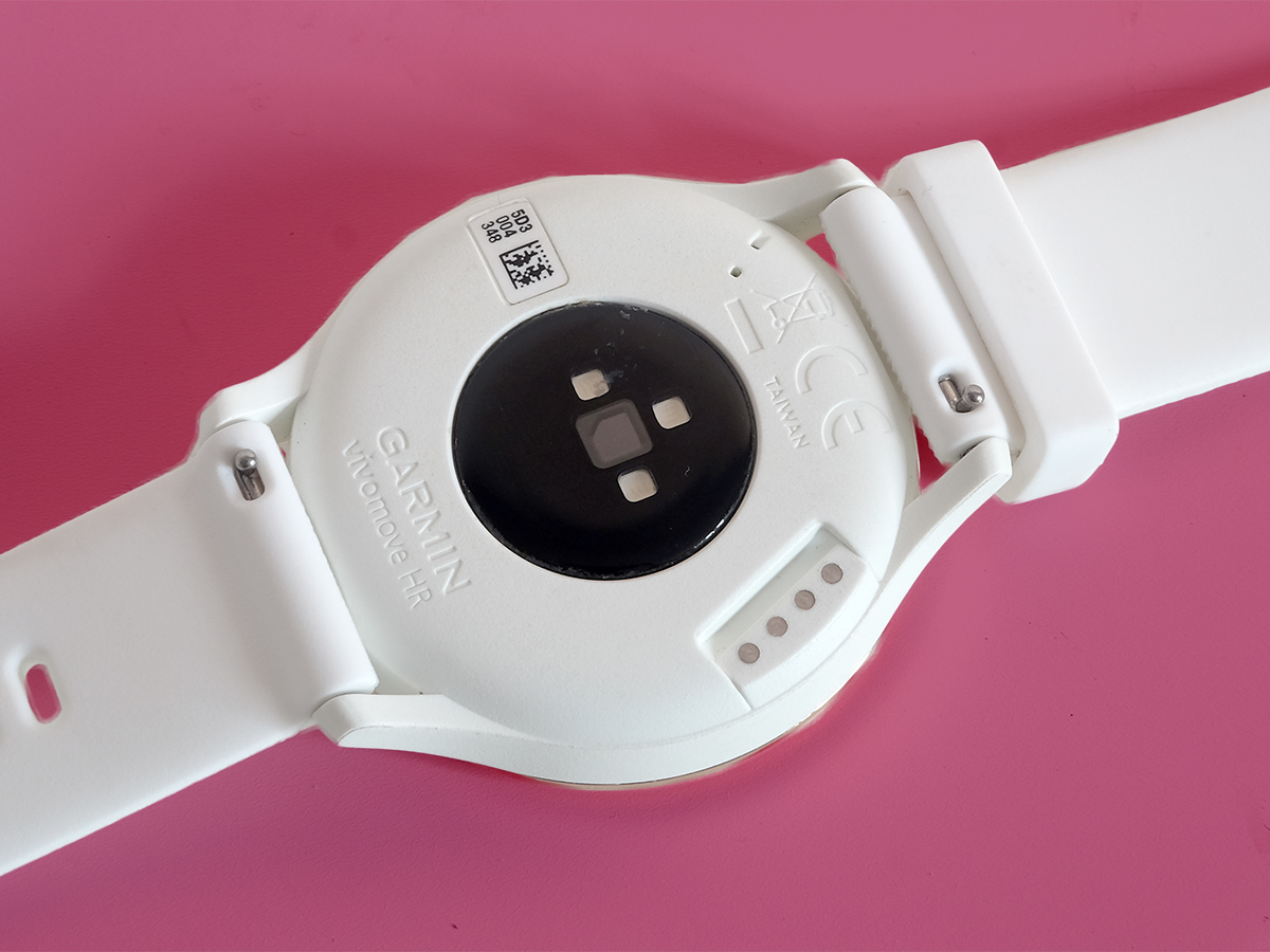
You can also switch straps in just a few seconds too, with a little release mechanism on the underside.
Display: hidden talents
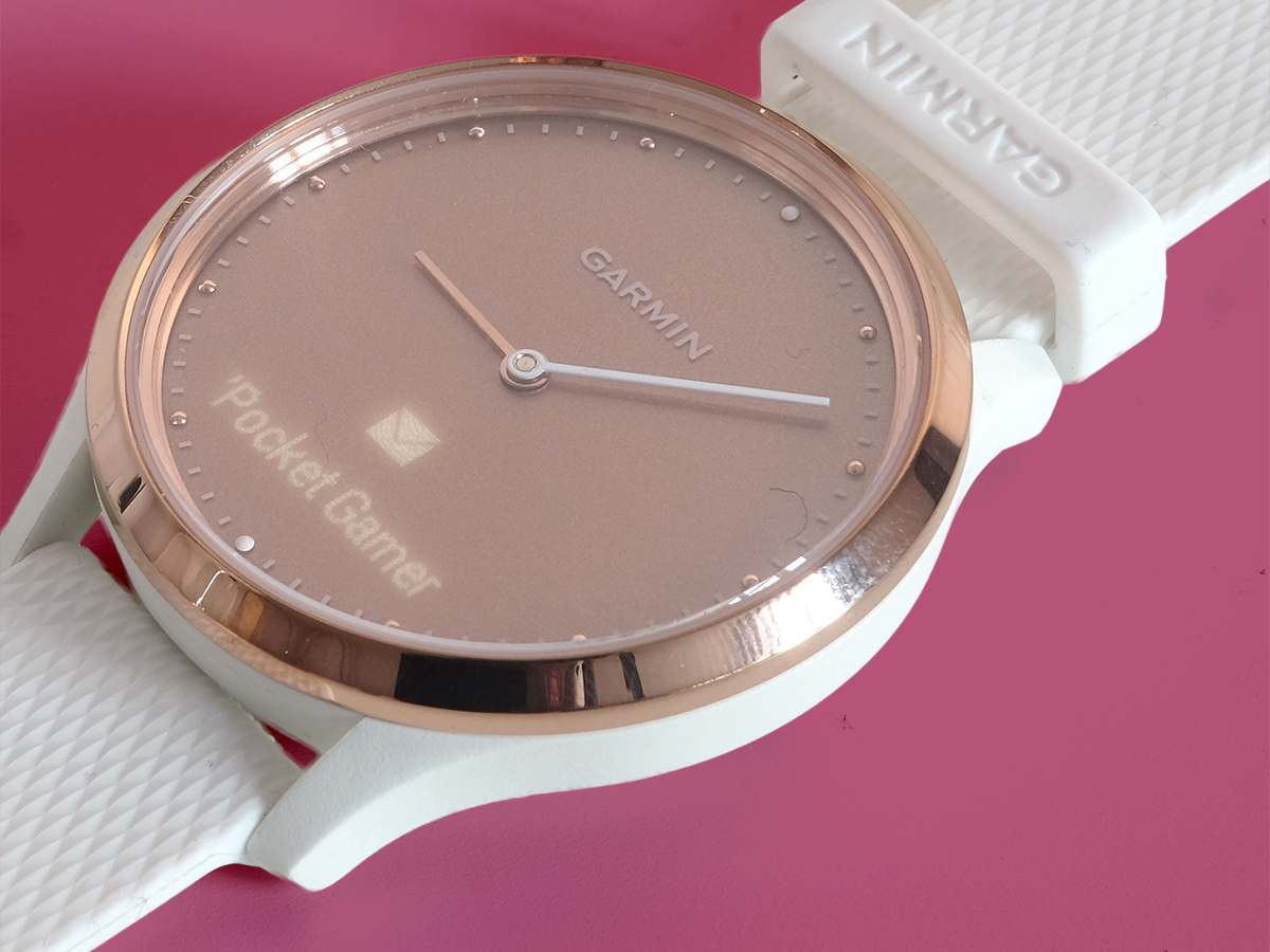
To bring the Vivomove HR screen to life, you double tap the area towards the bottom of the face. A little white read-out of your chosen home screen will then appear.
This might be a digital clock face, the date and time, or perhaps the date and your daily step count. Tiny swipes across this display take you through other info screens. There’s your step count, calories, music controls, the weather, the stress display and the stairs you’ve climbed: loads for a simple-looking hybrid.
You effectively get the same info screens as a Garmin watch with a much, much bigger screen. And that’s pretty neat. You can even tap on each display to get more details, like activity results from previous days. The Vivomove HR is an ambitious little thing.
Given how much the watch tries to cram in, cycling through these screens is surprisingly easy, not a fiddly mess. You use a long press to get to the menu, needed to dive into the settings or start a tracked activity, though this one seems to require a bit more precision.
There’s admittedly a tiny whiff of “beta” to the way the display looks sometimes. Off-centre graphics look a bit out of place and some of the stretched-looking fonts are at odds with the rest of the Vivomove HR’s style. In bright sunlight the display isn’t super-clear either. That said, London in December offered nothing that made the text truly hard to read.
It’s great for checking your step count, how long you’ve been running or who just emailed. But actually reading messages or emails is a real stretch. About 2-3 words fit on each page. It’s pretty swipe-tastic.
Still, with most other watches like this you don’t get notifications at all or, as with the Nokia Steel HR, limited ones. The Garmin Vivomove HR can suck up all notifications, including those from WhatsApp. They’re signposted with a buzz on your wrist. You get the bread and butter of a smartwatch, if not the rest of the menu.
There may be a smoother-looking take on the Vivomove HR’s style in the future. But as a first stab, this is still pretty impressive.
Fitness: fitter than most hybrids
The Vivomove HR also destroys alternatives like the Skagen Hybrid or Nokia Steel in terms of fitness tracking depth.
As well as basic 24/7 step tracking, there’s proper activity tracking for walks, runs, step aerobics, weight lifting and, erm, star jumps.
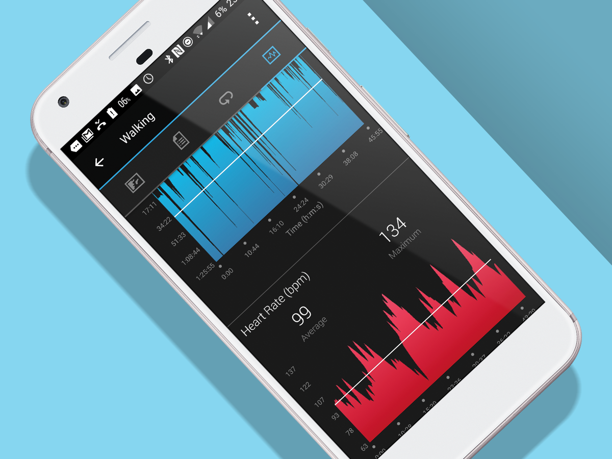
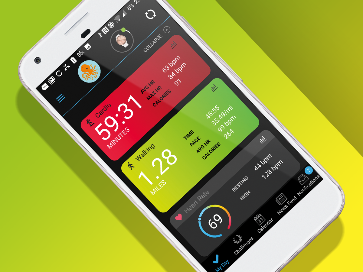
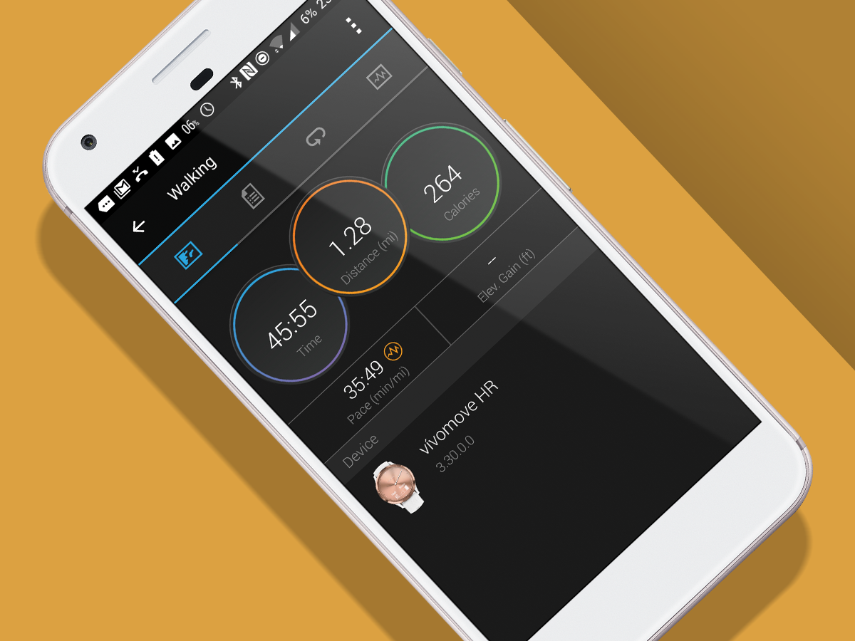
Go for a run and you’ll see how long you’ve been out on the display. And when you’re done you’ll get stats similar to those from a proper runner’s watch in the Garmin Connect app. There’s pace, calories, distance, a HR chart and even a detailed graph of your pace throughout.
Before you sell your Fenix 3, the Vivomove HR uses an accelerometer to judge pace and distance rather than GPS. You don’t get a map of your route, and the accuracy of data doesn’t match a “real” runner’s watch. That said, the heart rate accuracy is solid for a wrist-worn model.
The Garmin Vivomove HR really does get you a great compromise between low-key design, useful smarts and exercise tracking. It’s also shower and swim ready, although there aren’t any swim-tracking modes.
One slight downside with the Vivomove HR is that its battery doesn’t last as long as some of Garmin’s other gear, or anywhere near as long as other hybrids, which can last six months to a year.
Still, it does still last four or five days with a decent amount of tracking. You can also get it to last two weeks if you cut out the display and smart features. But that would kind of defeat the point of getting a smarter hybrid watch over something like the Fitbit Alta HR.
Garmin Vivomove HR verdict
The Garmin Vivomove HR is a very smart take on a watch that initially doesn’t appear to be smart at all. It’s a minimalist watch that after a few taps turns into a surprisingly good fitness tracker.
More than just a step counter, it has a barometer and a solid heart rate tracker too. A dabbler in all areas, it even offers proper notifications from your phone.
In typical Garmin fashion, the utility and aesthetics can seem at odds with each other at times. And both the normal Vivomove and Nokia Steel HR have more coherent designs.
But with the screen off this really does look like a normal watch, and it can simply do more fitness tracking stuff than most in its class.
Stuff Says…
One of the most fitness-focused hybrid watches around and a great Garmin-lite tracker for newbies
Good Stuff
Better at fitness than it first appears
Fairly good battery life
Supports notifications, including WhatsApp
Uses the same app as Garmin’s advanced watches
Bad Stuff
No GPS
Screen visibility only okay in bright light
Design could do with more refinement
