HTC One M9 review
Updated with hands-on video: HTC has chosen the path of evolution for the next-gen One, but is that enough to make it the new pick of the Androids?
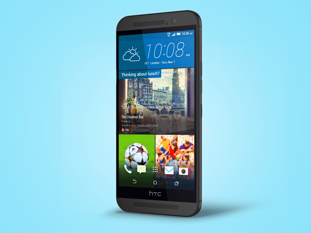
The HTC One (M8) is one of Stuff’s favourite phones ever. It sat atop our Top 10 smartphones list for a while and was shortlisted for smartphone of the year in the Stuff Gadget Awards 2014, no less.
But it did divide opinion somewhat. Those who loved it really loved it, on account of its beautiful design, superb build and lovely screen. But for some its flaws – namely the much-maligned UltraPixel camera – prevented it from being the best.
The HTC One M9 – no brackets this time – aims to put that right.
Round the back there’s a proper 20MP camera while the design has been refined slightly without losing what made it so special.
Eyes won’t pop out, HTC One M8 owners won’t suddenly feel the need to throw their current phone in the recycling bin. But this evolutionary approach is a sign of classy reserve that in this case makes a lot of sense.
We’re all behind the curve
Over the past three years, HTC has milled and beveled itself a reputation for great design and excellent build quality.
This approach has paid off to the extent that even Apple, a company more design-obsessed than a houseful of Scandinavian furniture designers having an argument over a lamp, has made a phone that looks somewhat One-ish.
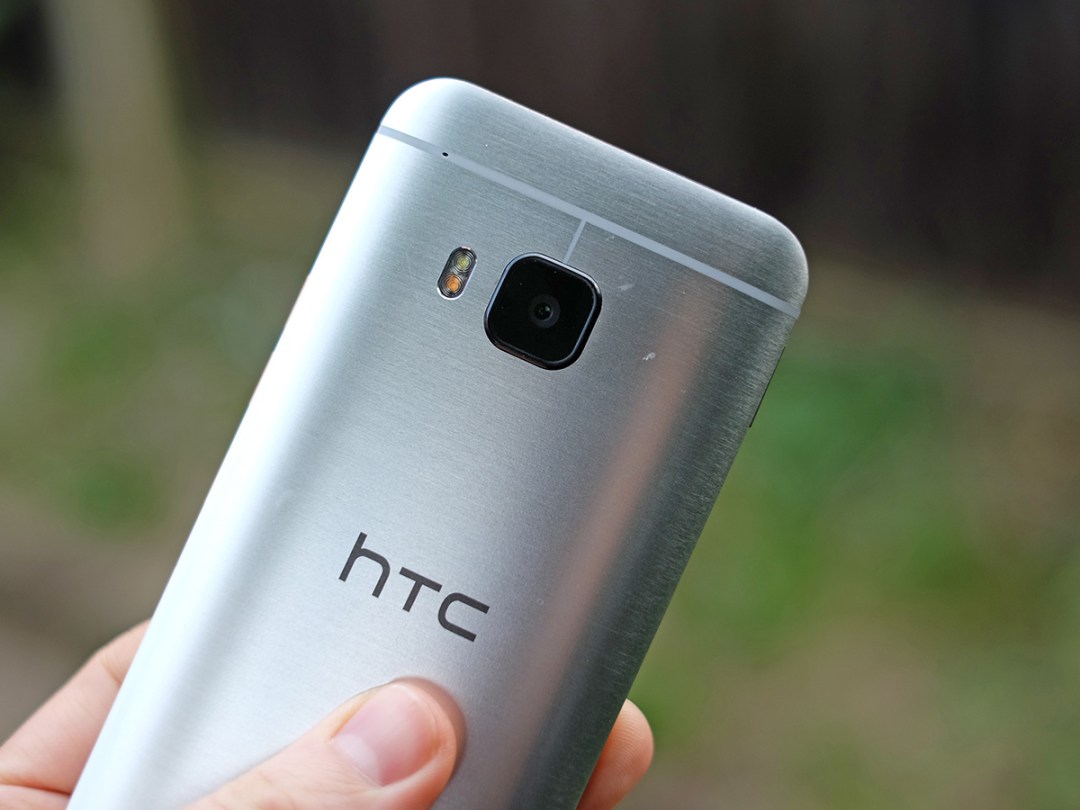
While the HTC One M9 body is a new design, you could be forgiven for thinking it’s basically the same as the HTC One M8. They’re very similar in size (the One M9 is fractionally thicker at 9.6mm), both make near-excessive use of cool, hard, brushed aluminium. And both feel just amazing.
The Samsung Galaxy S6 may be thinner and have a fancy new glass and metal design, but I suspect many will still prefer the feel of the HTC One M9.
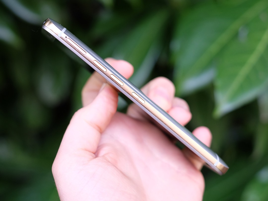
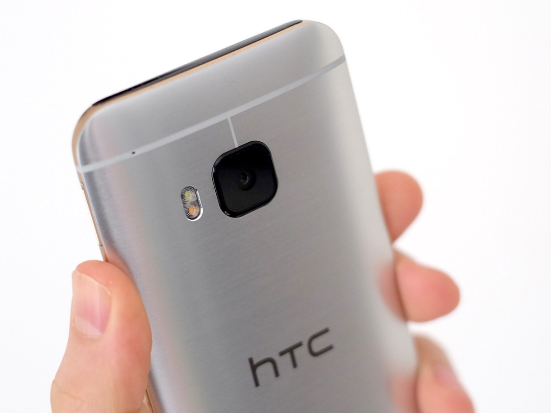
The look is actually ever-so-slightly different this time. HTC has used a two-tone finish, for one. The One M9’s sides are a bronze-gold finish while the front and back are much more silvery. Going for gold is always going to raise a few eyebrows, but the M9 pulls off the look with ease. No gaudy gold here.
To my eyes the circular camera lens of the M8 looked a bit better than the square one on the new M9, but that’s pure personal preference. Essentially, if you loved the look of the One and One M8, you’re going to love the M9 just as much.
The competition › Samsung Galaxy S6 hands-on review
Fully-featured
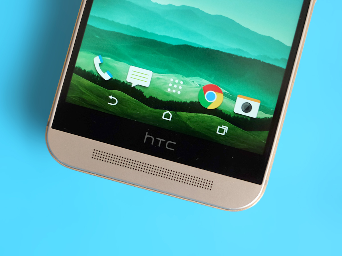
Unlike Samsung, HTC hasn’t thrown the baby out with the bathwater – the One M9 has a microSD memory card slot, the Galaxy S6 doesn’t.
You already get 32GB of internal storage, but the memory card slot enables you to boost that up to a huge 160GB for around £60. Upgrading to the 128GB version of a phone would cost you a lot more than that.
The BoomSound speakers are back, too. These front-facing stereo speakers made their debut with the original HTC One a couple of years ago, and they haven’t changed a great deal since. But they’re still just about the best mobile phone speakers around.
It’s not that they’re super-duper loud, but rather just a lot richer-sounding than the competition. People’s voices no longer sound like a gang of angry wasps trapped in a bottle. There has been a minor software update to the speakers this year, too. Dolby sound modes allow you to tweak the output (for the speakers and headphones alike) to suit music or movies.
Movie mode makes the sound bigger, Music does its best to get you a natural tone. It’s not a major change but every little helps.
Small-screen star
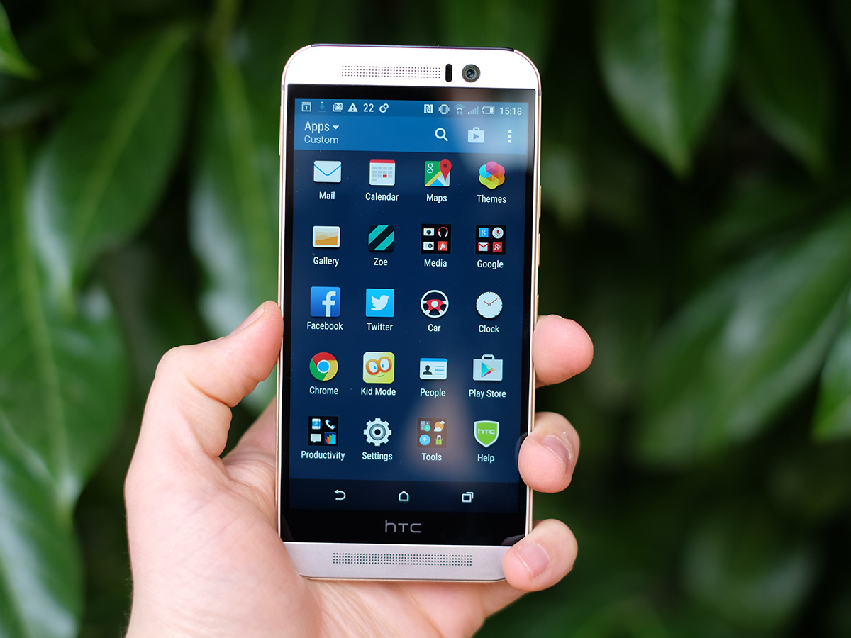
HTC has really picked its battles this year, and in the screen department it’s chosen the path of conscientious objector to the resolution war.
LG has been making QHD-resolution phones for ages now, but HTC has once again decided to stick with Full HD. If you’re a spec hunter the Samsung Galaxy S6 and LG G4 have displays with way more pixels.
But the difference in real life is far from massive, mostly because at 5.0 inches the One M9 screen just isn’t big enough to really benefit from loads of extra pixels.
After all, it’s still got a pixel density of 441ppi, light years ahead of the iPhone 6’s 326ppi. Screen obsessives are welcome to get hung up on the numbers, but there’s really no need to.
And once you put the figures to one side you realise that the One M9 has a great screen – one with natural-looking colours, excellent viewing angles and decent contrast. If you spend about 50 per cent of your time with a phone watching Netflix or iPlayer, consider a 5.5-inch-or-larger alternative such as the LG G3 or Samsung Galaxy Note 4 as well. You’ll be carrying around a bigger all-round phone, but the media benefits will probably be worth it when it comes to satisfying your streaming addiction.
And don’t go assuming this is simply the same screen as that of the M8. Comparing the two side-by-side proves they’re very similar indeed, but the M9 is slightly improved, particularly when it comes to viewing outdoors.
Should you wait? › LG G4 preview
A Sense of the future
So spotting the difference has been a bit tricky so far, but HTC has made a bunch of more obvious improvements to the One M9’s software.
The phone runs Android 5.0 Lollipop, but it’s actually the alterations made to the custom HTC Sense interface you’ll notice most.
Not that it won’t be immediately familiar to existing HTC owners. You get your usual selection of home screens plus the BlinkFeed rolling news page, and a vertically-scrolling apps menu (almost all other Androids use horizontal scrolling).
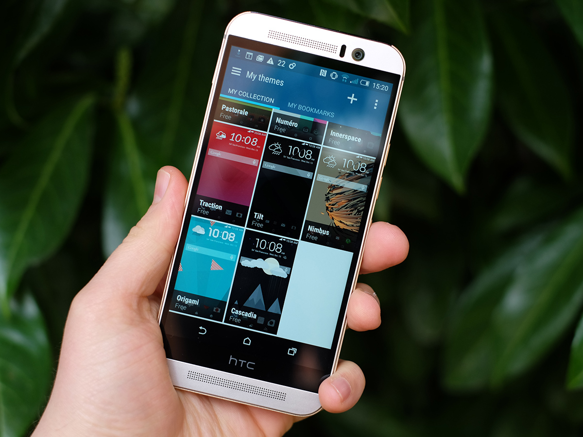
It feels much like business as usual, but this year you can also seriously customise the look and feel of Sense with themes. Previously it was only quirky Chinese phone makers such as Huawei and ZTE that were still banging on about phone themes, but HTC has actually applied them rather nicely.
They let you alter the font and icons of the system, but a good deal of the customisation is also about picking a colour scheme. A bunch of themes come preinstalled, but the neatest trick is how you can easily create your own: just choose a picture to act as the homescreen wallpaper and the HTC One M9 will automatically work out which colour scheme suits the image best. Pretty smart, right?
You can then override HTC’s decision if you like, but there are fairly tight reins on what you can do. The HTC One M9 does its best to stay looking classy: there’s no phone equivalent of the avocado bathroom suite here.
Sense Home is also more contextually aware; if it’s lunch time, it’ll show you Yelp reviews from nearby restaurants, and if you cycle to work, it’ll notify you an hour before sunset in case you need to charge your lights. That sort of thoughtfulness makes ownership a real pleasure.
Hot under the collar?
General performance is fantastic too. As usual with a top-end HTC phone, the One M9 is extremely snappy – there’s no drippy lag here. Of course, every phone should really beyond basic lag at this point, and the Qualcomm Snapdragon 810 CPU really gives HTC One M9 an excess of power.
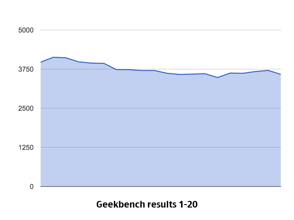
You can expect to get up to 4200 points on the Geekbench 3 benchmark, which is around 20-30 per cent better than most of last year’s top phones. Of course, we now know that this is the new standard – and that the Samsung Galaxy S6’s Exynos CPU is actually a whole load moe powerful. Does it make a big difference in everyday use? Not really – the One M9 has more than enough power for 2015 and beyond.
The internet’s also been abuzz with rumours of overheating from the HTC One M9, to the extent that some people seem to think it might melt in your hands the moment you do anything more taxing than check your emails. The internet is, of course, blowing it out of all proportion.
Yes, it gets a bit warm and the metal body makes that a bit more obvious than a plastic phone might. But stories of the thing giving your thigh third-degree burns are completely OTT.
To see whether the Qualcomm 810 chip pulls off any performance-limiting tricks to keep heat at bay, we made the phone perform the Geekbench 3 benchmark over and over again 20 times, not giving the little guy a second to breathe in-between.
What did we find? Well, the HTC One M9 seems to switch gears after 5-10 minutes in order to stop the body getting too toasty. However, as it stays to about 90 per cent of its peak performance, you really have to look to notice. At its worst, it’s still a load more powerful than the HTC One M8 at its best. And at its best it’s just blistering – in a good way.
Bugs in the basement
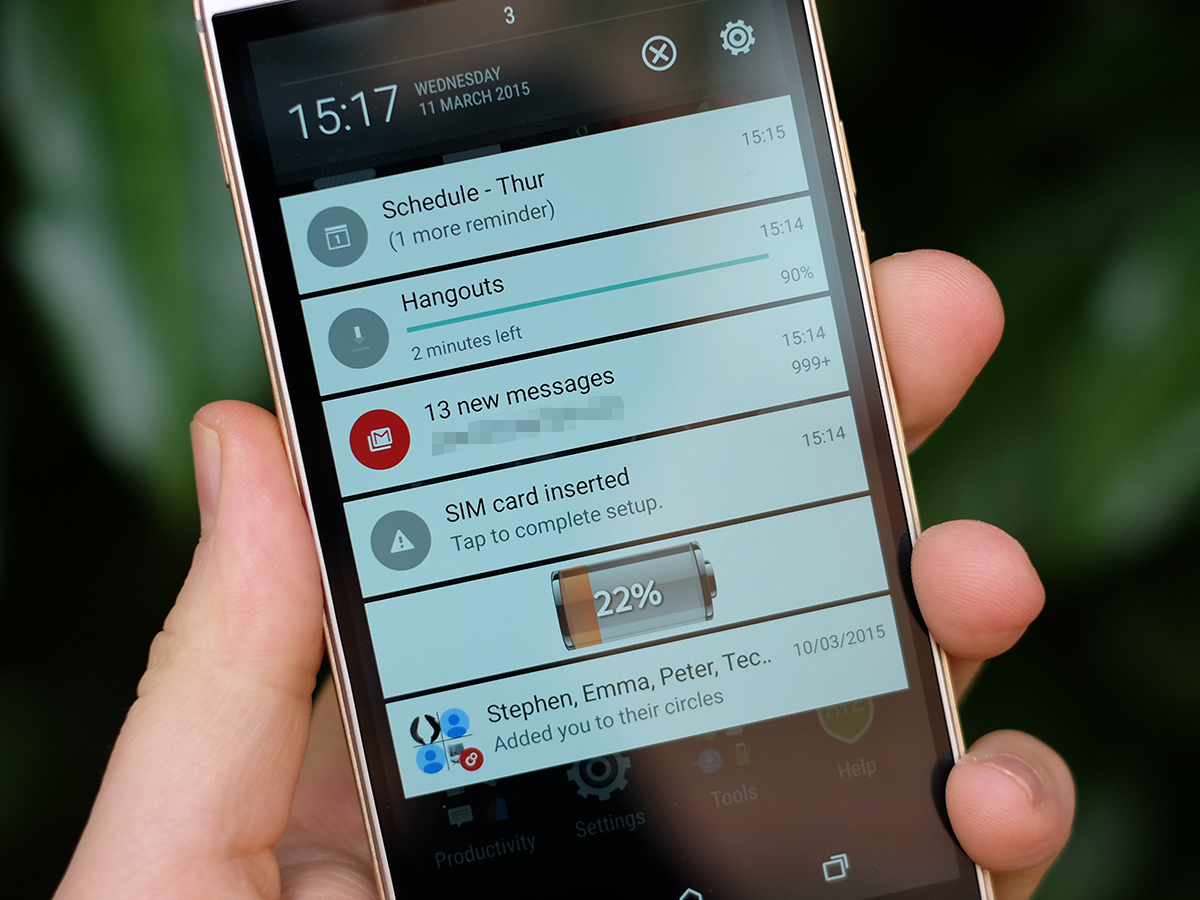
So the heat issue isn’t really an issue at all, but there is a small price to pay for all that performance, and it comes in the form of the battery.
The HTC One M9 has a 2840mAh battery that’ll get you a day’s use with a solid chunk to tide you over into the next morning/early afternoon. However, in our usual looping video test the phone only lasted for 9-9.5 hours. With the same test, a phone such as the Sony Xperia Z3 sails easily into double figures.
We say “only” 9.5 hours, but that’s not actually a terrible result. It’s not even bad. And frankly, until we get to the point of genuine two-day phones a day and change good enough.
There are plenty of tools to help you eke out every last drop of battery power. The Power Saver mode keeps the screen, CPU and data connection in check so that they don’t drain more battery than is essential. Going a step further, the Extreme Power Saver radically changes the One M9 to get those last few per cent to last hours rather than minutes. It simplifies the UI and limits phone features.
This is nothing massively new, though, and we’re left waiting for a true, throttle-free, two-day superphone.
Dawn of the UltraSelfie
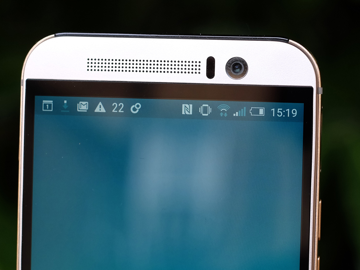
One area where HTC has put some of its most conspicuous upgrade man hours is the camera. In the last two One-series phones HTC used UltraPixel cameras. This is really just marketing-speak for a 4-megapixel camera with larger-than-average sensor pixels.
These are the little guys that collect the light that goes into making a camera’s photos: bigger pixels equals more light equals better photos, but fewer pixels means less detail in your shots. That’s the simple version, anyhow.
At Stuff we’ve been quite keen on the UltraPixel approach in the past – the way most people use their phone cameras means drawing out brightness is arguably more important than outright detail. But as phone cameras generally get better, more and more people are relying entirely on their phones for their snaps and that detail is becoming more demanded and more accessible. That, plus the usual obsession with bigger numbers, means HTC has had a change of heart.
The 4-megapixel UltraPixel camera of old hasn’t been binned, but it has been moved around to the front where it’s on dedicated selfie duty. It’s damn good at it too. No-one really needs ultra-detail photos in a selfie camera (not with these crow’s feet), and the better light sensitivity means less noise and the flexibility to use faster shutter speeds in lower light conditions. That means fewer blurry ‘in da club’ selfies. Its one of the best front cameras there is, and has none of the willy-waving spec bragging of the HTC Desire Eye (which has a 13-megapixel selfie camera).
Piling on the pixels


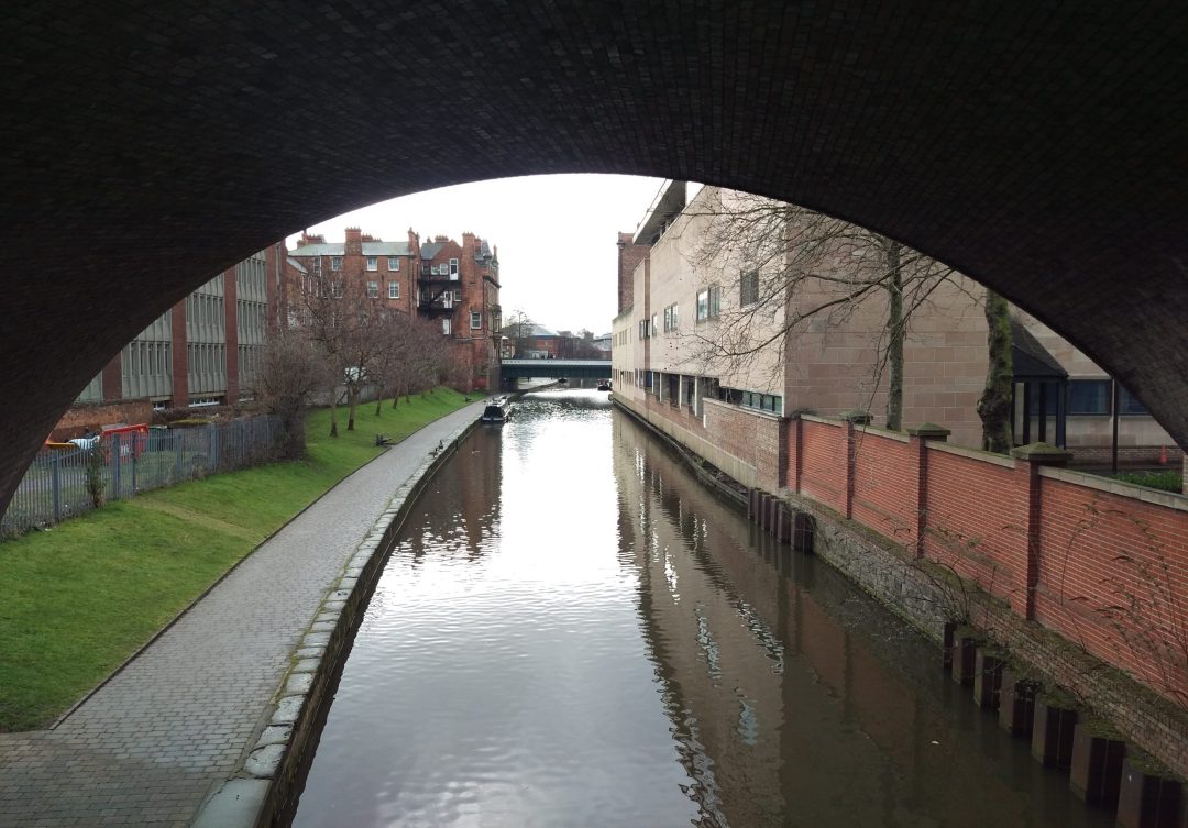
The front camera takes a more traditional approach. It has a 20.7-megapixel camera sensor with an f/2.0 lens, getting you loads of resolution but average-size sensor pixels.
In good lighting you can get absolutely bags of detail from the HTC One M9. Loads of the stuff, although as usual it actually shoots slightly lower-res 16:9 images unless you tweak the camera app’s settings.
The sensor’s native dynamic range is impressive, too. This tells you how much detail it can capture in shadowy areas before everything gets smudged into blackness.
As with the previous HTC flagships, though, it’s not quite as smart as the very best when it comes to exposure metering.
This is when a camera judges how ‘bright’ a photo needs to be. When we first got our hands on the One M9 its exposure judgement was pretty far off. A few updates later (which will have been applied before you buy your handset) it’s much better, although still not quite as good as rivals such as the iPhone 6 and Galaxy Note 4.
The issue is that it can go a bit too far. When you tap on an object to focus on it, any phone camera (aside from the really, really bad ones) will adjust so that that area, the subject, is clear and properly-exposed.
However, with the HTC One M9 it doesn’t always ensure that the sky behind isn’t totally overexposed. The camera brain is like an overexcited puppy. It just needs to chill out a bit. The selfie camera does this too, but it doesn’t matter so much there: as long as the faces are properly exposed, we’re happy. And they generally are.
You can learn to work your way around this, and with a bit of know-how the HTC One M9 can take some truly great photos, especially if you’re willing to give them a quick tweak afterwards.
The easy way to avoid the exposure issue is to use the HDR mode, but this little bit of software cleverness is also just a smidge short of the iPhone and Galaxy equivalents. It’s just a touch slow relative to the snappy standard mode and the preview window isn’t a very accurate prediction of what the photo will actually look like. The results are generally better than what the preview shows, though, so that’s not a massive issue.
Low-light performance is fine, but not much more. With that upping of resolution, HTC has traded away supernatural low-light moves. Photos are predictably a bit noisy and with no OIS onboard you need to be careful about how you hold the phone to avoid ending up with blurry shots. Use one of those phone tripods and you can get some good shots, though.
No more gimmicks
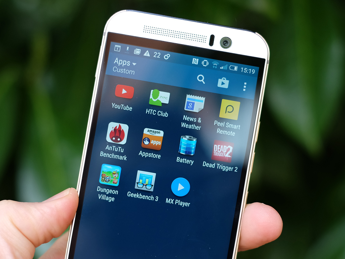
Fans of the HTC One M8 will also notice that there’s no longer a dual-camera rear setup on the One M9. The last phone in this series had two rear sensors to let it make a 3D map of a scene.
With hindsight it was all a bit of a gimmick, and proving the point the HTC One M9 pulls off the same tricks all with software (just like the other manufacturers did last year). The Bokeh mode takes two photos at the extreme ends of the lens’s autofocus to separate foreground from background, then ramping up the background blur for an artier effect.
The funny thing is, it seems to work even better here than it did when HTC had dedicated hardware doing the job. Pick the right subject and you can get some good results.
It doesn’t pile on too many more extra modes, though. You get panorama, HDR, a photobooth-style mode and simultaneous front-rear capture.
HTC One M9 Verdict
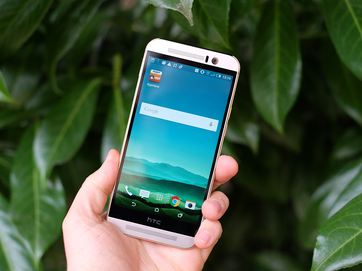
The HTC One M9 keeps all the bits we loved most about the HTC One M8. Its metal body, top front-facing speakers and snappy performance all mark the One M9 out as one of the year’s top phones.
It’s not that dynamic, and if you want a phone with lots of gimmicks and extra tech nonsense extras, this probably isn’t it. However, the more you use the One M9, the more you appreciate its great ergonomics, effortless style, and neat, slick UI. And we’re starting to fall in love with the BoomSound speakers all over again.
But now that we’ve also tested the Samsung Galaxy S6 and LG G4 we know that the One M9 isn’t the very best phone you can buy in 2015. It’s up there with the best but Samsung in particular has blown the competition out of the water. Still, if you like the way HTC does things and you’re a fan of the design, the One M9 remains a very solid choice.
Tech specs
| Operating System | Android 5.0 with Sense 7.0 |
| Screen | 5-inch LCD with 1920 x 1080 resolution (441ppi) |
| Processor | Octa-core Snapdragon 810 |
| RAM | 3GB |
| Storage | 32GB (microSD expandable) |
| Cameras | 20MP rear with two-tone flash, 4MP UltraPixel front |
| Connectivity | NFC, Wi-Fi, 3G/4G, Bluetooth 4.0, IR |
| Battery | 2840mAh |
| Dimensions | 145 x 70 x 9.6mm |
| Weight | 157g |
Stuff Says…
It’s more evolution than revolution, but that still equates to the finest phone around – at least for now
Good Stuff
One of the classiest phones available
Loads of power
Very nice screen
The best front camera around
Rear camera takes great shots in the right circumstances
Likeable, customisable UI
Bad Stuff
Battery life could be better
Getting the best photos takes a bit of effort


