Microsoft Surface Pro (2017) review
Meet the new Surface Pro, same as the old Surface Pro. But a little bit better
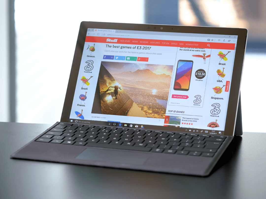
Confession: when the new Surface Pro was announced back in May I was distinctly underwhelmed.
I’d fully expected a new Surface Pro 5 to land with a planet-splitting, subsonic boom; my fevered little imagination had equipped it with a 5K screen, a Type Cover hewn from alien hide, and an all-new Intel processor that was eight times the speed of any previously known chip. All for the low, low price of £199, keyboard included.
So to find that the Pro 5 was, in fact, simply the Surface Pro, and that it was basically a vigorous refresh of the existing model accompanied by a price hike, was a bit disappointing. But then, as the news sank in, I came to realise that my hunger for seismic change may have been ill considered.
Sure, the original Surface Pro was obviously undercooked when it launched back in February of 2013, suffering as it did from soul-destroying bugs that took months (and what seemed like countless hour-long firmware updates) to eradicate. But let’s give Microsoft credit for its patience and faith: the Surface Pro format has carefully evolved into something that tons of other manufacturers shamelessly emulate (take a bow, HP, Lenovo, Acer and Asus).
And as the Surface’s problems have evaporated with the fixes, so the sales have steadily increased. So I kind of understand Microsoft’s reluctance to risk wrecking a winning formula with all-new features or out-of-kilter hardware changes. The Pro’s hybrid format clearly has a place in the world, which means that the job is to tweak everything until it shuffles a little closer to perfection.
If you accept that as true (and that’s a big ‘if’, I know), the question then becomes… do the latest Pro’s refinements represent actual improvements, and do they warrant the price hike?
The 12.3in display: why change perfection?
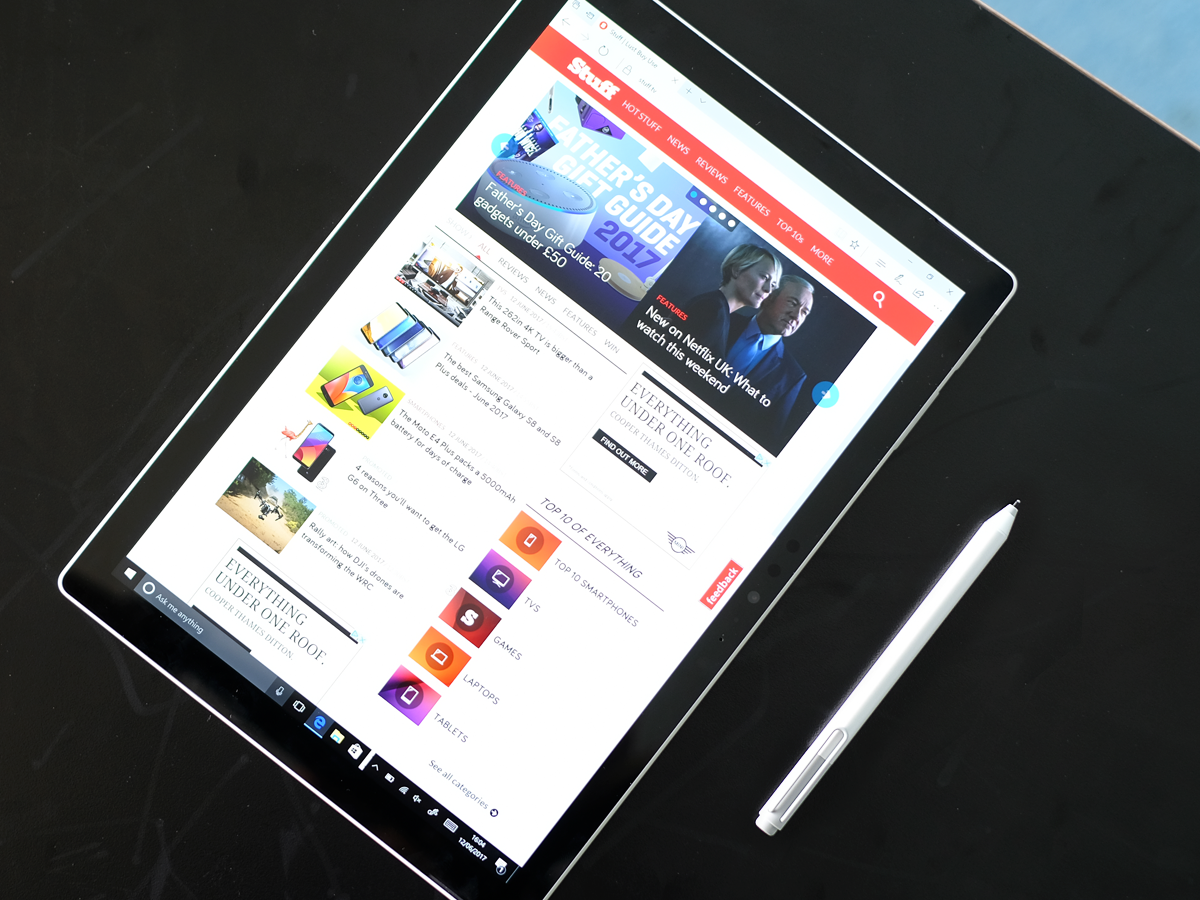
The Surface Pro 4’s PixelSense screen was stunning – so stunning that Microsoft has sensibly carried it straight over to the Surface Pro.
It’s a 3:2 ratio, 12.3in screen set to a native 2736 x 1824 resolution, offering 267 pixels per inch. As impressive as those numbers (still) are, they cannot hope to tell the story of how good this screen is in everyday use.
It’s calibrated beautifully; colours pop without suffering from the glaring vibrancy that afflicts some rivals (hello, Samsung); you can look at the Surface Pro’s screen for hours without tiring your eyes; and text is beautifully crisp, almost regardless of how much you enlarge it. It’ll go bright enough for outdoor use on the sunniest of days, and dark enough to not wake the neighbourhood if you’re using it in bed at night.
The touchscreen is incredibly responsive, too, and my review sample suffered none of the light bleed that I’d experienced in a Surface Pro 4 a year or so back.
The display resolution itself is a little unusual, a factor that at one time proved a problem for software vendors, who struggled to get their apps to render prettily. Happily, those days are long behind us: just about everything you install will look good by scaling correctly straight out of the box. However, you’ll still have a decision to make in how you want to scale text and iconography, set by default to a recommended 200%. As with the Surface Pro 4, I reset the scaling in Settings to 175%, creating more room on the display for content.
If I have one small niggle, it’s with the software more than it is the screen. The auto brightness in Windows 10 adjusts at quite brutal gradients that distract from the experience, so much so that I normally disable it. Quite why Microsoft hasn’t smoothed this out by now is beyond me – I can only hope it’s put to rest with the big upcoming autumn update. But that’s a niggle, and one you can fix yourself in seconds.
If you decide on a Surface Pro tomorrow, you can be confident that while rivals may come along in the near future with higher-resolution screens or a myriad of other head-turning claims, they’ll struggle to better the Surface’s combination of quality, usability and battery life (now a claimed 13.5 hours).
Performance: more than powerful enough for day-to-day use
If you’re new to the whole Surface Pro concept, don’t let its compact tablet-hybrid form factor fool you. As with its predecessor, the ‘new’ Pro packs the punch of a full desktop machine, pretty much regardless of which of the processor options you go for. You have a choice between three Intel chips: the base m3 (starting at £799 without the keyboard), the midrange i5 (at £979 for the 128GB / 4GB, and £1249 for the 256GB / 8GB), and the top-of-the-line i7 (topping out at a giddy £2699 for the 1TB / 16GB model).
As part of the Pro revamp, Microsoft has said goodbye to Intel’s 6th generation Skylake processors in favour of the latest, 7th generation Kaby Lake chips, a move that brings a small-but-worthwhile power hike and much greater power efficiency. Unfortunately, my review unit was the powerful i7, complete with a whopping 16GB of RAM and a massive, speedy 512GB SSD hard drive.
I say unfortunate, not because I disliked the i7 Pro’s performance, but because this spec is likely to represent a very small proportion of Surface Pro sales. I’d rather, given the choice, have spent time with either the basic m3, or the ‘new’ i5. The latter is particularly interesting; with the shift to Kaby Lake, Microsoft has decided that the i5 should join the m3 in no longer needing a fan… which means that you should enjoy silent operation without needing to worry about overheating.
Given our experience with Kaby Lake chips elsewhere, I’ll happily predict that even the base Pro should have more than enough oomph for 95% of users slogging their way through the routine office, web browsing, watching videos and listening to tunes. It’s only once you start straying into more demanding jobs that you may need to think twice before spending the cash.
For the record, my review i7 predictably chomped through just about everything I could throw at it in my two days with the unit, from playing ReCore at healthy frame rates and high-ish settings with almost zero lag to retouching some fairly complex images in Photoshop (thanks to the i7’s Iris Plus graphics).
The Pro with this spec is a monster, launching and switching between applications at the speed of thought, and managing to remain fairly cool throughout. But then, you’re paying a whopping £2149 for the benefit (a premium of £620 over the equivalently-specced Pro 4 you can buy in PC World today). Frankly, at that price, it should fly.
Practicality: lighter, leaner, longer-lasting
If you’re tempted to buy a Surface Pro, you’ll do so for its marriage of full-on desktop PC power and tablet portability. Truth is, you can buy much better laptops and much better tablets (enter stage left, respectively, the Dell XPS 13 and 12.9in iPad Pro). But then you’ll struggle to find either a laptop or tablet that can replicate the Surface’s balance between office workhorse, creative powerhouse and pick-up-and-drop tablet.
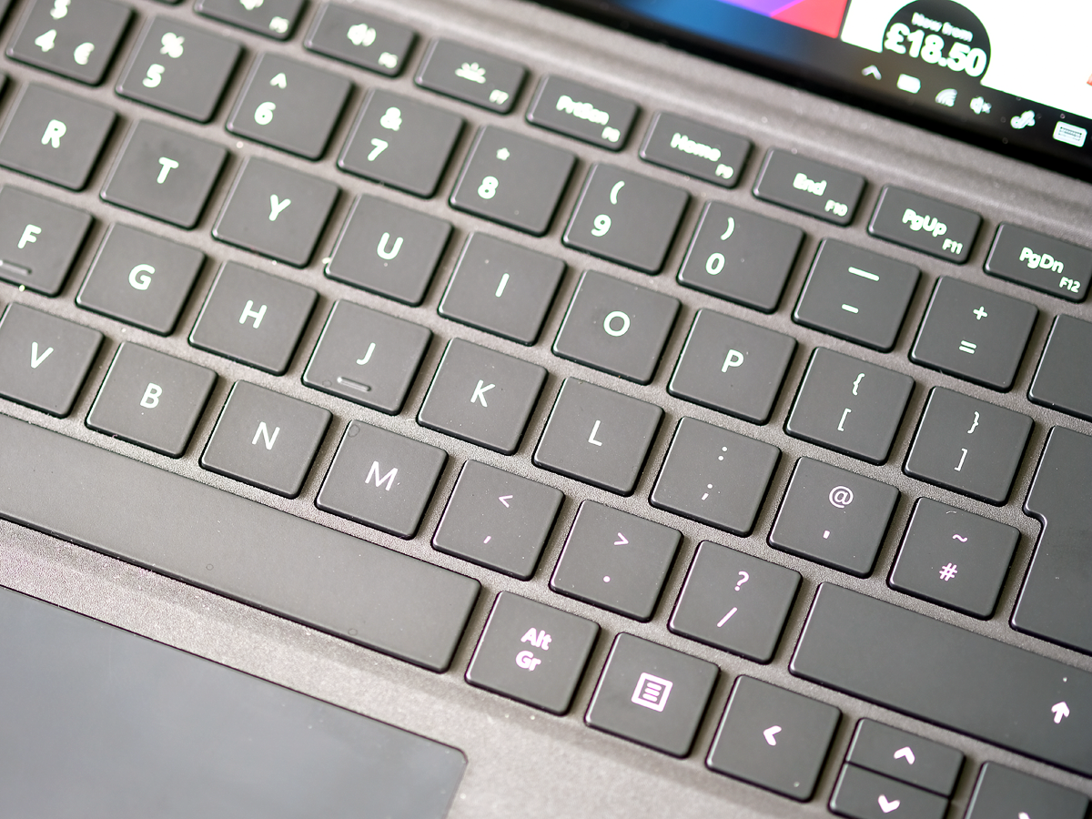
As with the original Pro back in 2013, its party trick remains the detachable Type Cover keyboard, which snaps on and off in seconds with a simple pull and a click. Without the Cover, you have a fairly non-descript 12.3 inch tablet. With it, you have a compact laptop with a keyboard that forces none of the compromises you may expect from something that, on first acquaintance, looks so impractical and fragile.
In fact, the Type Cover’s a delight to use – although how much you love it may depend on your typing style. If you’ve cracked the subtle art of touch typing, you’ll find the keys and their 1.3mm of travel to be spot on. Those with a heavier, two fingered style (me included) will have no problem with the travel of the keys or their spacing, but may be irritated by the resonance of the Type Cover’s backing board (unavoidable, given the materials used in the Type Cover backing board and the gap between it and the surface you rest the, er, Surface on).
That small irritant aside, the Surface Pro’s folding arrangement works well in places where you’d expect it to fail miserably. For example, the fold-and-hinge arrangement looks as though it will render it useless on your lap. Yet once you’ve folded the rear hinge back to the right angle, the Pro’s is a delight to use. Yes, you’ll need to use both hands if you pickup the unfolded Surface from the floor or a work surface, but you soon get used to the minor inconvenience.
At 1.69lbs for the base model including keyboard, the Surface Pro is brilliantly unobtrusive to carry around during the day (in fact, as Microsoft rightly points out, most laptop bags are considerably heavier than the Surface). In truth, I reckon very few people could spot the difference between the new ‘Pro 5′ and its forebear, although the newer model has a more rounded, slightly lighter tablet casing.
Personally, I always enjoyed the slightly chunky cut to the Pro 4’s shell, and was relieved to find that Microsoft hadn’t robbed the updated model of its solidity in the name of shaving some weight.
Features: the bare basics, and no more
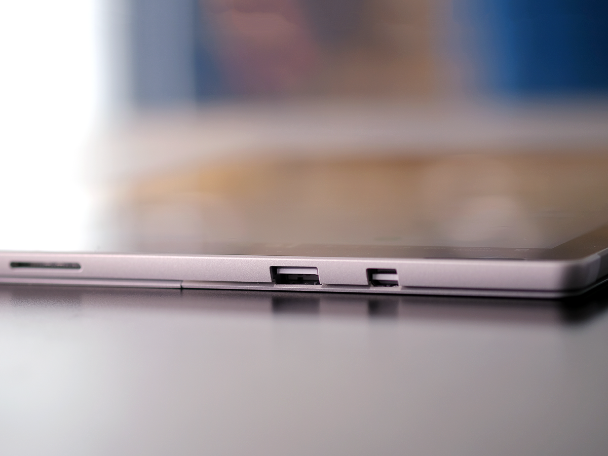
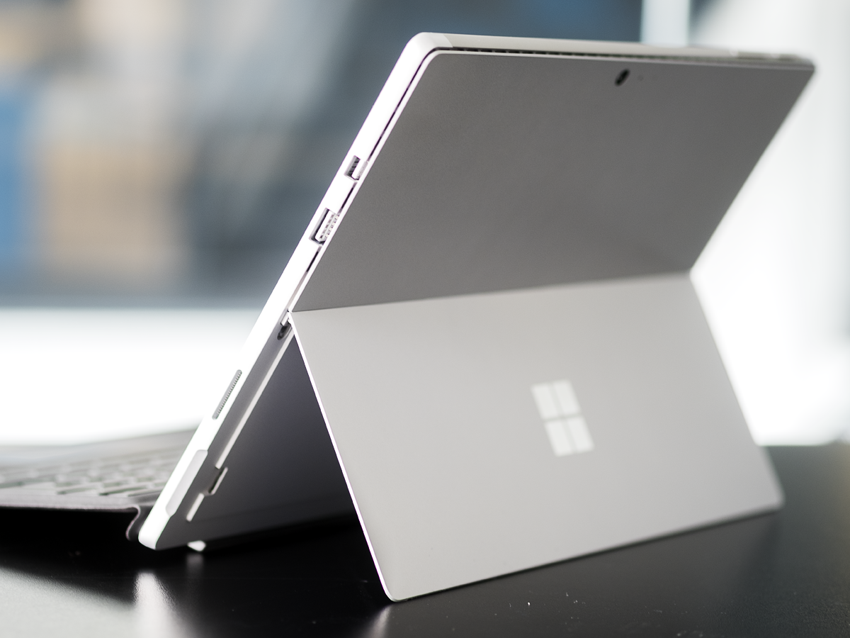
The Surface Pro 4 offered the bare bones in terms of socketry, and Microsoft has decided to stick to that philosophy with the ‘Pro 5′. Regardless of how much you spend, your new Surface will come with a single USB3.0 port, one mini displayport, a single microSDXC card slot under the rear hinge, a headphone socket, and the power port that’s bespoke to the Surface range (none of that USB-C nonsense here).
Your view of that line up will come down to your attitude to spending money on and carrying dongles. For example, rivals such as the Asus Transformer Pro 3 come with a full-sized HDMI port. Yes, I know that many of the world’s offices have mini display adapters lying around in their boardrooms, but the chances are that you’ll feel the need to play safe and buy your own (given that full-sized HDMI cables are far more commonplace).
Then there’s the single USB port. Personally, I almost never need to plumb in more than one USB device. But then, I know of colleagues (particularly those of an artistic or media bent) who would either reject the Pro’s single USB outright, or feel the need to immediately invest in a USB block or the official Surface Dock (£189 for a block that adds 4 USB ports, an Ethernet port and two mini displayports).
Slowly but surely, this eats into one of the Surface Pro’s major selling points – its portability. Yes, you’re buying a wonderfully lightweight, powerful laptop hybrid, but you may also need to pack a small arsenal of extras just so you can live with it.
Celebrate, world – 4G’s on the way
The revamped Pro’s connectivity options are either identical to or a minor refinement of what came before (for the record, Bluetooth bumps up from 4.0 to 4.1). But there’s one entirely new feature coming later in the year that’ll elicit a million mini fist pumps from the world’s road warriors – you’ll be able to buy your Surface Pro with a built-in 4G SIM slot.
We wouldn’t blame you if that simple fact alone stopped you from buying a new Pro on its UK launch date of June 15. As it stands, we have no launch date for the 4G model – but be sure that you’ll know as soon as we know.
A scribbler’s delight (or at least, that’s what it says in this press release)
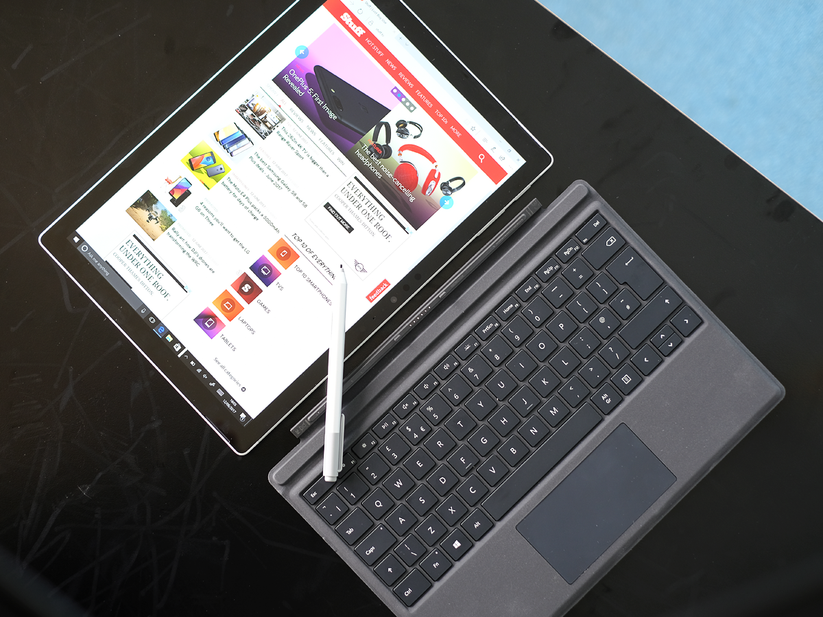
Sadly, our review unit came with the previous generation of Surface Pen. Given the claims for the improvements to the inking experience with the Pro (‘twice as responsive as its predecessor’, with 4096 levels of pressure sensitivity compared to 1024 in the previous iteration), that’s something of a shame.
Of course, we’ll update this review in the next week or so, once Microsoft can supply us with the latest hardware (which will come in a choice of four colours – black, platinum, cobalt blue and burgundy). For now, I’ll happily predict that the upgraded Pro will be at least as good as its forebear, which was already excellent.
I’m no artist, so my previous experience of using the Pen with a Surface was limited to capturing notes and doing quick diagrams and doodles in meetings, something I did virtually every day for a year with my Surface Pro 4. In that time, I learned to fall in love with the integration of Microsoft’s OneNote app with the Pen.
OneNote beats Evernote hands down in the way it will let you blend drawings with typed and written notes, and the ability to quickly launch a new note just by tapping the Pen is so powerful that you soon despair that it isn’t a standard feature on all PCs.
Oh, and one small but significant grumble, while we’re talking about the Pen. Believe it or not, but it’s no longer bundled with the Pro tablet. Yep, you read that right. Given that the Pro’s already close to the edge when it comes to value, I can see why this would be a deal-breaker for some.
The software: Windows 10, with a Fluid upgrade waiting in the wings
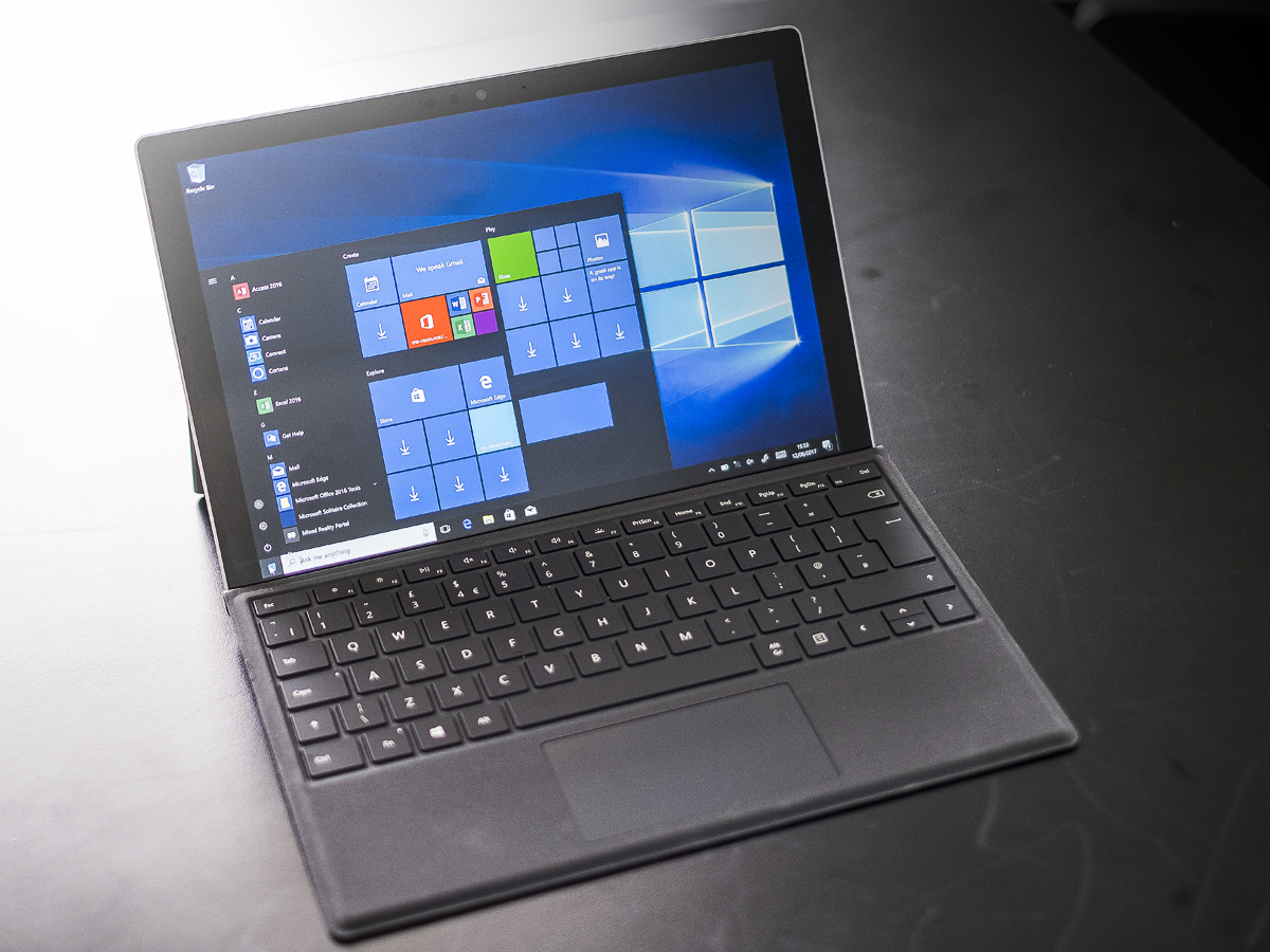
Unlike the new Surface Laptop (which comes with Windows 10 S, locking you into software from the official Windows Store unless you take action and unlock it), your new Surface Pro runs the full fat version of Windows 10 Pro out of the box. This is good news: the foolhardy bravery of Windows 8 is now a thing of the distant past, and the Surface Pro’s the perfect showcase for Windows 10’s successful balancing of desktop and tablet usability.
That said, there’s still too many elements of the Windows 10 interface that show their mid-’90s origins. The Windows File Explorer, for example, has changed little in the last 10 years, and looks every inch the compromise that it is when running in tablet mode on the Surface (a shame, given the polish and refinement of the surrounding hardware).
Fortunately, Microsoft is finally dealing with the problem, and recently unveiled its new Fluid Design language. If you want a glimpse of where Fluid is heading, you can do so today – download Groove Music or Calculator from the Windows Store, and you’ll see how Microsoft is adding subtlety and shading to the core Windows design language. We’re promised that the next big update to Windows 10 in the autumn will unveil Fluid Design throughout Windows 10 – which means that your shiny new Surface Pro is only months away from a free makeover that will make it an even more polished experience.
Value for money: is the Pro a hike too far?
Is the Surface Pro too expensive? On one hand, we like Microsoft’s confidence; it wants the world to see its hybrid as a quality, desirable slab of hardware, and has stuck on price tags that support its case. On the other hand, you can buy very similar products to the Surface Pro for less.
Today, for example, you can buy an Asus Transformer Pro 3 from £599, complete with keyboard. The equivalent i5, 128GB Surface Pro will weigh in at £1118, including £139 for the Signature Type Cover. That’s a premium of £519 over the (admittedly old) Transformer, and £275 over the equivalent Surface Pro 4 / Type Cover bundle.
Those are not sums of money to be sniffed at, so – without wishing to sound like purveyors of the bleedin’ obvious – you need to weigh up what’s important before handing over the cash. For example, the new Surface Pro comes with a claimed battery life of 13.5 hours (a figure I’m happy to believe from my short time with the machine), performance that dwarves the ageing Transformer Pro 3, and which gives it a 50% improvement over the nine hours from the Surface Pro 4.
That’s an impressive figure, sure, and a major selling point for the Pro. But then, you may only spend short periods of your day away from a power port, in which case true all-day battery life is no practical benefit to you. And a £500 premium’s a lot to pay for something you may never use.
The same goes for processing power. Yes, the Pro comes with the latest, 7th-generation Kaby Lake processors under the hood. But the average user may struggle to notice dramatic speed hikes over the equivalent Skylake-equipped SP4. In which case, it’d be understandable if you decided to save over £200 and snap up a Surface Pro 4 before it goes out of stock (and thanks to recent price drops, they’re now genuine bargains).
Has Microsoft pushed the price too far? Yes, and no. The Surface Pro is demonstrably better than any of its rivals today. And since at Stuff we see no shame in wanting the best possible experience, we’d happily pay a little more.
And let’s remember, the Pro has similar pricing to the Surface Pro 4 when it launched back in October 2015 (starting at £749 for the m3). But the decision not to package the Type Cover or Pen in with the new Pro’s price has just a little whiff of cynicism as you move up the range. By the time you get to the £2699 i7 / 1TB, it looks plain miserly.
Microsoft Surface Pro verdict
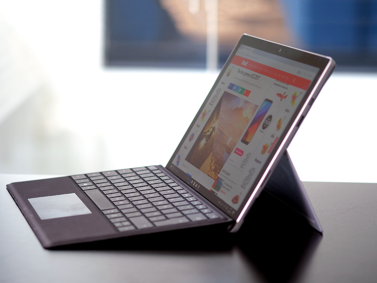
The Surface Pro thoughtfully improves on a winning formula. It’s beautifully built, a joy to use, and will make 99% of owners unspeakably happy. I just wish that Microsoft would be a little more generous. At the very least, they could throw the keyboard or pen in with the price. Especially when you’re asking the wrong side of £2100.
Is the Surface Pro i7 a five-star product? At this spec, I’m afraid that it just falls short. Yes, the i7 is delightful, and there’s something unspeakably cool about a device that is this understated and compact packing this much raw horsepower. But then, you can (almost) buy two Dell XPS 13s for the same money.
For my part, I can’t wait to get my hands on either the bare-bones m3 or the updated, fanless i5, the 256GB version of which may well prove the Surface Pro range sweet spot – and which may just earn it that extra star.
Stuff Says…
The refreshed Surface is an evolution rather than an entirely new lifeform, but it remains the class leader
Good Stuff
Masses of power
A joy to type on
Wonderful screen
Great battery life
Bad Stuff
Too pricey for the top-spec models
Lack of ports may frustrate some

