Microsoft Surface Studio review
Perfect it ain’t - but the mother of all Surfaces is still one of the most desirable objects we've seen in years
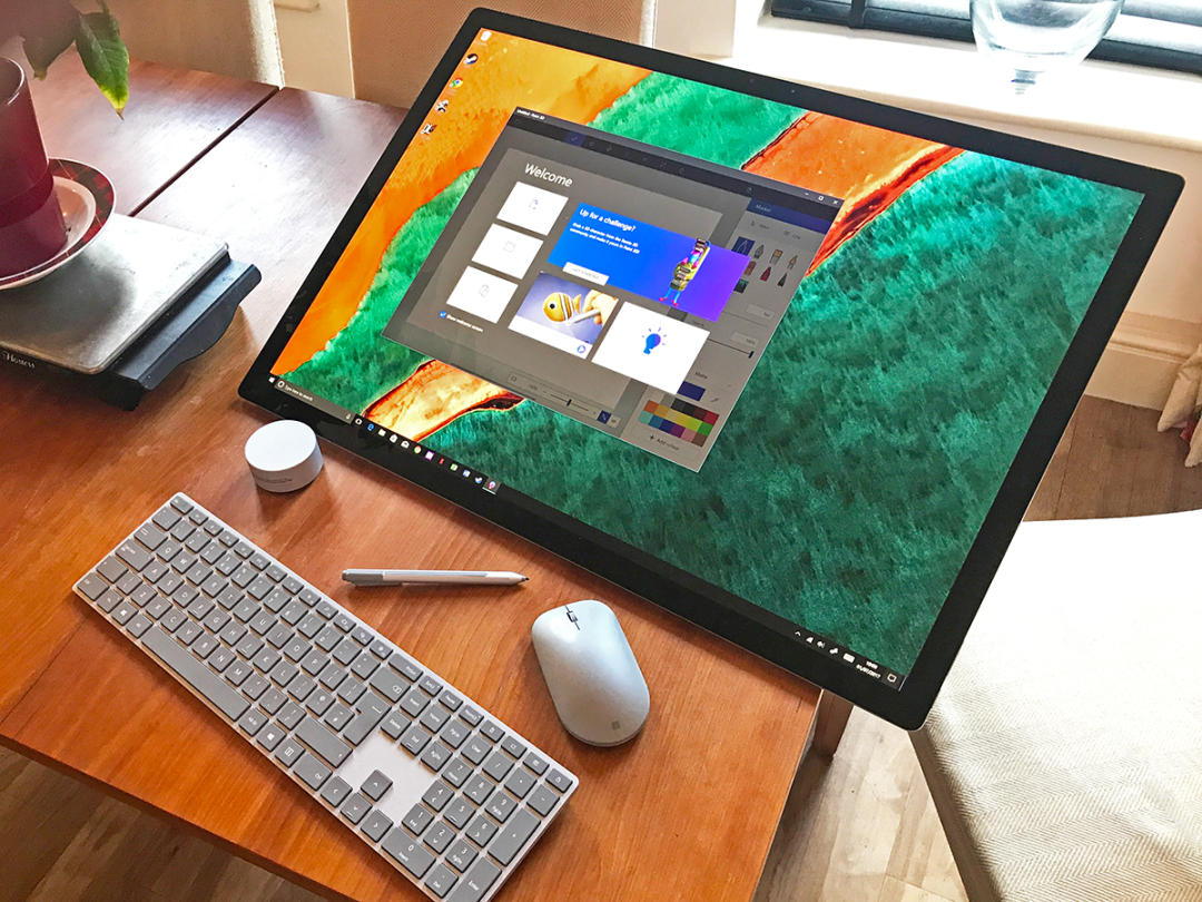
Let’s get straight to the point: the Microsoft Surface Studio is one of the most desirable objects to have passed through the Stuff team’s hands in years. We love it, and if you’re a serious illustrator it should be near the top of your shopping list.
We love it not because it is perfect. It isn’t – not by a long shot. Fortunately for the human race, desirability rarely relies on technical perfection – think back to the original iPhone for proof of that.
No, we love the Studio because it is outlandish, beautiful, tactile and quietly unique. If Werner Herzog went into the PC business, he’d make something like this.
But before you rush off to the nearest John Lewis, let me put some flesh on the bones of that verdict. After all, I’d hate you to part with between £2999 and £4250, only to find that our love affair translates into your years of regret.
The display: as beautiful to look at as it is to use
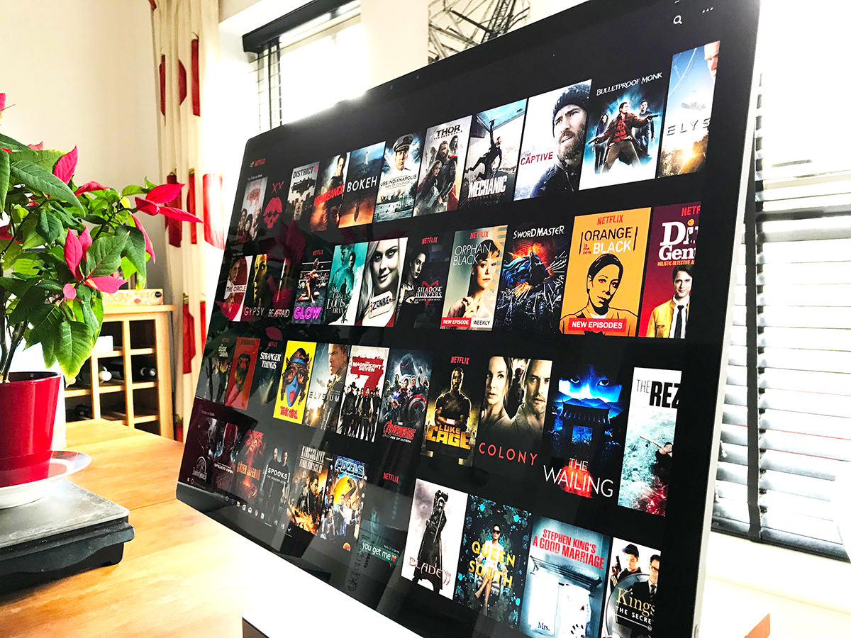
For those of you not already familiar with the Surface Studio, it’s best described as a Surface Book that’s been through some kind of comic-book radiation beam and emerged Bigger! Stronger! Better! It’s technically a desktop PC, but its glorious 28in touchscreen can flip down on a clever hinge so you can use it flat, like an illustrator’s tablet. Or indeed, like a Surface Pro.
The screen is the first thing you’ll see upon unpacking, and it dominates the entire Studio experience. Now I’ve seen a lot of screens, including the very best that Apple has to offer, but to describe this one as glorious is no mere hyperbole. It is truly stunning.
Having spent the wrong side of £4000, you have every right to expect the initial set-up to be impressive, and the Studio doesn’t disappoint. Log in for the first time, and I defy you not to feel a mini rush of glee and wonder at the 28in 3:2 screen’s size, colour depth and sharpness.
I could bang on about specs – the 4500 x 3000 native resolution, the 192 DPI, or the 10-bit colour depth. Also, I could mention that the rival 27in 5K iMac’s 218 DPI has the Studio licked, on paper at least – I didn’t have a 5K to hand for a real-world comparison.
Instead, let’s stick to what you’ll actually experience day on day. Own a Studio, and you’ll be staring at a big screen that’s crazy sharp. Text looks as though it has been intricately etched into the glass with a surgeon’s scalpel. It’s fantastic, and the novelty will never wear off. Promise.
Colours are well calibrated and attractive, without ever straying into gaudy. Besides, if you do find them a little saturated on the default ‘Vivid’ setting, you can always switch it to a more restrained sRGB mode, which I found more natural and much easier on the eyes.
As I unboxed the Studio, I briefly wondered how many of my favourite Windows apps would be thrown into an ugly mess by its ultra-high resolution. But I needn’t have worried – everything scales well and looks razor-sharp, from Adobe Creative Suite to Spotify to Steam. So be assured that your 28in PixelSense display will be a joy to look at, and will probably stay that way for years to come.
Design and build: immaculate, but not dainty
So the display is superb, but if you’re one of Studio’s target market of designers and illustrators, you’ll care just as much about how easy it is to use. The good news is that the Studio’s a pleasure to work with.
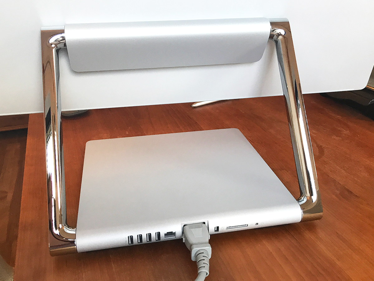
This is a beast of a machine that’s happy in its own skin. Even the product’s box is huge, more akin to the packaging for some self-assembly weapon that’ll bring down satellites than the wrapper for a desktop computer. Once out of that box, the Studio isn’t the kind of industrial design that will fade into the background in time. It’s big. The chrome screen support struts are chunky, and the aluminium base is plain but solid.
Although Microsoft makes much of the display’s relative thinness, there’s nothing flyaway or flimsy about the Studio – which isn’t a bad thing at all. The Studio feels as well built as my Surface Book, and that’s meant as a compliment: I’ve punished the hell of my i5 Surface in the last year, and it still runs like a clock. But then, you’d expect craftsmanship and reliability for the best part of £4250.
That impression of solidity isn’t dented once you start using the Studio in anger. It’s the few places where you’ll constantly interact with the Studio that really matter, and pleasingly, Microsoft has done a great job with them. The chrome screen hinges move their heavy load smoothly; the screen’s fit and finish is perfect, with no sign of light bleed or any errant pixels; the accompanying Surface Studio keyboard has perfectly weighted keys; the Surface Mouse looks good and feels well engineered.
If we have a grumble, it’s with the Studio’s noise under load. Don’t get me wrong – I’ve used high end gaming PCs that even when idle sounded more like jet fighters. No, the problem with the Studio is the pitch of the noise – feed it a decently chunky game and the fans kick in at a slightly droning frequency that’ll grate a little in a quiet room.
It’s not the kind of racket that will elicit complaints from the neighbours, and neither did it sound like something was about to fail – it’s just not the kind of sonics that you expect from a product at this price.
A quick note about hinges
Chances are you’ll be switching the screen between its upright ‘viewing’ mode and laid-flat ‘sketch’ mode (sitting at roughly a 20-degree angle from your desktop) quite a few times during the average day. It’s reassuring then, that the Studio’s hinges are sturdy and well damped, with no sign of either stiffness or slackness in the movement.
Microsoft calls it the Zero Gravity Hinge, but we could never allow such marketing yabber in a Stuff review – so scrub those three words from your mind forever. The overall design is also well-balanced enough to take much of the physical effort from switching modes (no small issue, given that the Studio weighs in at a hefty 21lbs, seven times the weight of a Surface Book).
My partner’s just north of 5ft tall, of slight build and is a better illustrator than I will ever be. She was intimidated by the Studio on first acquaintance, but then delighted at how light it was and how easy she found it to adjust.
