Apple gives WatchOS 3.0 a fitness focus with these five new features
Time to get fit and multitask right from your wrist
Apple is about to kick the Apple Watch into overdrive with WatchOS 3.0.
The big new update was revealed on stage at WWDC earlier today, and there’s plenty to get excited about if you’ve already got Apple’s first wearable taking up residence on your wrist.
We were at the event in San Francisco to get a first look, and bring you the biggest new additions before they arrive officiallly later this year.
Basically, if you’re not already using your Apple Watch every single day, get ready to find it a lot more useful.
Activity watchfaces
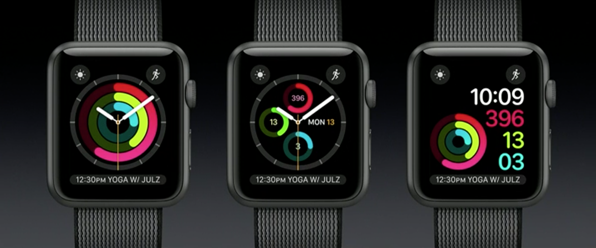
Let’s get this one out of the way first, fitness fans – apparently exercise is the one thing that gets Apple Watch users seriously excited, and it’s only getting better in WatchOS 3.0.
You don’t have to stick with a default watch face and dump your activity scores in a complication any more; an Activity watch face will put all that info front and centre, where you need it the most. There are several different designs, too, so you can still have that little bit of customisation if you prefer digital or a chronograph to analogue hands.
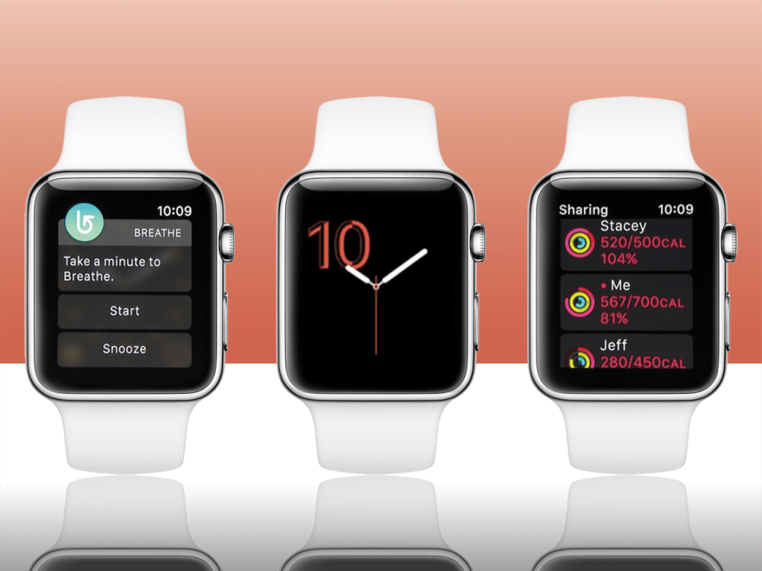
It’s not just a solo effort any more, either. You’ll be able to check in on your mates, seeing how many steps they’ve walked, calories they’ve burned, and how much exercise they’ve done each day. You can send a word of encouragement, or some good old fashioned smack talk if they’re slacking off.
Finally, there’s good news for wheelchair users. Activity tracking swaps "Time to Stand" with "Time to Roll" and movement tracking now works properly with different types of wheelchair mobility.
Control Centre
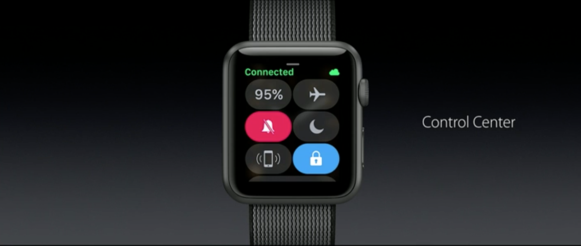
This one will come in handy if you’re paranoid about battery life; the control centre from iOS has made its way to WatchOS.
Now, a swipe up from the bottom of the screen will bring up a page of buttons and toggles, complete with battery life indicator. It’s got flight mode, do not disturb, night shift, sound mode toggles, and a screen lock just a tap away.
That should mean no more swiping through multiple tabs just to get to that one toggle you need once in a blue moon.
Better quick replies
This next addition is great if you don’t always have your phone to hand. Quick replies have been on WatchOS for a while, but you had to tap and scroll to get to the right page before you could send one – that’s all changed in version 3.0.
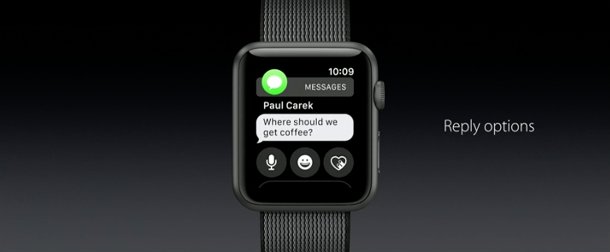
Now, when a message appears on your wrist, three icons will show up underneath it on the same screen. One lets you send a voice reply, the second fires back an animated emoji, and the third shares your heartbeat.
Not personal enough? Scroll down and your written quick replies are right there ready to send.
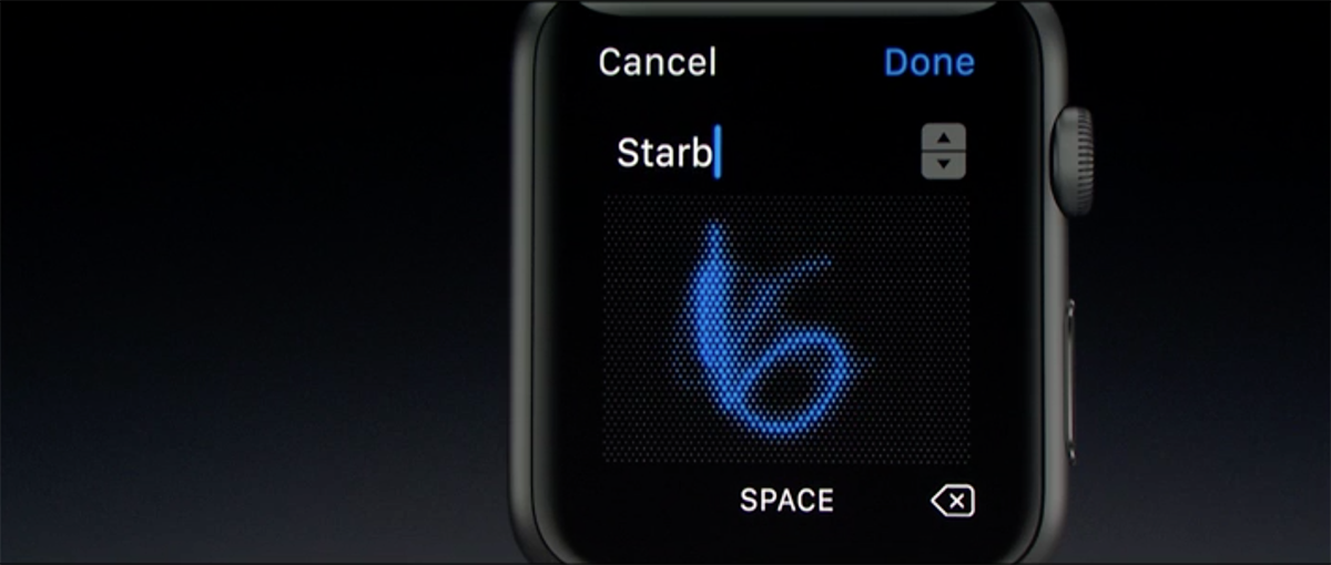
If you want to write something then and there, the new Scribble keyboard lets you draw characters onscreen one by one, without having to head to your phone for a full onscreen keyboard. It works with English and traditional Chinese characters – which is purely because Apple thinks we should all learn another language, and not because it’s monumentously popular in China. Nosiree.
SOS
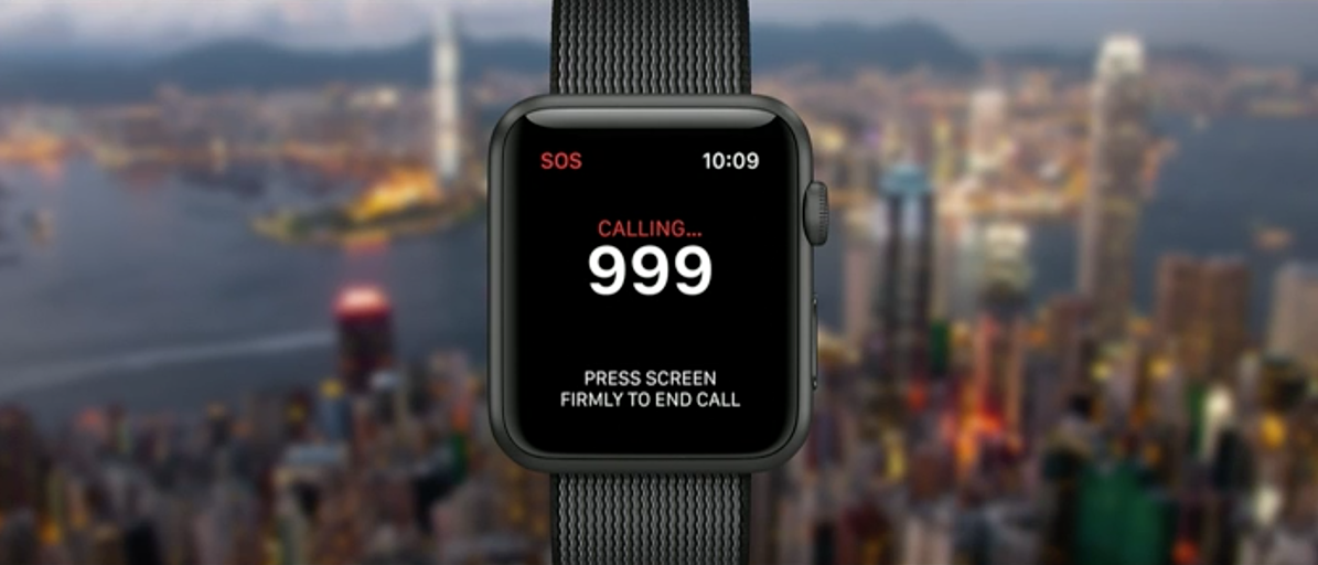
WatchOS is getting an emergency mode called SOS in version 3.0, which you can trigger by pressing and holding the side button. It can automatically call 999, 911, or whatever emergency services number is used in the country you’re currently in, over cellular or Wi-Fi.
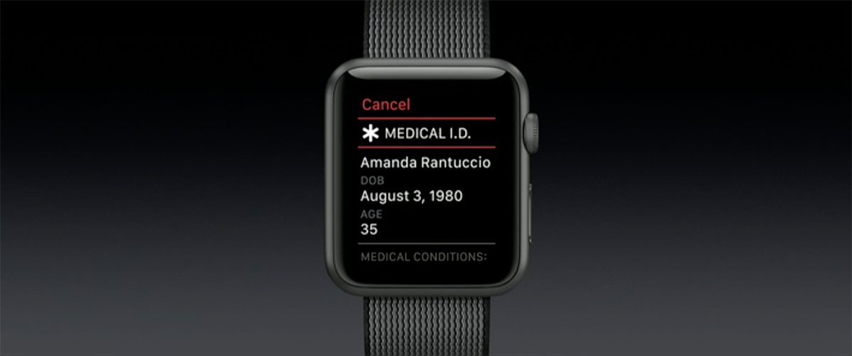
It’ll then notify your emergency contacts with a map of your current location, then switch to showing your Medical ID details onscreen.
This hopefully isn’t something you’ll need to use at all, but it’s reassuring to have it there in case the worst happens. Good move, Apple.
…And the rest
Adding more features is great and all, but not if it slows your watch down to a crawl – and the Apple Watch wasn’t exactly lightning fast to begin with. WatchOS 3.0 is giving things a speed boost, opening apps up to seven times quicker thanks to some clever background memory management.
Multi-tasking is getting a major shake-up, with quick access to recent apps in a new dock. The side button opens this dock, and the previews are all live, so you can see what’s happening in each one without actually jumping in to the apps themselves.
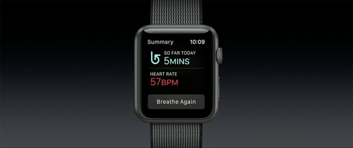
The one weird new addition is Breathe, an app that’ll come built into WatchOS 3.0 as standard. It’ll track your heart rate and give you prompts to help you relax with some deep breathing. In case you forget to, y’know, breathe. Apparently it’s medically proven to help reduce stress, so we won’t knock it too much, but you’ll have to put up with another set of hourly reminders in addition to the movement alarm.
Those are pretty much all the big hitters in WatchOS 3.0. It’s launching to developers today, but won’t be turning up on punters’ Apple Watches until the Autumn. We’ll be giving it a try as soon as Apple’s keynote is over, and will hopefully have some first impressions for you later.
