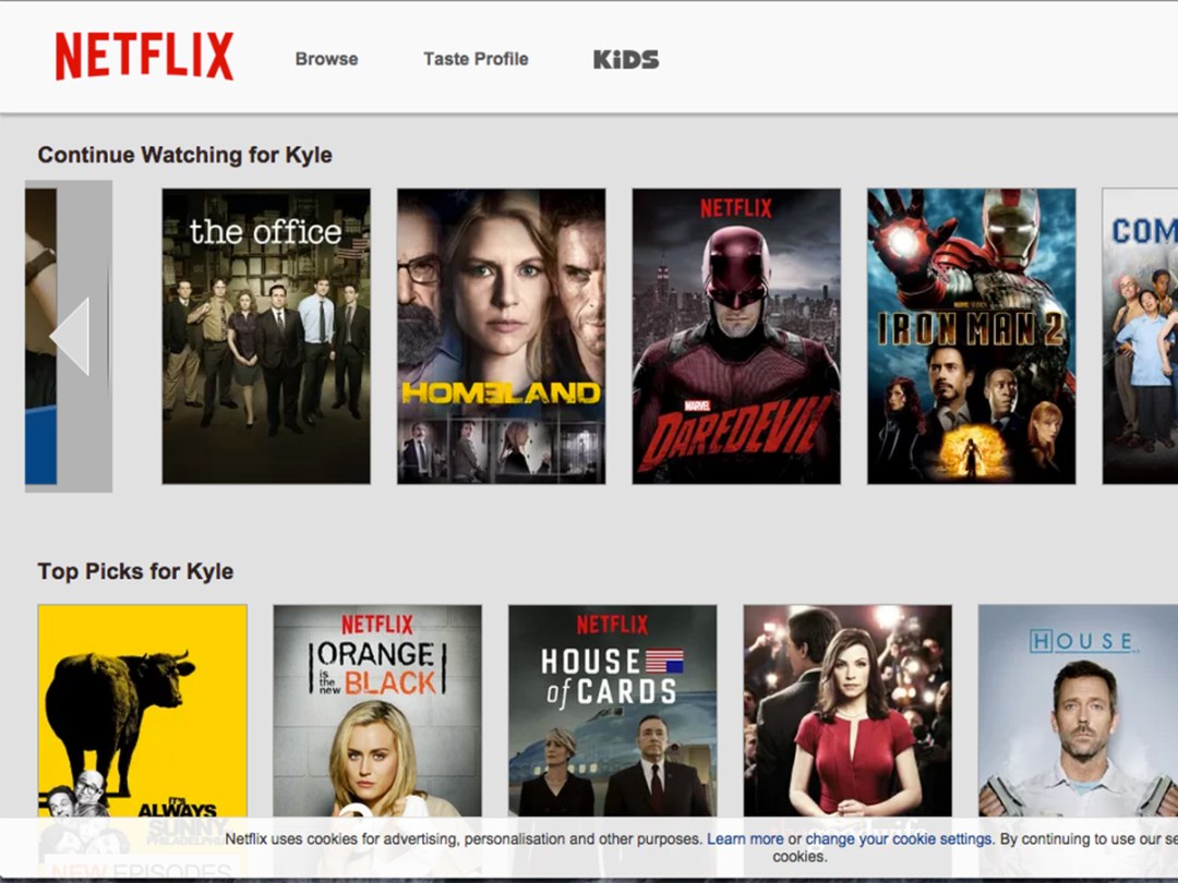
Carousel out of service: Netflix redesigns web version
The much-preferred click-to-scroll mobile interface comes to the web

Much as we love Netflix, we’ve never been big fans of its carousel browsing system – so three cheers for the news that it’s being ditched.
The web version of the service will get an overhauled UI in June, although selected users will be able to test-drive it immediately. And the good news is that it includes a couple of features that really should’ve been introduced a long time ago.
For starters, the carousel system is being scrapped and replaced by a horizontal scrolling system that will now be controlled by clicks of your mouse or trackpad. This should make it much quicker and smoother to use and will stop you having to patiently wait for it to slowly scroll through the newest movies.
Another change – and one that we feel should’ve been fixed a long time ago – is that it’ll now be easier to see information about TV shows and movies, and to choose individual epsiodes. At present, when you click on a show it automatically starts playing; the new UI will keep you on the same screen while displaying in-depth show and specific episode information.
Efforts have also been made to include more options that make it easier for users to find shows/movies that they’d like, add these to their lists, and find individual episodes.
The downside to all this? We’ll probably spend even longer watching TV.
[via TechRadar]


