Mac Pro hands-on review: the future of desktops has arrived
It's a monster of a machine packed into one of the most unique designs we've ever seen
The Mac Pro was long overdue for a refresh – and Apple hasn’t disappointed.
Apple hasn’t revised the basic design of its high-end workstation since its launch in 2006 – but the 2013 edition is a whole new machine, one that Apple’s calling “Something radically different from anything before it.” But is it change for the sake of change, or a genuinely innovative leap forward?
You spin me right round
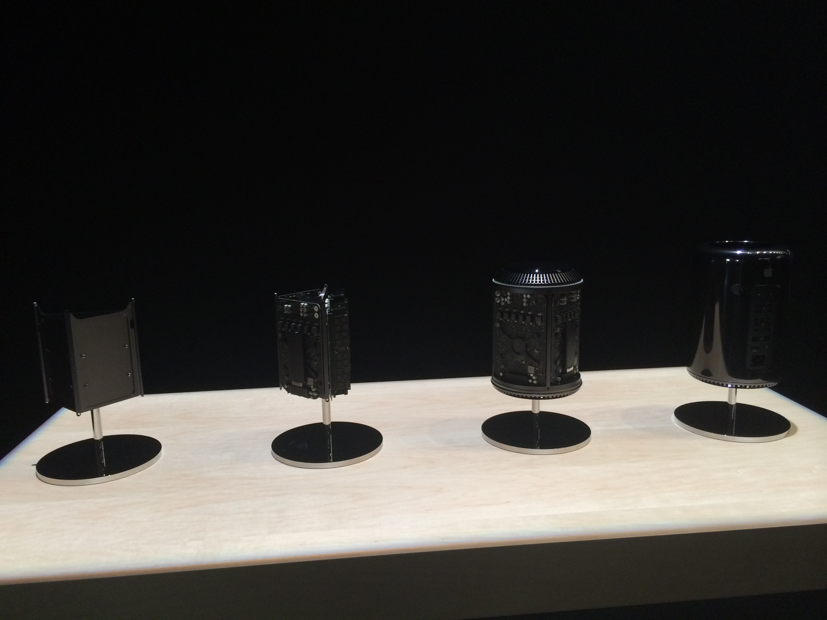
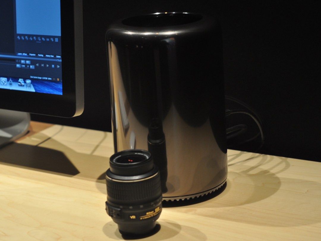
The first thing that strikes you about the new Mac Pro is that is really doesn’t look anything like a computer.
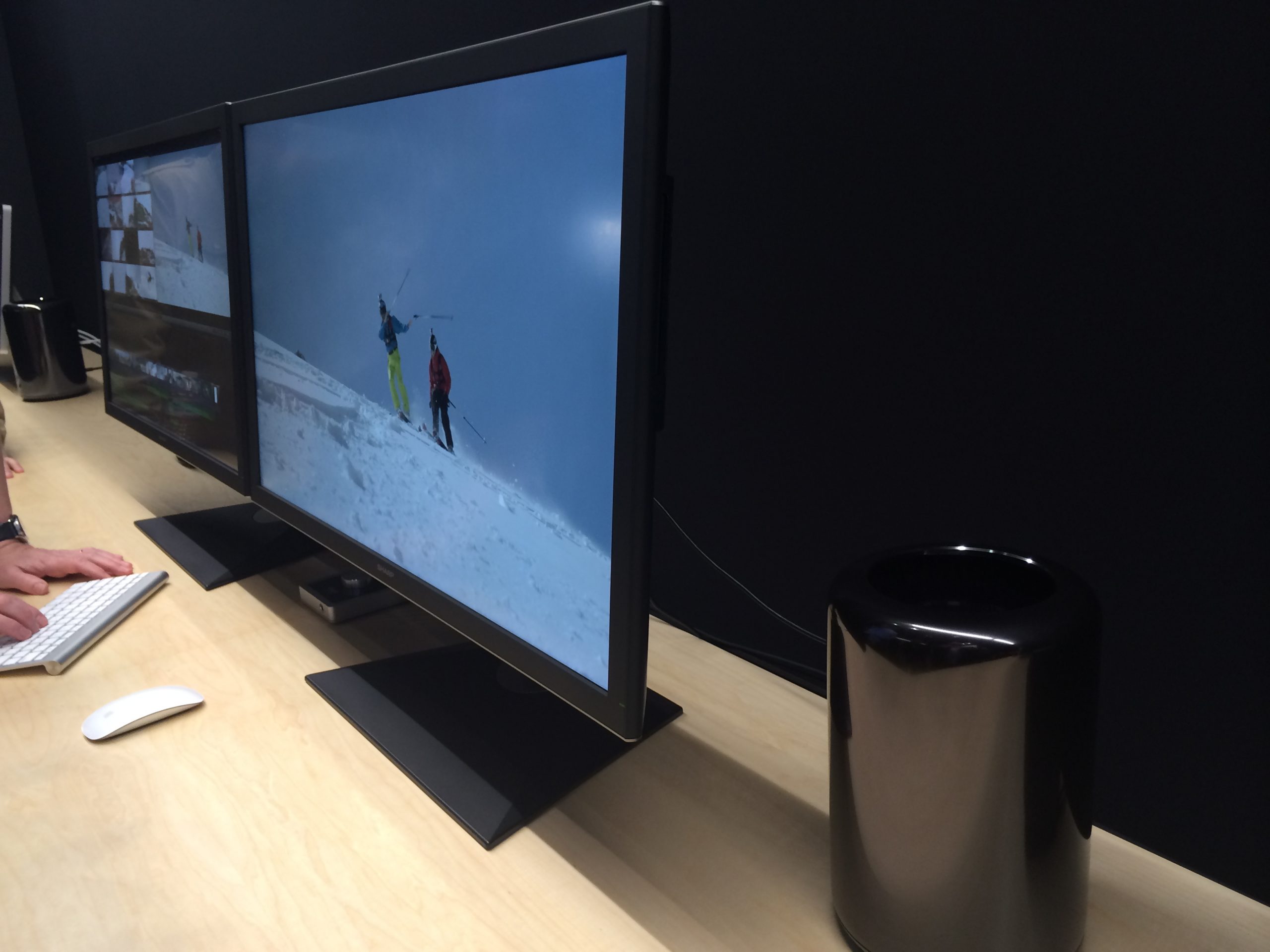
The shiny black tube is far smaller in reality than you’d think – a mere 9.9in tall and 6.57in in diameter. There are, we imagine, bigger drinks served in American cinemas. Despite its diminutive frame, Apple’s crammed an eye-wateringly long spec list into the Mac Pro, including everything from Xeon processors with up to 12 cores to 64GB of superfast DDR3 memory.
There’s something incredibly sci-fi about the Pro’s design, from the motion sensor that lights up the port indicators when you move it to the button you press to remove the cover (it’s just a shame Apple couldn’t make it produce a puff of dry ice to finish the effect).
