Sony PS4 hands-on review
We're getting up close and personal with the PS4 here at E3. Click on through for our first impressions on Sony's new gaming powerhouse
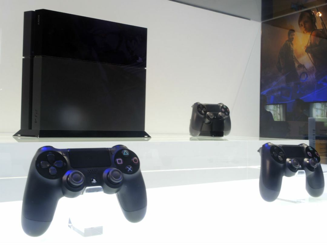
The morning after the night that Sony seemingly dealt a killer blow in the next-gen console war, we finally got a chance to find out whether the PS4‘s appeal is genuinely deeper than a very attractive price tag. Here’s what Stuff’s reviews editor Tom Parsons makes of Sony’s shiny new console.
Sony PS4 hands-on – design

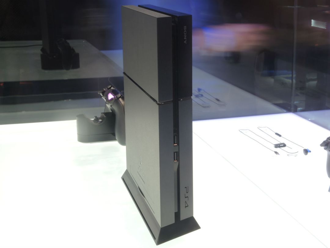
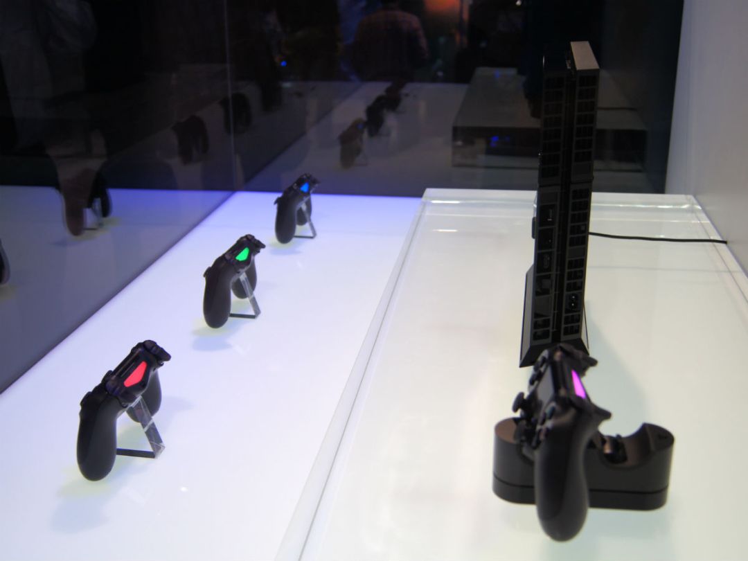
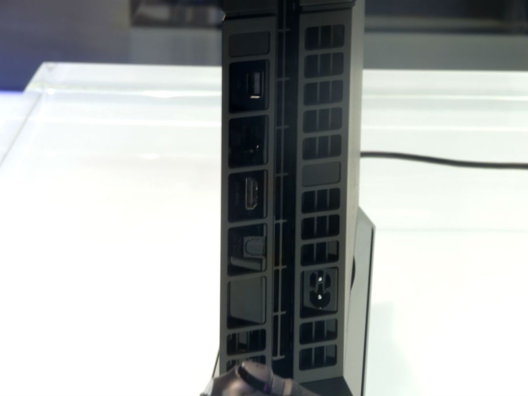
It might not be the sleekest or sexiest console design ever seen, but at least the PS4 looks as though it’s actually been designed – which is more than can be said for the VCR-like slab that is the Xbox One.
You’ve essentially got two slabs separated by a trench that houses two USBs and a slim slot-loader on the front, and vents along the back and sides. We’re going to call it Victoria Sponge Design.
About a third of the top panel is a glossy black, whereas the rest of the device has a matte finish that looks (Sony wouldn’t let us fondle it) like it’s probably very lightly textured. The pedestal you see in our picture is apparently an optional extra, and given that the PS4 is fairly slim, we’re not sure we’d risk vertical placement without it.
Sony PS4 hands-on – DualShock 4 controller
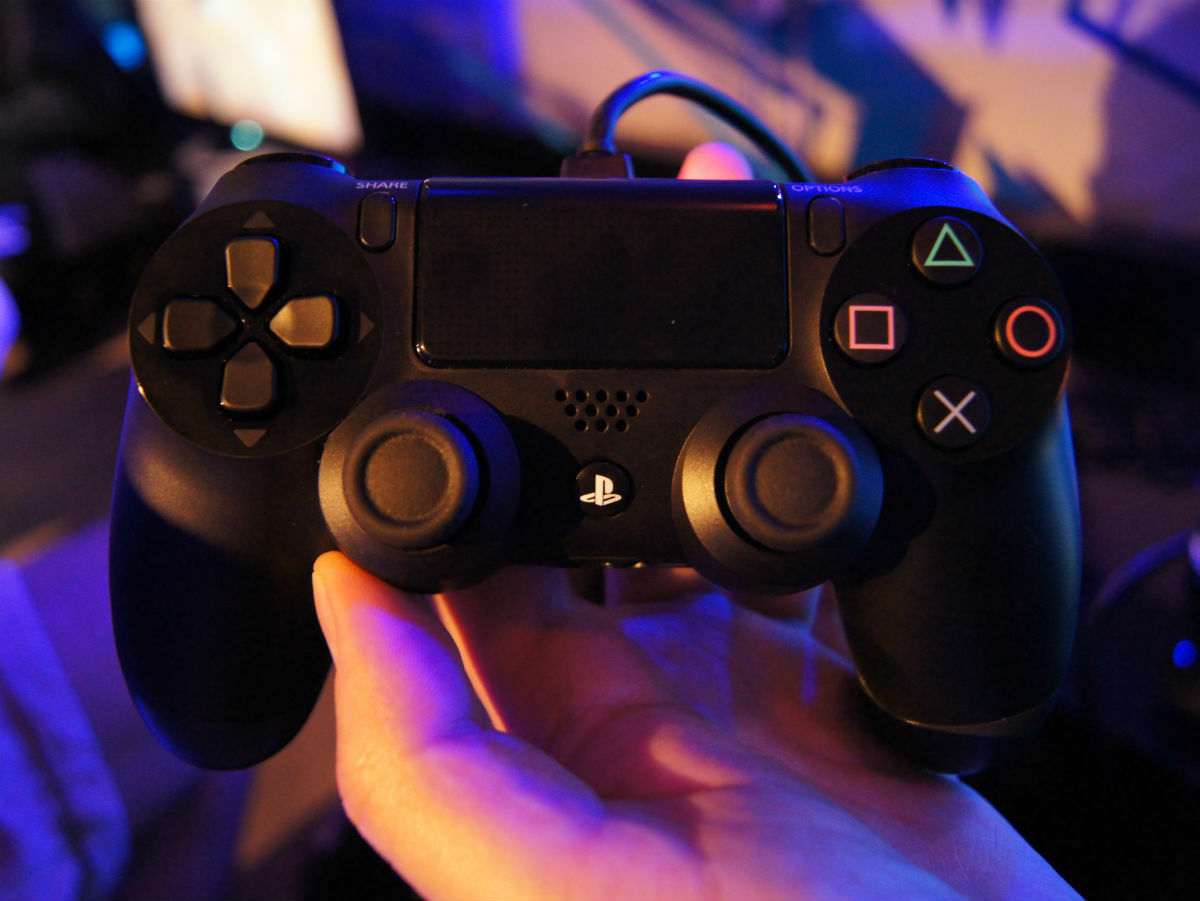
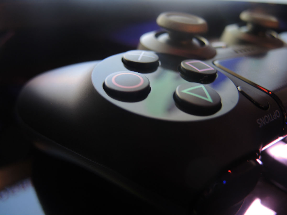
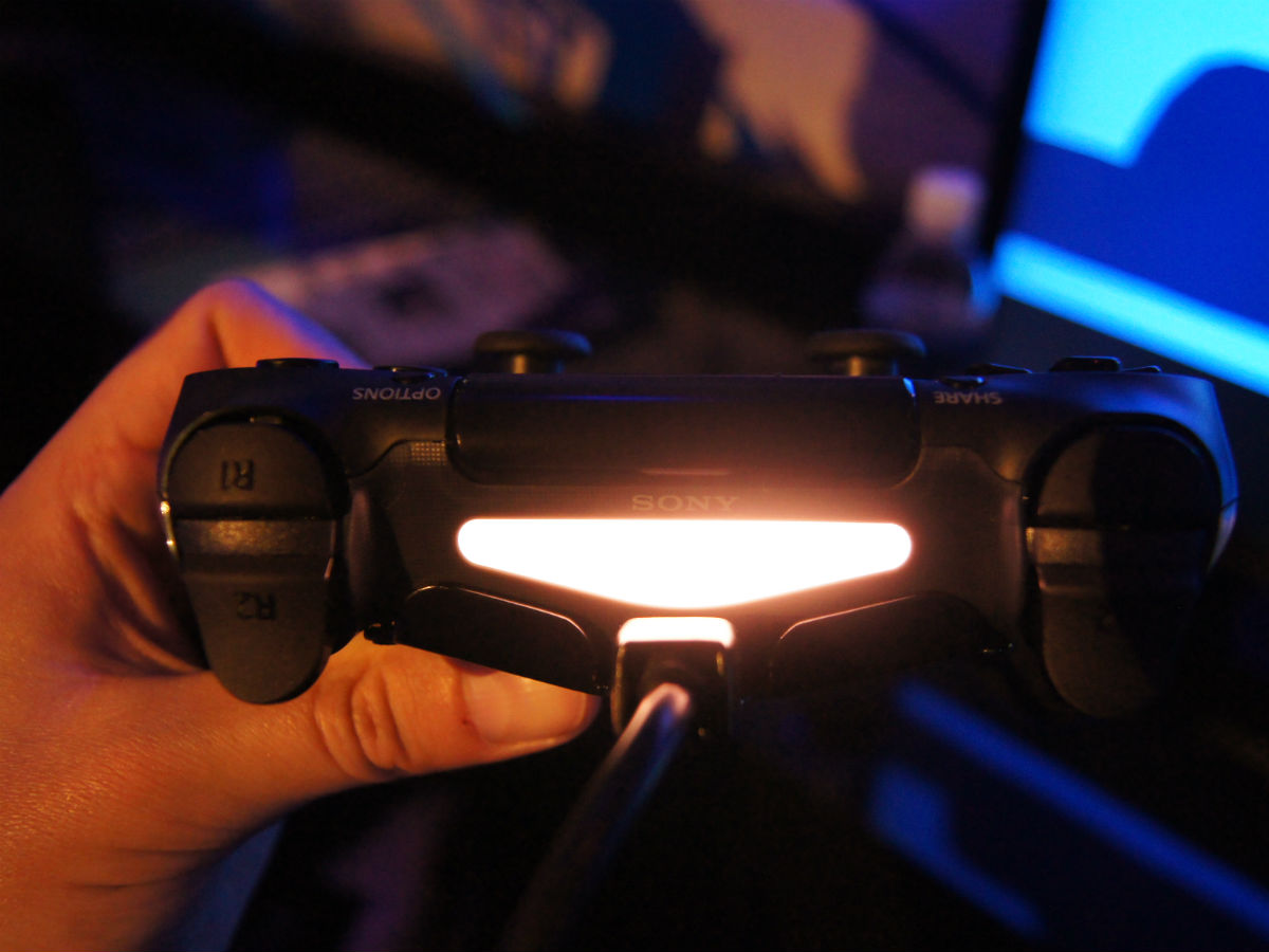
It may look very similar to the DualShock 3, but the PS4 controller is more of an improvement than we were expecting, The grips are a little bigger and more ergonomic, so they fit the palm better than before, while the triggers have far greater range – a quick play on Hohokum showed off very fine degrees of control.
