Pebble Smartwatch review
It's kicked up a storm on Kickstarter, but does the Pebble make a splash or sink like a stone?
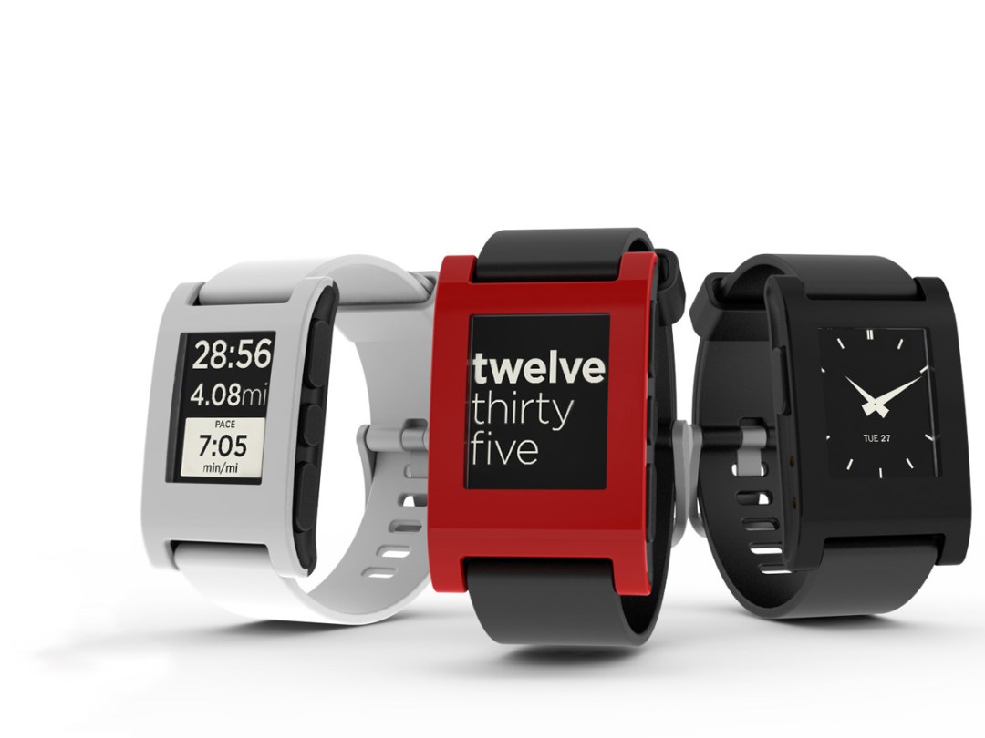
For all anyone knows, Apple might never release a wrist-mounted phone accessory. But if you must stay one step ahead of something that still doesn’t officially exist, the Pebble is your only choice. This crowd-funded, open source designer smart watch blew up Kickstarter, with nearly 70,000 backers handing its creators over $10m to bring timepieces into the 21st century. Nearly a year later, the first Pebbles are rolling off the production lines. So is Pebble the first must-have smart watch, or just another geeky gadget that promises Dick Tracy and fails to deliver?
Minimal design
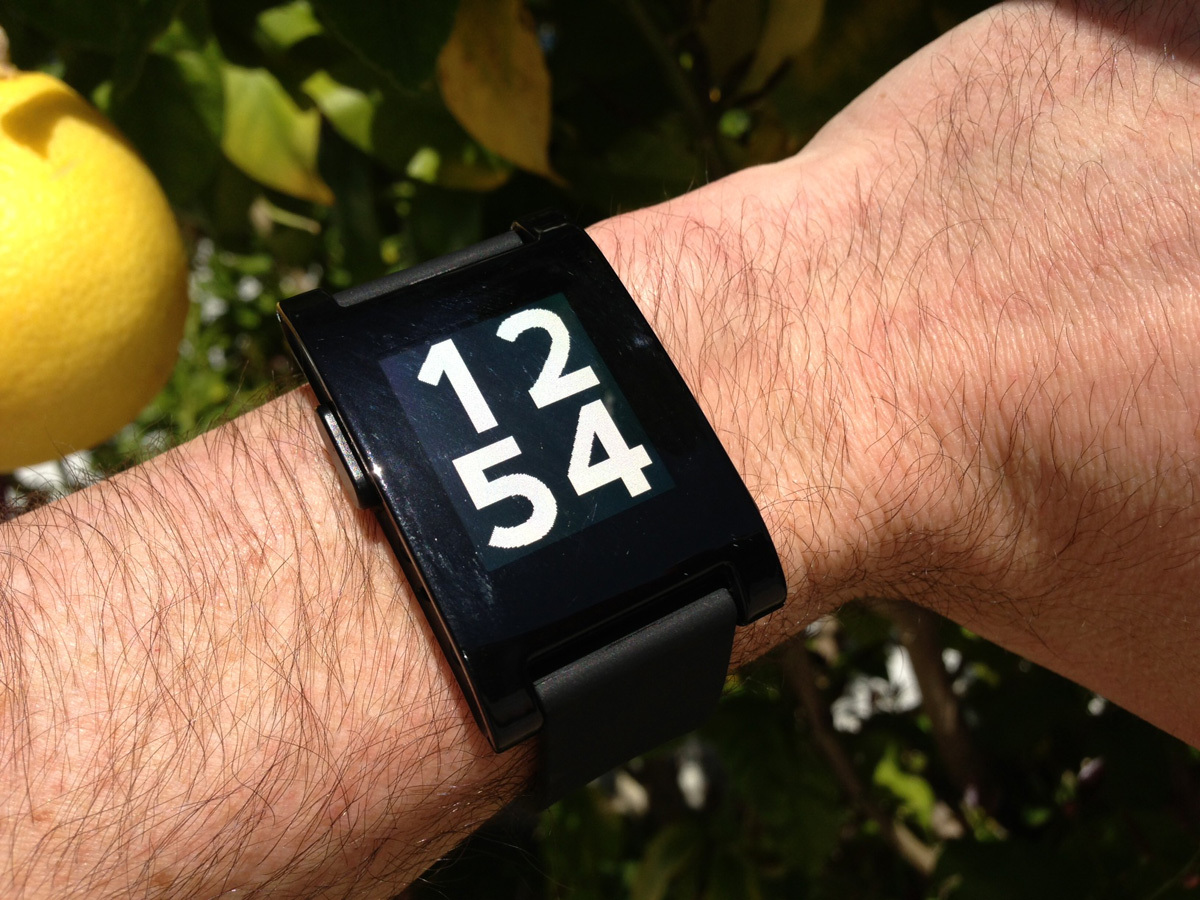
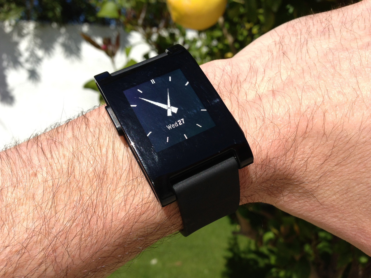
Black, white and primary colours, distinctive eco-efficient packaging and slim, minimalist design – the Pebble doesn’t so much nod to Apple as bow down in homage. Jony Ive might not approve of the chunky buttons or slightly clumsy curved case but neither does this look like something cobbled together by three 20-somethings – as it was. The strap is plain, comfortable rubber (it’s removable), the waterproof body is light and elegantly proportioned, and even the 10mm depth doesn’t feel too thick.
READ MORE: Pebble Steel review
E-paper screen
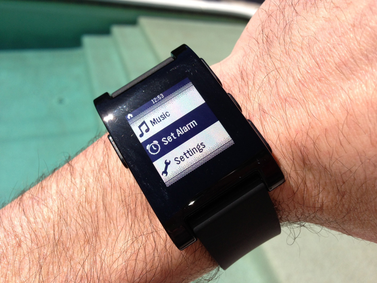
E-paper displays rock. The Pebble’s is nothing short of awesome. Like the Kindle’s screen, this is incredibly crisp and clear, especially in bright sunlight. The modest 24,000 pixels are plenty for displaying digits, watchfaces and text. An accelerometer automatically flashes on a backlight as you shake your wrist, which is great for hands-free time-checking but can also be occasionally distracting when you’re just moving your arms about in the dark.
Custom clocks
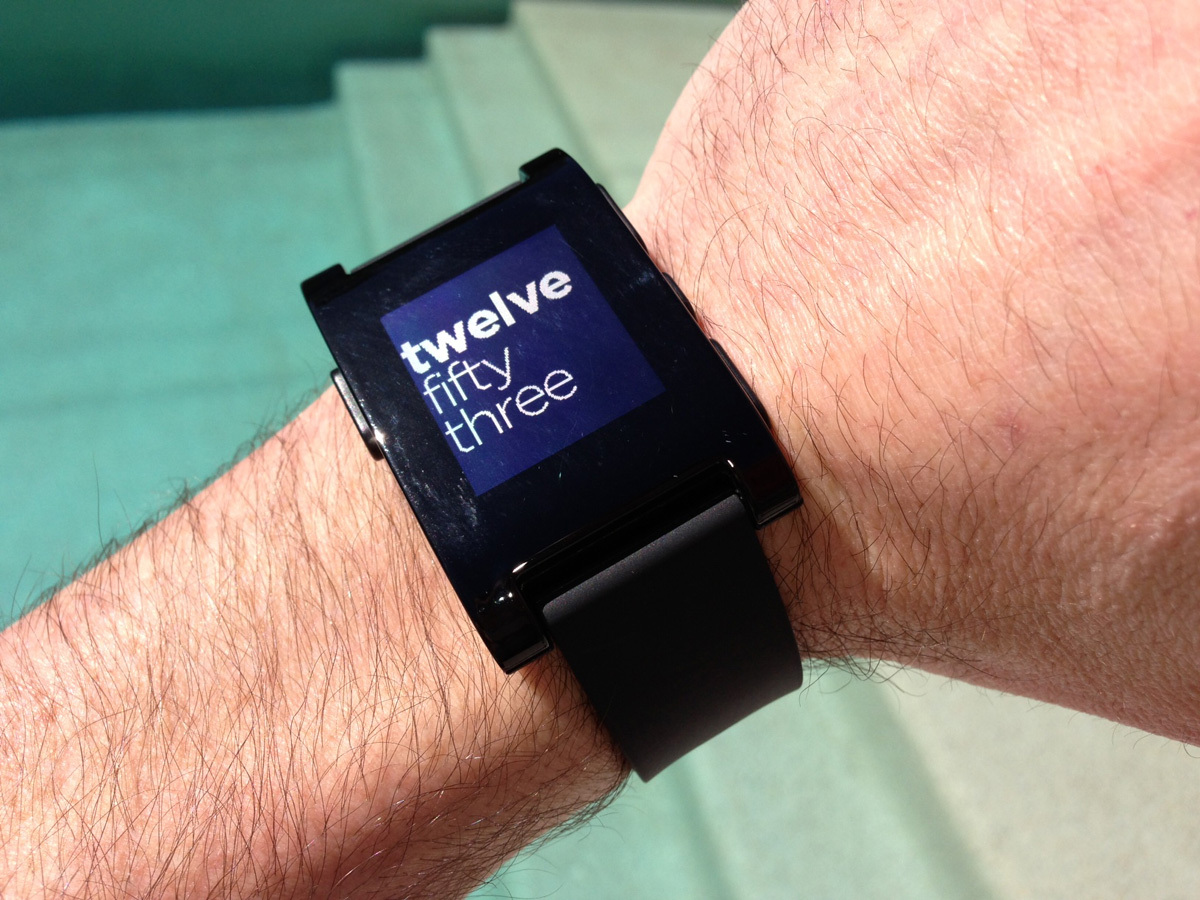
The left button brings up a menu of three built-in watchfaces (you can currently download two more from your smartphone app). The ‘Text’ face is certainly the coolest, spelling out the time in words that smoothly slink in from one side, but if you don’t like the others, a little patience is all that’s required. Pebble’s OS is open source and dozens of apps and watchfaces are just around the corner.
Smartphone smarts
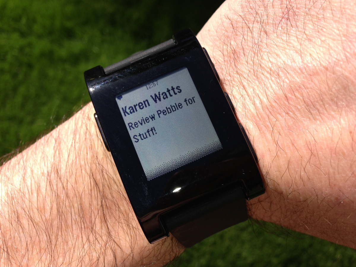
The whole point of a smart watch is to leverage your smartphone. The Pebble connects to iOS and Android devices via a simple, easy to use app. Pair it via Bluetooth, follow a few simple instructions and you start getting all kinds of notifications – incoming calls, text messages, email, calendar and stopwatch alerts, plus social messaging – will pop up on the screen with a gentle vibration. This is both incredibly cool and extremely useful, especially when you’ve got your hands full or it’s socially awkward to drag your phone from your pocket. You can also control your phone’s music – except if it’s playing on another Bluetooth device. But this is only the tip of the iceberg – apps are coming that will synch with running and cycling apps to provide performance data, connect to GPS to navigate golf courses, and in due course much, much more.
What about the iWatch?
Now that the smartwatch is an actual thing, technology’s hype machine turns its attention to pairing it with Apple? But for once the arguments make sense: Apple’s made a wrist mountable iPod Nano before and could call on its Nike partnership to add life tracking to monitor your health and fitness. Not that an iWatch is imminent, you understand – but it isn’t as far-fetched as many of the Apple rumours we’ve heard.
Power and problems
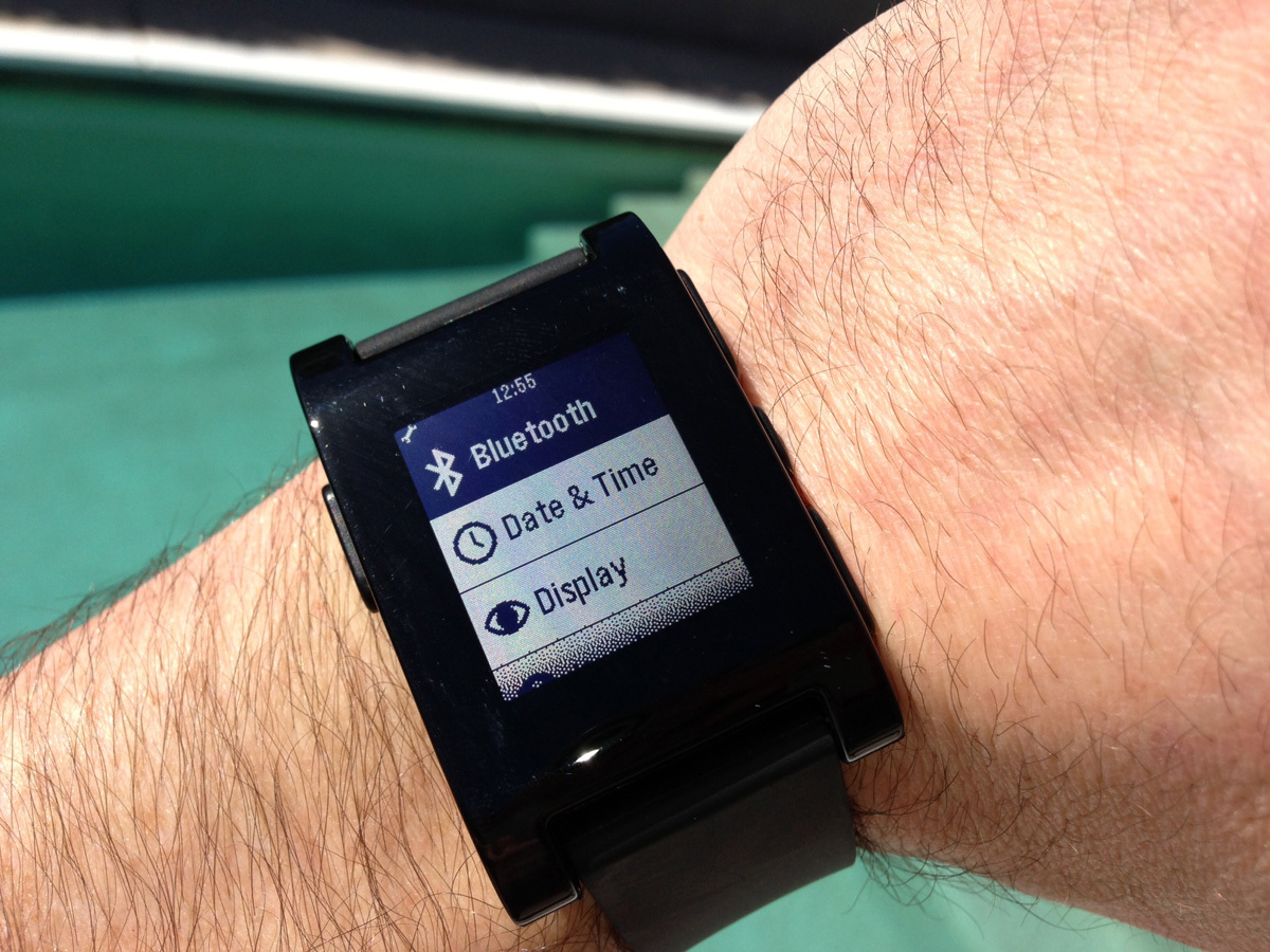
Of course, the first genuinely smart watch is far from perfect. There are interface hiccups that annoy – such as a back button that doesn’t take you all the way back to the watch face, and a very occasional Bluetooth lapse that meant we were at one point left unconnected from our phone for a few hours without realising it. These should be easily fixed in firmware updates. More worrying was a battery life that was less than three days, instead of the promised week, with the watch displaying a low battery icon then shutting down seconds later. Oh, and as an aside, the magnetic USB power cable feels like pure Apple.
Verdict
It’s easy to see what the Pebble is missing – the ability to reply to messages, voice recognition, better battery life. But that’s only because it already delivers so much. Not just the first essential smart watch for smartphones, the Pebble is a classic timepiece in its own right.
Buying one? › Order your Pebble from Amazon now


