Amazon Kindle 2012 review
Is this still the Kindle you're looking for? Or has the basic Kindle's thunder been completely stolen by the Paperwhite?

Amazon Kindle 2012 review – intro
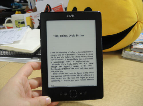
Thunder somewhat stolen by the now-flagship Kindle Paperwhite, Amazon’s basic Kindle still deserves some attention – it is just £69 after all. With a non-touch E Ink Pearl screen, a lighter build and the same Kindle Store goodies as before – with extra Lending Library treats to tempt you – is this still the Kindle you’re looking for? Or are Amazon’s higher-end tablets like the Fire HD the place to look for an ebook fix?
Amazon Kindle 2012 review – design and build
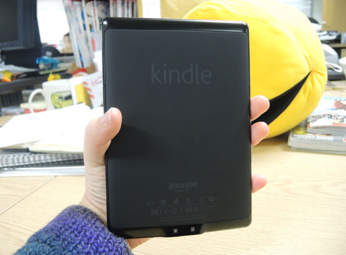
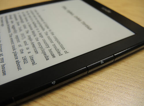
Grey is gone as the only Kindle colour – as well as the choice of Graphite, you can also choose a new all-black look. And while Team Stuff are divided on which we like best, it’s easy to grip back and neat, slightly more compact design fit very nicely in the hand, as ever. It also weighs in at 170g so is 30% lighter than the outgoing basic Kindle model. The page-turn keys work well and because it doesn’t have a touchscreen you can rest your thumbs wherever you please – just like a real book.
Amazon Kindle 2012 review – in use
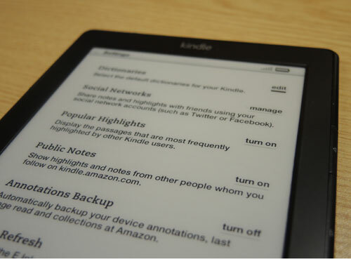
Easy to set up and quick to charge – via USB 2.0 it won’t take longer than 3 hours then you’re good to go for a month or so – the Kindle doesn’t waste any time. Before you start reading, it’s a good idea to turn off the popular highlights and public notes features in settings as both can get rather distracting.
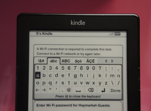
Page turns are very quick, as are refreshes of the E Ink screen when darting around settings menus and browsing the Kindle Store. When searching for books or entering Wi-Fi passwords though, scrolling through letters does get tedious, and you’ll wish you were using a touchscreen.
