App of the week: Adobe Spark Post review
Adobe shakes up graphic design on Android with a happy tappy slice of mobile magic
Whether self-inflicted or imposed on you from above, there will come a time when you must very abruptly become a graphic designer. And it’s a problem when you need to churn out a social network banner when your mastery of digital design packages is akin to a blindfolded gorilla attacking a sheet of card with a crayon – while wearing boxing gloves. Fortunately, you can use Adobe Spark Post instead.
Adobe’s found quite the niche on mobile. Rather than bringing across full-fat takes on its powerful desktop software, the company instead carves off chunks of functionality and repackages them as consumer-friendly touchscreen freebies. With Adobe Spark Post, you can conceivably go from blank canvas to spiffy poster, Facebook banner and Instagram story with just a few taps.
By design
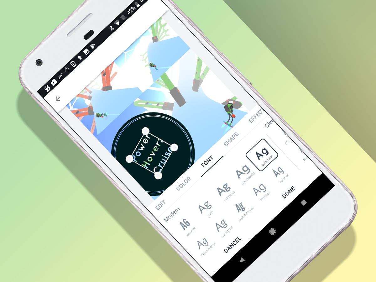
There are two routes into the app. If you have a bunch of photos you want to do something with, import them and Adobe Spark Post shoehorns them into a grid. You can fiddle around with its borders and layout, add filters to the images, and then overlay text elements.
The text tool is powerful, and fortunately succeeds in keeping you on the right side of losing all vestige of taste. You can select a font, background, and some basic effects, but even the more decorative effects manage to steer clear of eye-searing clip art.
The other eye-opener is the Resize tool. In most packages, this merely lops off a chunk of your design or adds acres of space to its edges. Here, you tap a preset – YouTube Thumbnail; Twitter Header; Facebook Ad; and plenty more – and Adobe weaves some magic to reconfigure your work to fit within its new boundaries.
Build to order
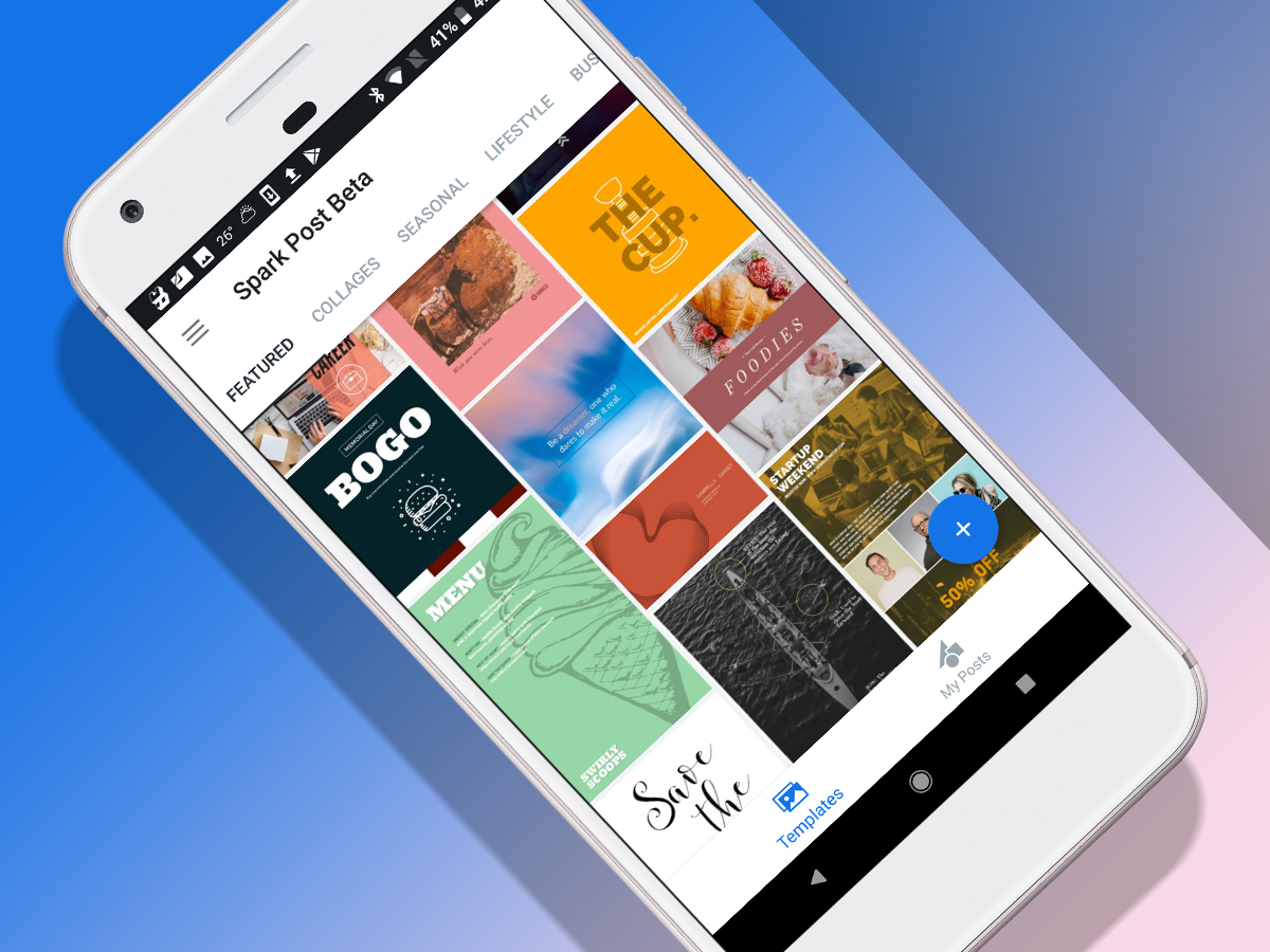
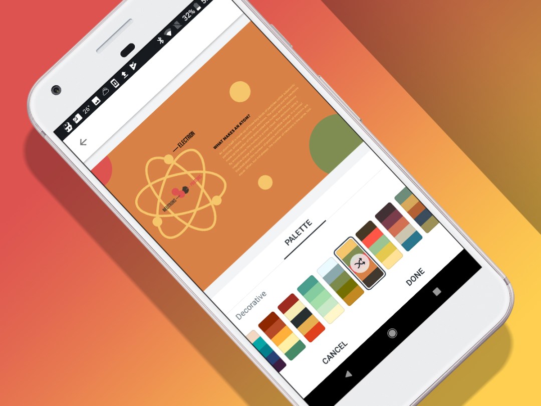
If even that feels a bit too much like effort, the app’s packed full of templates. Select one, stab a remix button, and the template’s hurled into the editor. Again, its various components can be fiddled with or added to.
There’s also a Design button, fittingly twinned with a magic wand icon, which when tapped provides access to a couple of dozen poster-like designs you can overwrite your current work with. At that point, one of the app’s drawbacks – or at least idiosyncrasies – becomes clear: there’s no undo. Adobe, it seems, wants you to be in the moment, and there’s no going back.
That snag aside, all this faffing about with imagery whizzing about the place is all rather fun, and the end results are frequently impressive. Of course, it’s still not proper graphic design – just a large number of ‘canned’ layouts you can mess around with. But there’s enough flexibility within for people who want to unleash their inner Peter Saville on their smartphone.
Adobe Spark Post is in beta for Android. It was previously released for iOS. The app requires a free Adobe ID to use. A paid tier unlocks the option to use branded templates, and replace the Spark logo with your own.
Stuff Says…
An entertaining, approachable app for anyone who needs to quickly crank out great-looking banners
Good Stuff
Loads of layout variations
User-friendly immediacy
Stores projects for later edits
Bad Stuff
Lack of undo is jarring
Still ultimately producing canned layouts


