App of the week: David Bowie is… review
David Bowie is… inside your phone. Or at least an AR take on a much-loved exhibition covering his entire career now is

Think of David Bowie and the word ‘conventional’ isn’t likely to flash past your eyes.
Instead, you’ll be thinking ‘pioneer’, ‘trailblazer’, and ‘what the heck was Tin Machine anyway’. All of which must have made things tough for the creators of David Bowie is – although sympathy erodes when trying to keep things grammatically sane while talking about an app called David Bowie is (and therefore outlining what David Bowie is is).
What David Bowie is isn’t (argh!) is a boring take on his life – a slideshow with some embedded music videos. That would have been anti-Bowie. What David Bowie is is (aiee!) is a virtual take on the hugely popular exhibition that started out in the V&A way back in 2013, before heading off on a world tour.
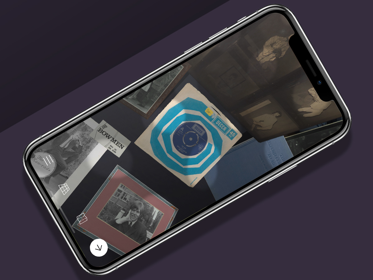
In short, you get dozens of costumes, songs, videos, live performances, photos, and sketches, all shoved inside your phone. These are then sort-of beamed on to the desk in front of you, like you’re a giant at your very own private showing.
Floating in a most peculiar way
This desktop AR set-up isn’t without its problems. Occasionally, the scene before you has an annoying inability to keep still, flickering about as you’re trying to watch a video – and said videos sometimes require you hold your phone at a bizarre angle to have any hope of watching them.
There’s also a stiffness that wasn’t apparent in the more immersive Shepard Fairey AR. There, you could zip about a warehouse installation and see things from every angle. With Bowie’s objects, you can merely shuffle documents on a virtual surface, or double tap them for a zoomed-in view – but you can’t spin most of them about, nor rotate them. Even Gary Oldman’s breathless intros can feel stilted, and clash with other audio if you accidentally trigger a clip or recording.
Fortunately, such awkwardness is eclipsed by the content. And as you start to poke around, you quickly realise you’re going to lose hours to the app. At least this is entirely at your leisure – rather than having to spend hours craning your neck over other people’s shoulders, just to get a glimpse of some iconic Burroughsesque cut-up lyric snippets.
Hallo, Spaceboy

I suspect full-on Bowie anoraks will find something to gripe about, but David Bowie is to my mind manages to be impressively comprehensive, packing in everything from Space Oddity to Blackstar – although fortunately not as literally as in this sentence. Instead, like the original exhibition, the artist’s history is presented broadly thematically rather than chronologically.
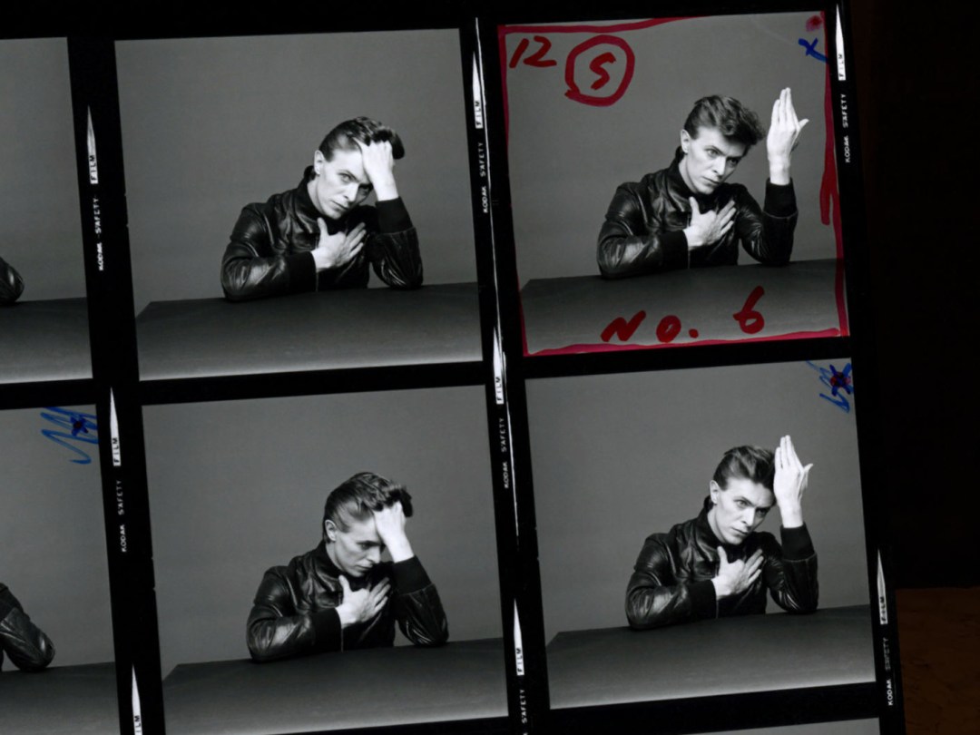
This structural decision is a masterstroke, and the result is that instead of darting to your favourite album and ignoring ones you don’t like, you immerse yourself in Bowie’s cultural influences, examine his characters, and unearth new insights regarding collaborations with Alexander McQueen and Kansai Yamamoto. You can dip into live performances, watch Bowie’s performance in 1969 short The Mask (A Mime), and marvel at how much he managed to pack into his 69 years.
Even during its highs, you may still question some of the form here – the app’s staccato nature; the odd decision to not entirely black out your own space in the AR view – but it’s broadly a success. Moreover, like Fairey’s app, it’s another great example of the democratisation of exhibits and art – not least when you consider the exhibition’s hardback catalogue still sets you back 35 quid at the V&A – and that doesn’t belt out Bowie live performances nor allow you to get your nose inches away from those iconic outfits.
Stuff Says…
David Bowie is gets the tense right – his work continues to echo down the ages. And this app’s an appropriate, well-conceived celebration of Bowie’s many achievements.
Good Stuff
Packed full of insightful content
Augments plentiful stills with audio and video
Smartly designed to dip in and out of
Bad Stuff
Rarely feels immersive
Interaction too often feels awkward
Oddly leaves your environment in view


