App of the Week: Snapseed review
Non-destructive editing, tons of filters, and a playful interface. Are you sure this is a free app? (Yes.)

Snapseed started life as an indie product on the iPad. Apple was suitably impressed, awarding it ‘App of the Year’ in 2011.
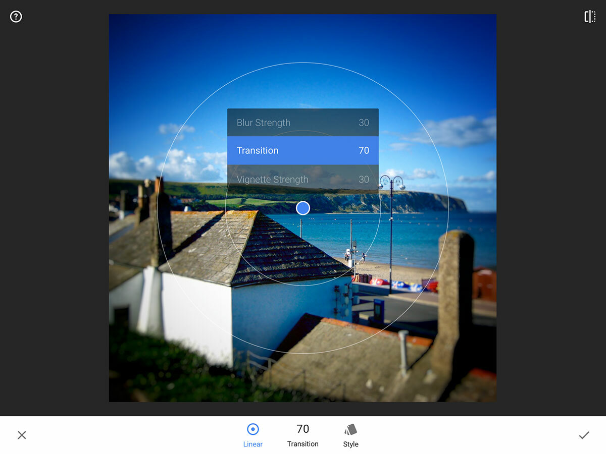
It’s easy to see why. The app was a smartly conceived image editor, providing a wide range of tools for reworking photographs, and while it was peppered with tappable buttons, it took a nicely tactile approach to applying filters. To change a parameter, you dragged your finger upwards, and to adjust its strength, you slid your finger horizontally across the canvas.
Google then got its claws into the app, at which point there was a bit of a panic. After all, the tech giant hasn’t got a great history of keeping is acquisitions alive. Snapseed bucked the trend, being ported to Android and still receiving plenty of updates for iOS.
In 2015, it received a major overhaul, and Google’s been iterating ever since, most notably with a recent set of optimisations for iPad Pro.
Stacks on the updates

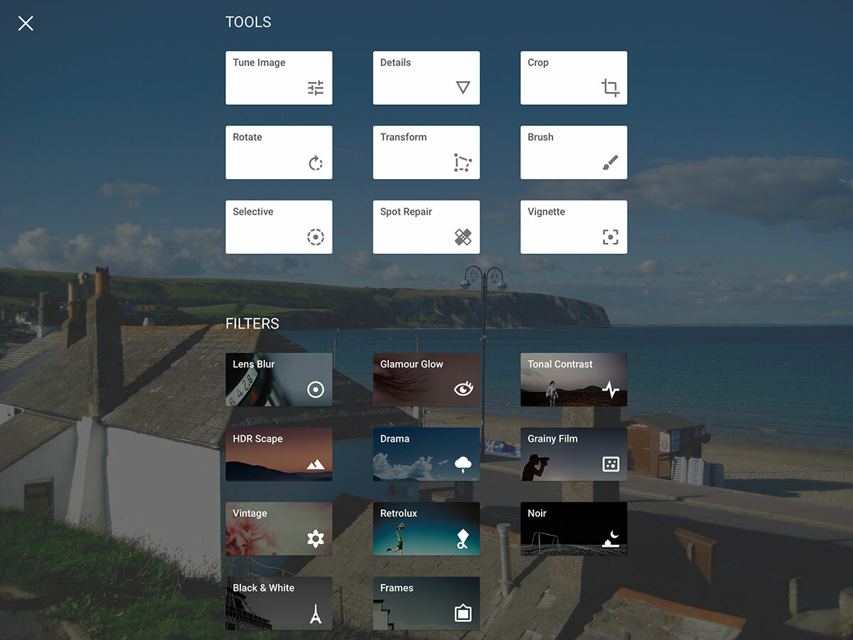
On the surface, the latest edition of Snapseed looks very different from its predecessor. Whereas you previously chose effects from a sidebar of book-like icons, Snapseed now finds itself firmly in the world of Google’s Material Design. Launch an image, tap the + button, and you get an overlay of flat buttons for selecting ‘tools’ and ‘filters’.
The interface for applying filters and working with tools is also bereft of texture, although it retains enough of the original’s design smarts to be familiar to existing users and reasonably intuitive to newcomers.
This release also adds a handful of new filters, including Lens Blur, Tonal Contrast and Glamour Glow, and although Grunge was notably missing on launch — angering people who liked adding textures to their images — it’s now returned. The biggest change, though, is Stacks. Essentially, any selected tool or filter is added to the stack. You can then later return to it and adjust parameters or remove an effect or edit entirely.
This kind of non-destructive editing is rare enough on desktop freebie apps, let alone mobile, and so is extremely welcome. The only downside is you can’t save custom stacks, although the current one can be copied to the next image you edit.
A no-brainer download

Stacks alone make Snapseed a no-brainer download. They’re an extremely powerful feature for what is ultimately a quick-fix photo editor with some nice filters that nudge the app into more professional territory.
Going forward, there are quirks that need addressing: the app weirdly pulled thumbnails rather than full-res images from a few of our shared iCloud albums on an iPad, and there’s a tendency for Material Design itself to sometimes be a bit opaque, ‘hiding’ loads of controls behind tiny buttons. Needless to say, it also feels alien on iOS, although not unpleasant.)
Still, any misgivings are massively outweighed by the positives in this latest update. Snapseed was always a great app, and now it’s even better.
Stuff Says…
The best photo editing app around is an insanely great bargain
Good Stuff
Non-destructive editing
Applying filters and edits feels great
Results of edits are frequently very pleasing
Bad Stuff
Interface is occasionally opaque
Can’t save stacks for later use


