Casio Pro Trek WSD-F30 review
Has this rugged ticker got the skills to please Bear Grylls?
Love hiking in the hills? Like recording your routes? Prone to falling in ponds? If you answered all three questions in the affirmative, Casio’s latest rugged smartwatch could be right up your trail.
About as subtle as a Day-Glo cagoule, the WSD-F30 is a well-built Wear OS ticker that can take quite the clattering.
And, when you’re not cartwheeling down a cairn, the chunky number will track where you tread, direct you through dales and measure a menagerie of metrics, all before texting your Nan that you’ll be home in time for tiffin.
But, while it’s built to go the distance, does this sturdy striding companion fix the flaws of its predecessor – and has it got sufficient mountain smarts to gun for the Garmin Fenix 5? I tackled lowland and Lincolnshire lake alike to find the answers.
DESIGN & DURABILITY: Built like a boulder
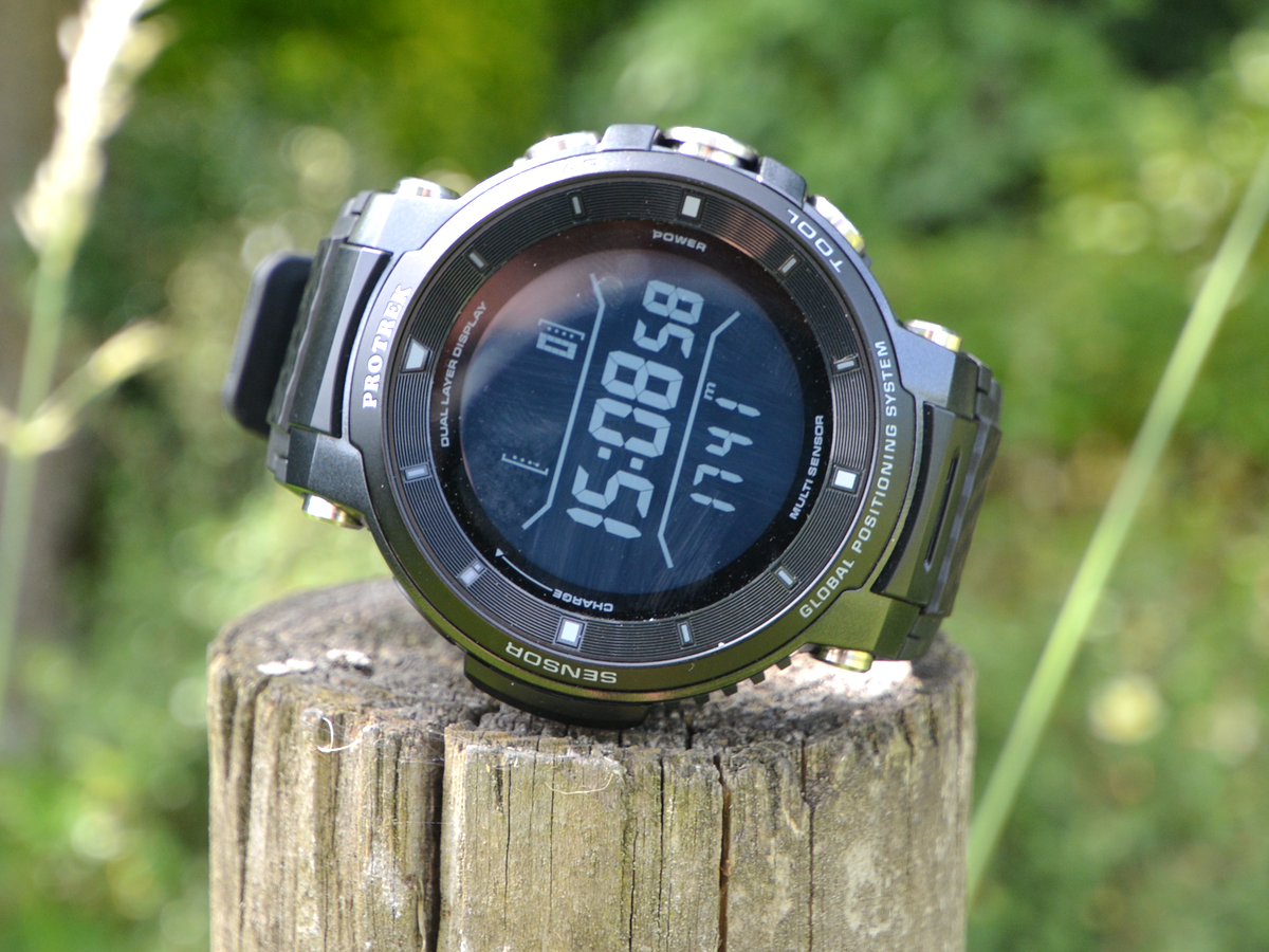
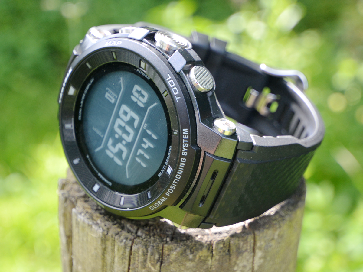
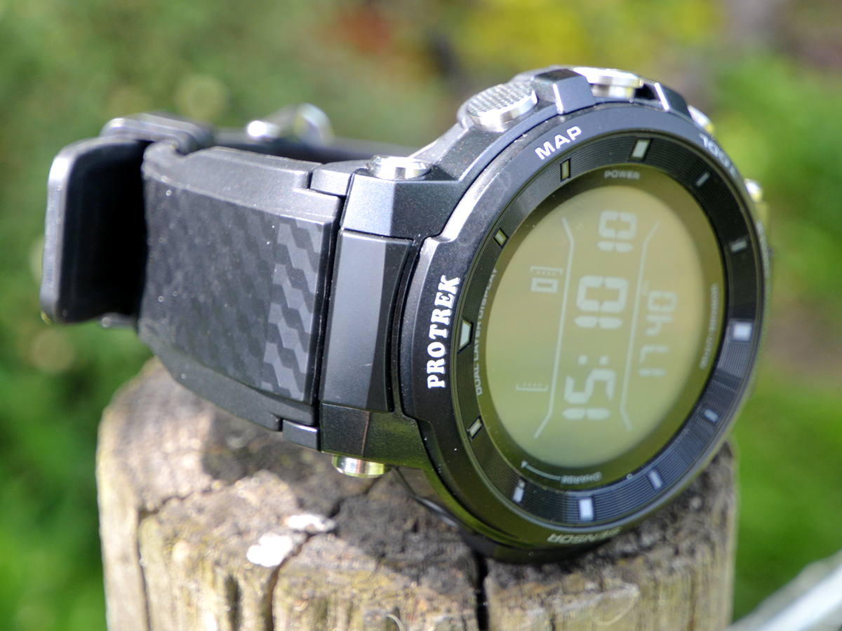
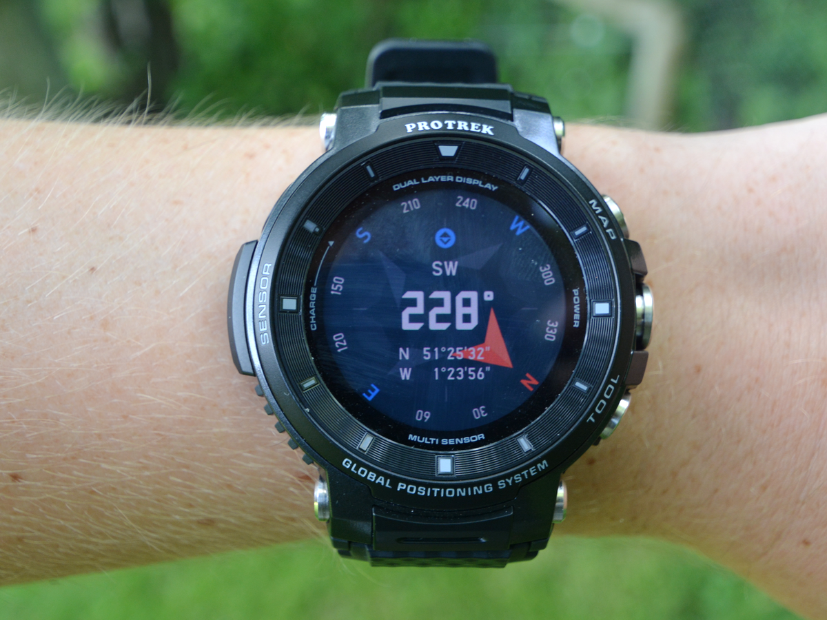
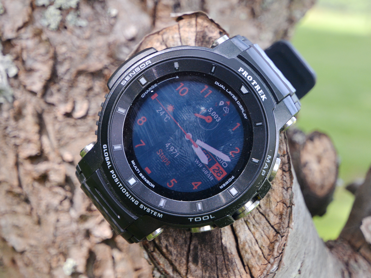
If you’re in the market for a smartwatch that can switch subtly from outback to office, this isn’t it: marginally slimmer than the F20, the WSD-F30 remains a massive thing. Fronted by huge bumpers and flanked by unmissable metal buttons, there’s no mistaking the Casio’s rugged credentials – and, even in black-on-black, it won’t go unnoticed in the boardroom. Mainly because you won’t be able to squeeze it under your shirt cuffs.
Similarly, the hefty bezels around the screen – now fully circular, after the frustrating flat-tyre display of its forebear – make it tricky for stubby fingers to reach the edges and the thick strap isn’t exactly the most flexible of things to wrap around your wrist.
Still, the pay-off is just how darn sturdy this thing is. According to its maker, the latest Pro Trek ticker passes a raft of stringent US military department tests. Translation? You can drop, crush, bash and even dunk the WSD-F30 down to 50m and it’ll still keep tracking and ticking as you trek towards the next flagpole.
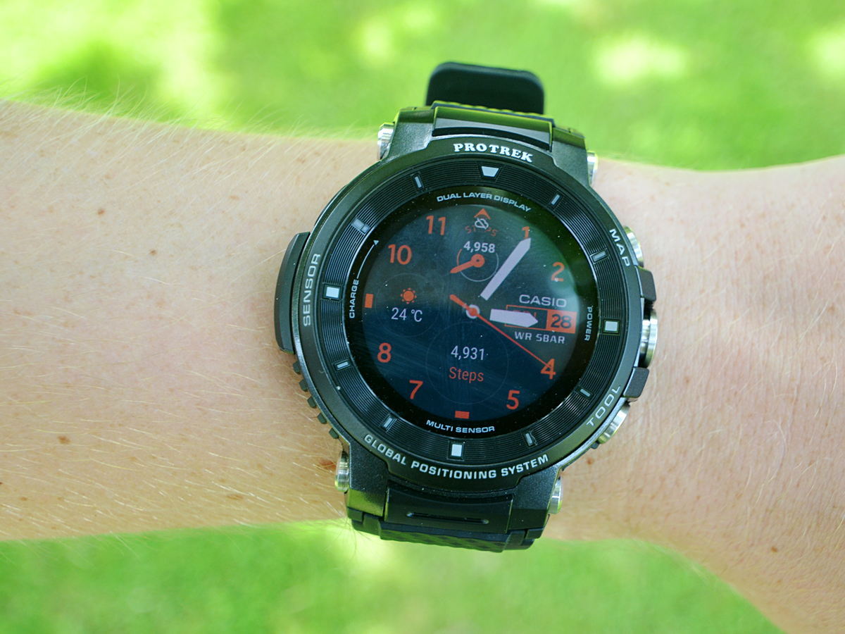
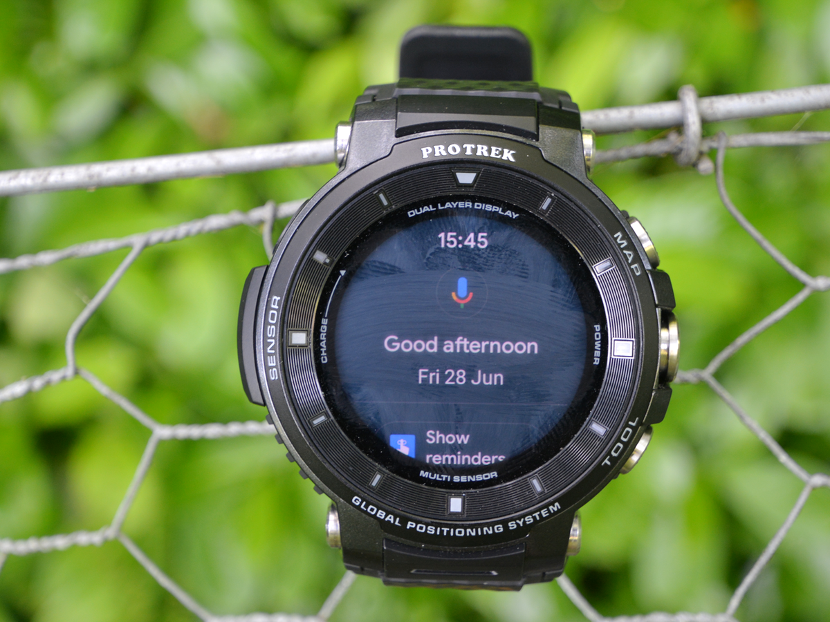
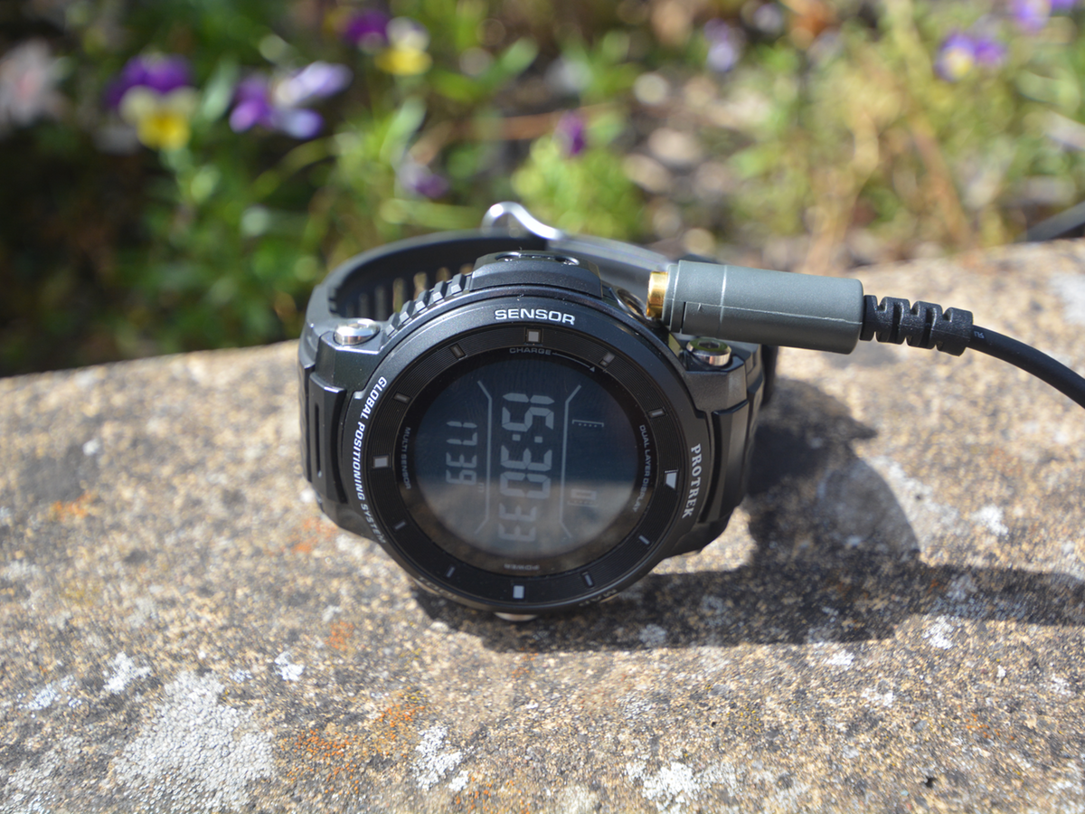
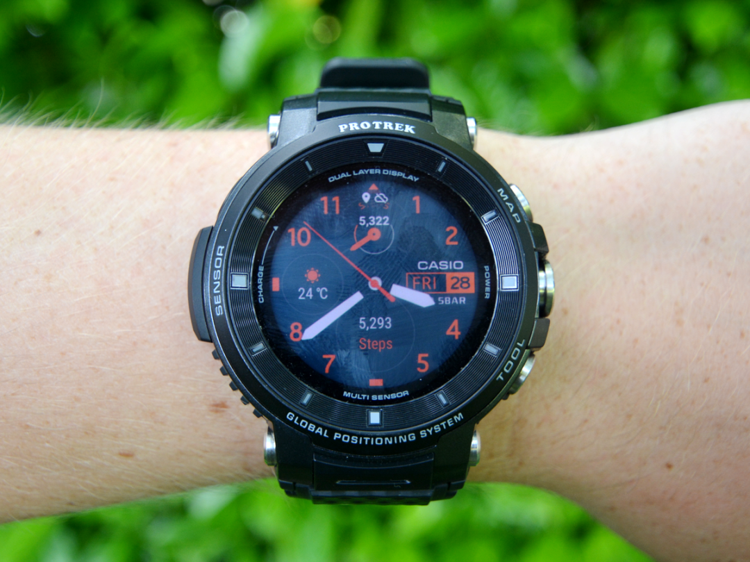
Ogle it on the way and you’ll find that, like its predecessor, the F30’s display is a dual-layer one – a monochrome LCD overlaid on a 1.2-inch OLED. It’s an effective solution that both prolongs battery life and makes basic information quick to see, with the LCD showing time and battery info before you wake the full-colour screen with a touch or flick of the wrist.
That black-and-white readout is also a boon outdoors because, while the updated 390×390 OLED is sharp and colourful in the shade, it’s almost impossible to see in direct sunlight.
INTERFACE & OS: Idiosyncratic tracker
Give the Pro Trek a poke and you’ll find the capacitive screen wonderfully responsive, which is more than can be said for the buttons on the side. They’re tougher than a doorknob, but using them requires gripping the opposite edge with your thumb and pushing hard. Good for preventing accidental presses, not for using with one finger.
That said, they are useful. Squeeze the bottom button – labelled ‘Tool’ – to access the Casio’s array of atmospheric sensors, or use the top one to fire up the mapping app. Alternatively, you can reprogram either as a shortcut to other apps, which proves a very handy function once you’ve tried grappling with the touchscreen interface. It is, like an Ordnance Survey map to the uninitiated, quite perplexing.
A Wear OS update has fixed some of the gripes that dogged the WSD-F20, but many idiosyncrasies remain and there’s a lengthy learning curve for new users. Swiping to the left on the home face, for example, doesn’t bring up the app list as you might expect (you need to hit the central button for that) but a customisable array of Wear OS screens. Swiping to the right while in an app? Sometimes it goes back within the app, sometimes it closes it.
It’s all learnable, yes, but not intuitive – and even after a month of using it every day, I still found myself swiping the wrong way on occasion, accidentally closing apps then poking around to try and reopen them from the list. Indeed, it’s symptomatic of a larger issue that afflicts the F30, as it did the F20 before it: the software feels like a slightly awkward melding of Wear OS and Casio’s own faces and apps.
EVERYDAY PERFORMANCE: Step it up
And that’s certainly something you’re aware off while using it day to day. Take the home screen: there’s a range of digital facades to choose from, many of which feature customisable data dials – except you can only select certain parameters for each. Want battery at the top and step count down the bottom? Sorry, nope – not without a workaround.
Likewise, while you can choose what metric is shown on the LCD screen when you’re in the battery-saving, feature-limiting Multi-Timepiece mode, you can’t do so on the Normal setting. You’re stuck instead with a battery percentage. More molehill than mountain, sure, but it’s a weird inconsistency that’s shows up the less than seamless software.
Speaking of battery life, use the Pro Trek heavily – say, a whole day of step-tracking, maybe an afternoon trek and some Wi-Fi fiddling while you’re at home – and it won’t make it through a second day away from the plug. For a longer stint, you’ll want to activate either that Multi-Timepiece setting, which disables the colour display altogether, or Extend mode, which keeps the colour but switches off Wi-Fi and Bluetooth, and lets you enable just the sensors you want. So you can ditch the altimeter if you’re not climbing anything.
It’s not a bad way to work around the middling cell longevity. More frustrating is the charging connector, which uses the same magnetic end as the F20 did and disconnects just as easily. Keeping it attached is a case of positioning the watch carefully and draping the wire over a nearby object. Any pressure on the cable whatsoever and it’ll detach. Oh, and it’s pretty slow to charge, too – think three hours from empty to full.
All that being said, the Wear OS stuff works well. Google Assistant is there with a long-press of the big button and it’s a cinch to use with the in-built microphone. Bluetooth pairing is straightforward and holds strong, detailed notifications all display as they should and any apps you fancy are generally easy to download on the watch itself.
TOOLS & TRACKING: Hills to climb
But you won’t buy the WSD-F30 if you just want a Wear OS smartwatch. You’ll buy it if you’re an outdoorsy sort after a ticker to suit your pursuits. So how does the Pro Trek tackle the great outdoors?
On paper, very well. It offers standalone GPS, offline maps and a whole raft of data sensors, from altitude to atmospheric pressure. All that’s missing is a heart-rate monitor which, while a deal-breaker for some, isn’t necessarily the end of the world on a hiking trip or kayaking expedition.
In practice, though, it’s more of a mixed bag – starting with how the Casio handles tracking. There’s still no core app on the watch that logically groups activities, data and historic logs; instead, the various tools are parcelled off into distinct apps – and you’ll need to learn which does what before you can confidently navigate the F30’s arsenal of functions.
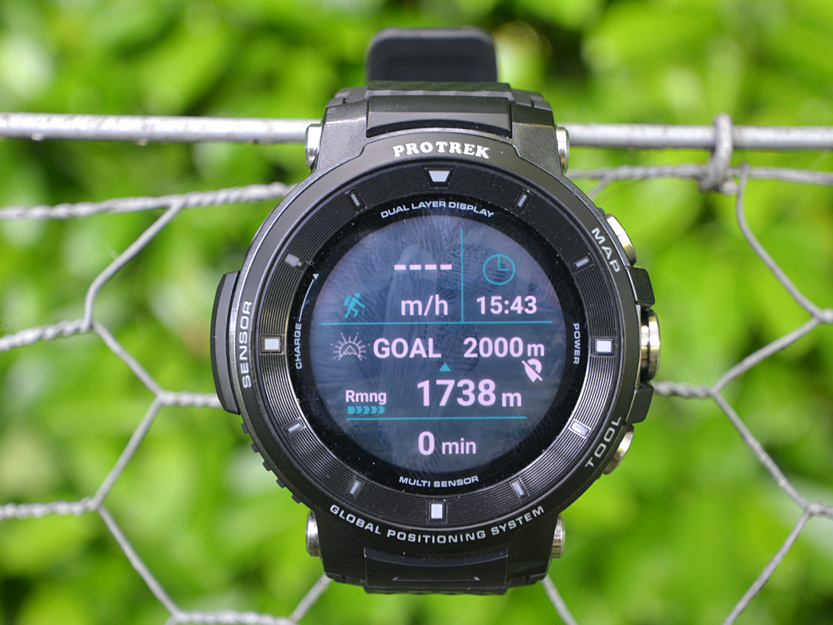
Your main port of call is Activity, which has modes for tracking trekking, fishing, cycling, paddling and snowsports. Each setting logs data from sensors specific to that activity, as well as recording GPS routes and feeding info to the LCD display. These generally worked well, with detailed yet clear readout screens to swipe through and the data itself largely corroborated with what my smartphone was saying – though the altitude reading was often out.
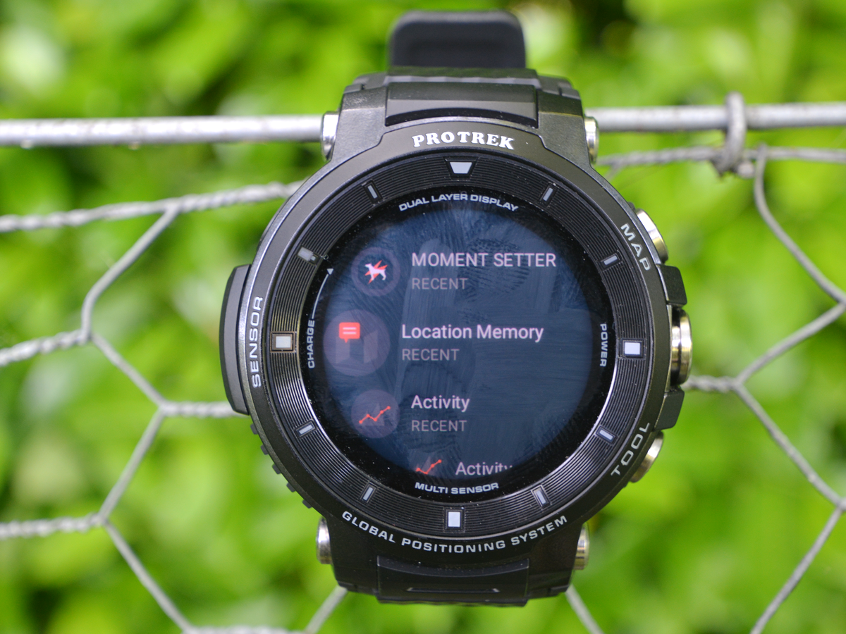
There are some quirks, though. The target parameter can’t be changed, for example, so if you’re stuck with a goal altitude when you’re trekking, rather than steps or distance. One way around this is to dive into Moment Setter, a neat addition that lets you program notifications and reminders that appear at certain points as you exercise – say, after a specified number of steps, as you hit a certain altitude or when the sun’s about to set. It’s powerful and customisable, adding a welcome extra dimension that’s specific to Casio. It’s just a bit strange to find it segmented off as a separate app.
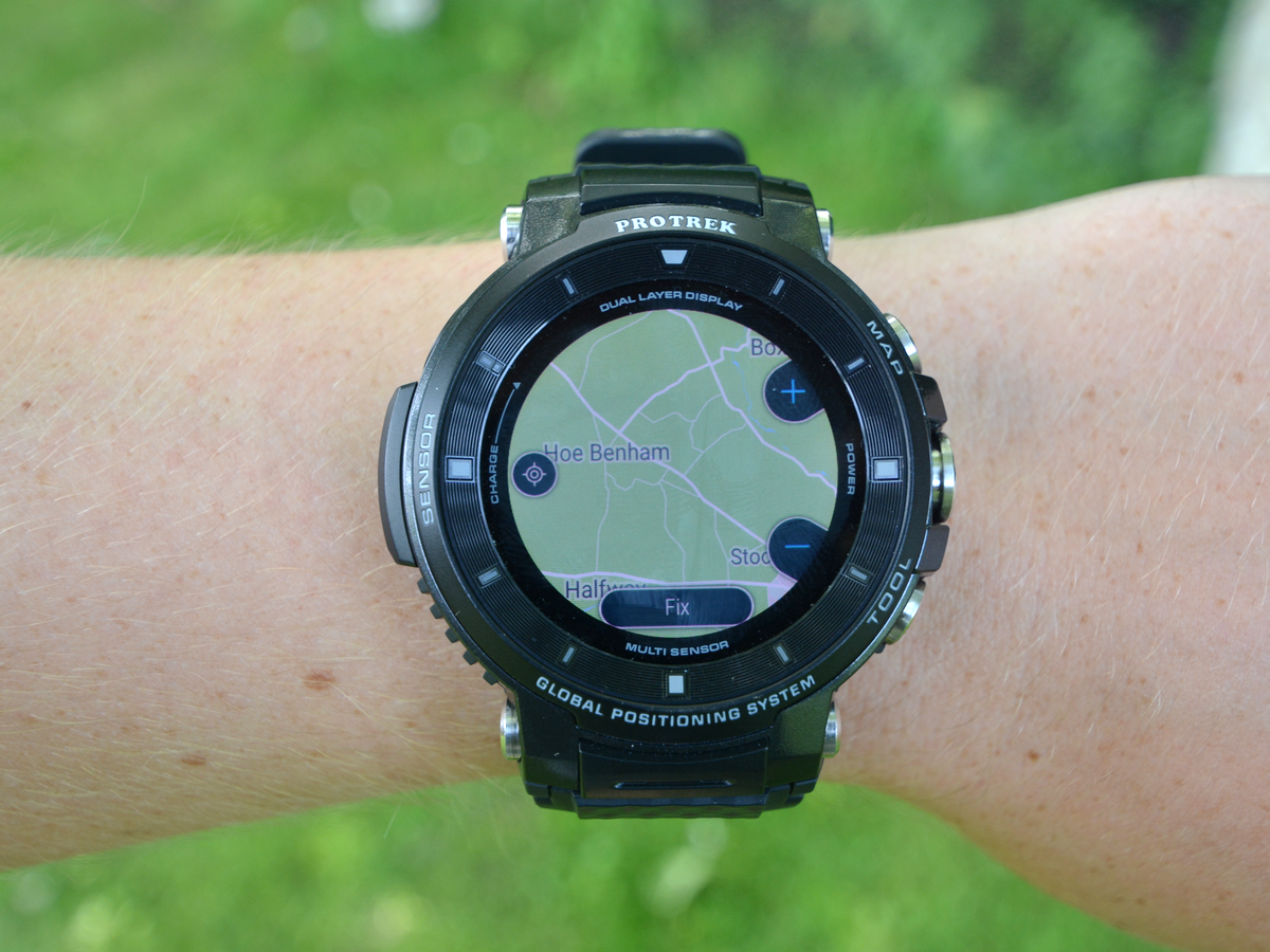
As for mapping, one of the headline features of the Pro Trek is its ability to save maps offline, yet I had some trouble with this. Maps did appear if the F30 was paired with my phone, but when I used Location Memory app to save a swathe of geography, it frequently failed to appear when I then went back to Activity to track something. That conundrum also affected the point-to-point routing feature, though even when maps did show up, the 1.2-inch screen made zooming and moving them fiddly and it’s hard to imagine anyone using the Pro Trek as a sole navigation tool.
More frustrating than those niggles, though, is what happens once you finish an activity. For all the data it’s capable of recording, the WSD-F30 doesn’t make it easy to view historic readings, routes or trends. They are there to an extent, stored as separate entries in Activity, but it takes several taps and swipes to get there. What’s missing is an app that brings together all of your activity info, which makes it feel like data simply disappears when you hit ‘Stop’. Even step counts are recorded apart in Google Fit and there’s no mode whatsoever for running, so you’ll have to fill in that – and any other gaps – by downloading a third-party app.
Casio Pro Trek WSD-F30 verdict
If that all sounds a bit negative, it’s only because the Casio Pro Trek WSD-F30 has the potential to be so much more. It’s got a clear display, GPS on-board and all the sensors you could want. Sure, the battery could be better and the screen brighter, but it’s pretty much there physically.
What’s not there, still, is the software. Wrestling with the fiddly, unintuitive interface and separate apps is tricky enough when you’re sat at home. Doing so while you’re striding, paddling or, at your own peril, skiing? Distracting and frustrating don’t quite cover it.
More than that, adding a central home for all activities seems like it should be something simple – especially on a smartwatch that costs £449 – yet it’s still lacking, just as it was on the WSD-F20. All the tools are there, they just need to be brought together to make the user experience slicker and more appealing. Until that happens, it’s hard to recommend the Casio over the Garmin Fenix 5.
Stuff Says…
Big, bold and built to go the distance, Casio’s sturdy smartwatch has all the tools to make it great but needs software tweaks reach the summit
Good Stuff
Tougher than a brigadier’s boots
Packs GPS and plenty of sensors
Dual-layer display works deftly
Bad Stuff
Interface can be idiosyncratic
Battery life is only average
Still no home for activity history
Magnetic charger disconnects easily
