Garmin Vivosmart 3 review
If you don't need GPS, this is one of the best all-round fitness bands out there
The rivalry between today’s fitness bands is so fierce that they’re cramming in more tech than Inspector Gadget’s fedora.
So what has Garmin managed to squeeze into this unassuming strap? Well, the Vivosmart 3’s main showstopper is that it can to VO2 blood oxygen saturation readings. This means it can, for better or worse, provide a good reading of your overall fitness level (which it marks from ‘poor’ to ‘superior’).
That’s not the end of the fitness tracking nerdery either. It also does stair-counting, has a ‘stress’ sensor, and does continuous heart-rate monitoring. Oh, and you get phone notifications too.
With so much health monitoring on board, it’s naturally a bit awkward to use at times and the software is nowhere near as fun as what you get with a Fitbit. It’s not as accurate as a Garmin GPS watch like the Runner 3 either.
So why the good score? Well, it’s easy to live with, really does give you more useful data than most of its rivals, and could even replace your smartwatch.
Garmin Vivosmart 3 design: for fans of bland
Garmin doesn‘t make the most stylish fitness devices in the world. If I was being harsh, I’d say the Forerunner 35 looks like something you might find at the bottom of a cereal box. Before the government ruined the fun and banned free Cornflakes toys anyway.
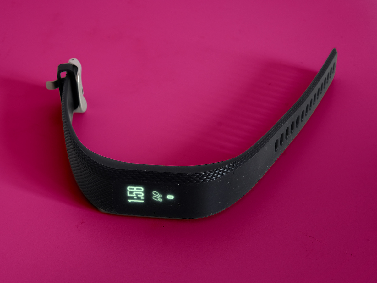
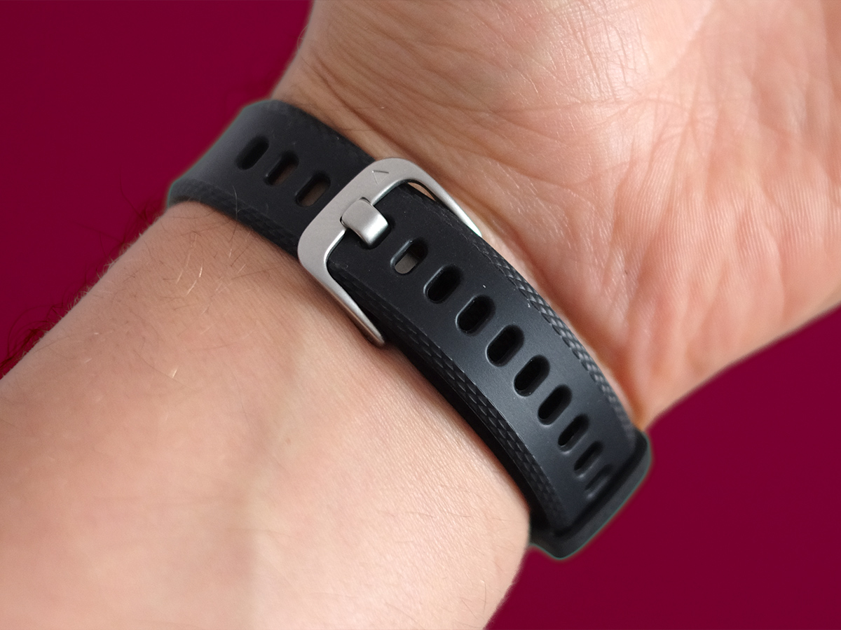
Still, this is one of the simplest, most tasteful wrist trackers around. It‘s a narrow rubbery band. Half of it has a diamond-embossed pattern, while the flat matt part over the screen continues seamlessly to the underside of the strap.
It‘s like someone locked a designer in a room with a Fitbit Alta and kept on saying “less” with each design draft. You might say it‘s boring, but I‘m just glad friends won‘t say it looks like I‘m wearing a Star Trek prop.
The Vivosmart 3 also uses a watch-like strap rather than one with fasteners you have to push through the strap. It makes loosening and tightening the thing a bit quicker.
Garmin Vivosmart 3 screen: Silicone glaze
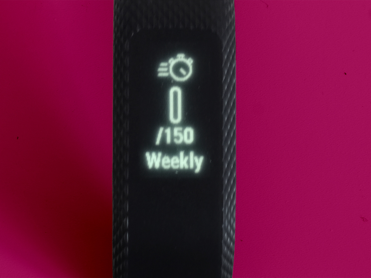
What’s more unusual is how the screen works. The Vivosmart 3 doesn’t cover its display with hard plastic but a thin layer of transparent silicone instead. As you can see in the photos, this smudges the display a little, diffusing the light of the pixels.
It’s no great loss when the Vivosmart 3 would otherwise look blocky. This is a 64 x 128 pixel white OLED screen: poor on pixels but high on clarity.
The OLED panel merges with the black surround and its pixels are super-bright. It’s clear even outdoors on a sunny day and there’s an auto brightness mode that handles the level for you.
It’s a touchscreen, meaning there’s no need for any buttons on the Vivosmart 3. It’s a slight shame that the screen isn’t always-on though, as you can’t really use it as your watch. You have to double-tap the screen or give it a wrist-flick to make it light-up.
The lax responsiveness is one of the main annoyances of the Vivosmart 3. Sometimes it just doesn’t light-up if your taps aren’t timed correctly or directed right on the touch panel, and there’s a delay after whipping your wrist around to wake it up with a gesture.
Garmin Vivosmart 3 Interface: Finger gymnastics
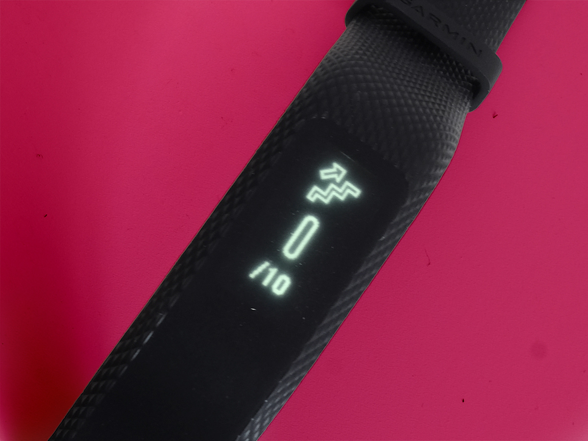
It takes a while to get used to the touch operation of the Vivosmart 3 interface too. Part of this is because it’s a bit more complicated than just a series of screens you swipe up and down through.
Double-tap the Vivosmart 3 touchscreen and you’ll see the clock face. Vertical swipes take you to the screens for all the other metrics, like stress, heart rate, steps and more. You can also swipe horizontally for more info on each.
Sometimes the Vivosmart 3 confuses a tap or vertical swipe for a horizontal one, particularly when you’re sweating your bits off on the treadmill. It’s one of the perils of a touchscreen interface on a screen slimmer than your pinkie finger, particularly when the touchscreen has a rubbery top surface.
You get better at dealing with this after a while, and perhaps it’s a fair trade-off for a fitness tracker that lets you do and see more on the watch than most. Let’s break down what those things are.
There’s the usual fitness tracking basics, and you can see the previous day’s results with a side swipe. You can see your heart rate and a graph of your HR over the last hour, right on the Vivosmart 3’s screen. There’s a weather report for the day, and a side swipe takes you to the weather of the days going forward.
One of the most useful mid-exercise screens is the music page, which has controls that let you play/pause and change tracks. This is music playing on your phone: there’s no built-in music player.
Garmin Vivosmart 3 Features: Make it Mindful
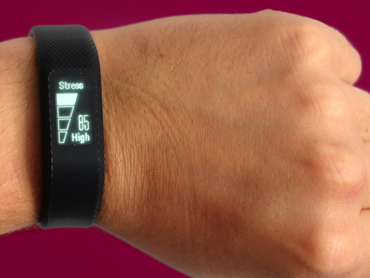
The bit you don’t get elsewhere is the stress screen. This checks out your heart rate variability to measure how stressed-out you are. You get a figure out of 100, and a ‘rest’, ‘low’, ‘medium’ or ‘high’ verdict.
It can seem like a gimmick but does actually work, and there’s a (grab your prayer beads) real mindfulness element to it. If you’re feeling stressed this part can also guide you through some breathing exercises to help chill you out.
That’s right, the Vivosmart 3 literally tells you when to breathe. But it works. After two minutes of deep breathing my stress was down to 5/100, and it’s a pretty good way to get your head back in gear after an awful work meeting.
Already a zen master? Maybe the Vivosmart 3’s phone notifications will appeal more. They’re miles more useful than those of the Fitbit Alta. Where the Fitbit can only receive call, text and calendar pings, the Garmin alerts you about emails and WhatsApp messages too. Or pretty much any notification your phone flings.
Garmin Vivosmart 3 Notifications: Tiny Smartwatch
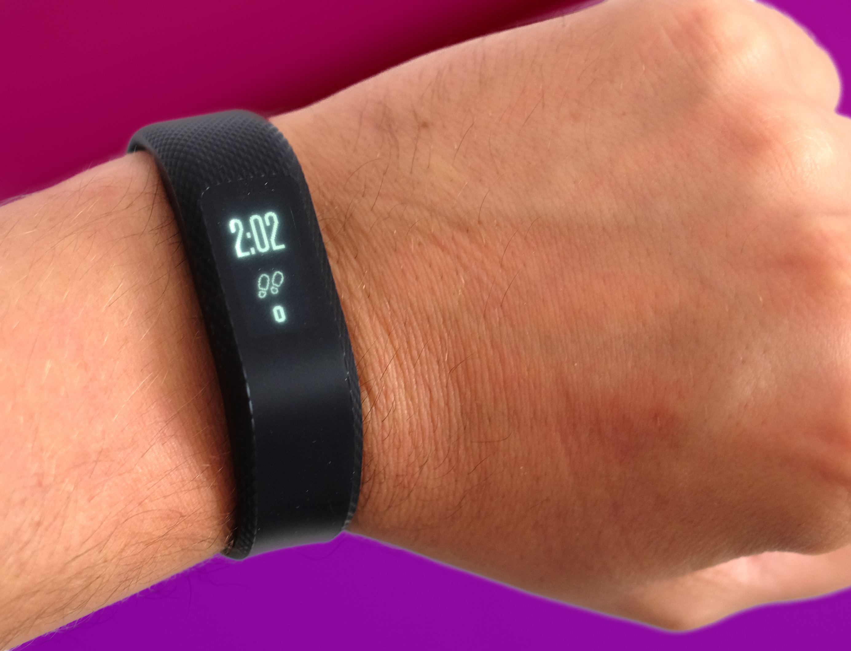
It’s a real smartwatch-like notification system. You can even read email excerpts and messages, although doing so on such a tiny screen never seems like a good idea unless you’re wedged between 17 people on a packed train.
Still, the Vivosmart 3 is basically an app-free smartwatch.
Given the display pops-up whenever you get a notification, and buzzes you with a little vibrate motor too, I’m impressed by the band’s battery life. Garmin says you’ll get five days’ use between charges, and that’s on the money.
That’s the pay-off for having a screen that isn’t always-on, of course, but makes the Vivosmart 3 much easier to get along with. To recharge, you clip it into a custom charge dock that hooks up with four little contacts on the back. There’s no removable core in this band, and no USB socket.
This locked-in design also helps give the Vivosmart 3 great water resistance. You can wear it in the shower, or even while swimming. A lot of devices that can be dunked in water can’t be worn in the pool, so this is an important win.
The Vivosmart 3 is a surprise hit as a low-fuss wear-anywhere smartwatch, but what about the fitness side?
Garmin Vivosmart 3 Fitness Tracking: Where’s my GPS at?
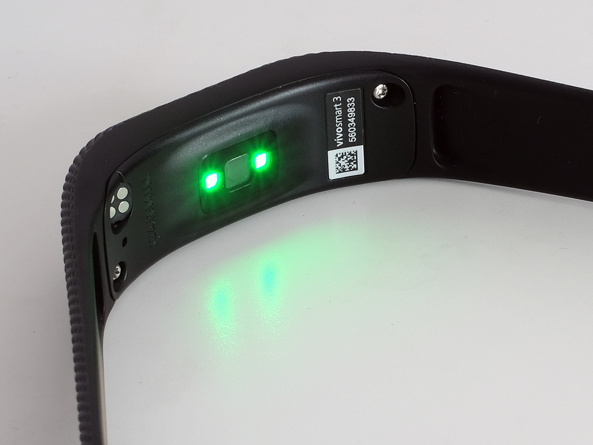
This isn’t a GPS watch and can’t even hook up with your phone’s GPS to map walks and runs. All tracking is done using the Vivosmart 3’s accelerometer and altimeter, measuring your steps and any altitude climbing you do when walking up to your 8th floor office.
The band has an IQ feature that can automatically start tracking exercise as long as you’re doing it for a few minutes, but manually tracking stuff is easy too. Long-press the screen and you get to the activity menu, and there are modes for walks, runs, a heart rate mode for aerobic exercise machines and a rep counter for weight workouts.
Basic step counting is solid, and so is the distance reading for runs if (the big if) you put the effort into perfecting your stride distance, which you can customise in the Garmin Connect app. Heart-rate reliability is good for all-day readings, and the Vivosmart 3 really does record throughout the day, but during a 5K run it’s rather more patchy.
Like other wrist HR trackers, it uses the sensors and an algorithm that compensates for the fact that any slight movement of the sensor relative to your skin means it has no idea what’s going on. Over a 30-minute run the Vivosmart 3 got my HR dead-on for the first few minutes before getting confused, showing it dropping rapidly and then gradually crawling up for the next ten minutes.
Still, while it isn’t particularly accurate, it is reliable enough to show how hard you worked during various stages of a workout. Even if it occasionally goes a bit mad and spouts nonsense.
The Vivosmart 3 also has a crack at VO2, a measurement of the oxygen saturation in your blood. Do this in a health lab and you’ll be strapped up to a breathing apparatus and a bunch of sensors, but Garmin estimates it using an algorithm and the heart rate data it picks up during the day and during exercise.
As with all the Vivosmart 3’s sub-scientific tracking, you’ll need to take the results with a glug of electrolytes, but it can be used over time as a decent measure of your improvement. It says I have a VO2 reading of 45ml/kh/min and a fitness age of 20. While I run the odd 5k, this seems a bit optimistic.
Garmin Vivosmart 3 App: Sport Science
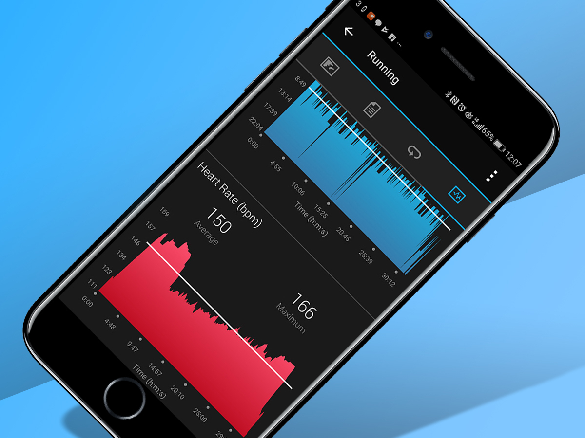
All the data, hokey or not, ends up in the Garmin Connect app. I think of this as the Excel spreadsheet of fitness tracking software, because it’s pretty boring unless you’re into stats. Really into stats.
Fitbit has a knack for making metrics seem fun, and using them to motivate you. Garmin… not so much.
With a real lightweight fitness band, this is a real turnoff, like buying a book on string theory for your niece who just wanted a My Little Pony plush.
Still, the Vivosmart 3 is an appealing middle ground between a basic tracker and a super-intense “I run ultra marathons for fun” one like the Fenix 5. Garmin Connect is not a fun place to hang around in, but at least it has established places for all the band’s data and can fling charts and graphs your way until your eyes glaze over.
It’s particularly good at charting your progress over weeks, months, even a year. But, to reiterate, it’s not fun.
The app also lets you make some important changes to the watch. For example, there are several watch faces, eight of them. Some are plain clocks, both analogue and digital.
Others add your step count, the weather or your heart rate. You can also choose whether the display is arranged in portrait or landscape. I prefer the more watch-like portrait mode, but have to admit the landscape view is much less cramped if you use a more stat-packed homescreen.
Don’t want to use the Vivosmart 3 as a watch? You can choose any of the interface pages as the default display, and cut out any pages you don’t need. This doesn’t stop the band from recording any data, but does make the interface easier to flick through. When you first fire it up there’s 11 pages of gumpf, which is a bit of a finger workout by itself.
Garmin Vivosmart 3 verdict
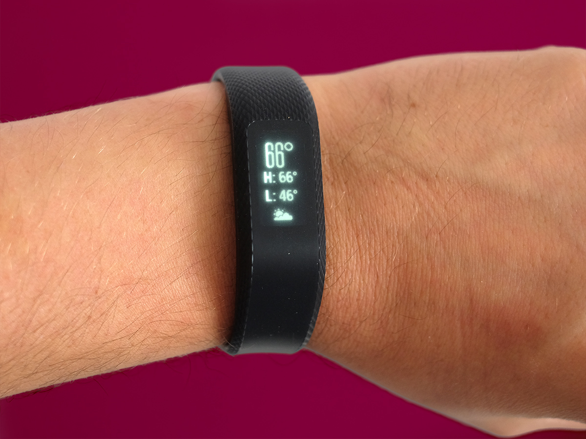
The Garmin Vivosmart 3 is a fitness band with several personalities. It’s a step counter. It’s a semi-hardcore fitness band. It’s a basic smartwatch. Heck, it’s even a mindfulness coach.
All of this fits into an innocuous black band that lasts most of a week between charges.
Fitbits are more fun and stylish, the Vivosmart 3’s touch interface is fiddly and not having an always-on screen is annoying when the screen isn’t super-responsive. But it does most things well enough to make it one of the richest, most useful fitness bands out there.
Stuff Says…
It could be more fun and less fiddly, but the Vivosmart 3 is one of the most useful fitness bands around
Good Stuff
Good battery life
Plain and simple design
Smartwatch-style notifications
Rich collection of metrics
Bad Stuff
HR sensor struggles with high-intensity workouts
Not an always-on screen
Fiddly, not-that-responsive interface
Garmin Connect app is dull

