HTC One (M8) review
2014's first flagship phone has landed, and it's an absolute corker

The original HTC One was (and still is) a mighty fine phone. One of very few Androids that could rival the iPhone in the looks department while also doing everything else we expect of a flagship phone, it was a shoo-in for our 2013 Smartphone of the Year Award. And then, at the last minute, the LG G2 arrived and stole its thunder. And who could’ve seen that coming? We certainly didn’t.
HTC’s plan to reclaim the top spot in our smartphones Top 10 is a straightforward one: More of everything. More screen, more power, more battery, more cameras and even more metal.
More isn’t always better, but in the case of the HTC One (M8) it’s done just the trick.
More metal
Wondering what the “M” in “M8” stands for? It’s “metal”. Apparently this is the eighth-generation metal HTC – hence M8. And you thought it was just try-hard text-speak.
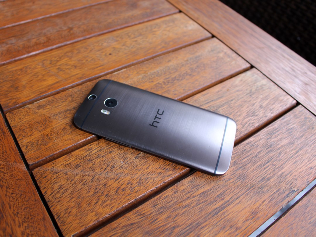
There’s actually 20% more metal in the One (M8) than the original One (roughly equivalent to a jump from Iron Maiden to Slayer), and while the original One looked rather like a plastic phone with metal panels, the One (M8) feels as if it’s been hewn from a single piece of cool, smooth aluminium.
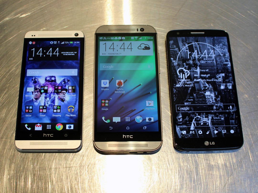
There are some Stuff staffers who feel some of the original One’s design flair has been lost on the M8, due mainly to the rounded edges, but no-one can deny the improved ergonomics of that perfectly rounded back. This is a phone that fits in the hand beautifully – even more so than its predecessor, despite nearly a centimetre increase in height and 2.4mm increase in width. Depth stays the same at 9.3mm.
If you like the machined lines across the back of our sample phone, best go for the same Metal Grey finish – the Arctic Silver and Amber Gold variants don’t have that lovely little aesthetic flourish. All three are pretty in their own right, but to our eyes Metal Grey suits the One (M8) best of the three anyway.
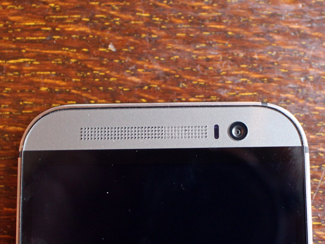
Beautiful machining is a big part of the One’s appeal, from the rows of tiny, meticulously cut holes for the speakers at top and bottom (more on which later), to the light-catching bevelling on every edge, including around the camera lenses. It’s a little strange, then, that the volume rocker protrudes rather a long way from the right edge. It makes it easy to find without looking, but it’s a slightly sharp blemish to the otherwise impeccably dressed body.
More screen
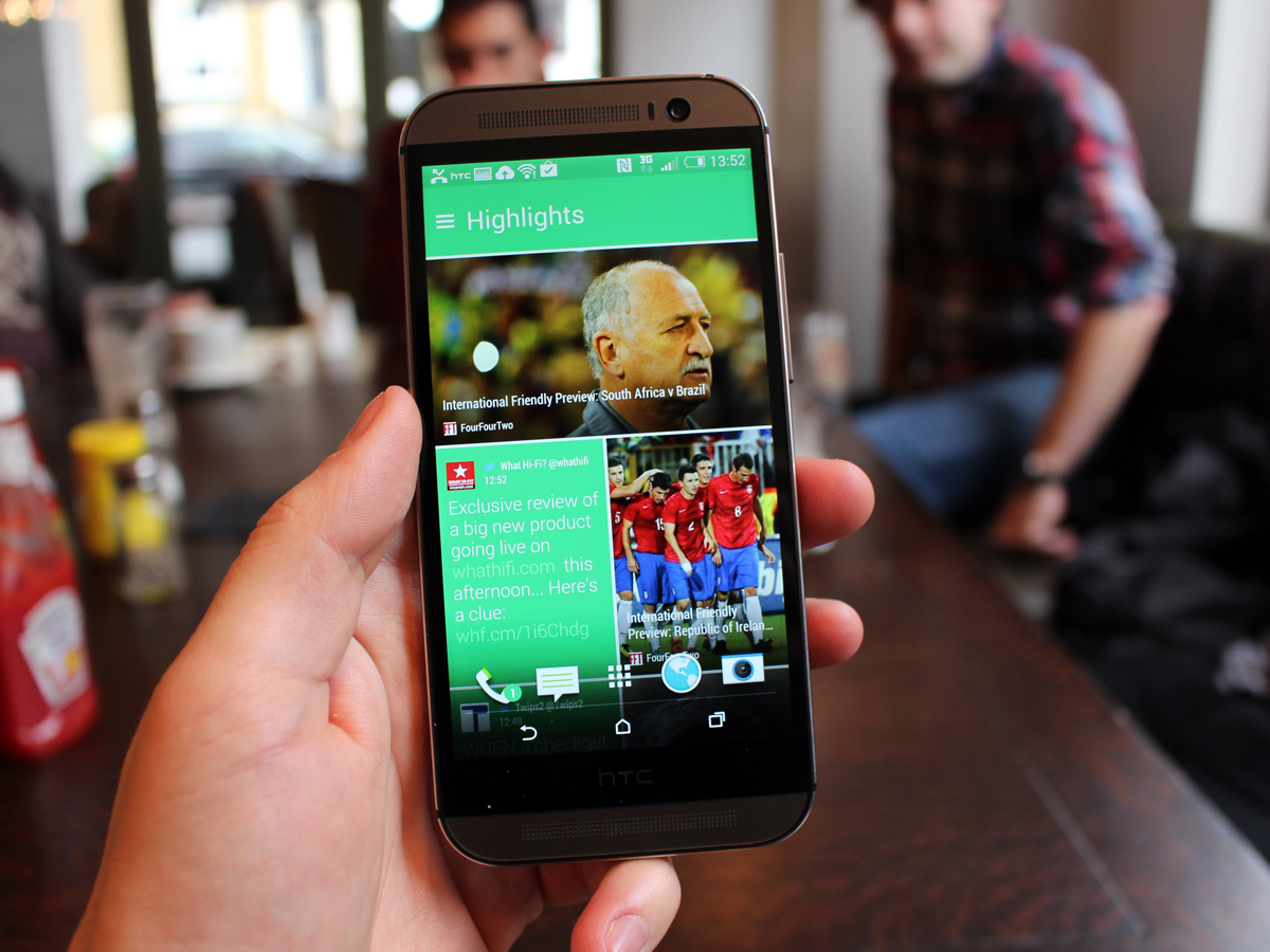
The chassis has expanded for one main reason – to facilitate a bigger screen. Phabletophobes need not panic, though, as the M8 is no finger-stretching giant – rather, it’s had a fairly modest size increase from the original One’s 4.7in display to a new 5in panel.
But the 1920×1080 resolution remains, and that means there’s actually been a slight drop in pixel density from 468ppi to 441ppi. In general use that’s an imperceptible loss, and text and icons (some of which have increased in size to make use of the larger display) are very sharp indeed. Colours are satisfyingly vibrant but never over-cooked, and off-axis viewing is very impressive indeed.
Compare an HD video side-by-side and there is a marginal loss in sharpness compared to the original One. The palette leans just a little towards the green side, too, but neither of these traits are noticeable without going all nerdily comparative. What is immediately noticeable to anyone with eyes is that extra display space, which makes a far bigger (and entirely positive) difference than either of those minor flaws. Be in no doubt – this is a really beautiful screen.
More power

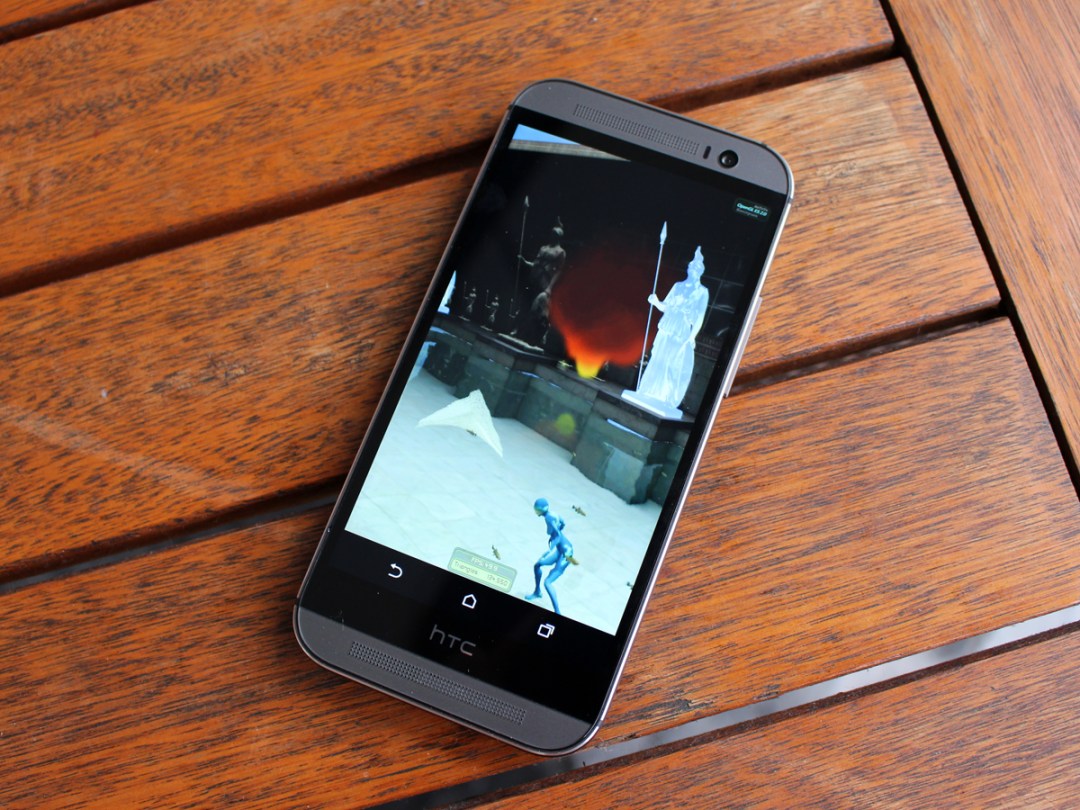
The HTC One (M8) is the fastest phone we’ve tested.
With an AnTuTu score of 36,149, it’s way above the old HTC One and Samsung Galaxy S4, and a little better than the likes of the LG G2, Sony Xperia Z Ultra and even the mighty Galaxy Note 3. The numbers aren’t vastly higher, but going right to the top is a massive symbolic win for HTC.
But as a petrolhead would have it – power’s no good if you can’t put it down on the track. And the One M8 definitely puts it down on the track. In the comparatively short time we’ve so far had with it, we’ve thrown everything we possibly can at it – HD movies, graphics-intensive games, benchmarking tools, constantly updating apps – and we’re yet to see so much as a stutter. The fast fluidity of everything it does makes living with the new One an endless pleasure.
It’s all down to a new chip, the Qualcomm Snapdragon 801. In many ways it’s “simply” a juiced-up Snapdragon 800, but that’s still enough to power HTC’s flagship to new heights in smartphone performance.
Will it stay on top of the performance charts for long? We suspect not. The Snapdragon 801 will also power the incoming Samsung Galaxy S5. Whether Samsung can use it to create a user experience that’s faster and smoother in real life than that of the One (M8) is another question altogether – we can’t wait for that particular showdown.
HTC One (M8) Tech Specs
More cameras
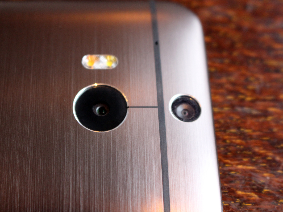
Ok, “more cameras” is a little misleading – “more lenses” is probably more accurate.
HTC continues to conscientiously object to the megapixel war, instead sticking to its light-gobbling UltraPixel guns. The One (M8) has basically the same 4.1 UltraPixel sensor as was found on the original One, but now it’s joined by a dedicated depth sensor to create what the company’s calling a Duo camera. And the Duo camera is quite a thing.
Remember the Lytro, the camera that could focus after your snap was taken? The One (M8)’s basically got one of those built-in. Take your picture, select the UFocus option and tap a point on-screen and that becomes the focus point, with all around blurring in a beautiful bokeh effect. And it’s not a fire-once feature – you can tap to change the focus point as much as you like.
You can scream “gimmick” all you like – we’re pretty confident that many more people will make use of the refocus effect than will ever crop, blow-up or print their smartphone snaps.
That’s key to HTC’s approach. The One (M8) loses out to the likes of the LG G2 when it comes to fine detail, but that’s only really exposed through close scrutiny and zooming. Use your pictures as most do – for sharing holiday snaps, food porn and selfies – and the One looks just as sharp. What’s more, it’s got a really nicely balanced, realistic-but-vibrant colour palette, and is a cracking camera for capturing party action – the sensor finds light where others see only darkness, and when it’s finally defeated by lighting conditions the dual-LED flash works to balance colours and produce natural skin tones.
If you do want a gimmick, you can have one. Dimension Plus essentially 3Difies your picture by using the depth sensor to work out the edges of a selected object. You can then use the phone’s motion sensors to alter the angles. While not flawless (it can be confused by some edges, creating a fun warping of the image), it’s pretty impressive tech. The problem is that there’s no real purpose to it – you’ll do it a handful of times in your first weekend with the phone and then never touch it again.
You will, however, make use of the Zoe Highlights Video feature long into your phone’s life.
Much loved by existing One owners, Highlights groups all of your pics and video from particular moments and events and turns them into a fun montage. It might sound a little like what grandparents do when they get back from holiday, but believe us when we say the results are far cooler and far less boring than that. What’s more, Highlights are getting more social with the One M8. You and your friends can share your pics and video from the same event and the software automatically combines them all into one video, even going so far as to time-synch the lot so that you can get different angles on the same moment. Seeing as we were testing the only final One M8 in the UK, we weren’t able to give this feature a go, but that won’t be a problem for those who buy the phone – there are even going to be compatible apps for other Androids and even iOS devices very shortly.
Watch the Duo Camera refocus feature in action
More battery
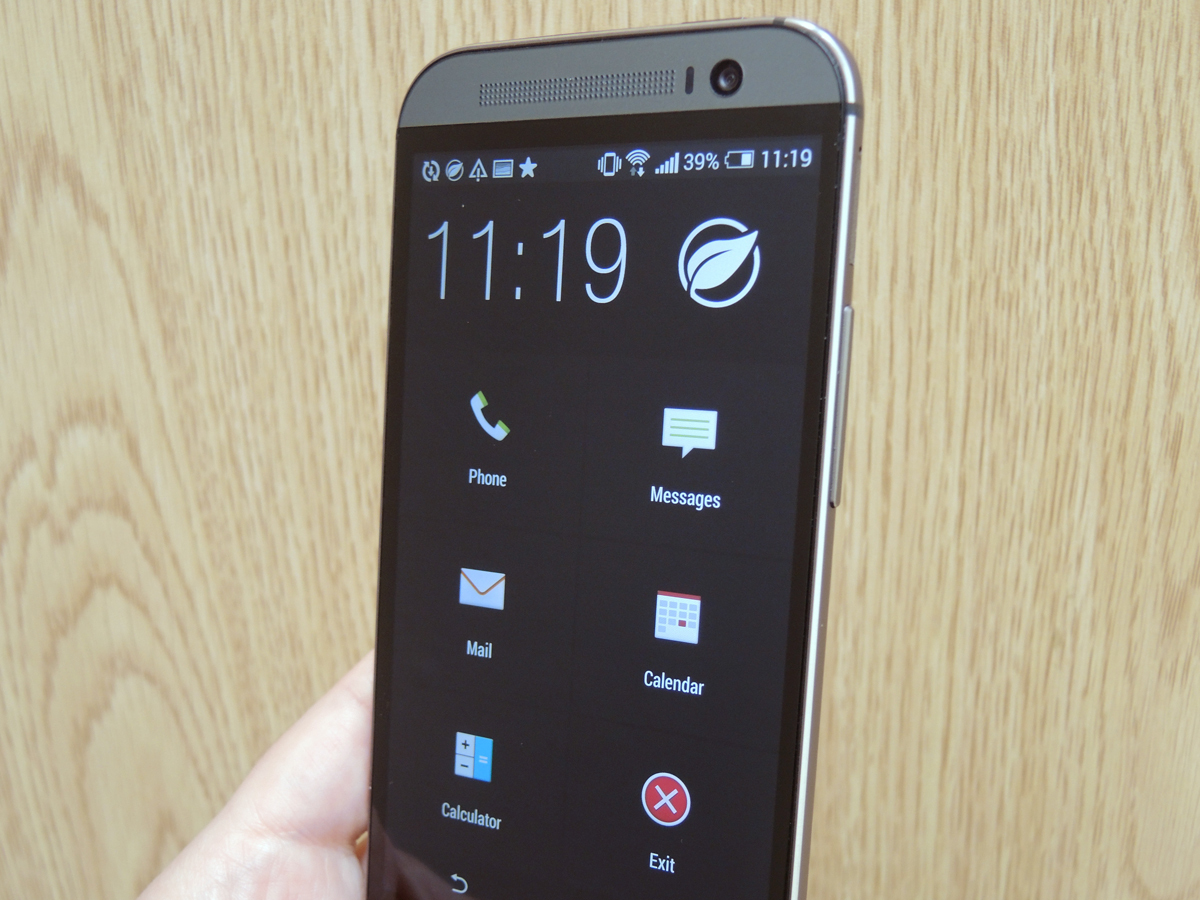
Pretty simple, this one. The old One had a 2300mAh battery, the new One (M8) has a 2600mAh battery. It’s little surprise, then, that the M8 outlasts its predecessor. What’s more surprising is that in our usual battery rundown test (looping HD video, half brightness, Wi-Fi on) the One (M8) matched the LG G2’s power drain, dropping a mere 6% every hour.
That’s impressive, but it doesn’t mean the HTC can match the superbly frugal LG in general use. In fact, over a weekend we found ourselves charging the One M8 just as much as the regular One – it’ll last the day but not much more. Unless, that is, you deploy its genius Extreme Power Saving mode, which kills everything apart from a Kids Mode-style screen of Phone, Messages, Emails, Calendar, Calculator and a big Exit tile. More than worth it for a 40% longer battery.
More intelligent news
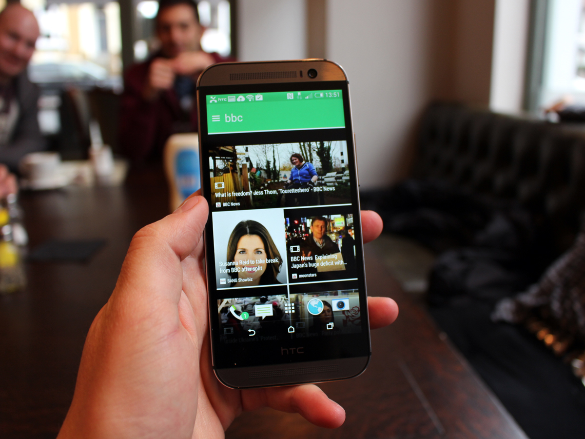
The One (M8) brings with it the new version of HTC Sense, Sense 6.0, and while it’s overall not a huge departure from 5.0, the sixth Sense (HTC’s pun, not ours) does make Blinkfeed even more awesome.
For those who aren’t already familiar with it, Blinkfeed collects social media posts and news from your favourite sources, together with calendar appointments, and gathers them in a beautifully presented pane of your Home screen. You’re not just limited to the 1400-odd official HTC content partners, but can add any RSS feed you like. More impressively, the HTC now monitors your activity, works out what most interests you and presents that first. Make it your default Home screen and every time you turn the phone on you’re treated to a snap shot of the news and friends’ activity that’s most interesting to you. In the time we had with it, Sense 6 Blinkfeed was brilliant, and it should become even better the more you use it.
More sensors


Well, just one more sensor – a barometer – but what’s clever is that several of the existing sensors (gyro, accelerometer, proximity sensor) now remain awake even when the phone is asleep. This always-on Sensor Hub means some fun new features such as integrated Fitbit tracking – you can now track steps, distance and calories without a physical tracker as on the iPhone 5s.
It also introduces LG G2-like wake functions. When the screen is off you can double-tap to wake it and double-tap to blank it again, allowing you to quickly check the time or your updates. You can also swipe in from the right to get to your homescreen, or from the left to fully open Blinkfeed. From the bottom unlocks to the last app you had open, and from the top is voice calls. It all makes the One (M8) a quicker, slicker device day-to-days.
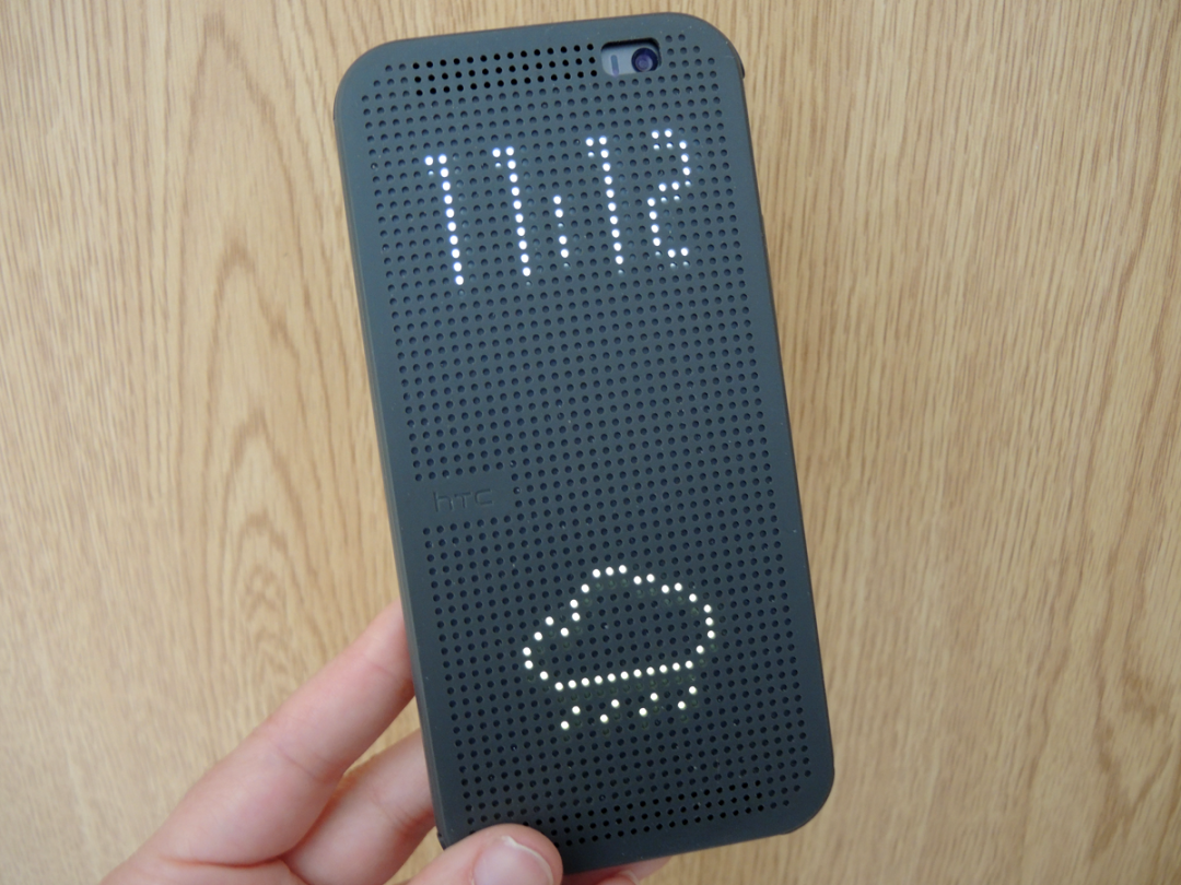
Perhaps the most awesome use of the new sensors, though, is the Dot View Case (£tba). Double tap its rubbery dot-matrix cover to get retro time and weather updates or see if that vibration was a message or email. And turn morning alarms off by swiping the clock animation through the case. We’re loathe to cover the One (M8) up but Dot View wins us over.
Watch Motion Launch & Dot View Case in Action
More volume
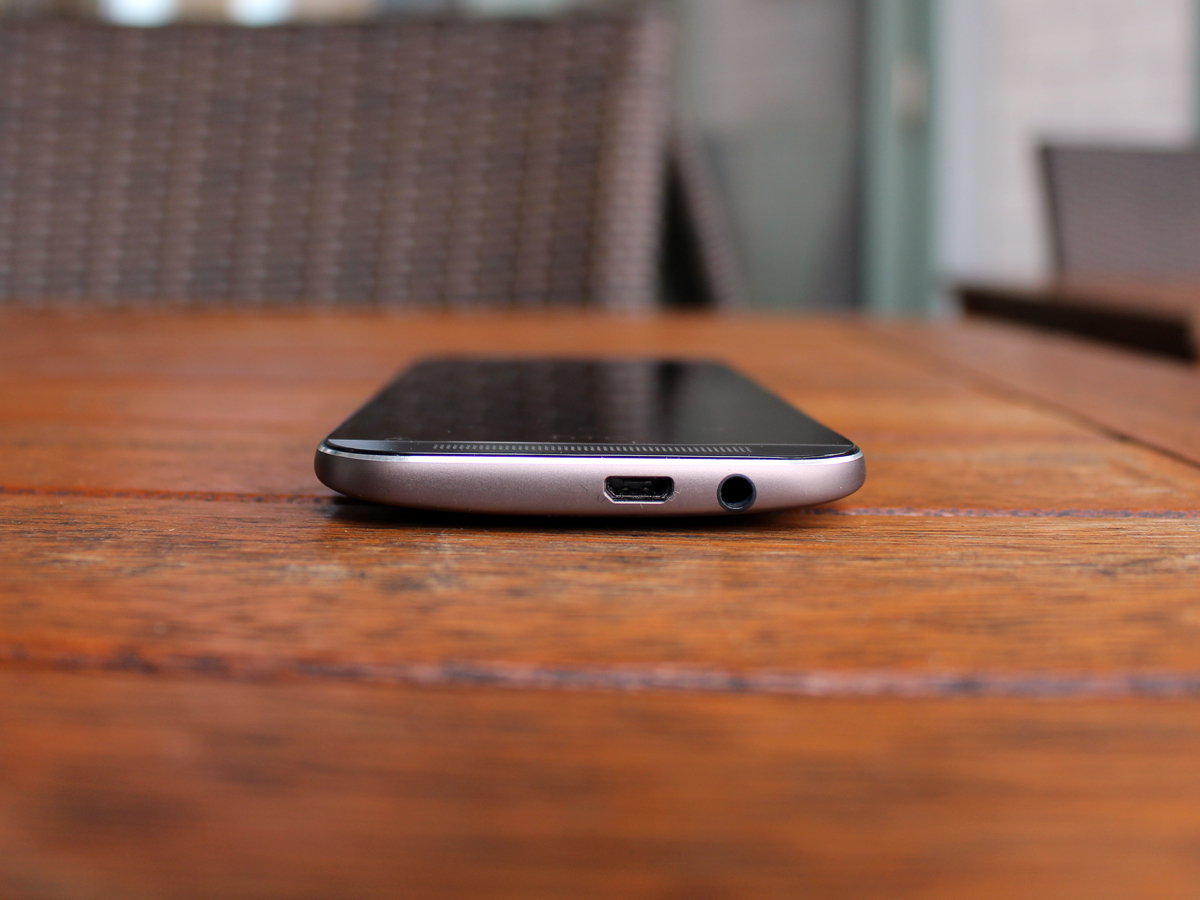
HTC and Beats have parted company, but that doesn’t mean the new One isn’t serious about sound. On the contrary, the BoomSound stereo speakers at the top and bottom are 25% louder than those on the previous One, which is obviously brilliant news for anyone trying to have a peaceful journey to work on the bus.
In fairness, the speakers do also sound better than before, producing clearer voices from YouTube videos and less tinny audio from games, but honestly, unless you really need someone else to hear what you’re playing, please use headphones – they sound infinitely better and they won’t annoy everyone around you.
HTC One (M8) Verdict
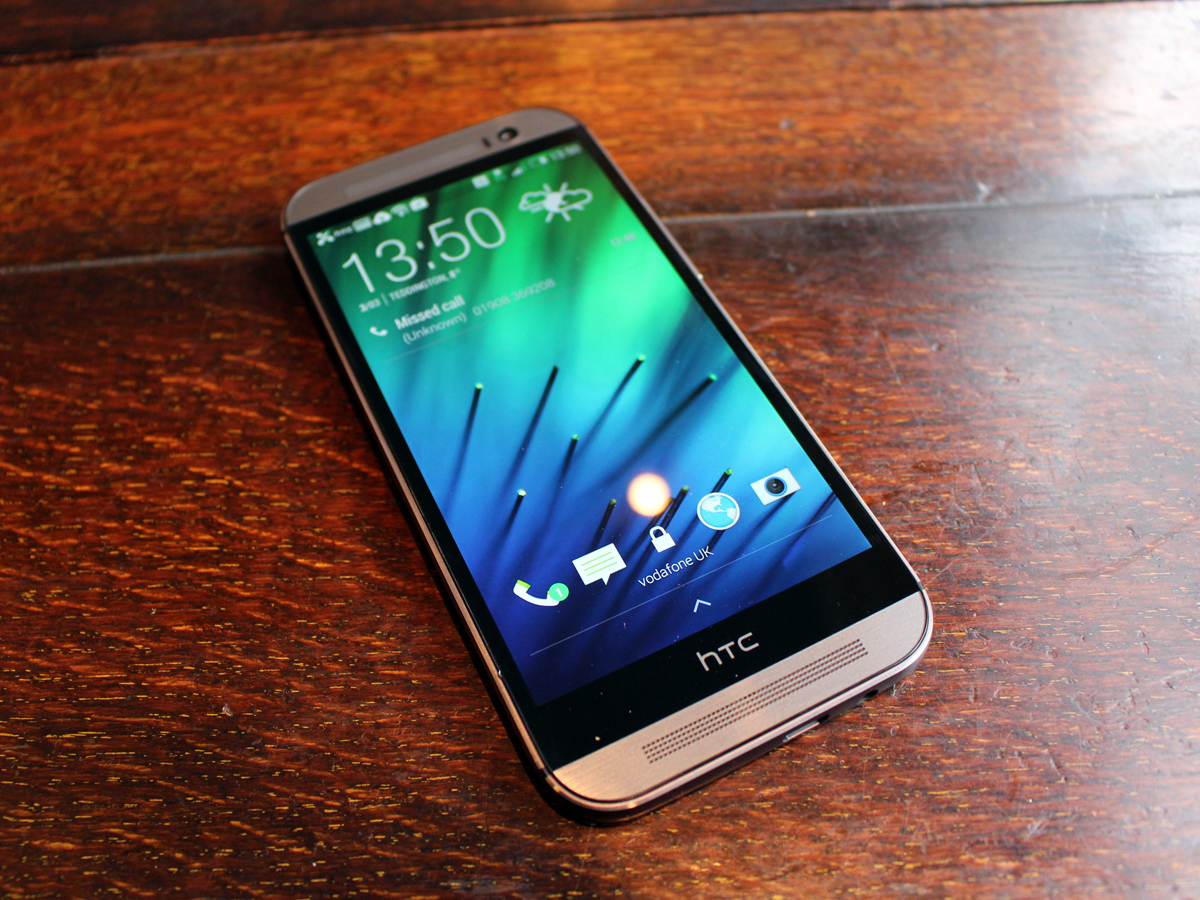
Chucking more of everything at your flagship phone seems an all-too easy way to get yourself to the top, but in HTC’s defence it’s not nearly as simple as it sounds.
There’s a careful balancing act to be achieved. A bigger screen requires more power, more power requires more battery, and all of these things require more room – hard to find without messing up a design thought by many to be the most stylish ever to grace an Android handset.
But HTC has achieved just that with the One (M8), and introduced other features that might initially seem comparatively trivial but could well be the things that people use and appreciate most on a daily basis.
Within a matter of weeks we’re going to see the arrival of the Samsung Galaxy S5, Sony Xperia Z2 and possibly even the LG G3. We’ll be mighty surprised if every one of them isn’t more powerful and more pixel-packed than the M8.
But will they actually perform better, and will they be as nice to hold and to live with? That’s far less certain – but it won’t be long before we find out. Until then, enjoy your time at the top, HTC.
HTC One (M8) – your questions answered
Stuff Says…
A truly brilliant, beautiful smartphone, and a new benchmark for 2014’s other flagships to beat
Good Stuff
The most powerful phone we’ve tested
Beautiful build and styling
Slick, fluid and flawless in operation
Fun and useful camera features
Bad Stuff
UltraPixels prioritise light over detail
Won’t stay top of the power charts for long


