HTC One Max review
A bigger, fingerprint reading version of the HTC One should be nerd nirvana. But has HTC got its phablet sums right?
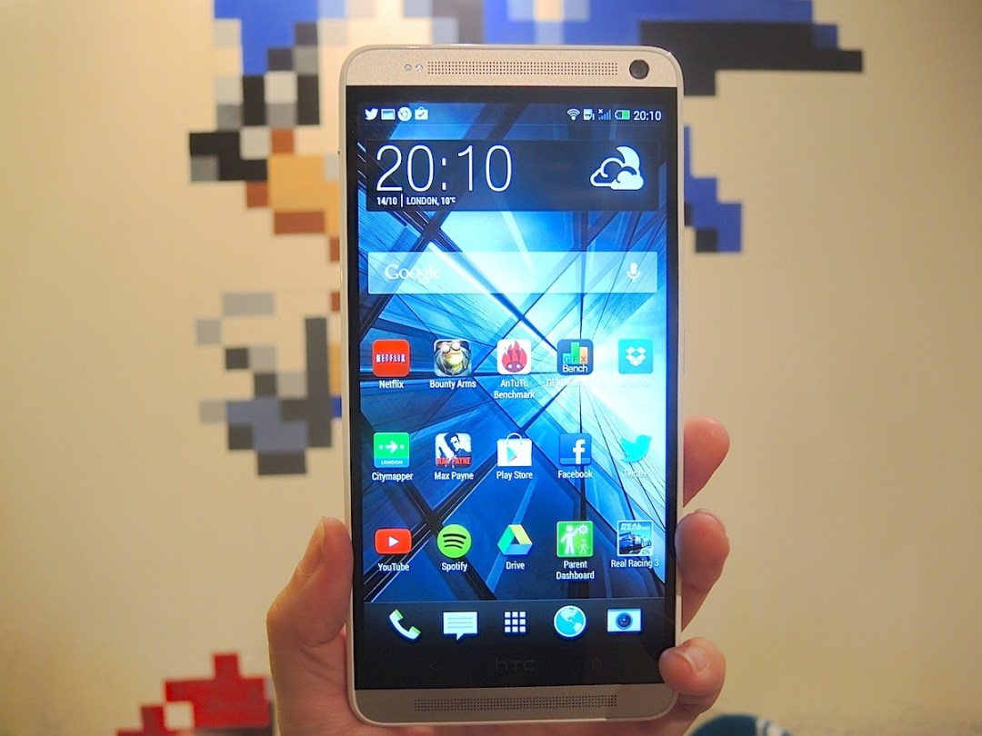
We love the HTC One even after eight months, so the prospect of having even more One in our palms made the Stuff team downright giddy with excitement.
Not just bigger, the One Max promises to be the boldest HTC handset ever, launching with the latest version of Sense (5.5) before the One gets it, rocking an in-vogue fingerprint reader and apparently banishing the few niggles we had with the HTC One. So there’s now a 3,300 mAh battery so that the One Max actually lasts a day of heavy-duty browsing, WhatsApping and gaming, while storage issues are no more thanks to space to expand the built-in space by up to 64GB. What’s more, HTC has built a phablet its own way: lashings of cool aluminium, front-facing BoomSound speakers, and substantial, premium-feeling weight. This is not a gadget of compromise.
And yet a phablet is about compromise. It’s about straddling the line between hand-friendly phone and screentastic tablet, and if it goes wrong you can find yourself either still longing for a bigger screen or taking phone calls by talking into a massive slab of face pavement.
Samsung’s now had three attempts to get its Note right, and it’s settled on a 5.7in Full HD Super AMOLED. If screen size is all you care about then the One Max’s 5.9in Full HD LCD makes it a clear winner.
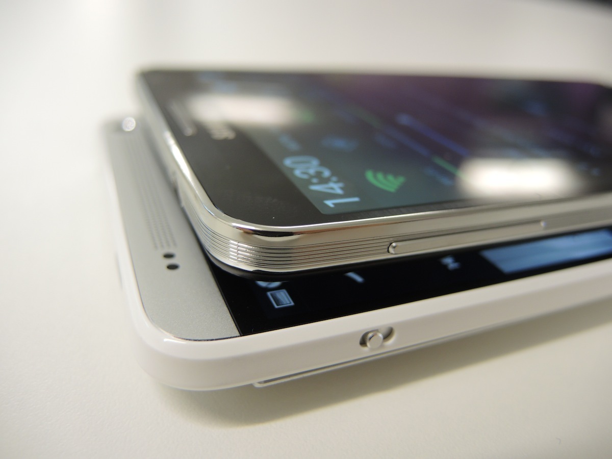
But take out your maths book and do a bit of working out (yep, that’s how we roll) and it turns out the One Max is 31.5% heavier, 24% chunkier and 9% taller than the Galaxy Note 3 – is all that extra heft worth it for 0.2in of diagonal screen space – or for maths fans, just 4.5% more screen real estate?
Still, if you can manhandle the One Max into submission, it’s a fantastic smartphone that beats the HTC One on a number of counts – bigger screen, battery and storage being three big’uns. But with such a substantial palmprint is this enough to join the Galaxy Note 3 at phablet the top table?
Design and Build – Mad Max
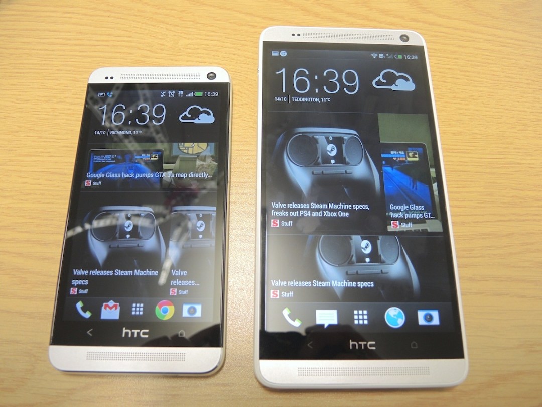


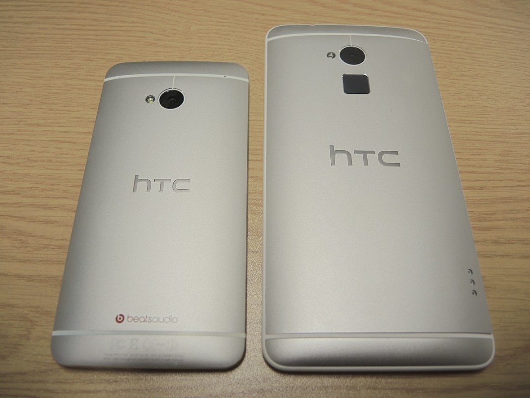
Every smartphone apart from the iPhone seems to be getting the Violet Beauregarde treatment this year. Only instead of turning blue (it already did that) the Max has just morphed into a fatter, heavier version of the One.
Don’t get us wrong, to the untrained eye it looks like a straightforwardly bigger version of HTC’s 4.7in flagship. But we’ve been poring over handsets long enough to flinch ever so slightly at the white polycarbonate trim (seen first on the HTC One Mini) around the Max’s edges and nod in appreciation over the new power button placement halfway up the right hand side (the IR blaster stays put on top). There are also three pogo pins near to the bottom of the right-hand edge on the back that connect it to an extra power-packing Flip Case.
And this time the brushed aluminium back comes off. Still feeling solid as a whole, a small toggle on the left-hand side allows the back to be peeled off – on our unit, it doesn’t sit completely flush to the sides but we’re assured this is just a symptom of an early review sample and not indicative of what you’ll be buying. And quite right, too.
Inside, goodies include a microSIM slot and microSD card slot (more on that later) but that 3,300mAh battery is sealed-in tight. We’ll let you know if we see any gadget torturers from elsewhere on the web prising it out for an upgrade.
Overall the One Max feels slightly less polished and premium than the One, and that’s certainly partly on account of its almost comical size. By comparison the Galaxy Note 3 is much lighter, more compact and easy to manage one-handed than the One Max (although the less said about Samsung’s faux leather look, the better). This is the kind of phone you’ll drop on your own face when you try to take an early morning phone call from bed. Or play hot potato with as it slips through your hand or tips to one side in portrait. Simply put, the magic maths of Big Screen + Hand-friendly Size isn’t quite there with the One Max, so it’s imperative that you try it out in your own paws before you take the £600 plunge.
Fingerprint Scanner – Beta Max
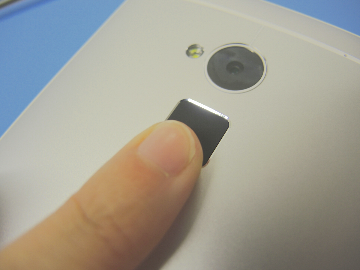
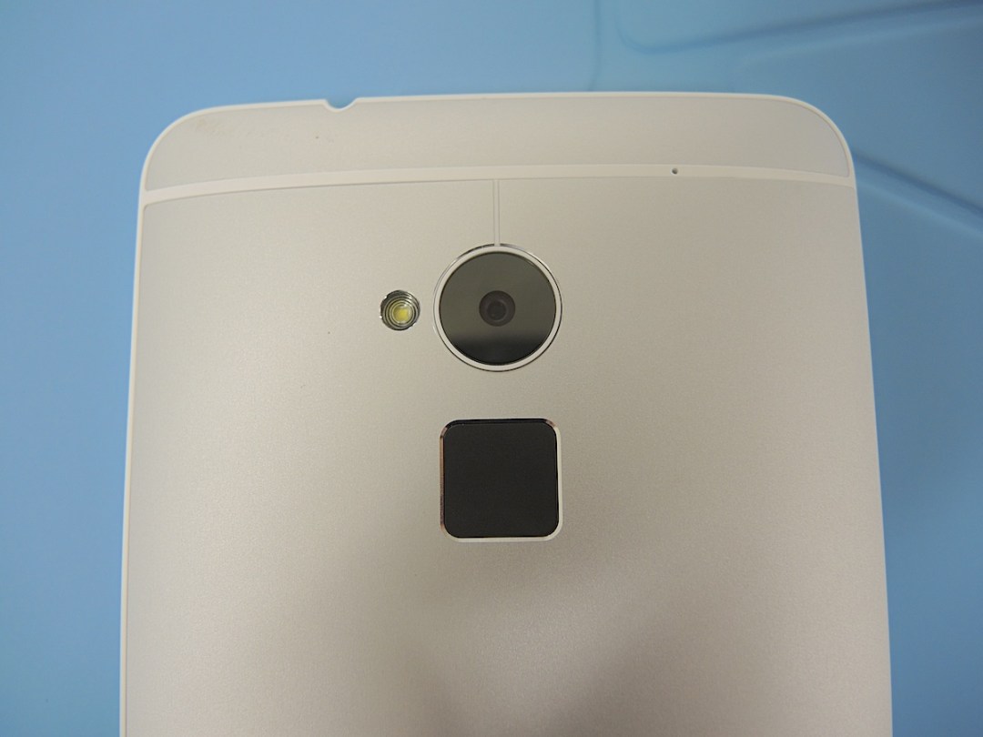
HTC’s big gamble with the One Max, which in all other respects is a blown-up HTC One, is the fingerprint reader beneath the rear camera lens.
Swiping your finger down the blank grey-black square on the back – old school compared to the iPhone 5s’ Touch ID Home button press – can be used to unlock your One Max without a PIN and launch specific apps. Up to three digits can be scanned in, which makes sense considering your thumb and little finger should be grasping your slab of a phone as if their very existence depends upon not dropping it.
It’s quicker to set up than Touch ID, but the One Max is fatally slower at recognising your prints. And while we’re not averse to a pleasing gadget rear, stroking the back of your phone feels downright weird just to open an app.
It’s almost exactly the same idea as Apple’s Touch ID system – apart from Apple using it to verify app purchases – but on the iPhone it’s a much more thoughtful and elegantly executed feature. On the One Max we turned it off after day three, on the iPhone 5s we locked our phone just to have another go.
We’re excited to see if any third-party apps make use of the One Max’s fingerprint reader in interesting ways, but for now it’s too slow to be of any real use.
Screen – as huge and stunning as expected
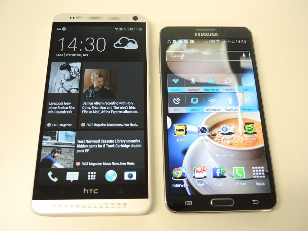


Any gripes you have with the One Max’s build or fingerprint tech instantly disappear as soon as you load up a good looking movie or luscious game on the 5.9in Full HD screen.
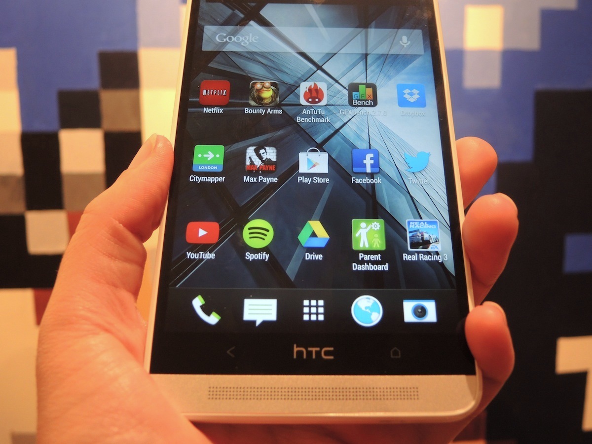
It’s a great size to watch movies on, so you can ditch the plan to buy a Nexus 7 and use it in landscape as a (admittedly very expensive) mini tab. Everything in Sense is now more spaced out, too, and there are rows five-apps wide instead of four on the homescreens.
Webpages load very large by default, and changing the phone’s font settings only effects text within Sense, so it’s worth paying a visit to your chosen browser’s settings to scale down the text. On the Stuff.tv homepage, 50% on the accessibility slider worked a treat so that we could zoom out and see more stories, making use of the extra screen space. Other apps, such as Facebook, will scale up your news feed, so the extra space doesn’t actually equate to more information.
With a cooler and more realistic colour palette than the Note 3 (even in the latter’s muted Professional Photo and movie modes), the One Max’s screen is still punchy, engaging and detailed. With a slightly lower ppi than the Samsung (due to the bigger screen), it’s occasionally caught out – with hi-res images, for instance – but largely when viewing webpages the supreme contrast and clear resolution make for fonts that appear lovely and smooth.
It’s fair to say that the Note 3 has a marginally better off-axis picture, and if you like your colours vivid enough to give you sunburn you’ll love its Dynamic mode, but if accuracy matters to you (and we think it should), the One Max is a real winner.
HTC One Max Tech Specs
Sense 5.5 – a small triumph for an Android skin
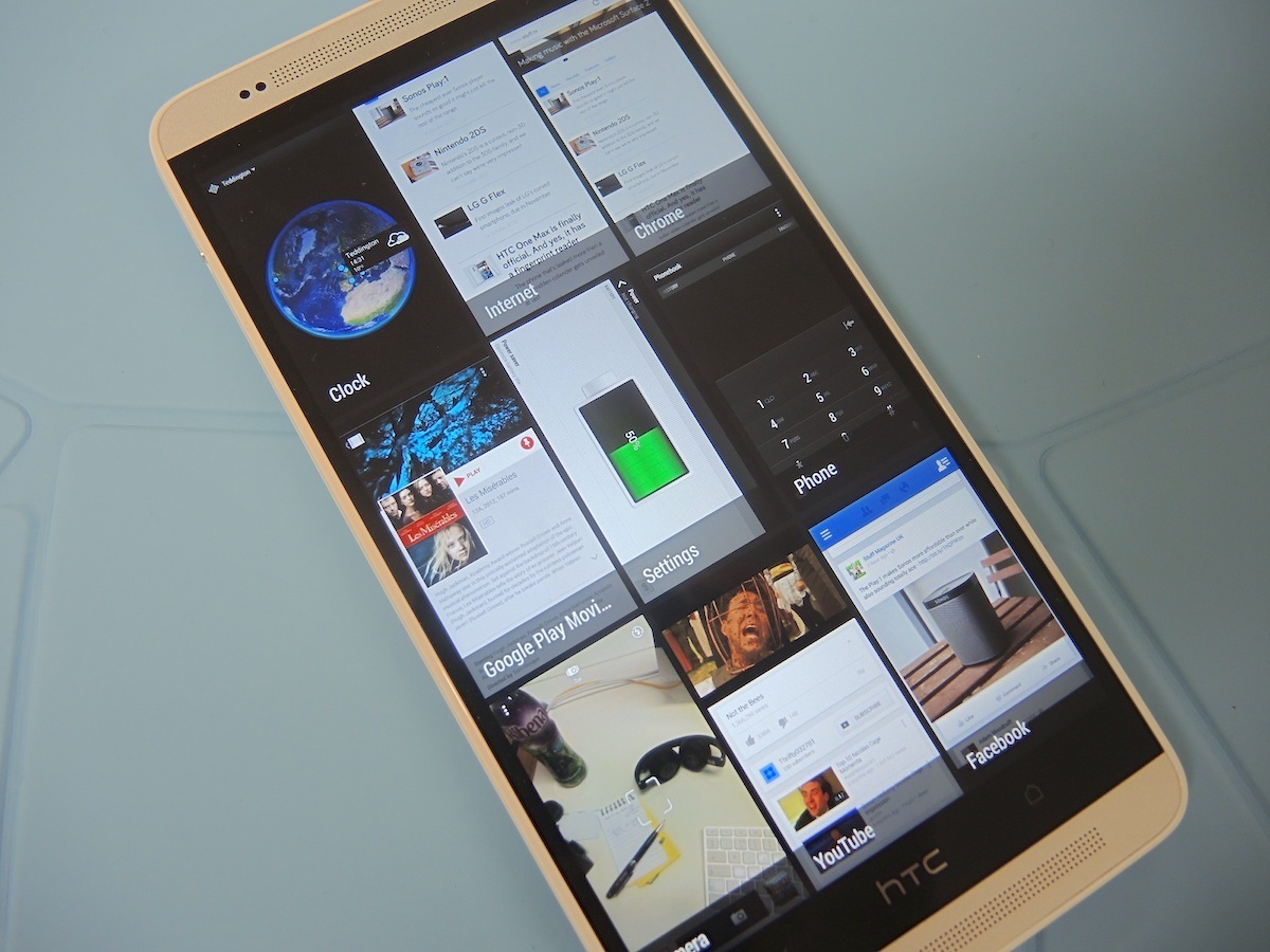
Launching with Android 4.3 out of the box within a week of the (probable) 4.4 KitKat launch isn’t much to brag about. But actually HTC’s Sense 5.5 skin really is. And it’s another way in which the One Max gets one over the original One.
And besides, with Google shifting most of its updates to individual apps (Drive, Keep, Maps, Gmail) rather than doing the whole lot with each new iteration of Android, keeping up with the Nexii is becoming less important.
Sense 5.5 was already a great, grown-up Android skin, and adding just a few meaningful tweaks has worked wonders. Thankfully the One and One Mini will be getting the same update within the next few weeks.
The multi-tasking panel, still accessed by a double-tap of the Home button, now has bigger thumbnails that fill the screen so you can actually see what’s happening within each app. Tweaks to the quick settings grid include Fingerprint scan, the new Do Not Disturb mode and Wi-Fi Hotspot toggles.
HTC has also added its own S-Note rival, Scribble – although there’s no built in stylus and far more limited integration than you’ll find on the Note 3. Compared to the S Pen’s heady list of hovering, cutting-out and multi-tasking tricks, a bolt-on notes app from HTC doesn’t really cut the mustard. Finally, Beats Audio is gone – both from the One Max’s internals and as a logo from the back – and we can’t say we’re sorry to see it go.
HTC One Max sound quality
BlinkFeed – you can now delete it, but you shouldn’t (and not just because Stuff is on it)
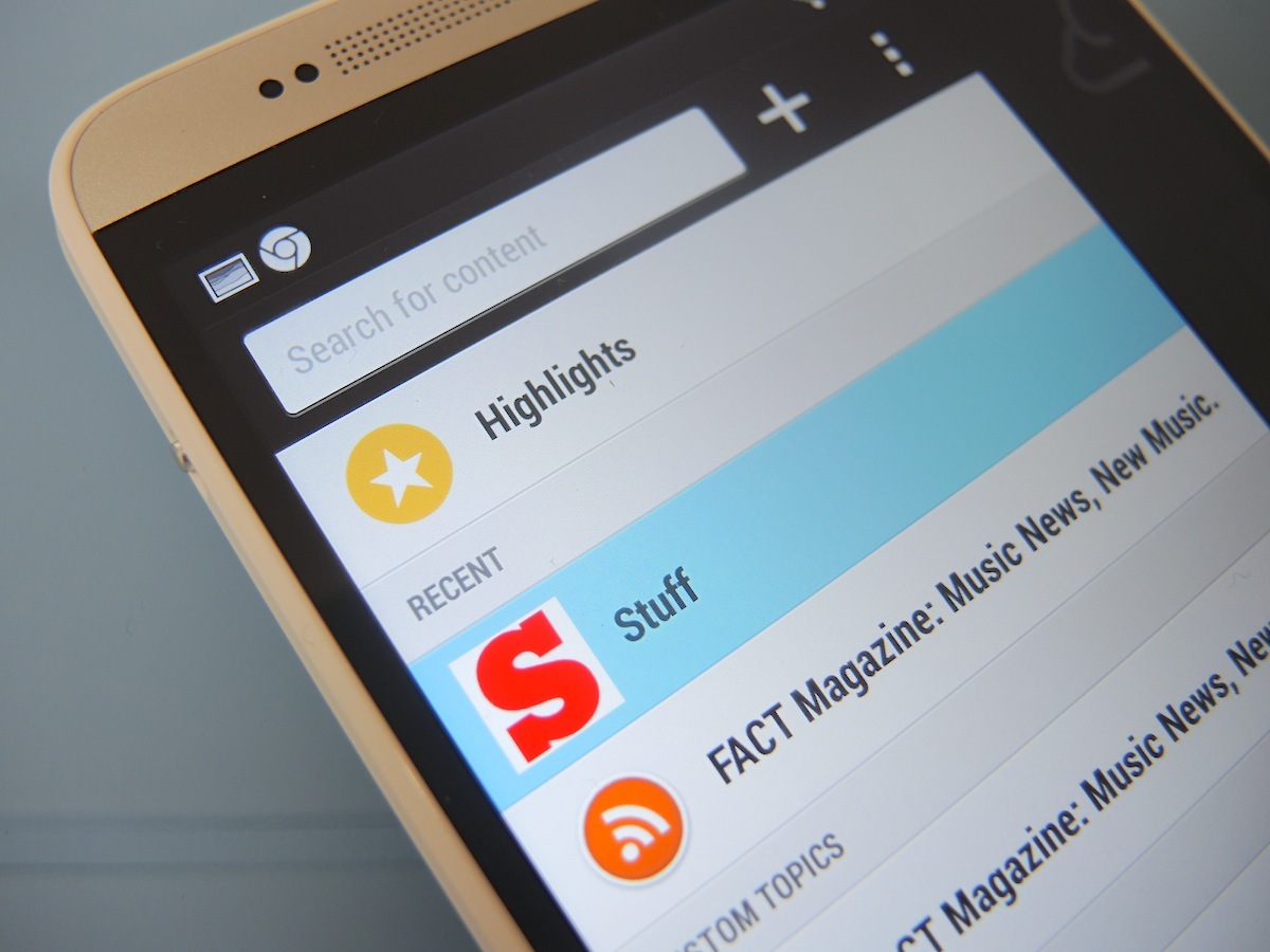
The best bit of Sense 5.5 is BlinkFeed, and one of the best things about BlinkFeed (at least as some will see it) is that you can now turn it off via the homepage management and widgets screen. We’re not kidding – it’s great that HTC has built this option in for anyone who just wants regular homescreens. But funnily enough, with its new feature set, you’ll no longer want to get rid of HTC’s Flipboard rival.
Swipe to the right of the regular BlinkFeed panels to access feeds (now including Instagram and Google+), settings and search. First up, you can add RSS feeds to Blinkfeed as well as the predetermined list of sites and ‘topics’ you’re used to. Just don’t be disappointed that the tiles aren’t full image bleeds like the posts pulled in from Facebook. More importantly, this means you can build an homage to your now-dead Google Reader on your phone – although admittedly without desktop support. Some RSS feed links are tricky to find but just look for the orange RSS icon and when in doubt hit ‘view RSS XML’.
HTC has also thrown proper search into the mix, and for free – unlike the excellent Feedly. As well as returning Twitter users and YouTube videos alongside text articles, you can also view a custom feed of one search term to keep on top of your favourite topics.
Offline reading is another welcome addition that’s missing from most free readers – choose from text only or full articles and these ‘read later’ articles will be housed in the Reading list tab under Highlights. The feature isn’t compatible with every RSS feed yet, but it’s already exceptionally handy.
Camera – Still the chink in HTC’s aluminium armour
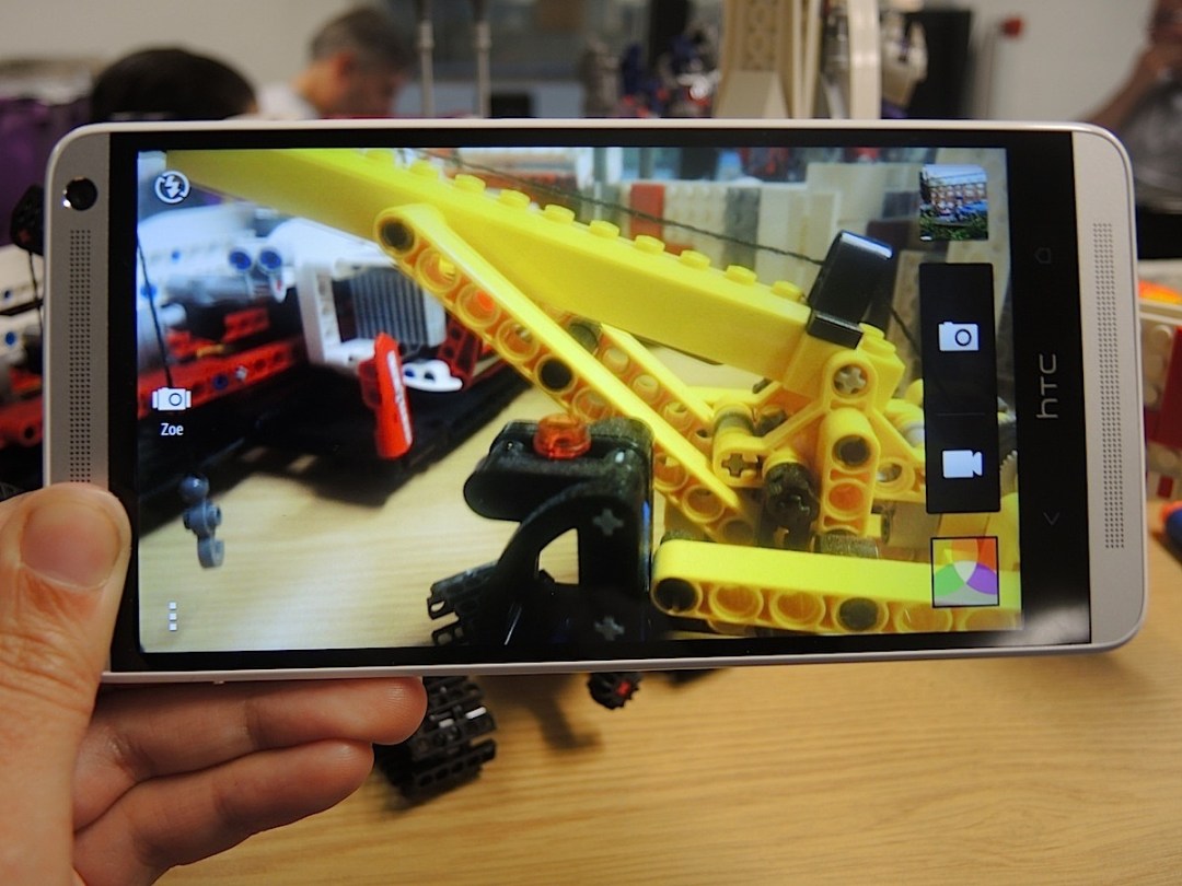
If you’re happy to buy a phone this big, perhaps camera quality isn’t your biggest concern (seriously, don’t be that guy at the gig), but while it stops short of the best, the Max’s rear cam is reliable enough. Sticking with the One’s UltraPixel system of larger pixels – we think 4MP but HTC hasn’t specified – plus a f/2.0 aperture and BSI sensor, results are unsurprisingly similar to its smaller comrade.
That means capturing bright and vibrant colours with impressive contrast and an impressive low light performance, especially when Night mode is unleashed. But detail is a bit lacking, both indoors and out, especially when shooting at a distance. The HDR mode on the Note 3 is much more capable, too, and with the One’s optical image stabilisation missing on the One Max, the ability to shoot smooth 1080p video on the fly suffers, even with the digital anti-shake option turned on.
With me-too features such as Dual Capture (stick your face in the scene for no reason!), the most exciting tweaks are actually in the editing suite. HTC Zoe – its insanely useful photo’n’video capture tool – is now listed in the photo capture modes as well as keeping its handy spot on the left hand side of the camera app. And it now comes with a GIF creator/editor – add effects, change speeds and yo-yo the footage on a loop before sharing in various file sizes to the usual social media suspects.
Video Highlights, which creates automatic montages of stills and video grouped together in one Event, has been improved, too. There are more editing styles to try out and you can now add your own music with magic beat-mapping to match the cuts. It’s an addition that we love – just be careful of Facebook’s strict copyright policies or you’ll be one instructional Rubik’s Cube video away from a ban.
Performance – (Not quite) Max Power
One criticism that spec junkies will aim at the One Max is that it’s running on the same quad-core Snapdragon 600 chip that beats inside the HTC One, despite all the big boys in the playground, such as the LG G2 and Galaxy Note 3, having moved onto the Snapdragon 800. At the pace smartphones move, this is as heinous as non-ironically playing on a Mega Drive when the PS4 lands.
The benchmarks backup the assumptions, and compared to the Note 3’s deadly Snapdragon 800 and 3GB of RAM combo, which scores 35311 on AnTuTu, the One Max can ‘only’ manage 19634. And yet back in reality the One Max runs very well indeed. We managed to flummox the One max a couple of times with real app abuse but the likes of Real Racing 3 look glorious and play gloriouser. We suspect in the coming months we’ll find games that make the One Max stutter, but they’re not available just yet.
It scores 1195.8ms on the SunSpider web browsing benchmark and both big games (we tried the 1.36GB Max Payne) and HD movies download very quickly over Wi-Fi.
The Note 3 also uses some of its extra silicon to process 4K video recording, but unless you’re going to break into Selfridges’ TV department no-one’s going to see that footage in all its glory for a fair while yet.
In the end both the One Max and Note 3 are just almost entirely hiccup-free in day-to-day handling, but the Galaxy looks to be the more obviously futureproof phone, and that may be something to consider if you’re signing up for a two-year contract.
Storage – Max out at 96GB, more than enough
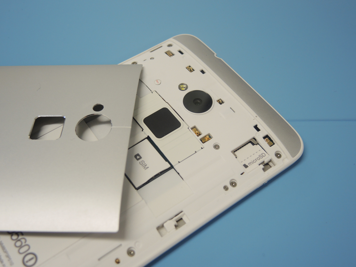
More good news for HTC fanboys getting Mutant Ninja Turtle-green with envy over Samsung’s love affair with microSD card support. Whereas the One comes in non-expandable 32GB and 64GB flavours, the One Max opts for 16GB or 32GB models but with – joy – microSD expandability by up to 64GB.
Pricing hasn’t yet been confirmed by HTC (we’ll update as soon as it has) but we anticipate the smaller model saving most buyers a fair bit of cash – power users who don’t have to splurge on a 64GB model and casual users who can make do with 16GB.
HTC has also ditched its free Dropbox space offer and replaced it with a similar Google Drive bundle. Just open up Drive from the One Max and you’ll be rewarded with 50GB of free cloud storage for two years. Nice.
Battery life – an HTC One handset that lasts the day
In stamina, too, the One Max lives up to its moniker – even with that humongous screen. One of the big reasons the HTC One dropped from the top spot in our list of the best smartphones in the world (link) is the handset’s slightly compromised battery life.
Verdict – a fine first phablet from HTC
The One Max is a true phablet in that it makes your whole gadget haul simpler – instead of doubling-up on devices that do many of the same things you can keep a big tablet or laptop at home and manage brilliantly throughout the day on this single device.
Bar a few viewing angle issues, the One Max’s bright, sharp, accurate screen is the finest yet to adorn a phablet. Couple that with a rebooted version of our favourite Android skin, bags of storage available via microSD and an all-day battery life and it looks like the Galaxy Note 3 could be in trouble.
But while this HTC looks more stylish and feels more premium than the Note 3’s plastic and faux leather shenanigans, the One Max isn’t quite as elegant as the HTC One and the extra bulk and weight over the Note 3 isn’t quite worth it for that little bit of extra screen. In the end the Note 3 gets the balance between phone and tablet more right, and to us that’s really the point of a phablet. But if your belief is that the best phablet is simply the phone with the biggest, best screen, you certainly won’t be disappointed if you fill your boots (and hands) with the One Max.
Review by Sophie Charara
Stuff Says…
Gorgeous screen, slick Sense and superb battery life but the max doesn’t quite master its phablet maths
Good Stuff
Beautiful screen, once again
Sense 5.5 and really useful BlinkFeed
Expandable storage, huge battery
Bad Stuff
Doesn’t quite match build of HTC One
No stylus
Heavy and big so could spell pocket trouble


