Apple iPhone 14 Pro Max review: more iPhone in every sense
Apple revamps its flagship phone in many meaningful ways – but it comes at a significant price

The iPhone 14 Pro flagship smartphone boasts an updated design including the notch successor and expand-o-lozenge Dynamic Island.
Elsewhere, the Apple iPhone 14 Pro Max gets display changes, a Pro-exclusive A16 chip and a camera revamp put more clear water than usual between the Pro line and the standard iPhone 14, which this time has come down with a case of copy and paste.
Still, more meaningful separation between Apple’s ‘standard’ iPhone 14 and ‘premium’ blowers for the first time since 2017 will soothe the pain of the price hike, right? Right? Let’s find out in the Stuff iPhone 14 Pro Max review…
The original version of this review was published on 28 September 2022
Design: Happy pill

With the screen off, this phone resembles its predecessor – but is a little bit… maxier. You won’t notice any weight difference coming from a 13 Pro Max unless you moonlight as a set of scales, but 14g more over a 12 Pro Max is unwelcome. The extra depth is slight, but will impact on snug-fitting accessories.
Elsewhere, the stainless steel edges look great until you touch them, whereupon they’re fingerprint magnets. And the colour selection is the same boring hues we’ve come to expect.
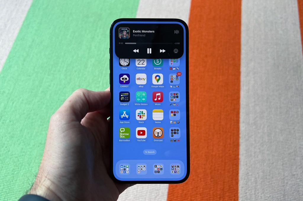
With the screen on, you notice the big change: Dynamic Island has replaced the notch. Whereas the notch somewhat vanished into the bezel, Dynamic Island is designed to stand out. It’s an interesting play by Apple, making a virtue of a cut-out, and in use Dynamic Island becomes a playful expand-o-pill.
Music and podcast apps minimise into it, as do directions and timers. If you’ve multiple background activities running, your iPhone figures out the two most important and provides live indicators for both. The illusion of hardware/software integration is only knocked slightly in very bright light, whereupon the outlines of hardware components become visible.
There are drawbacks: in landscape, Dynamic Island doesn’t do anything. Even in portrait, its prominence might grate. Several apps and games we tried had content that partly sat behind the pill. And, in truth, it feels more nice than vital. Still, the upcoming Live Activities API will soon allow sports scores and flight info to live in Dynamic Island, and further vindication exists in Android folks ripping off the concept and Apple fans mulling over whether it should come to iPad.
Display: The bright side
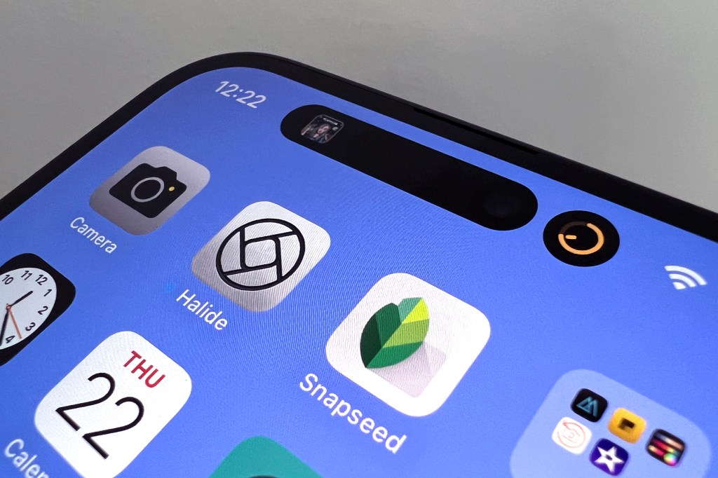
This year, we get a (relatively) minor change and a major one to the 120Hz display. The smaller update is a boost in brightness. HDR peak brightness is up from 1200 to 1600 nits. In sunlight, this ramps up to 2000 nits. Apple says the phone intelligently pushes brightness of the brighter pixels, to boost text legibility. In use, all this is noticeable, not least during rare UK days when the sun makes an appearance.
More noticeable is the always-on display. It borrows a trick from Apple Watch in fading your Lock Screen and reducing the refresh rate to just 1Hz. It’s… weird. At first, you think your iPhone’s broken because the screen never turns off unless it’s face-down or in a pocket, or you have the sleep Focus active. But in a cheapo desk stand, we liked how it displayed cycling wallpapers, the clock, and a handful of widgets.
The widgets feel version 1.0 though. They’re mono, which can make information hard to decipher – or render it entirely illegible – against busy photos. Apple’s current designers don’t do contrast. And when the Lock Screen fades, your Activity Rings don’t display information, which is baffling. Still: the always-on display is a meaningful evolution, and if you don’t like it, there’s an off switch in Settings.
Cameras: A prettier picture
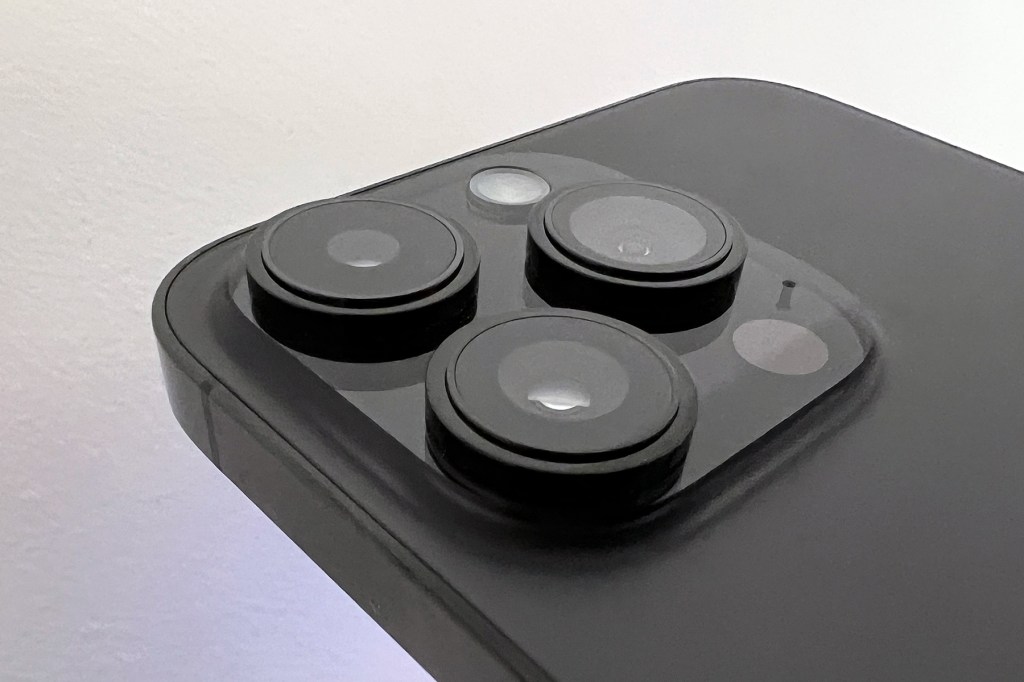
The 12MP ‘Wide’ camera is now the 48MP ‘Main’, with a quad-pixel sensor. Like many Android blowers, it uses pixel binning to combine four pixels into larger ‘virtual pixels’, resulting in brighter photos with less noise. The middle part of the quad-sensor enables a 2x telephoto without scaling, which is a good option for Portrait mode. (0.5x and 3x are your other optical zoom options.) Also, Apple’s Photonic Engine infuses signal processing smarts earlier in the computational photography process, further improving detail and dynamic range.
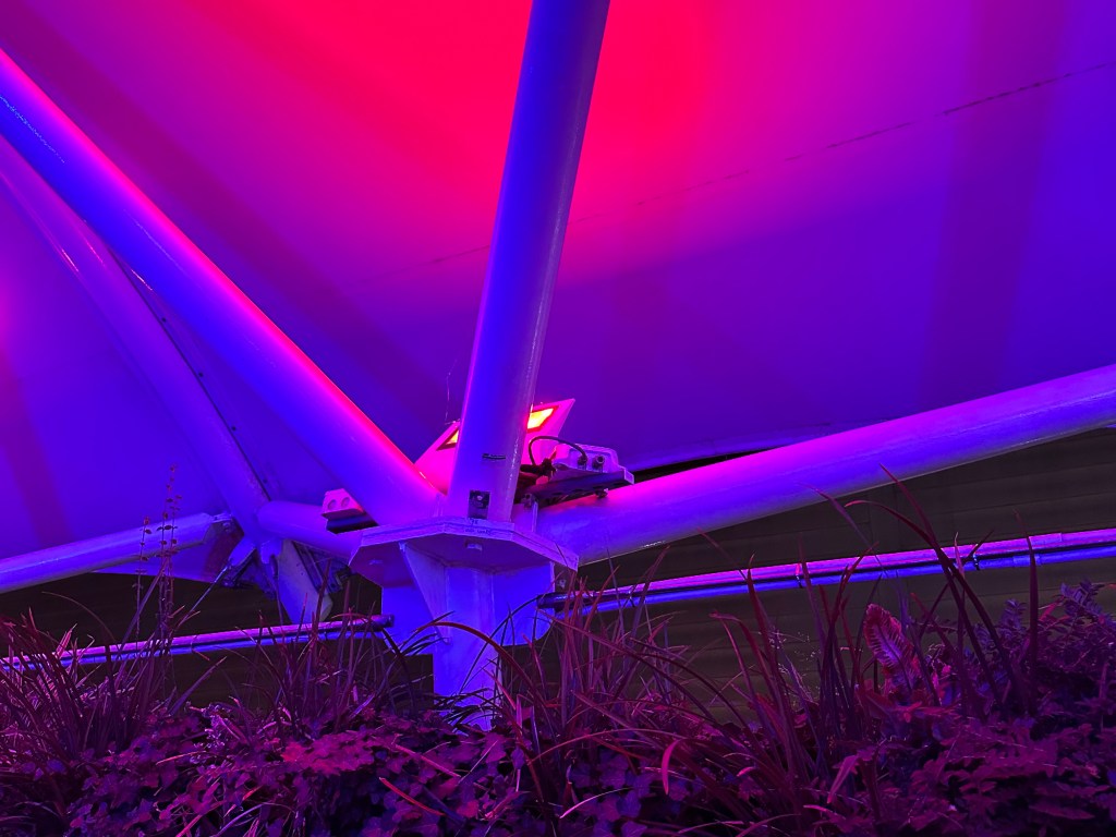
Standard snaps impress, although there is a tendency towards a touch too much contrast and sharpness. The system does improve details and textures over the 13 Pro Max, mind, and low-light shots – always top-notch on iPhone – are now even better. We like how it’s not afraid to allow a little vignetting and highlight blow-out – which might sound strange, but the photos you get feel more alive than those from devices that mute everything into a flat mess of nothingness.
ProRAW, turned on in Settings, lets you toggle 48MP snaps in the Main camera, bringing more detail at the expense of speed (shots take a half second or so to process), file size (RAW files are huge) and Live Photos (which are disabled in this mode). You probably won’t use ProRAW by default, but it’s a good option for key moments in your life you’d later look back on and wish you’d captured with more detail when using the standard 12MP.
Beyond that, the macro remains wonderful, selfies get a little more definition, and Action mode in video gives you a kind of software gimbal but crops your 4K footage down to achieve this. There will doubtless be people who crow that Android had a lot of these iPhone benefits for years, but Apple long objectively kept pace, even with lower specs on paper. It’s still behind on optical zoom compared to the likes of Samsung, but this Pro set-up ably cements this iPhone’s place among the very best smartphone snappers.




Performance and battery: Refine of the times
This time, Apple has for the first time not rolled out a new chip across its entire iPhone line. The vanilla 14 and its Max sibling make do with 2021’s A15 with more GPU clout, which Apple awkwardly tried to spin during its September keynote. Still, this further differentiates the Pro models.
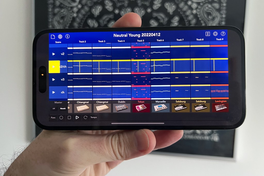
Running benchmarking numbers reveal performance is up around ten per cent. GPU memory bandwidth is up 50%, which aids games. Honestly, it’s hard to care about the details, though. Apple silicon long ago outpaced the majority of people’s needs, and is far ahead of the competition. During testing, nothing fazed this phone – photo retouching; running a DAW with a slew of virtual synths; video editing; games.
Battery life proved more uneven. Early on, we feared it was substandard compared to 2021’s Pro Max. But it can take iPhones a long time to settle after transferring data. After extended testing over a couple of weeks, the battery life seems… fine. We saw no obvious improvement over 2021’s flagship, but no major drop either – despite the always-on display. As ever, your mileage might vary, especially if you constantly hammer your 5G data connection, have the screen brightness maxed out, or spend hours playing games.
Random observations
- Like all new iPhones, this Pro Max has car-crash detection. Fortunately, we didn’t get to test that feature for this review, but it’s nice to know it exists.
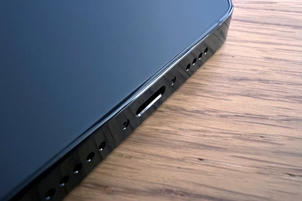
- Apple’s retained the Lightning port, which feels ridiculous on a phone that shoots RAW photos north of 70MB each. USB-C (or Thunderbolt) next time, please.
- Emergency SOS via Satellite arrives in November – but only in the US and Canada. So don’t get lost in the wilds of Basingstoke, far from a cell tower.
- However, outside of the US, you still get a SIM tray, so it’s swings and roundabouts really.
- The iOS app and game ecosystem remains far ahead of Android’s.
Apple iPhone 14 Pro Max verdict
On paper, the Apple iPhone 14 Pro Max is the firm’s best phone. It moves things on with Dynamic Island, the always-on display and an impressive camera revamp – all of which further differentiate this most premium of phones from the standard iPhone. But it’s also big, heavy and expensive. The elephant in the room is the larger UK price hike, which is down to the relative strengths of the US dollar and sterling – but your bank account doesn’t care about that.
If you’ve an existing 13 Pro Max, probably hang on to it. If you’re on a 12 Max, there’s enough here to warrant upgrading, even if some of those things are ‘in progress’. And if you’ve been mulling going Pro for a while, this is the time to do so, given the comparatively nothingy update the iPhone 14’s received.
It’s just a pity this coincides with your bank account getting a kicking. So on that note, also mull over if you could cope with less battery life, screen real estate and hand strain for the non-Max Pro, because the iPhone 14 Pro is equally good.
Stuff Says…
Meaningfully moves the Pro Max on for the first time since its inception – but all this quality comes at a price.
Pros
Impressive camera system
Industry-leading display
Dynamic Island is actually good
First-rate performance
Cons
Bulky and heavy
Hefty price hike
No USB-C
No optical zoom beyond 3x
Apple iPhone 14 Pro Max technical specifications
| Colours | Space Black/Silver/Gold/Deep Purple |
| Display | 6.7in 2796×1290 OLED HDR at 460ppi |
| Processor | A16 Bionic |
| RAM | 6GB |
| Storage | 128GB/256GB/512GB/1TB |
| OS | iOS 16 |
| Cameras | 48MP ƒ/1.78 main, 12MP ƒ/2.2 ultra wide, 12MP ƒ/2.8 telephoto (3× optical zoom in) rear; 12MP ƒ/1.9 front |
| Battery | 4,325 mAh (est.) |
| Dimensions | 77.6×160.7×7.85mm |
| Weight | 240g |
| Connectivity | Lightning |


