Mac OS X Yosemite hands-on preview
UPDATED 23/07/14: The Yosemite Beta is now available to all - we go hands-on to find out if you should dive in now
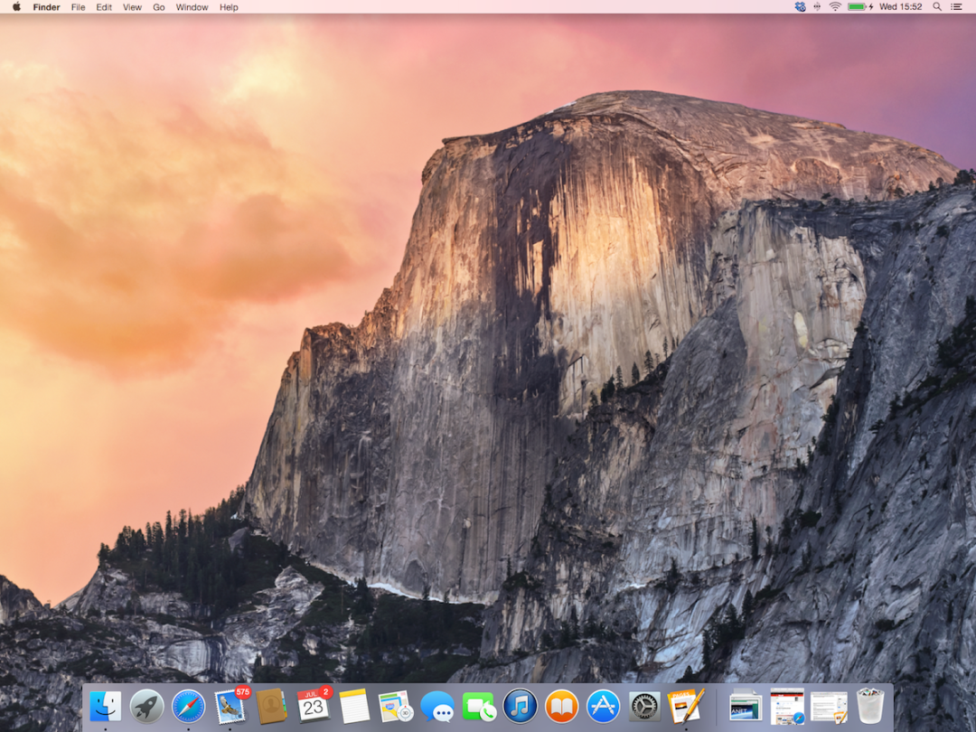
Apple’s latest and greatest OS – OS X 10.10 Yosemite – will be out later on this year, with plenty of new tweaks and tricks to entice new and faithful Mac users alike.
But you don’t have to wait until Autumn to give it a go. For the first time in its history Apple is launching a public beta – and it’s available right now (albeit limited to the first million people to sign up).
So should you dive into the shimmering Lake Yosemite right now or wait for the water to get a bit warmer? We’ve spent the last week finding out.
A prettier place to be

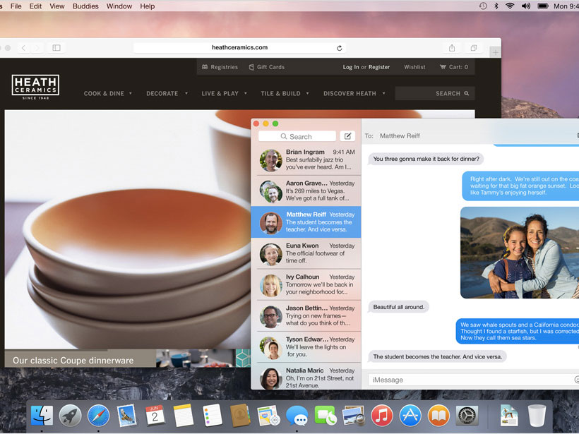
Like the Californian national park that shares its name, OS X Yosemite is a pleasure for your eyeballs. Apple has tightened up the design, with a flatter, simpler look to icons that’s lifted from iOS 7; it lends the Dock a much cleaner look and makes it more instinctively navigable.
And how about that new translucenct Trash icon? We’ve not been this excited about a desktop bin since the thrills of the Oscar the Grouch utility for Mac OS 7.1.
Translucency is actually a big theme here, and is used to give toolbars and sidebars a frosted glass-like effect, allowing you to see colour tones of background content through your foreground programmes. It’s terrifically pretty, but the level of transparency informs you only that there’s something behind the window you’re working on, rather than what it might be.
Prettiness for prettiness’ sake is fine by us, mind, and it doesn’t even really matter that this sort of thing was introduced first by Microsoft way back at the launch of Vista. We only wish Apple had also seen fit to pinch the auto-sizing of windows that leads to a pleasingly regimented arrangement of, er, windows in, um, Windows.
That hasn’t happened, but Toolbars have been tidied and streamlined. The Close, Minimise and Maximise buttons are now Close, Minimise and Full-screen. Maximise hasn’t moved elsewhere, it’s been relegated to a secret (OK, not actually secret) shortcut – press Alt while you click the Full-screen button and you’ll get the old-school Maximise, which means your window will fill most of the screen but leave the dock and menu bar visible.
Apple clearly wants people to use Full-screen, swiping from app to app using their MacBook’s touchpad. Honestly, that’s not a usage scenario we’ve managed to get used to just yet, but in a two-screen setup Full-screen works well, giving you a massive space for your most used app (in our case the web browser) while leaving your dock and an array of smaller windows available on the secondary screen.
And finally there’s the new font, which while not identical to that used in iOS 7 will feel immediately familiar to all those iPad and iPhone users out there. There are font bores in Stuff Towers (one of whom you’ll be hearing from in the next couple of days) who’ve taken against it in quite a big way, but to these eyes it’s a rather fetching blend of fun and function, and is never less than perfectly legible.
All-in-all the design changes are fairly subtle, which means existing Mac users will find themselves right at home in mere moments. Whether everyone will immediately take to the new icons and font is another matter, but we suspect that once those knees have stopped jerking most will agree that the cleaner look makes for a nicer overall user experience.
Glorious continuity
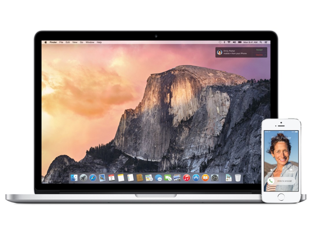
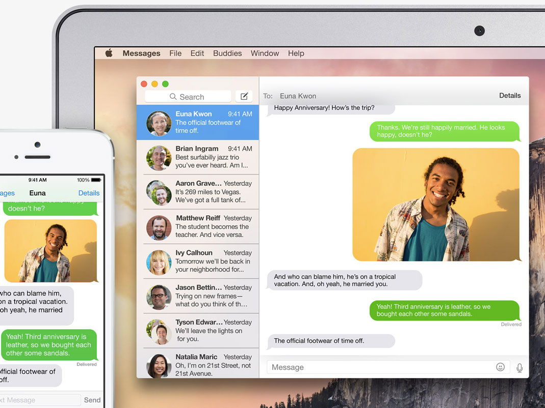
Continuity is perhaps the biggest and most exciting new feature in OS X Yosemite. Unfortunately it only works with iOS 8, which isn’t yet available to test. We have seen it in action, though, so read on for all the details.
During its launch at WWDC, Apple stressed how important it was for it to create a seamless experience between all of its iDevices and Macs, and Yosemite absolutely looks like it’s set to deliver just that. And then some.
For starters, Macs and iDevices will be able to automatically recognise when they’re near each other, connecting between themselves without you having to lift a finger. And it opens up a box of very powerful tricks.
Take phone calls for example. Imagine if you’re on your iMac, doing important… iMac things, and your iPhone’s charging away in your bedroom.
All of a sudden, you get a phone call, and you’re tripping over Barbie’s Selfie Summerhouse in an attempt to make it to your iPhone on time. With Yosemite and iOS 8, instead of crushing your little girl’s dreams, you’ll get a notification on your Mac desktop to tell you who’s calling.
You can choose to reject the call, or answer it and carry out the phone call directly on your Mac, while the iPhone remains in the other room. Impressive, no?
Messages get the same treatment. You can now send and receive SMS, MMS and new audio clip messages directly from your Mac – regardless of whether or not they’re being sent, or received from, an iPhone. The only exception to non-iOS devices might be audio clips, but this has yet to be confirmed.
Another big benefit of your Mac automatically connecting with your iPhone is that you’re able to use OS X Yosemite’s new Instant Hotspot function.
If the Wi-Fi at your local Starbucks conks out due to a mocha explosion, then all you have to do is selected your automatically connected iPhone in the Wi-Fi menu, and boom – you’re hooked up to mobile data in an instant – no passwords required.
Very handy
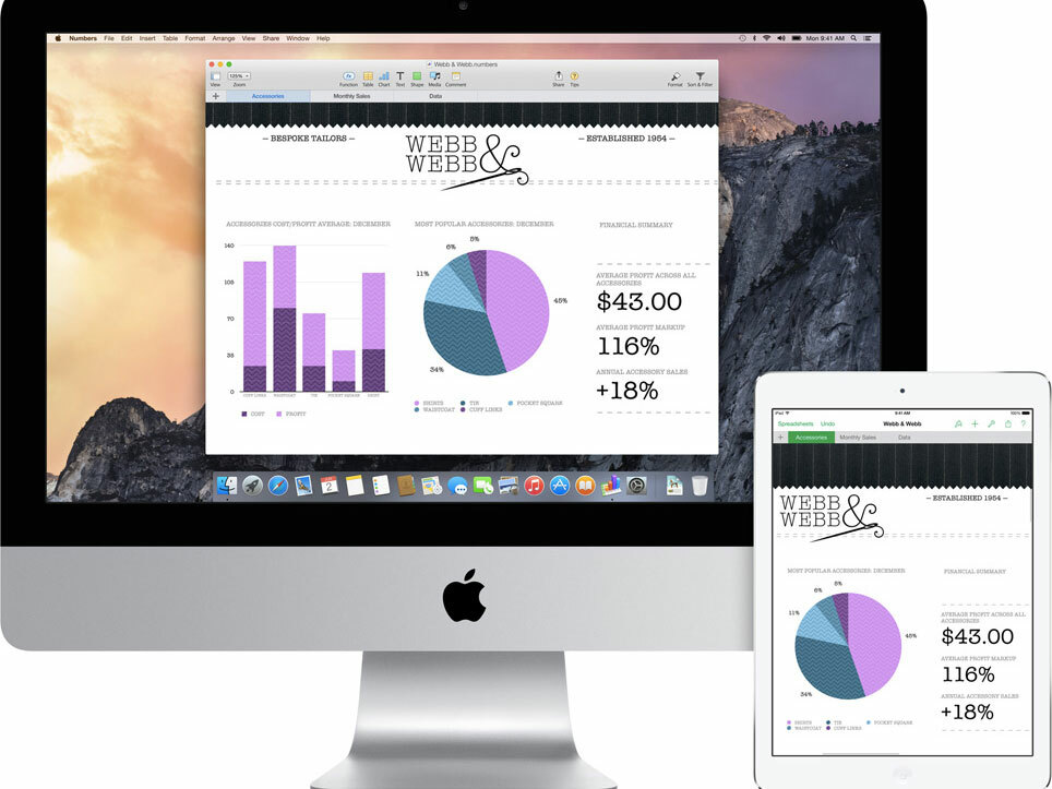
Continuing with, er, continuity, Yosemite and iOS 8 both have a useful new function called Handoff, which lets you seamlessly work across your Macs and iDevices, saving your current state each time.
Imagine writing a report on your Mac, then realising you have to dash out. Instead of having to emailing it to yourself, the Handoff button will let you instantly transfer the report to your iPad, saving it exactly where you left off.
It works the other way around too. If you’re editing a photo on your iPad but would prefer to work on a larger screen, a simple tap of the Handoff button will let you do just that.
It’s simple, yet powerfully convenient, and works with Mail, Safari, Pages, Numbers, Keynote, Maps, Messages, Reminders, Calendar and Contacts. It looks like a very tempting way of convincing people to buy into Apple’s ecosystem, but we’ll have to wait for iOS 8 before we can test the feature fully.
READ MORE: Apple iMac review
Will your Mac support Continuity?
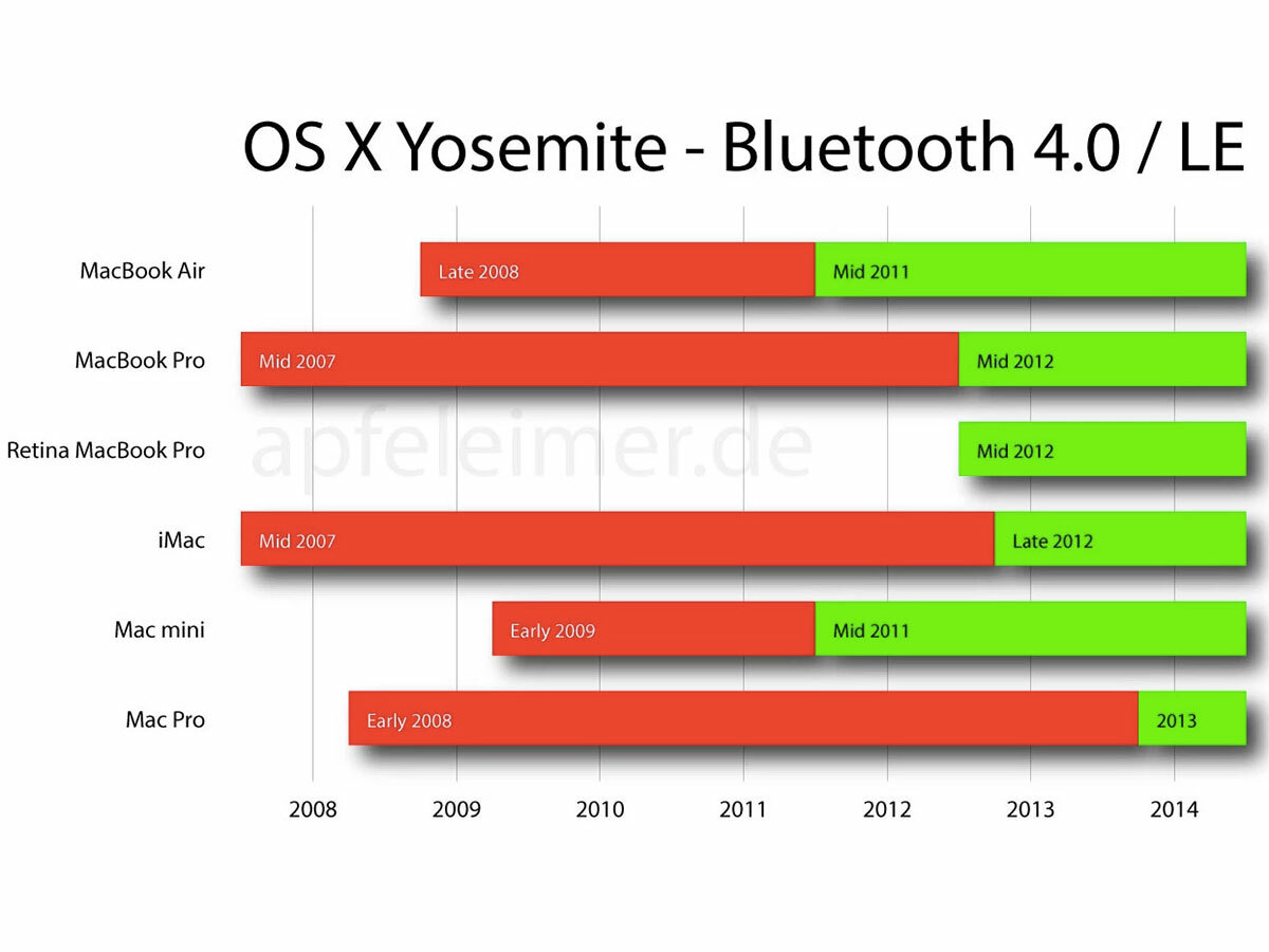
Update 18/06/14: Yosemite’s Handoff and Continuity features are likely to be limited to Macs which are Bluetooth 4.0 LE-enabled.
German site Apfeleimer has put together the above chart which will show you if your Mac is compatible with Yosemite’s Continuity feature. If you’re in the green, then your Mac will play nice with your iPhone. If you’re in the red, then you can still run Yosemite, but you won’t be able to use the Continuity features.
Apple could change the requirements before Yosemite’s full retail release, and we’ll be sure to update our preview if that’s the case.
Souped-up Notifications
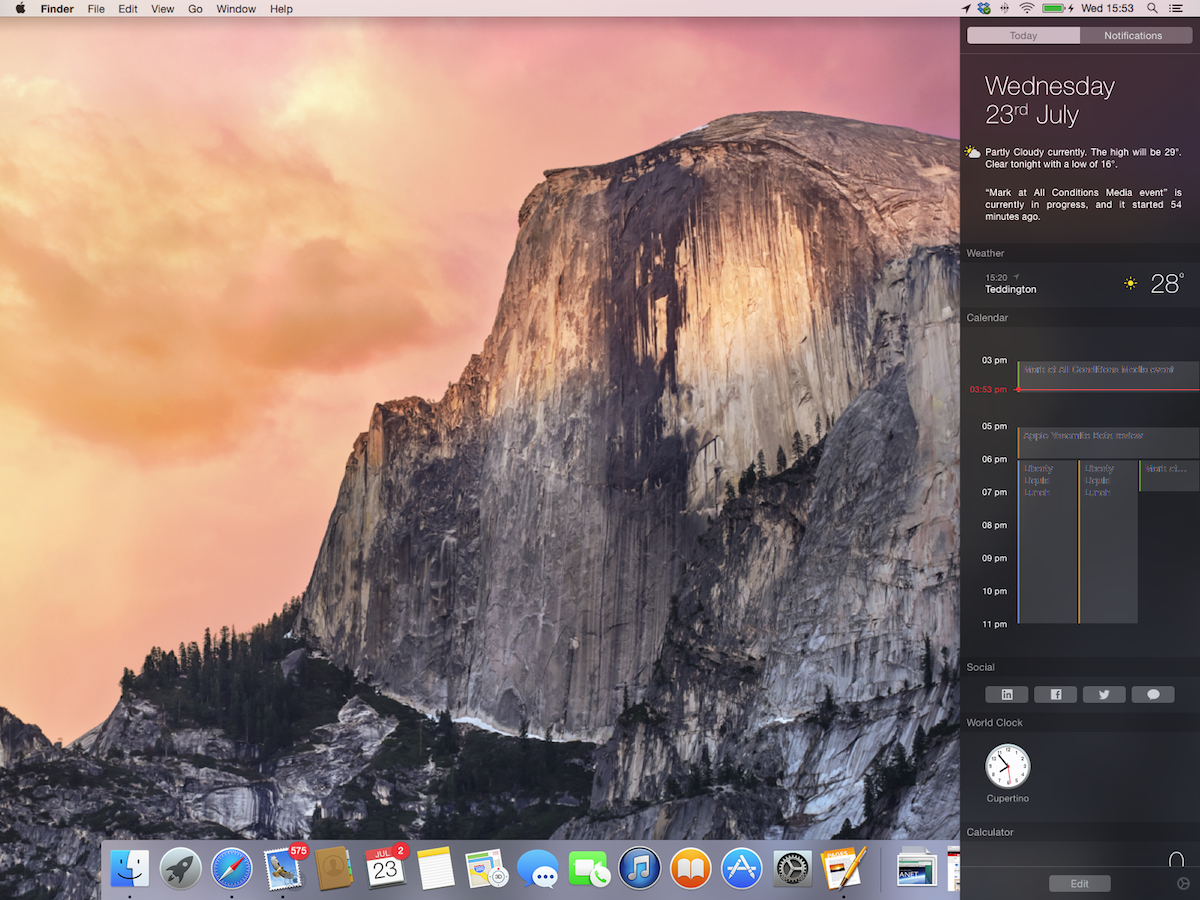
The Notification Center, which appears to the right of your desktop with a click or a swipe, now has a new Today feature – essentially an at-a-glance look at any imminent meetings, events, reminders and birthdays, in addition to summarising what you’ve got to look forward to (cake tasting), or dread (dentist), the following day.
Click Edit at the bottom of the Today panel and you can remove unused widgets (Stocks, begone!), move others around, and add new ones from the pre-populated list to the right or from the Mac App Store (although this portion of the App Store isn’t open for business just yet).
Interestingly, certain websites when accessed from Safari already have pop-ups that ask if you’d like to add their Notifications widget. Variety is one such example, although the Notifications themselves don’t actually appear to be active yet. Expect loads of these to become available in the run-up to Yosemite’s full launch.
It logically makes sense that the Tomorrow entry would go right at the bottom of the Today panel, what with it not being something that happens today, but I’d personally prefer to see it directly underneath the Calendar widget. Alas, Tomorrow can’t be moved. It can’t be clicked on, either, so if you want more details than a vague “There are 6 events scheduled” you’re going to need to open the Calendar app yourself.
And while we’re on the subject of Calendar, entries in its Today widget occasionally appear with black titles, making them hard to read over the grey background. This has the feel of a simple bug, and one that will undoubtedly get a fix in short order.
Serial Tweeter? You’ll probably appreciate the Social widget of Today, which allows you to post to Linkedin, Facebook and Twitter – or send iMessages – in a snap. You can’t add images, but this is perhaps the quickest way yet to spout your thoughts on to the interwebs.
And of course the thoughts of the interwebs are spouted right back at you via the standard Notifications panel, but now if it all gets a bit much you can activate Do Not Disturb, which has endless customisation options.
In the Spotlight
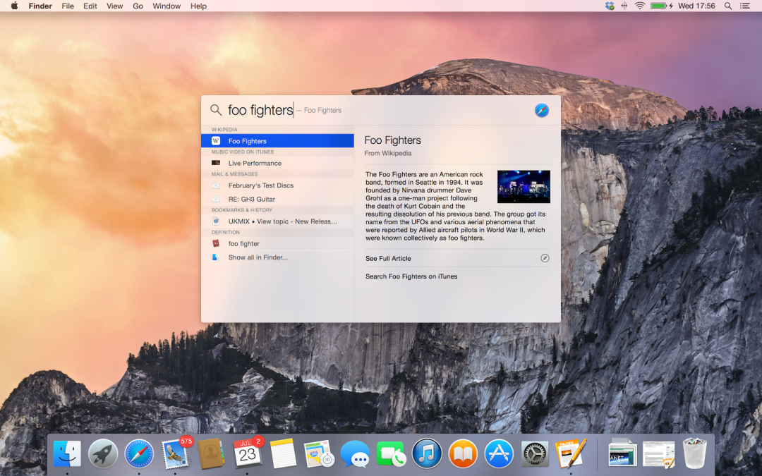
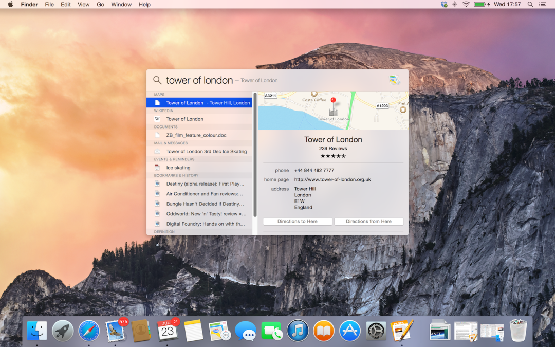
Spotlight search is accessed in the same way as before (click on the magnifying glass or hit CMD+Space), but it’s now far more useful.
It takes pride of place right in the middle of your display, and as well as more effectively searching your local documents and media (it has an unerring habit of picking exactly what you’re after as the Top Hit) it also draws information from sources such as Definition, Wikipedia, Maps and Yelp. The Wikipedia integration is especially useful – no longer is IMDB the quickest way to work out which darn film it was that you last saw that blasted familiar actor in.
Spotlight is also a fantastic way of finding little snippets of information you read on the internet days ago but that you’ve no chance of finding by looking through the list of obscurely titled web pages in your History. That’s because it actually searches right through the pages in your history.
And when Continuity does go live the integration of Contacts should also prove supremely easy. Start typing a name, your mate’s details appear and you can message or ring them directly through Spotlight, providing a more fluid experience for getting in touch with people even faster.
Naturally, Spotlight also brings up books, movies and videos that are relevant to your search, letting you pick them up from iTunes within seconds. That’ll keep Apple’s revenue streams flowing nicely.
Instant currency conversions are also possible, as are quick app launches.
In short, get used to using Spotlight and your entire computing experience will instantly become way, way quicker.
Can You Upgrade?
Here's a list of compatible hardware for OS X Yosemite:
- iMac (Mid-2007 or later)
- MacBook (13-inch Aluminum, Late 2008), (13-inch, Early 2009 or later)
- MacBook Pro (13-inch, Mid-2009 or later), (15-inch, Mid/Late 2007 or later), (17-inch, Late 2007 or later)
- MacBook Air (Late 2008 or later)
- Mac Mini (Early 2009 or later)
- Mac Pro (Early 2008 or later)
- Xserve (Early 2009)
Minimum system requirements are 2GB of RAM, 8GB of free storage and OS X 10.6.8 or above
[source: Ars Technica]
Surfin’ Safari
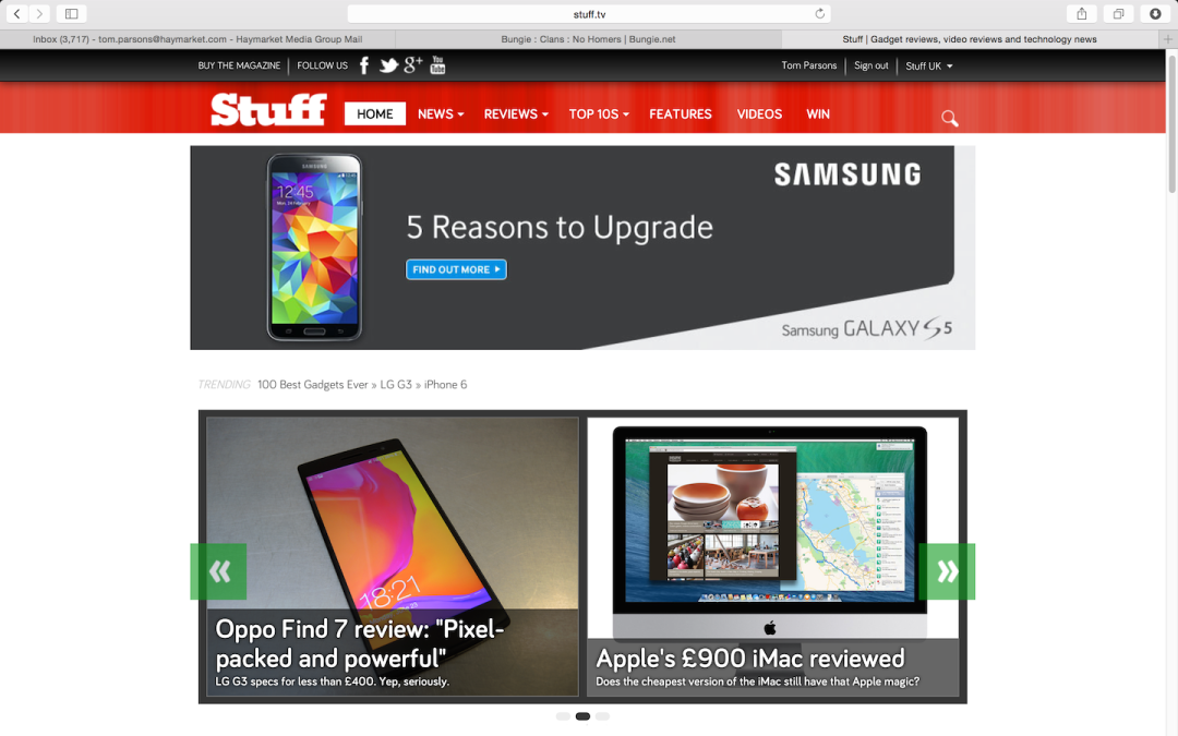
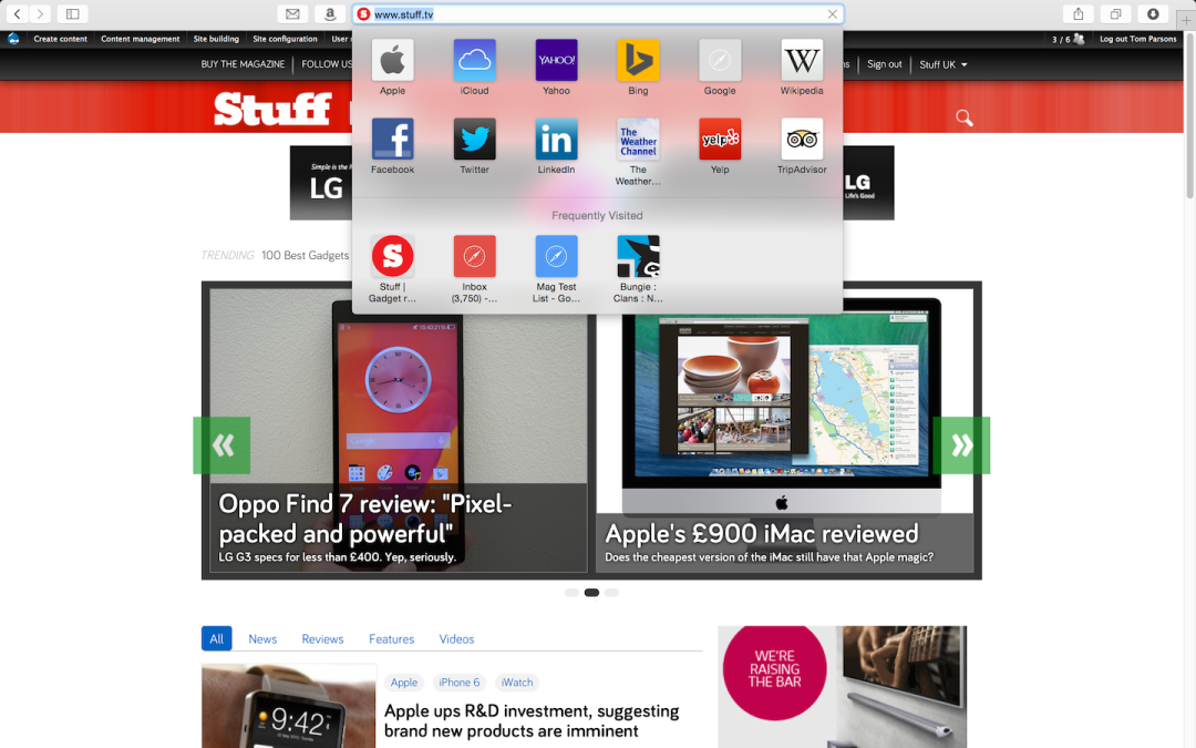
In keeping with the general theme of Yosemite, Safari has been given a significant tidy-up. The URL bar finally doubles-up as a search bar (with Spotlight integration), and clicking on it also opens a drop-down panel with neat rows of icons for all of your favourite and most visited sites.
This panel, combined with scrollable tabs and a Tab View that shows you every single open tab (across all devices once iOS 8 goes live), goes some way towards making up for the fact that Pinned tabs are still not a feature of Safari. But not all of the way. Those who have a strict setup of pages that they sit on all day might want to change the default Favourites to those tabs that would be Pinned in Chrome and open them at the start of each Safari session with the Open In Tabs option in the Favourites section of Bookmarks. Or they might want to simply stick with Chrome.
Sharing is also easier. Seen a hilarious meme that you simply have to share with your great aunt Gertrude? A few clicks is all it takes to beam it straight to her via Mail, Messages, AirDrop, Twitter, Facebook, etc. Oh how she’ll chortle.
Also, Safari has caught up with Chrome’s private browsing features in the sense that you can, at long last, open up a separate Private Browsing window, in which all tabs will also be private. That means you can go all Secret Squirrel in one window, while browsing normally in another.
Apart from a visual makeover, Safari’s back end has also undergone some tweaking. Boring bar charts aside, JavaScript optimisations and Yosemite’s overall energy efficiency mean that in addition to being faster than ever, you should be able to squeeze an extra two whole hours of Netflix streaming out of your MacBook Air’s battery life. This isn’t a feature we’ve been able to test as yet, but we’ll provide an update here as soon as we have.
You’ve Got Mail
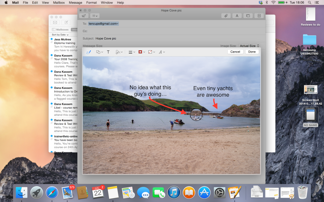
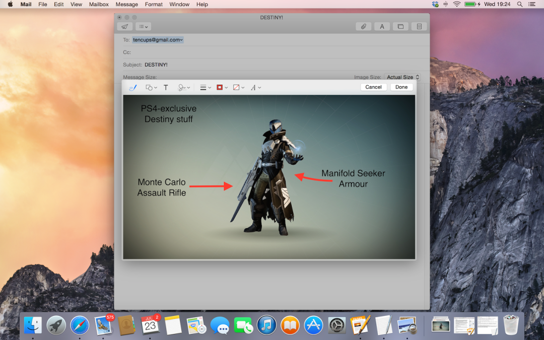
The biggest new feature of the Mail app is Markup, which apart from coming in handy for quickly signing off PDF files with your scanned signature, also allows you to scribble notes over images. It’s clever enough to recognise when you’ve doodled, say, an arrow or a speech bubble, and convert it into a smoothly rendered drawing. Jony Ive will brook no squiggles; everything you do on his Macs will fit into the Apple design language, whether you like it or not.
It also allows you to place localised zoom areas on pictures, highlighting a particular detail or object from the background, and while that’s currently a little slow (and therefore fiddly) when dealing with high-res images (even on an i7 MacBook Pro with 16GB of RAM), it will still be an incredibly useful tool for certain users.
Mail also lets you send attachments up to 5GB in size, preventing large emails from bouncing back. It’s all thanks to the new Mail Drop feature which automatically uploads large files to iCloud.
Apple users will, of course, find the experience seamless; if the recipient’s using Mail on a Mac, they can open the file as if it was an ordinary attachment. non-Mail users have to slum it with a download link, as the service depends on iCloud.
Sharing is caring
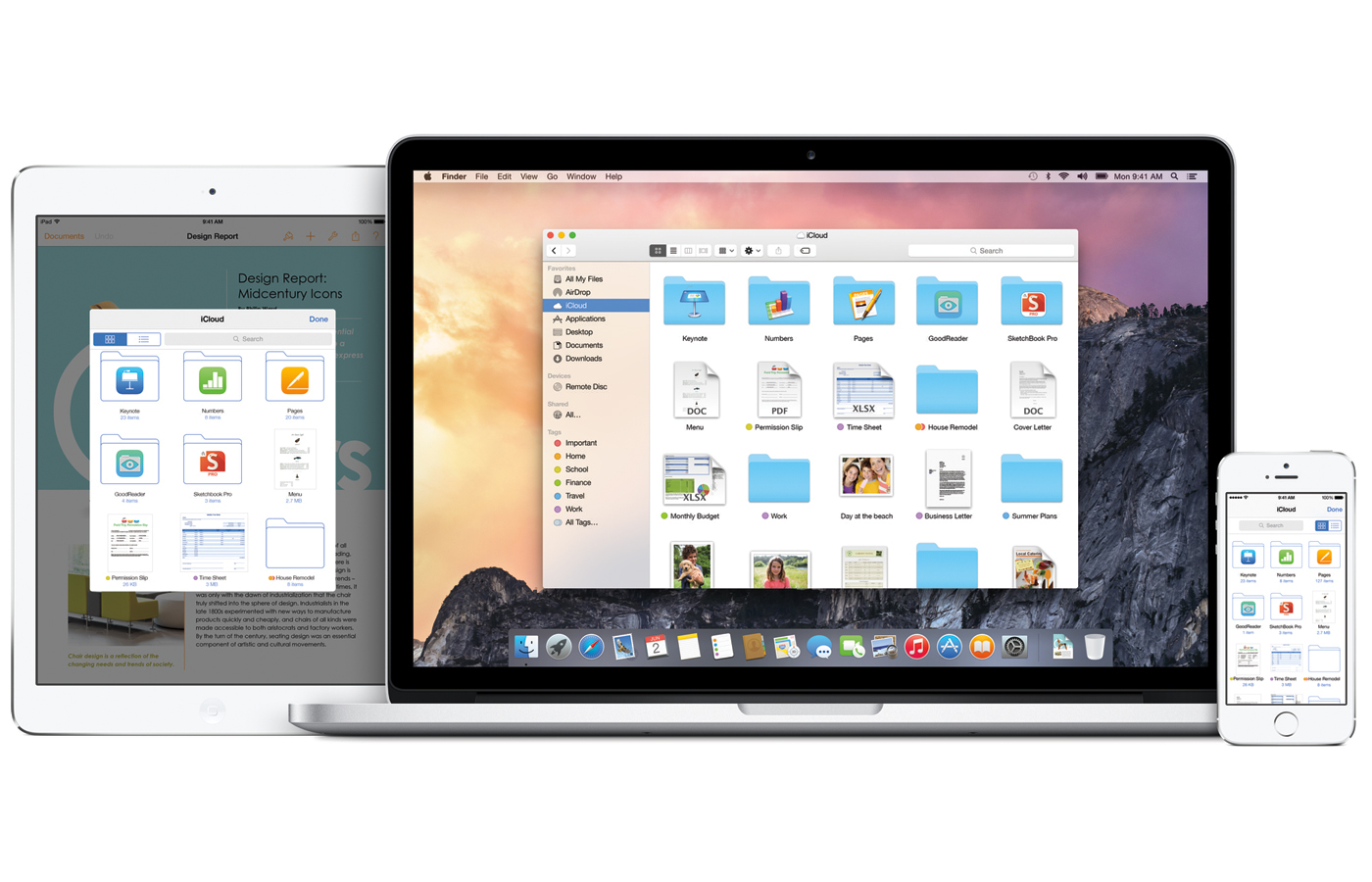
As with Continuity, the iCloud features of Yosemite aren’t ready for testing yet, but we have been eyes-on. Here’s the skinny:
iCloud is now built directly into the Finder window, and behaves like any other standard local folder. If you’re using Dropbox then the experience of dragging and dropping files directly into the iCloud folder to sync it instantly will be familiar, and you’ll already know how incredibly useful it is. In fact, Dropbox might be a bit worried about this new version of iCloud.
You can create additional folders using iCloud Drive too, which then syncs them across all of your Macs and iDevices. And iOS 8 includes the option for developers to create iCloud folders so that certain things – doodles you’ve made in Sketchbook Pro, for example – will then be available across all devices.
AirDrop is another useful feature which lets you push files between nearby iOS devices or Macs with just a few clicks, though we’ve yet to test out if this method will be faster than bashing out a quick email.
A near-flawless performance, even in beta
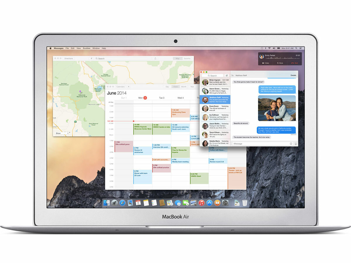
Just because Apple is launching a public beta for the first time doesn’t mean it’s unleashing a shoddy piece of unstable software on an unsuspecting public. In fact, even in its beta form Yosemite is exceptionally stable.
In our week of constant use and abuse we’ve not encountered a single crash or freeze. Only the Notifications toolbar, which fairly regularly stumbles rather than glides into view, has given us any cause for concern, and we’ve no reason to think that won’t be looked at and smoothed-out long before the final release of Yosemite.
Apart from that the performance has been lightning fast and stutter free, but in fairness we have been testing on an i7 MacBook Pro with 16GB of RAM. Our next step will be to install Yosemite on a number of other Macs to put Apple’s claims of faster performance and longer battery life to the test – stay tuned for updates on that one.
Apple OS X initial verdict – should you download the Beta now?
It may be ‘only’ a point release, but OS X 10.10 Yosemite is actually a rather large update for Apple’s Mac operating system. The tricky thing is that the biggest, most striking features (Continuity and iCloud) aren’t yet available to test as they’re reliant on iOS 8.
But even at this first stop on the long road of an open beta we are able to get a good feel for Yosemite, and it already appears to be lovely. The cleaner, simplified design is immediately familar yet fresh and a little more instinctive in use. It’s super fast and already extremely solid, too.
So should you download it now? That depends. If you’re a developer or have a penchant for seeing software develop, fill your boots. Ditto if you fancy doing some serious testing and bug reporting for Apple.
But the average user? Perhaps not quite yet. There’s no guarantee that all of those apps you rely on on a daily basis will work with the Yosemite beta, and as a beta there’s always the chance it will fall over and do something horrible to your vital data. If that sounds like it would be a fate worse than death, best hold on for the full, final release. We’ll certainly be waiting until then to deliver our final verdict.
Still want to take the plunge? Then head to the OS X Yosemite Beta Program page here, but not before heeding Apple’s own warnings about doing so, which we’ve reprinted in the boxout below.
Apple’s Yosemite Beta Tips

