Mio C520t review
The 520t might just show why TomTom, Navman and Garmin won’t hog all the market share for ever

Belgian company Mio has a range of handheld, in-car and mobile phone based sat-nav solutions, but none of them had eked more than a raised eyebrow out of us, Until now.
It’s refreshing when something comes along which rocks the boat: we weren’t expecting the Mio C520t to be as good as it is. But, having read that, don’t run out to the shops just yet. There are some things about the Mio you need to know before you buy one.
Traffic alerts
First things first: the C520t has a widescreen 4.3in touchscreen built in to a solid-feeling chassis. The ‘t’ suffix means that this model comes with a TMC traffic info receiving cradle, which only works when plugged into your 12v socket, and when the TMC aerial is plugged in and suckered to your window somewhere unobtrusively. It works well.
Like the TomTom’s and Garmins of this world, the Mio has no buttons other than the power button: all inputs are via the touchscreen. And this is where we get to the charm of this device.
Moreish menus
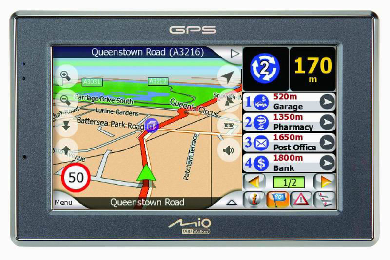
The C520t has the most customisable, useful user interface of any sat-nav we have used. You can have the map filling the 4.3in screen. Or you can have an info panel slide in from the right.
The top of this panel always displays your next turn diagram, but underneath that you click through a choice of screens: time/trip figures, a list of the nearest POIs with corresponding numbers appearing on the map, upcoming TMC-updated traffic problems or a list of upcoming turns. Click on an item, and you get context-sensitive options, like navigating to the indicated petrol station, or avoiding a jam.
Now, we love having easy access to all that information. But, it really works best for confident sat-nav’ers. If you are easily distracted or have stubby fingers, it’s unlikely to work for you. You have been warned! For the rest of you, the C520t is recommended.


